CAP 13 CAP 2 - Art Submissions

Status
Not open for further replies.
Greetings gents and gent-ettes! Its been too long.

761756-B9PARHP.png


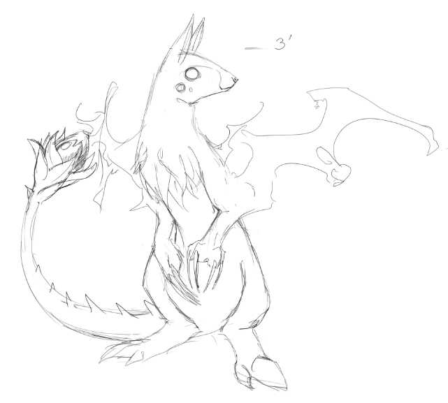
An axe-wielding ghost that inhabits a felled tree stump. (Apologies to Bubbly for coming up with what is kind of the same idea)

EDIT: As promised, some critique!

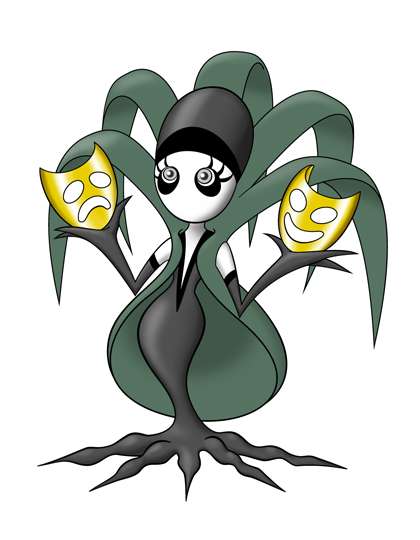
Yilx Anything but design 4 looks great. That purple briars just look too poison-type. The purple body/dress can still work though.

DougJustDoug Love it.

Solstice I like this! It just needs a bit of refining.

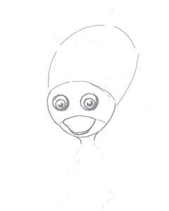
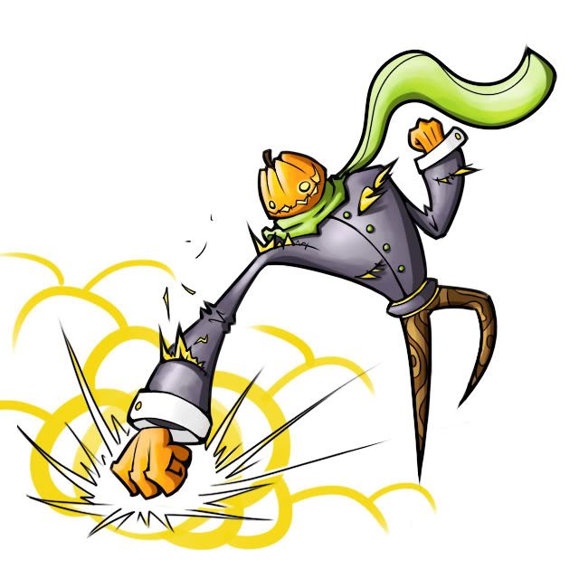
Calad The onion/pumpkin guy is wonderful.

Wyverii I love the little guy. His mouth should have some colour inside when its open or it isn't going to show up in the design.

SoIHeardYouLikeSENTRET I actually liked the initial version of the pumpkin guy better. His leaf scarf is great though.

Also, Joeyboy: It was just drawn and inked on paper, then scanned and coloured quickly in photoshop.
 
My vote also goes with 3, Yilx, although the green of 1 is really appealing for grass-type-signifier. How would merging that into 3 look? I'm trying to visualise it.
 
tea_and_blues
Okay, your design just makes me think of Roserade. I know it doesn't actually look all that similar, but nevertheless I can't help but think of Roserade. I also don't really think the Ghost type is reflected clearly in the design. Its not bad, but I think that element should be enhanced.

Yilx
Go for design 3, its the one the embodies the ghost idea best, the other's could easily be other types, especially poison.

Paras Hilton
I like it, but I almost feel it would look better without the bushiness at the bottom, or at least with it reduced. It looks a bit cluttered for a Pokemon at the moment, in my opinion. Also have you considered trying to represent the sketch aspect of the CAP?

Wyverii
This is going to sound odd, but I actually think your design looks like a perfect prevo, rather than a fully evolved form. There's just something child-like about it. I like the design though, especially the hat, and actually there's no reason why the design shouldn't look like a child.
 
Yilx
I would go with color scheme #3 as well since having mainly black&white as your coloring had some additional "hidden" symbolical. Tea&Blues' suggestion about adding the green vine/branch onto color scheme #3 is also a good idea to incorporate, though you don't have to.

BTW, nearly a good 50% of all ghost type Pokemon are either shade of purple or black so being mainly black in coloring doesn't automatically means it's a dark type. I just wondered to mentioned that because people tend to think that way.

Tea_and_Blues
Your design is good I'll give you that but the face and "fin" could use some work. Also having one hand being a permanent paintbrush strike me as rather odd and asymmetric.....however giving it two brush hand make it too like Roserade for anyone's taste. The only suggestion I can think to remedy this is a thistle pen and leaves/paper and converting it to some kind of poet/writer. Literature is a form of art as well.
 
hey guys, i took all the art here and made a yt vid (its sort of an experiment in a sense, but i really love the art here and wanted to showcase it)

http://www.youtube.com/watch?v=adyMK--HQFs

id like to say all of the art here is fantastic - sorry if i missed a piece of yours :(, however, hopefully, people can see this and will want to be more involved in cap

i hope you like it!
 
http://img62.imageshack.us/img62/9524/mushbeta.jpg

Just figured I'd get some opinions on this basic design before I go any further. Basically, it's a mushroom. I understand that it doesn't look that much like a Ghost-type, but I came up with the design ages ago and since it now kind of looks like a Chinese Vampire... (not really) uh, yeah.

My other idea is a columnar tree that was left by a strangler fig. I had a sketch for that somewhere, but I think I threw it away. I wasn't really very pleased with the outcome, anyhow.
 
Just figured I'd get some opinions on this basic design before I go any further. Basically, it's a mushroom. I understand that it doesn't look that much like a Ghost-type, but I came up with the design ages ago and since it now kind of looks like a Chinese Vampire... (not really) uh, yeah.
Ghost mushroom sounds like a cool idea, because there's lots of fungi that are already associated with death (like death caps) and it'd be fun to give it a literal spin :p You could have tentacles coming out the bottom and maybe some creepy eyes just below the cap itself. I guess it'd look a bit like a cross between Amoonguss and Jellicent, but you've got plenty of ways to mix it up a little. I say go for it! :)
 
Yilx I personally like #1. I think your design conveys the ghost typing without color, so I don't think you necessarily need to go with the design that is most ghost-colored. As I've said before, for something that will be sketching moves like Sacred Fire while also using its Grass and Ghost STABs, red is a nice color - your design is recognizable as a ghost and a flower, but doesn't seem tethered to those.
 
Yilx
I like both #1 and #3. I mostly like #1's green hair while #3's color scheme. I suggest changing #3's hair to #1's in order to get the best of both. I think you may have done that already as I can't help but remember seeing a picture of it. I digress.

T3hB33
Very good flavor art fitting for the cute ghost pony. However, I can't help but think it to be a psychic-type with the less menacing or silhouette art style (which is difficult to say because I can clearly see the pony fade in the original post). Is there some way to reinforce the idea that it's a ghost without losing the cute pony? If not, ignore me.
 
Wyverii
It's a very nice design, however, doesn't it look a bit... familiar to something else? With the colour scheme and the hat... and the ability to learn sketch. I mean, shouldn't we try to set CAP apart from that... other Pokemon?
 
@ Yilx: #s 1 and 4 have the most distinct color schemes in my eyes, with #3 looking like Darkrai's little sister. If you wanted to run that angle, you could definitely go for 3, but my personal favorite is #1.
 
Yilx you're design actually is my favorite right now. Very unique and it captures everything about this CAP :) (#3 is my fav followed close behind by #4)

Paras Hilton that design ROCKS!!! From a design perspective its amazingly creative and I love how you've drawn it(how by the way ;)

Really liking the ways everyones taking it. Tough competition this time around(when isn't there?).
 
Thank you for all the feedback on my "Weeping Willow" design. I've been working on a few possible tweaks, but I'm not planning on changing too much about it. Here's the current version:

weepingwillowd.jpg


I go into a LOT of details below, so I'm going to break it into sections in hide tags, out of courtesy for those of you that really have no interest in seeing walls of text about this design. But for anyone out there who wants to know more about the design, or why I made certain choices, then this should be informative. I also included a bunch of links to reference pictures, development pics, and alternate colorings.


Several of you have commented about the masks as being "too much" or "unnecessary" -- and I get that. I would love to be more subtle with the actress theme, but I can't think of a way to convey it without it being so subtle or obscure that everyone misses it completely. Most people don't take the time to read inspirations or backstories, so I need some overt visual clue that conveys the concept of "actress". If I don't get the actress theme across, then I pretty much have nothing more than "yet another ghosty plant" design. Even with the masks, I don't expect people to pick up on the grande dame thing, or the fact that she is colored in black and white and has no mouth, which signifies "silent films". Only people who read the supporting material will get that. The masks are beating everyone over the head with the actress theme, but I can't think of a more subtle way to pull it off.

I thought about trying to make the Comedy and Tragedy masks part of Willow's organic composition (kinda like how Aragornbird included all the pirate gear as part of Arghonaut's anatomy), but it seemed a lot more "forced" to do it that way, rather than just include them as props. And I think they are pretty cool, as props go. They are shiny gold, which adds bright pizzazz to an otherwise intentionally drab colored pic, and I can imagine various ways the masks could be used for different moves, so they have utility value too. Hey, you gotta admit, they are a heckuva lot cooler than Conkeldurr's cement pillars, right?

Besides, there *IS* a subtle reference in the masks that will only be known to those of you reading this. The theme of the design is a faded silent film actress who mourns for her past glory, right? Well, what is the epitome of acting glory? -- acting awards. Yes, pretty gold trophies signify the height of achievement in the dramatic arts. I wasn't going to slap an Oscar or a Golden Globe in her hand, so I made the Comedy and Tragedy masks golden, as if she is carrying around her acting awards as reminders of the glory days of her youth. That's also the reason she is holding them up "presentation style", like a model showing off her wares. Weeping Willow is all about vanity, and desperately wants to show the world that she was once beautiful and famous.

Nobody will pick up on the trophy reference, and I'm not trying to push it hard. It's just a little tidbit we will keep amongst us here in the submission thread, OK?
I struggled with how to handle the eyes and mouths of the masks. I envision the mask holes are open or "see-through", meaning Weeping Willow can actually wear the masks and see through the eye holes. The mouth doesn't really need to be see-through in practice, because she has no mouth herself. But I think for consistency sake, the mouth should be handled the same as the eyes. So I planned for the holes to be open, which would mean whatever is behind the mask is visible through the holes, right? Well I tried that, and didn't particularly like the results. Here is a rough reproduction of what it looks like:

<-- Click this for the full picture

There are a couple of problems with it. Because of the curvature and positioning of the masks, the background of a large part of each masks eyes and mouth is actually the mask itself. Which means I have to color that gold, and shade it. On top of that, there are green leaves behind both masks that intersect the holes at rigid angles. Having all those intersecting shapes and colors effectively "inside the holes", makes it somewhat confusing as to what the heck she is holding in her hands. Yes, if you look at it for a second, you can figure out that the holes form the traditional "happy face" and "sad face" of dramatic mask symbols. But I don't think it is immediately apparent and I feared that many people might misinterpret them at first glance, and think she was holding some weird metal objects in her hands. Also, for some reason, the background details in the holes just look "too busy". I think it detracts from the basic elegance of the rest of the design.

I also tried fading the background details in the holes, to lessen the impact of the background details but still convey that the holes were letting the background through. I didn't want to use graphics tricks like fading and blurring into the background. In many cases, using gimmicks like that is actually against the rules for CAP designs (commonly referred to as "the outline rule"). Even if I did it in such a way as to circumvent the rule, I still don't like the practice. On this design, I want to keep things fairly simple, and not resort to fancy art tricks to make it work.

I also considered "filling in" mask holes, to make the masks be more like hand-held talismans, rather than actual functional masks that she could wear over her face. Here is a rough reproduction of how that looked:

<-- Click this for the full picture

I didn't like that much at all. Filling in the holes takes away a lot of the imaginative uses for the masks. After all, they are masks, so they should be able to be worn, right?

So, I decided to simplify the whole thing and just left the holes a blank white. The biggest reason was to make the hole patterns obvious, while still leaving the general impression that they are "open". I realize the white holes might make the masks look somewhat like they are unfinished, or that I forgot to color them in. As you can see, that is certainly not the case. I am still open to suggestions of how to handle the holes. The masks are a big part of the design, so I want their aesthetics to be as nice as possible.

What do you think? Am I off-base in my assessment of the holes? If I change it, it will be to incorporate the look of the "open holes" picture above. But right now, my inclination is to leave them simple white.
I've been playing around a lot with coloring on this little lady. Most of the coloring experiments has been just wild stuff for fun. I like to imagine the possible shiny colorings for my designs, so I build my designs in Photoshop in such a way that makes it very easy for me to play with the coloring. You can see some of my fanciful coloring experiments below. But before I get to that, I do have one subtle, but important, coloring dilemma to nail down with the base design.

The shade of green I am using in on the "cape" of the design, is hard to get *just right*.

I have intentionally washed out the green significantly (very low saturation, for those of you that are coloring-savvy) and made the green dull and grayish. It goes with the whole "dead" theme. A HUGE problem with CAP2's typing choice is that Grass is a very "living" type, and Ghost is obviously, well... "dead". So trying to mix the two in a single design is very hard. By dulling the green down a bit, it makes the design have big green leaves, which helps connote the grass typing, but doesn't clash too hard with the black, white and grey of Weeping Willow's body. Rich green and grey do not go together nicely side by side. By lowering the saturation on the green, it mitigates that problem. The big question is how much green is the right amount?

Before answering that -- remember another HUGE consideration when making color choices with CAP designs is accounting for the wide variety of monitors being used by different viewers. I do most of my design work on a Wacom Cintiq 21UX, which is a very good display that shows colors almost flawlessly. They are bright and vivid, even the dull colors. But on lower-quality monitors (like most laptop screens), colors look MUCH different than they do on high-end monitors. Low-end displays tend to make all colors look more grey and have less differentiation between colors. On some other designs, I use nice bright colors. So normally the biggest issue is choosing colors that aren't too bright for the folks with top-quality monitors. In this case, I have the opposite problem. I don't want a color of green that is indistinguishable from grey for the people on low-end monitors.

Here is a version of Weeping Willow with a bit more saturation in the green. On a high-end monitor, this is about as green as I care to make it without getting into the "green and grey don't look good together" problem.

<-- Click this for the full picture

So, taking all this into consideration, do you think I should use a richer green that what is in the picture at the top of this post? Every time I look at these colors, I have a different opinion. Sometimes I think one is better than the other, sometimes I can't even tell a meaningful difference.

Anyway, as promised above, I did make some fun colorations for my sad little actress. They are named for seasons, as if her colors might be able to change like Sawsbuck.

Fall
<-- Click this for the full picture

Winter
<-- Click this for the full picture

These are just for kicks, Weeping Willow's coloring will be the scheme posted in the main pic.
I pulled from many sources for visual inspiration. The biggest inspiration was Gloria Swanson in the movie Sunset Boulevard. For those of you unfamiliar with the movie (which was later remade as big broadway musical), it is the story of a faded star of the silent screen era, living in the past in her decaying mansion on the fabled Los Angeles street, "Sunset Boulevard". Gloria Swanson was herself a star of silent films, and her later role in Sunset Boulevard pretty much defined her career for posterity. Her portrayal has become the archetype for the "elder diva actress" or "dramatic grande dame" who uses bravado to mask deep sadness and regret. So this design pulls from that whole genre and archetype.

Here's a reference pic of Gloria Swanson I used that gave me the idea of the big beehive head wrap:

<-- Click this for the full picture

For the coat/cape, I knew I wanted it to be big and billowy, to allow me to interpret the top part as long drooping willow leaves. In this case, I was actually thinking of the garments worn by one of the most famous wicked cartoon grande dames of all -- Cruella Deville:

<-- Click this for the full picture

Yeah, she wears a fur coat and not a cape, but that was the big, oversized feel I had in mind.

Weeping Willow's body is supposed to evoke the image of a long, tight evening gown. Weeping Willow doesn't have feet, she has prehensile "roots" (Ingrain should be in her level-up moveset, imho), that are supposed to look like the bottom of a dress spreading out on the floor, perhaps hinting at the tattered look you see in some witches dresses.

Weeping Willow's arms are colored to give the impression of arm-length gloves that complete the look of a high-society lady.

I originally had Weeping Willow posed standing pretty much straight up. But while searching for references, I came across this picture of a figurine titled "Grande Dame":

<-- Click this for the full picture

I loved the way the figurine's hips are shifted to the side, so I incorporated that into Weeping Willow's stance.
Ah, the eyes. In my opinion, Weeping Willow's eyes are really the centerpiece of the design. I know some people don't like the eyes, but I personally love them. I worked very, very hard to get them just right and I am pleased with how they turned out. When designing the eyes, I knew I wanted them to be "wide open". There's something very creepy about a wide-eyed stare. Here's a pic of Gloria Swanson doing the look in Sunset Boulevard:

<-- Click this for the full picture

I also mentioned in my first post that I was thinking of the creepy open-eyed look that some people get when they have had too many facelifts, and their skin has been pulled so tight that their eyes look like they are perpetually open.

Here is an early development sketch of the eyes, when I was considering having her face wrapped in post-surgery bandages, with big wide-open eyes:

<-- Click this for the full picture

I decided to ditch the whole plastic surgery angle, because it didn't look that great, we've already done the bandages look in the biggest way possible with CAP in Revenankh, and plastic surgery isn't exactly the sort of thing you play up in a kid's videogame. But the sketch got me thinking of a scene from A Clockwork Orange, where Alex's eyes are propped open with little hooks, forcing him to watch some disturbing films:

<-- Click this for the full picture

That scene is what led me to extend Weeping Willow's "eyelashes" all the way up to her "headband". I planned on having big eyelashes anyway, just to emphasize the feminine look. But by extending them all the way up like that was due to Kubrick's film. I realize it is an incredibly obscure reference, but if there are any Clockwork Orange fans out there, you might appreciate my nod to one of the creepiest scenes of all time.

The black drooping ellipses under her eyes are supposed to convey sadness, like a woman who wears lots of mascara, and it runs down her face when she cries.

Here's an early inking of the eyes, when I was trying to make all the eye elements fit together.

<-- Click this for the full picture

I hated that version, for obvious reasons. But I knew the elements had potential. In the final version, you can see how I pulled it all together.

For the record, in Pokemon terms, I don't think of Weeping Willow as having "eyelashes" or "mascara" or anything like that. She has organic face markings around her eyes. All this stuff I am mentioning here, is just visual inspiration for how I came up with the look.
If this design was to be the winner, I would advocate a special way to learn the move Sketch, that bypasses the need to be part of the Field Egg Group and breed with Smeargle, and avoids the issue of making an inherent part of the concept (ie Sketch) an event move.

I'd make this a breeding move that is learned by virtue of holding a special item. I would suggest creating a new item called "Drama Masks" (or something along those lines). The item could do something irrelevant like increase beauty in contests, or it might just duplicate some battle effect of other items. For example, the Masks could increase evasion like Brightpowder, since you are "hiding" of sorts. Although evasion hax sucks, and this *is* a competitive project, so I would probably advocate making the Masks increase accuracy like Wise Glasses. Whatever the effect, that really is besides the point -- the point is that there is an item that, when held by a parent during breeding, the baby Weeping Willow is born with the move Sketch. It won't work that way for any other species other than Weeping Willows, so it ties the concept together in a special way. This is exactly how Pikachu learns Volt Tackle (by breeding with a Light Ball), so it's not like we are going outside of game canon by doing it this way.

I love the flavor aspects of having an item that represents "portraying a role" actually conveying an egg move that allows our new pokemon to learn any move in the game. Basically, you allow the pokemon to "play any role it wants". It's an actress, after all! This would make the move Sketch an inherent part of this pokemon's entire concept, and not be some anecdotal result of the pokemon's breeding chain with Smeargle.

This sort of thing would be decided by the TL at the end of this CAP, and I'm not trying to suggest this should be voted on or discussed in the art thread. But, I think it's a cool flavor idea that would fit nicely with this design.
If you made it through all that detail, then I am impressed. Either you love this design, you love reading about art, or you simply have too much free time on your hands! Whatever the reason, thanks for your interest in my design. I've had a lot of fun making it. I realize most of the detailed thinking behind this piece is almost impossible to discern in the final work. Because this is a Pokemon, everything needs to be wrapped in a cute, simplistic package -- and I LOVE cute, simple pokemon. But, as you can see, I also like putting a lot of other thoughts and ideas into my designs, even if they can only be explained in posts like this for diehards in the art submissions thread.

If you care to give me feedback on some of the questions and topics I mentioned earlier, please don't quote this whole monster post. Just mention you read these details and give me your feedback or suggestions. Although I don't anticipate making any big changes to Weeping Willow, I do have a few nagging concerns that I would like to resolve. If you think you can be of assistance, I'd appreciate the help!

-Doug
 
Yeah there isn't much time left to work on designs so I guess I'm gonna roll with this idea. Basically it's (yet another) mushroom pokemon, based on a cross between those glowing mushrooms and slime molds. It's just a sketch right now but once I line and color it the design will really come to life. I'm debating several cosmetic changes but I've pretty much decided on it's base design.
DqXfi.png
 
Better Art

I had a rush of artistic inspiration last night. Behold my much-less-suckish art: Chefmon!

Chefmon3.jpg

It was based on the Culinary Art of cooking. The actual Pokémon is the Hat; it manipulates the Knife and Cutting Board with some sort of odd power. The Ghost aspect is obvious, but the Grass part is less so. It cuts up vegetables on its board and flings them at people to use moves like Razor Leaf and Sleep Powder. The Knife could enable him to use attacks like Shadow Claw and Leaf Blade. He could also use the Cutting Board as a shield to block attacks. Plus, it's quite cute, and the lack of eyes makes it slightly creepy as well.

C&C Please!
 
So far I'm loving Yilx's #1 the most, but to be honest it isn't... Crap, I don't know, they all just seem too much as if we already have something like them. Some sort of Mawile-Lilligant mix, maybe. It just seems likes I'm missing out on why it's getting all the attention. I hope it's not the artwork detailing itself. Don't get me wrong, it's a very well done image, better than the official artwork made by Ken Sugimori himself even, and your Fakemon is nicely executed, but beauty can be applied to anything (some things having a harder than others). It's a matter of enhancing an idea itself that should matter. I'm not saying godly art is bad, but I'm just getting the feeling that it's running a monopoly in the votes simply because it was made by the more artistically gifted. I've seen elegant plant-mons and humble maidens with an aggenda-mons before, so it just seems like making it the winner based on the art alone would be a mistake.

I really hope I don't receive backlash for making a wrong assumption here. I don't know if that's why you all love it. I don't think there's anything wrong with that if you do. I'm just saying I hope the rest of the ideas don't get overshadowed by Yilx's just because it's the most visually appealing.
 
Yilx: I think coloring #4 is the best by far. I think you need to be really careful to not fall into the "this doesn't look like Grass" worries. To me, #2-3 just don't look like Grass to me. #1 does look Grass-y but with those red "leaves" (actually called bracts) make #1 into a Poinsettia, which is Christmas-y and festive and not altogether suited for a Ghost type in my opinion. I think a Green body is best, but I would recommend continuing to fiddle with the "hair" coloring. But I really, really like where you are going.

Doug: Your designs are always some of my favorites, and it's no different this time. Grieva (Potential name? Grief and Diva.) Personally, I would stick with your more faded green. The more saturated ones just won't give off the ghost vibe at all, which in my opinion is the less obvious one in your design, since the depiction is of a living-but-faded actress, and not actually a dead one. As for the masks, I am unsettled by the current state with the white background. It just looks off. But I don't think the "solutions" worked particularly well. Definitely keep experimenting with the prop. I don't think the masks are necessarily the best choice. Maybe using a more typical trophy-looking prop, but change the arm poses. Maybe she can be clinging the trophy protectively, just as she is trying to hold onto former glory. Right now, her pose holding the masks is just too... Vanna White-y. Looks like she is presenting them rather than actually the winner. IDK. Maybe that's just me.
 
It was based on the Culinary Art of cooking. The actual Pokémon is the Hat; it manipulates the Knife and Cutting Board with some sort of odd power. The Ghost aspect is obvious, but the Grass part is less so. It cuts up vegetables on its board and flings them at people to use moves like Razor Leaf and Sleep Powder. The Knife could enable him to use attacks like Shadow Claw and Leaf Blade. He could also use the Cutting Board as a shield to block attacks. Plus, it's quite cute, and the lack of eyes makes it slightly creepy as well.

C&C Please!
I don't think that many ghost-type pokemon are that levitate-ive or possessive on other objects as limbs and body parts. The ones I can think of are Haunter (which have distinctive hands) Dusclops (again, to the hands), and rotom (which possesses the object to be the entire body).

I may suggest trying to solidify these body parts, but it's kinda hard to do that while staying true to the original drawing. Not a bad drawing but the concept needs some work to make it convincing. Just the opinion of a lurker, though.

So far I'm loving Yilx's #1 the most, but to be honest it isn't... Crap, I don't know, they all just seem too much as if we already have something like them. Some sort of Mawile-Lilligant mix, maybe. It just seems likes I'm missing out on why it's getting all the attention. I hope it's not the artwork detailing itself. Don't get me wrong, it's a very well done image, better than the official artwork made by Ken Sugimori himself even, and your Fakemon is nicely executed, but beauty can be applied to anything (some things having a harder than others). It's a matter of enhancing an idea itself that should matter. I'm not saying godly art is bad, but I'm just getting the feeling that it's running a monopoly in the votes simply because it was made by the more artistically gifted. I've seen elegant plant-mons and humble maidens with an aggenda-mons before, so it just seems like making it the winner based on the art alone would be a mistake.

I really hope I don't receive backlash for making a wrong assumption here. I don't know if that's why you all love it. I don't think there's anything wrong with that if you do. I'm just saying I hope the rest of the ideas don't get overshadowed by Yilx's just because it's the most visually appealing.

I don't think Yilx's work is "winning" based solely on talent. I found it appealing because it melds both grass and ghost-types well in a believable pokemon as well as Yilx's justification for its (her maybe?) ability to use sketch through channeling. I also found it relieving after all of the other pokemon from CAP being fierce or manly like Syclant, Arghonaut, Kitsunoh, Colossoil, and Voodoom. I found Yilx's work to be more of a subtle elegance while portraying a vicious and strong will.

...that and the art style is beautiful.
 
CAPscarecrowpaunchjpeg.jpg


Some action pose! Just general supporting artwork. I chose the grey I liked from 4 and the scarf color of 6.

Sorry to all fans of the Ponytail painter, I don't think I'm gonna do it. I just don't quite feel it.

So far I'm loving Yilx's #1 the most, but to be honest it isn't... Crap, I don't know, they all just seem too much as if we already have something like them. Some sort of Mawile-Lilligant mix, maybe. It just seems likes I'm missing out on why it's getting all the attention. I hope it's not the artwork detailing itself. Don't get me wrong, it's a very well done image, better than the official artwork made by Ken Sugimori himself even, and your Fakemon is nicely executed, but beauty can be applied to anything (some things having a harder than others). It's a matter of enhancing an idea itself that should matter. I'm not saying godly art is bad, but I'm just getting the feeling that it's running a monopoly in the votes simply because it was made by the more artistically gifted. I've seen elegant plant-mons and humble maidens with an aggenda-mons before, so it just seems like making it the winner based on the art alone would be a mistake.

I really hope I don't receive backlash for making a wrong assumption here. I don't know if that's why you all love it. I don't think there's anything wrong with that if you do. I'm just saying I hope the rest of the ideas don't get overshadowed by Yilx's just because it's the most visually appealing.

I think this a perfectly valid point. A brilliant idea has little to no chance if the person visualizing the idea isn't the most capable artist.

@Yilx: I personally really love where you're going (and have gone) with your shrine maiden, I just can't help but get the feeling that it's too busy. Something about all the thorns and eyes and petals is just a little too much in my opinion.
 
Doug, I did read all that, I have a couple of things to say.
Firstly on the see-through holes - I didn't even think about that until you pointed it out. I assumed the holes were holes, but It didn't occur to me that there should be stuff behind. In other words, I don't think you've got anything to worry about there.

I'm not to keen on the masks overall though. I get where you're coming from about people not getting it, but there are plenty of existing Pokemon with obscure designs nobody gets. At least we have the option of making a Pokedex entry pointing it out clearly, and besides - we'll all know.

As it stands, I find that the masks conflict with an otherwise great design. The bright gold completely defies the subtle greys and greens and they almost look tacked on which detracts from the sleek elegance of the rest of the design.

On the other hand, I love your flavour idea for how it learns sketch. I already though that acting was an adequate way of justifying sketch but your way of putting it and the mechanism you've suggested is great.

There is an idea I JUST had (while typing) to make the masks more subtle but still present in the design. What you could do is instead of two huge masks held in her hands, she could have little mask-shaped 'pins' on her chest which hold the cape on as well as serving an aesthetic purpose.
A quick mock-up of what I mean:
actress.png
See what I mean? If you did something like this and got rid of the masks it might help to suggest beyond doubt "yes she's an actress" without screaming it at us. Obviously it would better if you drew it rather than me making them in powerpoint and tacking them on...

Anyway that's all I have to say. I'm not the most artistic mind so feel free to disregard me as an idiot; you're doing a lot better than I could've. Even if you keep the design exactly as is I will probably still vote for you.
 
T3hB33
Very good flavor art fitting for the cute ghost pony. However, I can't help but think it to be a psychic-type with the less menacing or silhouette art style (which is difficult to say because I can clearly see the pony fade in the original post). Is there some way to reinforce the idea that it's a ghost without losing the cute pony? If not, ignore me.


Well i Tryed to add blue spirit flames on its hooves but then.... I realised it looked like ponita >_>;.....
So i tried just putting flames around it...... But it got to clutherd....

Thats why i tought just making it transperant and glowish would make it seem better >->;
 
Well i Tryed to add blue spirit flames on its hooves but then.... I realised it looked like ponita >_>;.....
So i tried just putting flames around it...... But it got to clutherd....

Thats why i tought just making it transperant and glowish would make it seem better >->;

Guess that leads to option 2...IGNORE ME! And stick with the pony, as it's a pretty strong design already.

Honestly, I should stop replying and commenting for a bit.
 
Status
Not open for further replies.
Back
Top