• Check out the relaunch of our general collection, with classic designs and new ones by our very own Pissog!

CAP 12 CAP 1 - Art Submissions

Status
Not open for further replies.
cap1headshottest.png


I decided to try my hand at CAP this time around. I don't currently have a scanner or tablet so I am going to be drawing it in Miscrosoft Word. With that being said I will be adding segments to its body with each update. Hopefully WIP don't need to be full view, the OP didn't say they did. Anyway, comments on what I have at the time would be nice. It is based on a rooster (cockfight).

Edit:

cap1torsotest.png


I changed the color of its head and neck since it seemed too deep of a red. It looks much better in a dark orange. I fixed the position of its right eye. The body will be muscular and eventually I will add different color feathers here and there. Since I am making it a little human shaped, I will try giving it thick arms with wings spawning off them and thick legs.
 
OK, Panda update!

This time with a more coherent color scheme, bamboo, and a grandmasterly expression!
The hands are posed so that you can imagine whatever special attack blast effect being channeled in the upward palm and being blasted out the other hand. You guys like?

I really like it! Just ditch the bamboo and revert the eye colors, as said before.
 
http://img.photobucket.com/albums/v391/Kevin_Garrett/cap1headshottest.png?t=1300229630

I decided to try my hand at CAP this time around. I don't currently have a scanner or tablet so I am going to be drawing it in Miscrosoft Word. With that being said I will be adding segments to its body with each update. Hopefully WIP don't need to be full view, the OP didn't say they did. Anyway, comments on what I have at the time would be nice. It is based on a rooster (cockfight).

Edit:

http://img.photobucket.com/albums/v391/Kevin_Garrett/cap1torsotest.png?t=1300235331

I changed the color of its head and neck since it seemed too deep of a red. It looks much better in a dark orange. I fixed the position of its right eye. The body will be muscular and eventually I will add different color feathers here and there. Since I am making it a little human shaped, I will try giving it thick arms with wings spawning off them and thick legs.

Keep in mind CAP1 has 60-something base attack-which is approximately the 2.5th worst attack for a Fighting-type in the game. (tied with DW Medicham and Makuhita, only better than Tyrogue and DW Meditite (who counts as half a mon IMO.)) Even Machop/Mankey/Riolu are stronger-and this is for a fully evolved Pokemon. This thing shouldn't look too "buff." I'm even ditching my Quetzalcoatlus that depended heavily on musculature for another design-though you'll have to wait to see what that is.

I would recommend going along a more "mystic" route-this thing needs to look like it's ready to Aura Sphere your face, not Karate Chop it. It's good art-but like many other people's designs, the stat discussion and polls were not kind to it.
 
Final Submission


I have no choice but to do this because I don't want to take the risk...

Thanks to everyone for the help. I've deicded to go with her instead of the rabbitcopter because for the love of god I could not find a good colour scheme for it or have the time to draw it's gyro properly.

...there's still a chance, but I'll have to leave that up to the rate things progress.

Yes, I know it looks too human-like and I apologize... I'm still quite torn between the two I did up. She's a kung-fu valkyire that's what she is.

If I come back before the polls are up I'll immediately respond to any feedback and draw up at least a few supporting material posts before it commences.

Hey Yilx i just wanted to post and say that i really like your design.
and that I was thinking you could try a version that has the the helmet down or something similar so as not to show a face, and possibly accentuate the wings.

So without it having a face and identifiable eyes it could make it look lets human. and the reasoning behind the accentuation of the wings could be to make it seem like flight is its primary mode of movement.
 
Another update on my Rocket Boots. I refined him a bit more, took some people's advice on making him less steel-y. So I rounded him off a little but more, which I hope would effectively make him look a little more rounded. Also gave him a new face, fit with a smile and swirly eyes. The smile references some of the "friendly" small robots, and at the same time, the big ones who have face masks. The swirlies are there because full-out glowing triangle eyes would make him look too mechanical. Here's the original blank face with the new body design for comparison. http://tinypic.com/usermedia.php?uo=u3L5ZvFm2l6Q0uA6FSPg04h4l5k2TGxc

The only thing that's REALLY giving me trouble is the color scheme. I know for sure the V and the crest will be basically that color. But the rest, I have a hard time figuring out a color scheme that, at least in my eyes, would be more appealing than red/white. I know for sure I want SOME red in it, but the rest is just "pfft" right now. I actually tried another scheme right here http://tinypic.com/usermedia.php?uo=u3L5ZvFm2l4nz8rrfDWEZ4h4l5k2TGxc but don't think that's really all that much better.

Again, any comments or criticism at all is much appreciated!

28sofmo.jpg


EDIT: Seems like alot of people are suggesting Intimidate for the ability. I guess the smile can work into that.
 
A good way to make it seem a little less Steely would be to maybe make it's face a bit more humanoid - something along the lines of how Bisharp's head/face look. Sort of tend it more in the direction of a Megaman-esque theme.
 
http://i262.photobucket.com/albums/ii118/mayatraese/Haredevilsketchesmod.png?t=1300291721

Heres some action sketches of my design. Since the CAP is special based, I wanted to show that side of this mon a little more. The bottom right one is doing Hurricane, but the scanner cut that off.

Someday I will learn to use a tablet so that people can take my submissions seriously on here.

Everyone Amazing jobs on all the modifications done, keep up the great work guys and gals!
 
Hi,
I made some new color schemes...

Here is the old one:
iaza15124640829500.png


And here are the new ones:
iaza15124610335600.png
iaza15124611252500.png
iaza15124615317600.png


I personaly think the blue/yellow one looks good but I think it would make more sense if it was the shiny form of it.

And here is a picture without the pattern on his body:
iaza15124642087400.png

I think it has something going on but maybe I sohuldl ower the body more into the cloud again
 
I am getting close to complete with my Red Baron Fighter Plane design. Here's an updated and colored version of the scourge of the Unova skies:

fighterplane12.jpg


I got rid of the iron crosses, because although they looked very cool, they just didn't fit with the idea of markings on a Pokemon. I changed the patterns to circles that are vaguely reminiscent of bullseyes or possibly even pokeballs. I got the idea by looking at pictures of one of the most famous triplanes of all time, the Sopwith, which had the British RAF roundels on the wings. I think the circles are overall a better choice for the design. They are simple, they have an interesting historical reference, the bulleye look supports the general idea of fighting and combat, and since they are basically spots, they can be plausibly present on the "skin" of this Pokemon. I'm pretty happy with how they turned out.

I have a lot more background on this pokemon, based on the idea that it is a "Red Baron of the Unova skies". This pokemon is the final evolution of a line that has a biplane pre-evo, with normal coloring much like the Sopwith pic linked above. These pokemon fly in big squadrons, but each squadron can have only one fully evolved "Red Baron". Some squadrons have none. The only way a pre-evo "Sopwith" pokemon can evolve into a Red Baron, is to defeat another squadron's Red Baron in aerial combat. I imagine the pokemon would learn the move Aerial Ace, which would be the evolution move for this pokemon (like how Mamoswine evolves on the move Ancientpower, for example). This move signifies that the pokemon is now the ultimate in flying combat -- the move Aerial Ace always hits in combat, and for this evolution it signifies that its aerial dogfighting prowess has advanced to the point where it "can't miss" when targeting an opponent. Thus the pokemon evolves, gets the signature red coloring, and becomes the Red Baron of its own squadron.

I've got some more background material, and support sketches. I'll post that later. Hope you like how this one is turning out. I'm having a lot of fun with it!
 
Haha, your plane is amazing DJD. I can definitely see it using Intimidate, being bulky, learning all of the recommended moves... Tell me, would a Red Baron be considered a Prankster as well?
 
noobiess, I think the best looking design is the one on the left (the most brownish one). I also like Doug's Red Baron, and also the idea around it.

@Sentret, your panda has been my fave from the start, so some more in-depth here. The pose looks great, but I think you should stay away from the patches around the eyes, and maybe get rid of the bamboo on its head. Apart from that, it looks great :)

Edit @ Chubbs: Right now we also have lawnmowers, garbage, ice creams, so why not a plane?
 
Do not post that a design does or does not "look like a Pokemon". Such comments are unable to be substantiated or refuted, and leads to never-ending bitching and bickering. We don't care if it is "just your opinion" -- it's a bullshit comment. There is no artistic style guide for Pokemon, so don't act like you know what a Pokemon should look like. If you like or dislike a design, that's fine -- just say that. But don't reference some mythical Pokemon style rules as "reasoning" for your opinion. It serves no purpose other than to troll the thread.

Read the OP Chubbs, just saying. Also, DJD has added features to make it look distinctly like a living creature, so by saying this you aren't even taking into account the effort he has put in..
 
More Cowbell said:
Edit @ Chubbs: Right now we also have lawnmowers, garbage, ice creams, so why not a plane?
This is a great point. We have a lawn mower, ice cream cones, trash bags, refrigerators, toasters, and much, much worse. Not only is it against the rules to say something like "It doesn't look like a Pokemon", it's absolutely wrong. A plane looks just as much like a Pokemon as any of those other ridiculous things that Game Freak has made.

Please respect the rules and the artists.
 
@DJD, the only issues I have with the design are the machine gun looking ports in the wings. Triplanes and WW1 era aircraft normally housed machine guns in the cowling by the nose propeller. If you put, say, two holes there it could even serve as nostrils and increase the animal-ness of it. I love the design, as I have a soft spot for inanimate object becoming pokemon :)
 
I'm not sure why garbage bags and ice cream have been mentioned but not chandeliers.

noobies, I like the middle one. The blue one doesn't really give off a fighting feeling, and the left one feels more like Landlos than a fighting type.
 
bamboomblastPNG-1.png


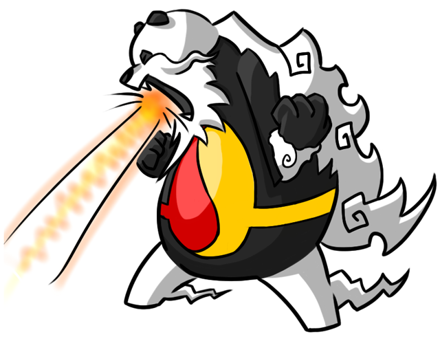
OK guys and gals, I think this is gonna be the final form of the flying panda. I may add eyebrows though, we'll see. This picture was a demonstration of the panda master losing it and firing his laser. JK but it's a special attack anyways. This was also a style test. Do you guys prefer this style or the softer, thinner outlined one?

I had another Idea. What if the panda's Yinn-Yang changed colors with the season?
http://i782.photobucket.com/albums/yy101/SentretLover/bamboomseasonscolorstudy.png?t=1300303378
It kinda seemed cool to me. The final sub would still be the Summer version, but this would kinda be part of his concept. Black and White got me thinking with their season system and it got me thinking. Lemme know whatcha think!

@Noobies: I think I like the second cloud guy best!
@DJD Yes! Lookin good my friend! I also love Mayatraese's idea of having the nostril like gun holes like old planes did!
 
Sentret, if you opt for the season thing (which seems kinda good if you ask me), the colours should more flow into each other, if you know what I mean: Green-Yellow, Yellow-Red, Red-White, White-Green from spring to winter. That way it would be more equally transitional. I also like the thinner line betters, but removing the bamboo and coloured patches are certainly good steps.
 
This is a great point. We have a lawn mower, ice cream cones, trash bags, refrigerators, toasters, and much, much worse. Not only is it against the rules to say something like "It doesn't look like a Pokemon", it's absolutely wrong. A plane looks just as much like a Pokemon as any of those other ridiculous things that Game Freak has made.

Please respect the rules and the artists.

Well I personally think gamefreak are running out of ideas, as soon as I saw the ice cream cone I did lose a lot of faith in their creativity.
Nevertheless, you gota give it to doug- that plane is prety badass.
 
Oooh I love the seasons idea! If the bamboo were still there, it could change with the seasons too but that's up to you. Fits in perfectly with a potential Grass/Fighting prevo (when and if we get to that stage). I agree that the eye patches just being white is much better. I kind of prefer the whispier cloudier outline to be honest but frankly this guy is so awesome he works any which way.
 
You anti-bamboo lot are destroying the best submission!

Sentret, before you do a final sub you should make two versions, one with the green color scheme and bamboo on the head in a peaceful pose and one with the ugly red and yellow scheme in an ugly offensive pose so the anti-bamboo lot can see how much better the bamboo version is.

Would you all rather see a final sub which is a 10/10 aesthetically and has some ambiguity as to being flying / fighting or one that has no ambiguity but is only a 7/10 aesthetically?

@DJD looks good. It's amazing how much of a difference some of the small changes made. I agree with the feet instead of wheels idea.
 
Wikey, my man, you've hit a golden idea. Only I'll make both in a peaceful grandmasterly pose so that people can see that the green fits even more! :D We shall see though what people have to say.
 
Status
Not open for further replies.
Back
Top