Alright. I'm back and it's been too long since I last said anything. Oh well...
Wyverii:
Man, I meant to comment on yours in my first comment. Sorry about missing you!
Anyways, in regards to your heartless racoon mon, I think you have a really strong design here. The fighting type is put forth very clearly via the way the Pokemon is built (as it should be, considering that fighting is supposed to be this Pokemon's primary type) and the dark element comes in through your critter choice, color scheme, and the fact that this Pokemon lacks a heart. Frankly, the fighting type comes out very well no matter what pose you but your racoon in.
Caladbolg~:
Yea, more evil clown 'mon!
Anyways, I like the design you have chosen for the "faces" on the clown's gloves. I am wondering if the gloves talk like they look like they could (to me, at least), though that's beside the point. Your color scheme is fine: you were going for a color to contrast with the purple on the clown's outfit and yellow works wonderfully (afterall, yellow is purple's complement).
Personally, though, I don't think the new striped outfit is as good as the initial outfit you had and I also prefered the original hairstyle (again, color is fine). That's my own personal prefernce and you, the artist, are entitled to ignore it as this is YOUR piece.
Buffalo Wings:
Dude, that evil sensei/sifu/whatever is badass. It's all, "come to me, my child, and I shall teach you the ways of the dark side." Almost like a Sith lord or something.
I was going to say that either the color scheme on the right or the color scheme on the left would have worked fine. It seems you have chosen the one on the left before I could say so, though. I say that's a good choice on your part.
Anyways, since you want comments on your supporting work (and I can't say much in way of helping you with the actual design itself), I will say that (1.) you seem to be missing the Jafar-esque shoulder pads on the speed and attack portions and (2.) the shoes aren't colored in on the attack portion but are on the other two. In short, the supporting artwork does not look very conistant to me right now (either that, or I'm just being picky). Other than that, it looks fine to me: you can add color or more sketches if you want, but I shall leave that up to you.
EDIT:
DougJustDoug:
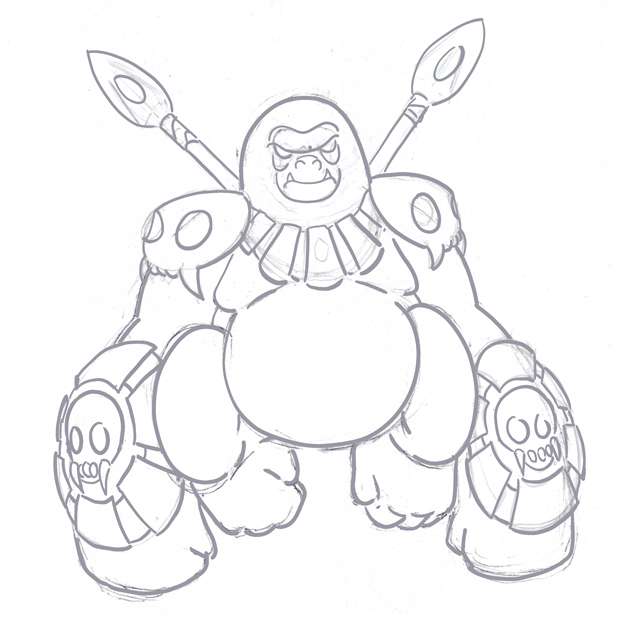
I have to concur with what a few others have said: that gorilla design is much better than that other Jack the Ripper design. Your knack of tribal designs serves this big guy here quite well, I think.
As it is, the design itself looks fine to me. Nothing seems to be missing from it and everything you put on this design goes together, although you could make some changes (I myself am thinking a staff instead of those spears) to make it appear more specially-based if you wish. At this point, I would say clean up the sketch and play around with some color schemes on him so that you can see what works.
----
Well, that's all I can help with for now. Either way, I love what I am seeing so far. Keep up the good work, everybody.