CAP 11 CAP 11 - Art Submissions

Status
Not open for further replies.
Thanks for all the comments and support! I changed the fingers to more pointy claws, any other suggestions? I really appreciate people commenting and offering suggestions to make my idea appeal to everyone.

http://img18.imageshack.us/img18/3594/capclaws11.jpg

This is my favorite so far. I have a couple of suggestions regarding the fingers, since you asked : P.

First, it might be neat if you incorporated some of the geometric weirdness of the legs into the fingers. This could make for very unique and distinctive claws. It could also be overkill or too busy, but it's an idea.

Also, the pose might look more aggressive if the left hand (his left) was open, as if it were conjuring an aura sphere or something.
 
alright, this is what i have heard more than anything, so i think a change is definitely in order. i know people have mentioned making the lighter fur darker, and i'd just like to take a moment to explain why i haven't. part of the reason why i think the colours of this design are attractive compositionally is the high contrast of both fur types. if i closed this gap, the design would looks less dynamic, and the idea of a ninja "helmet" and "armour" depicted by the dark fur would be played down

i think it is still possibly for this design to look dark with that light fur intact, and with this in mind, i've decided to experiment with the colour of the scarf. personally i liked the gold, but i some interesting things have come up through experimentation

i've numbered them all so that it's easier to discuss them (#1 being the original) so let me know what you think! there's a lot to look at and i wanted them at a decent size so i'm going to link:

http://img838.imageshack.us/img838/6388/tanukicolourcompv2.jpg

thoughts? the dual-colour is an experiment more than anything, but i actually think with some tweaking it could look good. so far purples look good to me!

with regard to the eyes, i hear you. i really want to stress that i don't think "dark" types have to look evil or be all black and red etc, but at some point the eyes stopped expressing what i wanted - a sort of mischievous fox-like look - and are instead apparently now just too cute!

i'll post another variety of revised eyes soon, and i might bring back the option of having them open, though personally i like the slanted look

thankyou for so much feedback, it's really helpful and i couldn't refine this design without it! and sorry again for such a huge post aaaa
Yeah, I get where you are coming from with the eyes. I think the main issue is that in combination with the lighter colors (maybe even just a darker shade of gold would help?) is just looks too playful. Its the combo above all else I think. One or the other has to go to really bring across the darkness.

Of those I would pick #4
 
Alright. I'm back and it's been too long since I last said anything. Oh well...

Wyverii:

Man, I meant to comment on yours in my first comment. Sorry about missing you!

Anyways, in regards to your heartless racoon mon, I think you have a really strong design here. The fighting type is put forth very clearly via the way the Pokemon is built (as it should be, considering that fighting is supposed to be this Pokemon's primary type) and the dark element comes in through your critter choice, color scheme, and the fact that this Pokemon lacks a heart. Frankly, the fighting type comes out very well no matter what pose you but your racoon in.

Caladbolg~:

Yea, more evil clown 'mon!

Anyways, I like the design you have chosen for the "faces" on the clown's gloves. I am wondering if the gloves talk like they look like they could (to me, at least), though that's beside the point. Your color scheme is fine: you were going for a color to contrast with the purple on the clown's outfit and yellow works wonderfully (afterall, yellow is purple's complement).

Personally, though, I don't think the new striped outfit is as good as the initial outfit you had and I also prefered the original hairstyle (again, color is fine). That's my own personal prefernce and you, the artist, are entitled to ignore it as this is YOUR piece.

Buffalo Wings:

Dude, that evil sensei/sifu/whatever is badass. It's all, "come to me, my child, and I shall teach you the ways of the dark side." Almost like a Sith lord or something.

I was going to say that either the color scheme on the right or the color scheme on the left would have worked fine. It seems you have chosen the one on the left before I could say so, though. I say that's a good choice on your part.

Anyways, since you want comments on your supporting work (and I can't say much in way of helping you with the actual design itself), I will say that (1.) you seem to be missing the Jafar-esque shoulder pads on the speed and attack portions and (2.) the shoes aren't colored in on the attack portion but are on the other two. In short, the supporting artwork does not look very conistant to me right now (either that, or I'm just being picky). Other than that, it looks fine to me: you can add color or more sketches if you want, but I shall leave that up to you.

EDIT:

DougJustDoug:

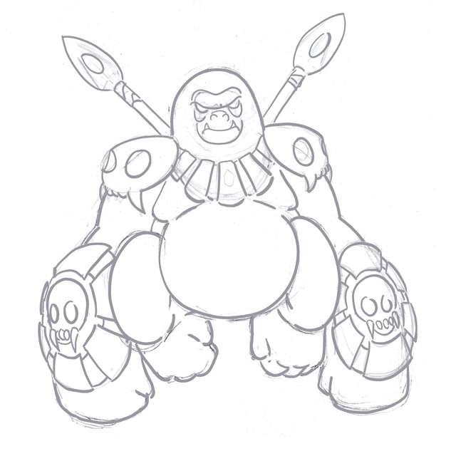
I have to concur with what a few others have said: that gorilla design is much better than that other Jack the Ripper design. Your knack of tribal designs serves this big guy here quite well, I think.

As it is, the design itself looks fine to me. Nothing seems to be missing from it and everything you put on this design goes together, although you could make some changes (I myself am thinking a staff instead of those spears) to make it appear more specially-based if you wish. At this point, I would say clean up the sketch and play around with some color schemes on him so that you can see what works.

----

Well, that's all I can help with for now. Either way, I love what I am seeing so far. Keep up the good work, everybody.
 
Have heard no word on my new design yet so i thought I would add some colors.

I'm just blocking out the colors right now, so nothing is final.
 
@pkmn-taicho, I'd consider making the face the same green as the body and the hair the redish-brown of the tail. You should also add some detail colors to the legs and feet, maybe the chest.
 
Hey, can I get some comments on this? Crit? What should I change? please?
The colors don't seem to go well together. I don't really get "dark type" from the brown, blue, orange combo. He kind of just looks like a generic fighting type. I feel if you pushed it just a bit more in the "dark" direction, this could be a good design. I can't think of anything off the top of my head to add to it that might make it more dark feeling... Play around with it :D
 

DougJustDoug

Knows the great enthusiasms
is a Site Content Manageris a Top Artistis a Programmeris a Forum Moderatoris a Top CAP Contributoris a Battle Simulator Admin Alumnusis a Smogon Discord Contributor Alumnusis a Top Tiering Contributor Alumnusis an Administrator Alumnus
Moderator
I started playing around with a few other design ideas, and I started tinkering with gorillas, King Kong, tribal warriors, and cannibalism. Yeah, maybe you guys don't tend to merge those ideas -- but I'm kinda twisted like that. Anyway, here's a rough sketch of my design progression along those lines.


Obviously it's very rough, but it gives you an idea of where I was trying to go with it. I don't know if I will take it any further, but I think it captures certain elements of Fighting/Dark. And it has a mystical flair too (tribal designs tend to do that, which is why I love 'em so much). Anyway, I was just kicking it around, so I thought I'd toss it out here and see what others think.
 
Anyway, I was just kicking it around, so I thought I'd toss it out here and see what others think.
Doug, there is nothing wrong with the new gorilla. But as I said before, I decided not to even submit art for this CAP because I like your "Ripjack" design better than what I was working on. Please make it your final submission.
 
The colors don't seem to go well together. I don't really get "dark type" from the brown, blue, orange combo. He kind of just looks like a generic fighting type. I feel if you pushed it just a bit more in the "dark" direction, this could be a good design. I can't think of anything off the top of my head to add to it that might make it more dark feeling... Play around with it :D
Thanks for the help ^_^ Heres the tinkered version

 
Alright, I got inspired. Dark/Fighting is a cool type. So I went to the closest thing I knew, Saxton Hale(as pictured here). Five minutes(thats a lie, more like...two) later in MSPaint, I created

Feel free to laugh or tear your eyes out, I don't mind.

EDIT: Work in progress name: "Derp Fighter".
 
There are so many awesome concepts being presented, my personal favorites being Cartoons!'s bruiser, Caladbolg~’s demented clown, Wyverii’s heartless raccoon, aragonbird’s werewolf, Buffalo_Wing’s evil sensei, ckpmax1108’s badger, Swaggersaurus’ little warrior dog, and DougJustDoug’s savage gorilla. Great job, guys.


Titan of terror?
 
@Doug.. I was not very fond of the Jack the Ripper idea, so I may be biased, but I certainly like the gorilla a lot more. I would love to see a colored version.
 
Considering what is going on in the stat spread thread, I think Jack the Ripper would be a better submission. I do love that design, just not on this CAP.
 
Not to be offensive, but DougJustDoug's attempt was paling sharply in comparison to Krillowatt. Also, makes me think of posh tsutaja.

On the other hand, I like Kukem's, SEO's and Darkmattr's art and concepts in that order. They seem so much more...pokemonish.
 
Okay! I tweaked the color pallette on mine a bit, and just wanted opinions on it before I actually fully color it in.

So, It went from this:


To this:


I'm still not sure which I like better. CnC PLEEEEASE.

Also, just some comments on the lineart would be nice too. :3

EDIT: @AlmondEyes, Maybe changing the blue to a dark red? It looks amazing, just tweak the colors a bit. :3
 
@Doug

I agree with Class that the gorilla is a much better option. Ripjack looked kind of cool, but absolutely not like a Pokemon. As mentioned before, the clothes just seemed too off and the subject was a bit too morbid for Pokemon.

The gorilla fits way better in my opinion. But since the CAP is looking to be specially based, maybe make it an elder silverback gorilla with more shaman/witchdocter/mage-like features? Just an idea.
 
Well, here it is. I worked pretty hard on this one. This is, once again, a piece of supporting artwork for my design. It's my design using focus blast and being an overall badass.I really hope you like it.


I've also been thinking about some back story. So far I am going with something along the lines of lonely temple guardian. This pokemon spends most of its life in the deepest reaches of ancient mountain temples around the world. They live out their lives in solitude, devoting all their time to meditation in order to better guard the ancient treasures and secrets they are responsible for. Since they spend most of their lives in the deepest regions of mountain temples, these pokemon are hardly ever seen. If you do ever happen to stumble upon one of these rare pokemon, be ready for a difficult battle! This ancient species are also believed to have incredibly long lives.

And that's what I got. I as also thinking about something like their glowing spots getting brighter and brighter throughout their lives, indicating their increasing mental strength.

If time permits, I'd be happy to work on another piece of supporting art for this guy. It's actually a lot of fun! Once again guys, please feel free to critique me, or even better, show support! Thank you guys for all the love thus far, I'll try not to disappoint!
 
Status
Not open for further replies.

Users Who Are Viewing This Thread (Users: 1, Guests: 0)

Top