Heres a really rough sketch of my idea

Only a 5min rough sketch, ill gimp it up and add colour later
Only a 5min rough sketch, ill gimp it up and add colour later


@Swaggersaurus: Sorry, but your design looks a lot like Lucario. I think it has potential, but if cpkmax1108's rooster supposedly looked like Blaziken (which I disagree with), then I think this one definitely looks like Lucario.
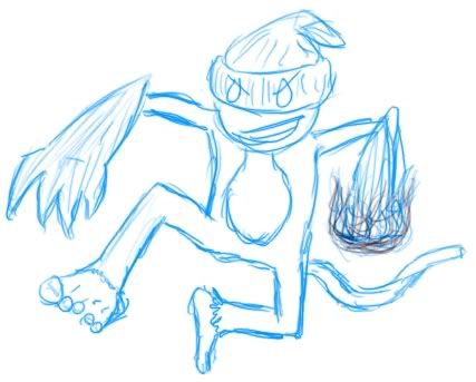
I'd REALLY like some comments on mine, because I feel its missing some Fighting type-ness:) Any suggestions are great
At the moment it just looks like Rock/Dark...


 and E
and E 

alright, thanks for the feedback
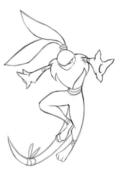
could you be a little more specific? when designing a human-shape dog pokemon, i knew that this would be a risk. i looked at mewtwo, lucario and zoroark, which of all have quite a similar look to them, especially the latter two, and though i knew that's the road i would have to go down "pokemon shape" wise, i don't want to just be regurgiating their design
do you have any suggestions about veering away from that look? something more ninja-esque around the legs/waist perhaps to give it a unique feel?
thanks!
Well, the main things that remind of Lucario are the legs and cream colored middle area. Just looking at pictures side by side, I looks like you ripped them off, which I am sure was unintentional. My suggestion would be to change the cream color to something else, and perhaps try to make it a little more dark looking. As for the legs I'm not too sure what to change, but the way it looks like your guy is wearing shorts makes it look very similar to Lucario.
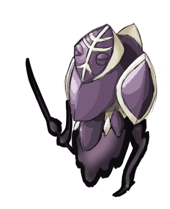
Were thinking more of the Purple, brown or Black as the solid color. Also can you be more specific with the tribal makeup?@Zakki- I saw the color schemes you made before too. None of them scremed "This is the one" perhaps make the monkey one specific color and add some tribal makeup?
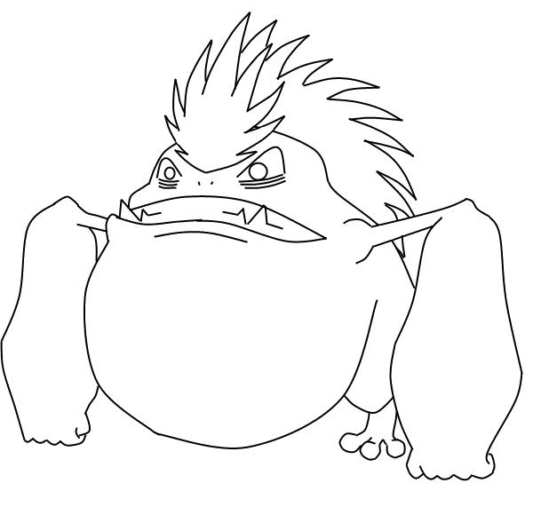
I like the design itself. It maintains a sense of simplicity that pokemon designs should have. The problem I have with it though is that I am having a hard time finding the typing. I'm sure that the dark typing will come along with with the colors, but I really feel that you should make your design more fighting-ish.