CAP 16 CAP 5 - Art Submissions

Status
Not open for further replies.

Yilx

Sad
is a Top Artist Alumnusis a Smogon Discord Contributor Alumnus


I slightly modified her hands to bring home the "Cactus Flower" concept more and do away with the "Cacturne-ish" feel of it.

Mos-Quitoxe: I hope you get far with this, because IT'S GUNNA WEEN
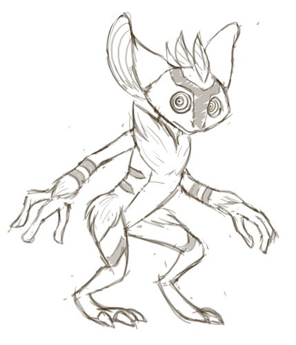
Menshay: I ADORE the silhouette and expression you've given this guy, can't wait to see you flesh him out.
pkmn-taicho321: Your first design has a really cool concept IMO, but you might wanna watch out not to overdetail it! In the second batch, my favourite is easily the animal, but the cactus is cool and simple too. Don't take the Cacturne comments too hard, I think they are inevitable.
paintseagull: Can't wait to see you flesh out yours either. I really like the moss-covered texture you've gotten down so far.
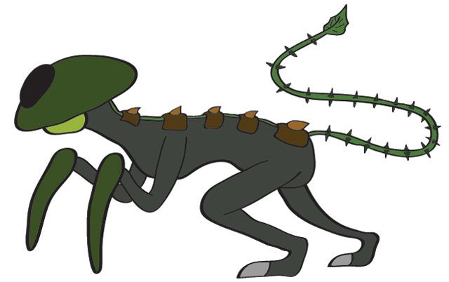
Chomz: This is also easily another favourite. Solid silhouette, can't wait to see you apply the colours!
aragornbird: You could modify the Tiki guy, but tanuki ninja is really sweet too.
Calad: Another one in the greek/goat vein, and really sweet IMO.
Doran Dragon: If I were you, I'd keep both designs in mind in case the stats call for a more bulky (first design) build. I like the concept, though!
Nastyjungle: It dosen't look fire-type to me. It looks like an awesome grass-type clearly, but if that's a concern you could just tweak the colours to give it more natural hues.
CommanderZorvox: I wouldn't worry about it being too simple, sometimes too much design is a bad thing too. The appeal of yours comes from the sleek silhouette and simplicity, IMO.
Quanyails: Your design has really come far in such early stages and it's looking great so far.


Ok! So what was the first thing I thought of when I saw dark types? An evil creature. Grass type? Forests! Thus, I got inspiration to do a wendigo pokemon. What do you guys think of it so far? Colours are most likely gonna be green, brown, and black. I'm gonna give the horns a retouching to make them look nicer.


Fav designs go to Shanimanim and Wyverii! Really great stuff you two.

Also, KoA, here's just a bit of critique for you......

The tree looks a bit too much like ghost/grass as of now, with the whole possessed tree come to life. Maybe if you made it more ent like it would work, but that might run into a problem that goes with your dwarf design.....

Whenever i look at it I can only picture Shiftry, another dark/grass type. It's a cool concept, but to me, it seems to similar to Shiftry as of now. I do think an ent design would be cool to see from you, as it could be a nice meld of the dwarf and tree. Hope that didn't come off as nasty to you..... Hope that helps!
 
Improved version of my submission


It's times like this when I wish I had a tablet. Or knew how to shade properly.


A take on Brer Rabbit, in this case a briar rabbit. My Tablet's USB cord broke, so I just wanna get my idea out there. Its a briar patch hare that has retractable vine claws. I should have my tablet soon, then I can add color and more boldness.
 
Harle: I think the drawing is nice but it's not quite enough, maybe there could be something a little more substantial under the lily pad?
Funny you should mention that...

Because I've done exactly that, heh.


A suave duelist with a fancy hat.

The concept has evolved a bit from fortune teller to bandit, but the basic idea of disguising itself, its love of stealing, and the lily pad hat remain. It pretends to be an ordinary flower, hiding most of its body as it waits for an unsuspecting traveler to rob... And stab. I am more inspired my the amoral aspects of the Dark type. Oh, and that is a cat tail stuck in his hat like a feather would be. He is a mon of the marsh.
 
So I don't even remember for which CAP I did this, but just know that I had to brush the dust off. I haven't touched it since, and had to go back to the original posting just to get the picture, but here is my rough idea of this CAP. Got very little notice last time, but since it's relevant again, who knows.


And since I always seem to mess up the process of posting a picture, here is the link:
http://s1186.beta.photobucket.com/user/sucker_puncher/media/CAP/spitemareoriginal.jpg.html

As always, any feed back is welcome.

EDIT: It used to have eyes I think, but as I recall most of you didn't like the fact that they were just yellow blobs floating in the dark.

EDIT#2: Right I forgot to explain. Basically it's a thorny flower thing that doesn't like things. Maybe it looks like a flower until you disturb it, and the bud in the middle turns out to be a head. Who knew?
 
Tried to make it seem more plant like. Still having a tough time with a color scheme and representing the dark type. Haven't gotten around to shading this one yet.


Any suggestions?

Also here is a view of it's eyes with one closed.


Yilx

Sad
is a Top Artist Alumnusis a Smogon Discord Contributor Alumnus


Finished colouring the Vampire Heart.

Will probably colour the Cactus Girl sometime soon, but I'm still open to feedback on her arms.
 
So I don't even remember for which CAP I did this, but just know that I had to brush the dust off. I haven't touched it since, and had to go back to the original posting just to get the picture, but here is my rough idea of this CAP. Got very little notice last time, but since it's relevant again, who knows.


And since I always seem to mess up the process of posting a picture, here is the link:
http://s1186.beta.photobucket.com/user/sucker_puncher/media/CAP/spitemareoriginal.jpg.html

As always, any feed back is welcome.

EDIT: It used to have eyes I think, but as I recall most of you didn't like the fact that they were just yellow blobs floating in the dark.

EDIT#2: Right I forgot to explain. Basically it's a thorny flower thing that doesn't like things. Maybe it looks like a flower until you disturb it, and the bud in the middle turns out to be a head. Who knew?
I love that cloak/hood design! I just had a surge of ideas that might be cool; maybe try to make the body abit more cute, simple and feminine…like roserade or Kirlia. Maybe less spikes. The cloak and hood could be the same color, and might be a little less “venusaur-ish” (maybe a color that conveys dark type better). Glowing eyes of some sort might give it more life/iconicness.


Okay thanks guys for your comments, but I decided to do a new one as the holly on didn't seem dark enough and was a bit random!! If you don't like this new design I can always go back to the holly one or make a new one!! Okay, this is based off these elf things in Greek mythology who stole of people and were mischievous! That is why they are dark type and green around the top of their body is supposed to be grass but I don't think it looks grassy enough?? How could I improve??

My favourite design on here so far is either Yilx's cactus or Harle's musketeer !!
 
I love that cloak/hood design! I just had a surge of ideas that might be cool; maybe try to make the body abit more cute, simple and feminine…like roserade or Kirlia. Maybe less spikes. The cloak and hood could be the same color, and might be a little less “venusaur-ish” (maybe a color that conveys dark type better). Glowing eyes of some sort might give it more life/iconicness.
Yeah I hear you, I just haven't touched the thing since CAP 2. I will be working on some other color variations, but my artistic abilities are very limited lol.
 

CyzirVisheen

Am I poplar yet?
is a Top Artist Alumnusis a Forum Moderator Alumnus
Some designs I've been brainstorming, thinking of a few more to go with.
http://dl.dropbox.com/s/r4qzyoi1qu08ya0/rrh.png
This one's based on 'Little Red Riding Hood', and is a mishmash of the wolf, little red herself, and a play on 'woodsman'
http://dl.dropbox.com/s/2h0nwfu8cu7xx5p/tiki.png
This is based on a tiki carving primarily, but also on something in Hawaiian folklore we call in Hawaii 'Menehune' Look it up, the stories are quite interesting.
EDIT: Ah crap, ABs also thinking of doing a Tiki. TIME TO BRAINSTORM SOME MORE I GUESS
 
Aragornbird: I very much prefer your Tanuki actually, because it ties in so well with both Grass/Dark. Tiki while being cool in itself doesn't really work out for me, since I find it stronger with the Ghost vibes.

Yilx: The Vampire Heart seems stellar. After all, I would find the cactus humanoid much less viable an option, with Cacturne and Maractus going around.

Will provide comments later due to busy schedule :I
 
DoranDragon, I'm much more in favor of your Baphomet now that you've simplified it a bit. In particular, the shape of its head, its eyes, its gaze, even somehow its posture look very Darkish while not being blatantly exposing its typing and overshadowing the whole design. It reminds me both of Absol and Weavile (and Lucario to a certain extend). This is the kind of design that says "Justified", which is interesting because few Dark suvgestions choose to emphasize on the good aspect that can be related to this typing.
 

Magistrum

DOITSU NO KAGAKU WA SEKAI ICHI
is a Top Artist Alumnus
Hi guys this is my first attempt involving CAP. It's only a rough sketch though...
http://25.media.tumblr.com/0722ff2a0e40b3afdc2492f4e9051d8d/tumblr_miqb04BoIs1s5x8aoo1_500.jpg
Concept:Forest Troll
According to norse mythology, trolls are basically humanoid giants with enormous strength. They basically live in forests, caves and other natural terrain, and take on various forms when struck by sunlight, usually into landmarks or stone.

Comments, suggestions, critiques and criticisms are welcome!

Edit:will make the limbs more wooden, and the mask a bit more eerie than cutesy, though unsure at the moment.
 
magistrum: Jeezus that looks awesome. I won't lie, though; with the dynamic foreshortening and all the crosshatching, it's kinda hard to make out what the guy actually looks like. Incredible first attempt though.

Also, attempt two for moi:


Based on an aye-aye, which are these cute little jungle critters with these big creepy eyes. Threw in some tribal shaman influences to make it a little less bland. Also, I think it's way better than my deer-covered-in-tree-bark design. Anyone care to weigh in?
 
Wow, so it wasn't so horrid.

The wings and long fingers seem out of place, though.
They're not wings, the whole neck area is pretty undefined but they were supposed to be petals/leaves (waiting for something more appropriate). (See below for the fingers.)

but even with the jester themed hat, I don't really see this as a dark type. The mace-like hands and the overall body structure makes it look fighting type.
I agree I'll likely have to work more on the dark typing, though I can't see any real resemblance with a fighting type (just look at the obvious Cacturne, excluding the obviously dark facial expression). The whole body structure is meant to feel lanky and weirdly proportioned to evoke some sort of creepy jester/clown vibe.

Anyway, I tried to flesh it out a bit more.

Back view and some head sketches.
(Pleas ignore the horrid quality of the colouring and some obviously wrong proportions, this was hastily done. No, it isn't supposed to glow.)

Yeah, the colour scheme doesn't really feel dark, maybe I should try a darker/more purplish shade of red. The yellow parts could be white or gray, maybe. I'm accepting suggestions.

I replaced the nondescript petals/leaves around the neck with a cape/hood hybrid while keeping the five tips to keep the flower connection. The eyes are still the black spots, the pointy areas around them are meant to evoke some sort of clown makeup (see also Jirachi).
The feet are supposed to vaguely resemble claws/roots, though they're likely to be changed. I tried a simpler desing for the hands since all those tendrils felt distracting, though I like the idea of not having a palm/back distinction (more creepy vibes).
The tendrils ("fingers" and tips of the "hat") don't have a set orientation since they're supposed to be very flexible.


Liking both of Arkeis's desing, Mos-Quitoxe's Wario garlic thing, Doran Dragons baphomet, Eol's scarecrow (though it doesn't really look like something that likes sun), KoA's gnome and Yilx's vampire heart (also the third scrapped design) so far (in no particular order).

also gosh you guys are boring!!! nothing is fun about a normal golden calf, of course it has to be human like, thats how the minotaur is............................ /gripe
I feel the problem is mostly in the arms and hands, since most humanoid arms in Pokémon (Machop line, Geodude, Mr. Mime, Jynx, kami trio to some extent) have a much more cartoonish structure.

Chomz, I actually liked the deer better (though the existence of Sawsbuck might hurt it a little). The aye-aye still looks nice, though the grass typing doesn't feel as explicit (which could change with some colour, I guess, and yes, I noticed the leaves on the head).
 

Here goes nuthin'
Hour's work so far
Gonna add more detail, changed arms slightly

Based around a parasitic plant which attacks flowers and removes their heads from which it draws energy for sustenance. Idk it sounded cool at the time ;-;
 
My first design looked like a prevolution, so I re-designed him:

http://i49.tinypic.com/k4hwlk.png

I still have trouble with the color scheme (I think I will use dark green, purple and black colors), and I don't know if it looks like a grass type. Anyway, he's based on a forest imp (You know, those mischievous monsters).
 
this is my last post today so I'm using it to ask you this. Do you think this new sketch is better than my hollymon from page 1? I certainly do but I think the arms need work, especially the vine one!! please leave a comment so I can improve it!


I also have a kind of queen holly design and a theiving elf thing but I don't really like them as much as my new hollymon!!
 
Status
Not open for further replies.

Users Who Are Viewing This Thread (Users: 1, Guests: 0)

Top