
-
Smogon Premier League is here and the team collection is now available. Support your team!
-
The moderators of this forum can be found in the CAP forum staff directory.
-
Welcome to Smogon! Take a moment to read the Introduction to Smogon for a run-down on everything Smogon, and make sure you take some time to read the global rules.
-
Congrats to the winners of the 2025 Smog Awards!
You are using an out of date browser. It may not display this or other websites correctly.
You should upgrade or use an alternative browser.
You should upgrade or use an alternative browser.
CAP 7 CAP 7 - Art Submissions
- Thread starter Magmortified
- Start date
- Status
- Not open for further replies.


EoE how bout the mouth just on the face mask? I'd think that'd be ok...
IMO, the mouth on the face looks the worst.
The original design was really good, I'm less enthusiastic about all the additions.


This is my tea kettle guy coloured. He doesn't have legs anymore and there is some cool blue mist.
I like this guy a lot. It has metal on him and actually looks like it could be a Pokemon.
The fact that he's a kettle makes him cooler. I'd keep him without legs.
Ok, then. Third option! This is a self made cross breed, with complex facial features (mouth + eyes) and the simplefied subordinate masks (No expressions, no flaps on the thigh masks, lowered shoulder eyes, and a distinct separative line on the thigh)
3:

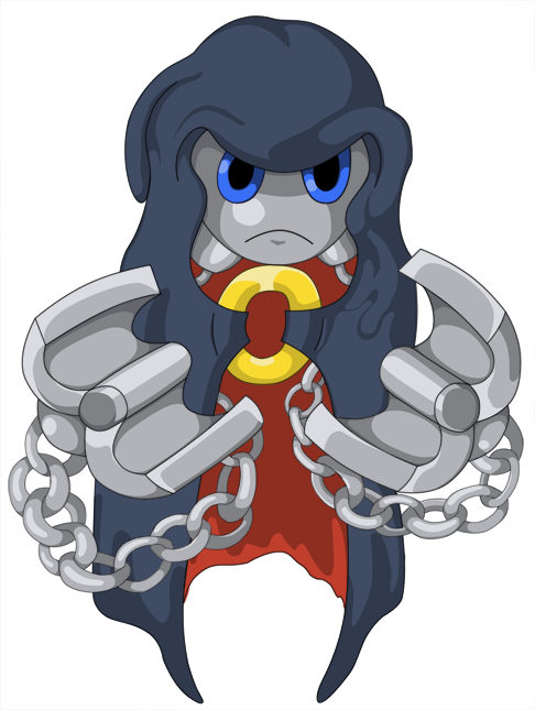
The final's colors will be the original's, with a dark blue body and red-orange eyes.
Also, what did you think of my friskies reference?
3:
The final's colors will be the original's, with a dark blue body and red-orange eyes.
Also, what did you think of my friskies reference?
I have to admit, EoE, the expressions on the side masks just didn't look right to me but the one on the front looked perfect, so I'm glad you've done what you've done. I still think that the body should be a bit darker, but that's about it.
Your design is pretty much guaranteed to get my vote now.
Your design is pretty much guaranteed to get my vote now.
...the side masks don't have expressions. That's why they don't look right.
What I mean is, the expressions that were on there before didn't look right.
Elegy, that is looking great. BUT... you might want to make the masks look like they are made of steel, to keep us in the elements.

Alright, I finally finished the coloring on my little bugger. I tried out a completely new coloring technique unlike my usual, and I must say I'm fascinated with it. t takes a whole lot longer to do this way, but it lets you focus on items one at a time.
Well, here's the Vassago all colored up and ready for public viewing:
Larger size:
http://i10.photobucket.com/albums/a110/kingofanime/Art/Fairly Recent to New Art/vassagolarge.png
Now then, compare the new style with my old style of coloring:
http://i10.photobucket.com/albums/a110/kingofanime/Art/Fairly Recent to New Art/hibabango.png
Should I keep Vassago colored like it is or revert to my old style?

I like your old styl better
Well, it may be over edited, but it isn't too complex. Actually, it didn't take too long at all.
The features are set in stone. No more of that. What I should do now is determine the small things: Too dark? Another eye color? Tail mist?

I had a little trouble burning the tail, and when you do it too much it loses it's definition. But in this case, it made it more luminous.
This is NOT my final. But it's so close you can taste it...
The features are set in stone. No more of that. What I should do now is determine the small things: Too dark? Another eye color? Tail mist?
I had a little trouble burning the tail, and when you do it too much it loses it's definition. But in this case, it made it more luminous.
This is NOT my final. But it's so close you can taste it...

I really like yours EoE, it's so fresh :D
As for yours KoA, I personally prefer this style, and it's a really cool design too
No, you didn't miss anything, I've just been in a bit of an artistic rut, sorry :[ (Though I intend to fix that soon)
As for yours KoA, I personally prefer this style, and it's a really cool design too
Although I like your final, I'd still prefer it without the main face's mouth.
Right now my vote is pretty much tied between EoE's and Atyroki's, but the latter hasn't posted in a while (or I missed it, but I don't think so).
No, you didn't miss anything, I've just been in a bit of an artistic rut, sorry :[ (Though I intend to fix that soon)

Well, it may be over edited, but it isn't too complex. Actually, it didn't take too long at all.
The features are set in stone. No more of that. What I should do now is determine the small things: Too dark? Another eye color? Tail mist?
I had a little trouble burning the tail, and when you do it too much it loses it's definition. But in this case, it made it more luminous.
This is NOT my final. But it's so close you can taste it...
EoE, you could try duplicating the tail, then smudging the bottom layer. This might help you keep the definition while keeping the swirl underneath. Otherwise, you would likely have to just go back and manually clean up part with an eraser.

I'm not clearly leaning one way or the other in terms of top picks yet.
Wyverii's is close. I love the design, the concept and the especially the colours, but I'm not sold on that metallic protrusion on its head. I think my problem with it is that it doesn't really do anything to define the nature of your Pokemon and ends up looking tacked on and ambiguous. Also, have you seen "Coraline"? Button eyes are creepsville and would fit your jester doll to a T!
I wasn't really into EoE's design until that latest entry. The 'face' is far more appealing now as are the body's proportions. A wispy tail might help in selling its ghostiness but it isn't necessary.
I always enjoy Hazmat's submissions for being fun and unpretentious. I'd shorten the legs a bit, or make him more of a squatter as tall Pokemon can't fit very convincingly into an 80x80 box.
Does this mean that you have abandoned your old design? I know that I am new and as such my opinion counts for little but you have a strong design. If you came up with some supporting material I'm sure you could win some others over as well. The little guy has too much character.


Am I the only one that sees some epic VICTOR VON DOOM here?
The art in this is really, really tough to decide from. I don't think I can live with just one...


Yeah I see Victor Von Doom, I think it would a cool idea to make a shiny for this with Doom's coloringsAm I the only one that sees some epic VICTOR VON DOOM here?
The art in this is really, really tough to decide from. I don't think I can live with just one...


Line art for my finalized design. Anything I do after this will be coloring or supporting material.

- Status
- Not open for further replies.