Please read this all the way through. I think it includes things that many voters aren't considering (or at least aren't showing consideration for in their voting explanations). No offense to anyone and everyone who did vote based on these criteria, but I think a lot of people are neglecting some key issues. And no offense to any of the artists; most of these are better designs than existing pokemon.
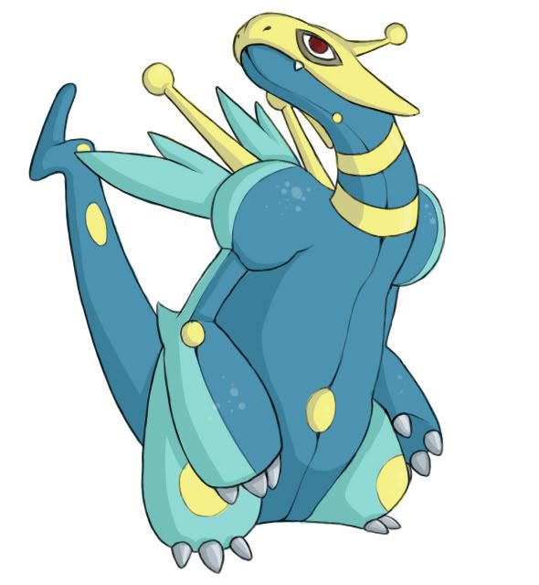
I based my vote off the final stat spread of CAP 8, as well as this so-called "neglected ability" idea that seems to have devolved into an afterthought (resurfacing momentarily as an argument for no secondary ability). Only two of these submissions look like they can run Shield Dust and Static: Atyroki and CyzirVisheen.
Dustox and Venemoth have Shield Dust because they appear to have a way of dispelling dust into the air around them via their wings. This is tough for a non-bug or poison pokemon to do, so we'll have to try really hard to make it visually possible (creating pokemon isn't just about new typing and stats. The matching picture makes the escapism part fun, too). That being said, I voted for
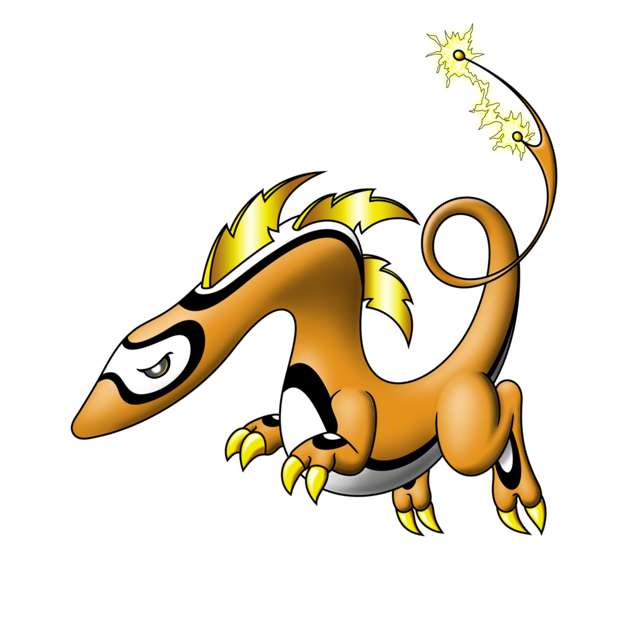
Atyroki.
Atyroki's design is not only a fresh course for CAP (it destroys everything you've ever known about electric pokemon), being cute and whatnot, but it also fits the stat spread perfectly (appearance-wise) and has the fluffy aspect that makes Shield Dust obvious and makes Static suddenly a very literal ability, more so even than the current pokemon with Static. I mean, who doesn't think of shuffling their socks against the carpet then zapping someone when they see that fluff? That's right. No one.
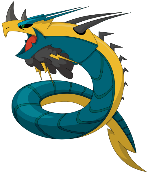
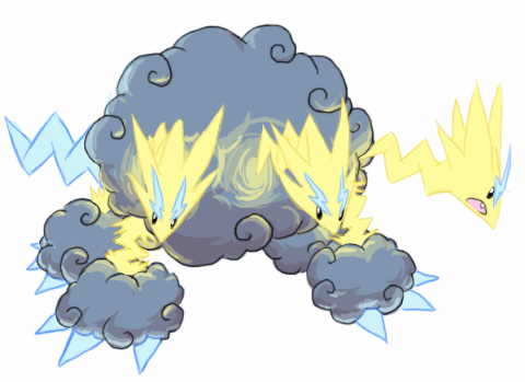
Cyzir's electric Cerberus doesn't really look like it can run Static because, since it's made out of clouds and lightning, it doesn't even look like it can be hit by physical attacks, let alone boast a base 118 defense stat. Even Altaria and the Ghosts have some semblance of physical-ness about them, so unless there's something I'm missing and there is something physically present (like, under the clouds or something) with this design, I don't see it working.
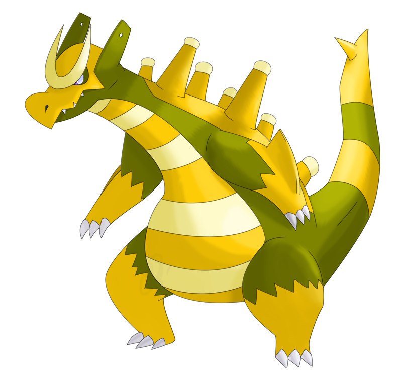
If I were to consider only what I think looks like the coolest electric/dragon, it would be Cartoons!'s by far (great work, btw); however, I could never see it being able to pull off Shield Dust or having a base 60 Attack (see
Here and
Here for examples of this kind of immense physical power). Regi DS's, Wyverii's, and pkmn-taicho321's also look like capable or even primarily physical attackers, so I couldn't see them working.
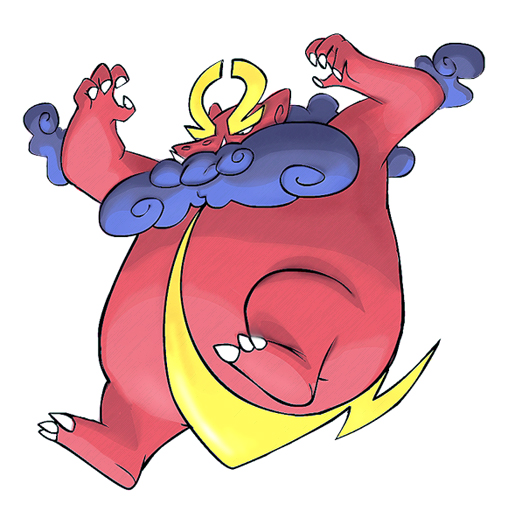
KoA's is a cool electric-gyarados thing, but I can't see it running Shield Dust out of its beard, and it also looks physical (similar to Gyarados).
DJD's looks super awesome and would have fit a fast, special sweeper-type pokemon perfectly, but it doesn't really look physically bulky at all. And don't say Celebi makes this point null. It's the Gen 2 small, cute 100s stats legendary pokemon (see also: Mew, Jirachi, and Shaymin), so its stats can be and are completely unrelated to its appearance. Every other pokemon fits its stats and abilities, appearance-wise, and DJD's design simply does not fit these stats. Nor does it have a visible way to pull off Shield Dust.
Ixfalia's is also really cool, but again, I don't see Shield Dust or it being particularly defensive. Same story with Zantimonious.
Basically, this pokemon's design has to tie in perfectly with everything already established. It has to
look like the pokemon we've created, and Atyroki's does that. It's got electric/dragon down. It
looks defensively biased with its fat-ish, non-threatening appearance. It
looks like a special attacker with its lack of fists/fangs/whatever. It
looks slow (but not that slow), so, coupled with the previous two reasons, it can conceivably run 108/60/118/112/70/80 stats. Finally, it
looks like it can conceivably have Shield Dust and Static as abilities thanks to its fluffy cloudy stuff. It's like it was meant to be.
Please don't make a choice based on what looks awesome or is drawn the best. This pokemon has to fit its description.