


paintseagull, that art is super adorable! I love it! The profile shot is good, but you should try a pose at a 45 degree angle so we can see more of the body.

-
Check out the relaunch of our general collection, with classic designs and new ones by our very own Pissog!
-
The moderators of this forum can be found in the CAP forum staff directory.
-
Welcome to Smogon! Take a moment to read the Introduction to Smogon for a run-down on everything Smogon, and make sure you take some time to read the global rules.
You are using an out of date browser. It may not display this or other websites correctly.
You should upgrade or use an alternative browser.
You should upgrade or use an alternative browser.
CAP1 - Part 11.5 - (Pre-Evo Art)
- Thread starter Rising_Dusk
- Start date
- Status
- Not open for further replies.

@jellyhat: this is purely a matter of opinion, but I think it might be nice if you added ears. The head seems a little bare as is. Besides that, pretty awesome drawing.
@reckham: I get you're going for the defensive idea, but right now your drawing makes me think fish, with the fin-arms and the scale-feathers. Even if you don't want claws, maybe have paws. Kind of like the idea of the underformed beak-feathers looking like a wild hair-do. Also, for consistency's sake I would reccomend making the tail more like the evo's.
@reckham: I get you're going for the defensive idea, but right now your drawing makes me think fish, with the fin-arms and the scale-feathers. Even if you don't want claws, maybe have paws. Kind of like the idea of the underformed beak-feathers looking like a wild hair-do. Also, for consistency's sake I would reccomend making the tail more like the evo's.

Hi guys, I'm new here, but although I'm not a native English ( and sorry for the future grammar mistakes ), I thought that it would be interesting to submit an artwork for this pre-evo. It's just a draft, but I focused on main points of the dad's design :
The Helmet was interesting, because I wanted it to be here on the pre-evo art. I think that I kind of succeed ( or not ). The wings and the claws were important for me. I wanted it to be here on the pre-evo art too. I thought It would have been interesting to do something that vaguely looks like a cocoon from where wings could "hatch". I wanted claws that look like Tomahawk's. Furthermore, I wanted feathers in the artwork, because, after all, it's a bird pre-evo, right... Well. I think that it can reflect a fighting/normal type. But you are judges.

The Helmet was interesting, because I wanted it to be here on the pre-evo art. I think that I kind of succeed ( or not ). The wings and the claws were important for me. I wanted it to be here on the pre-evo art too. I thought It would have been interesting to do something that vaguely looks like a cocoon from where wings could "hatch". I wanted claws that look like Tomahawk's. Furthermore, I wanted feathers in the artwork, because, after all, it's a bird pre-evo, right... Well. I think that it can reflect a fighting/normal type. But you are judges.

Sunnt, I really like the cuteness of your design; great work. Maybe lighten up the colors
Paintseagull-D'awwwwwwwwwww! ^_^
Paintseagull-D'awwwwwwwwwww! ^_^


suntt123- oh nooo not the colours thing again xD. I think it looks fine. The tail on the back sprite looks a little scribbly though, and I think should be redone a little smoother. I also like the facial expression on mini-hawk's open wing pose. It looks like it would evolve to be intimidating.

paintseagull, that is incredibly adorable.

Looking good Paintseagull and Suntt!
Mine isn't nearly as cute...
http://i998.photobucket.com/albums/af108/SClipD/CAP11prevocopy.png
Because I wanted to emphasise action over cuteness ;)
the basis behind this guy is that his hair-scales are present but not stiffened, so he appears as a shaggy pile save for the one on the tip of the tail, which has hardened into a blade as an offensive weapon since it's limbs aren't suited for striking moves and it (i hope!) has difficulty in manipulating aura.
supplements for your enjoyment.
http://i998.photobucket.com/albums/af108/SClipD/fakes/CAP11prevosupplementcopy.png
Okay this is getting ridiculous. why do certain links arbitrarily not work?! I've been trying for hours to link to the actual image, but no dice! IMG links VANISH as soon as I preview them, and direct links lead nowhere! it's a miracle the supplement worked at all.


Mah submission:

http://i56.tinypic.com/287hpqb.png
First sketch on black and white :D
Looks pretty physical to me...
Anyway, I'm coloring it at this moment, hope you like my idea
http://i56.tinypic.com/287hpqb.png
First sketch on black and white :D
Looks pretty physical to me...
Anyway, I'm coloring it at this moment, hope you like my idea
I'm loving Mos-Quitoxe's submission, in that it fits the idea I hold for Tomohawk's pre-evo, a fierce physical attacker, in contrast to its special sweeper evolution. I imagined it to be hairless (or featherless), but those "hair-scales" works excellently as well, just as long as it does not look to much like feathers.
But I noticed that most people in this art thread are biased to cutemon designs, so i suggest maybe working on the "sitting detail" as well? (Or maybe just work that cuteness and Prankster-ness into it's face somehow?). And I'm partial to the "hair-scales" on his head right now, since it is more or less the same as that of Tomohawk's. Maybe try removing the "purple eye" on it and see if it's nice.
Btw, your supporting material sheet tells me that you are an excellent artist. Really loving the style there. ^^
Mos-Quitoxe, amazing drawing, looks really nice. But. It looks perfect for Intimidate. Shame that the pre-evo doesn't have Intimidate, it has Scrappy/Prankster. If the face became less Intimidatory and more Prankster-ish, I would be absolutely sold
you posted this before I fixed(?) the links. Does that mean you could see what was invisible to me? cause that's bizarre.
thanks for the feedack though :) Personally I was thinking about scrappy during the design process :V. Also if the adorable Shinx can successfully intimidate gnarly pokemon like Tyranitar then it's just as likely that a more 'intense' cat won't IMO.
This is bloody amazing. Like, it looks like a Scrappy fighter, it looks perfect grounded with the typing, and it looks ferocious. I totally dig it. Great job. Just please make sure when you submit your final submission to label it as Final Submission! I definitely want it going to the poll!Mos-Quitoxe said:http://i998.photobucket.com/albums/af108/SClipD/CAP11prevocopy.png


Mos-Quitoxe, I came in here expecting submissions not masterpieces. The stance is like a cat ready to pounce. The Eyes have a "don't mess with me" face. That thing looks like a tasmanian devil cub ready to rip whatever annoys it to shreds. You've made an amazing submission I can't wait to vote for on the final poll. Bravo!
Since I'm not actually entering this I can actually have an opinion here without fear of breaking my personal self imposed bias rule. I'm never comfortable directly critiquing a person's art if I'm in the same contest.
paintseagull and Mox-Quitoxe have the cleanest and best designs in thread at the moment. Both are extremely different as well which is a good thing! One goes down the more cute route and the other appears to go down a more mature but not yet fully grown route.
paintseagull has an excellent and clean representation of his concept. I can see no problems with it. People might have minor quibbles with markings or claws but it stands up perfectly well on its own. Proportions give it an extremely baby-like appearance and the egg idea is there without being thrown into the viewers' face. Extra poses will be a great boon to fleshing out the concept and showing off more of the belly and face shape since that's obscured a bit from the side on pose. Excellent work.
Mox-Quitoxe has a well drawn, bold and fairly clean concept. I have minor issues with it such as not quite knowing how the tail axe turns into harmless feathers. Being fairly complex it has more chance of looking cluttered or overcomplicated. The supporting work is top notch showing the body and standing positions while no back pose is nessarily needed due to seeing it on four legs. Again, excellent work and a top contender for those looking for a more serious looking design.
I'd personally go with the simpler and cuter design. There's something more endearing about a small babyish creature trying to act like daddy and I find Scrappy works very well for it. This is not to say that scrappy doesn't work with a more serious design of course just that I prefer that view of it.
Finally I'd like to say that jellyhat's piece is a pretty good example of good art, bad design. He's got a small head, large body, tiny eyes and no mammalian characteristics on the body or head like ears or hints of fur. This actually makes the design look older and more wizened than the creature it evolves into. The way it's set up makes me think of a Tomohawk that has outgrown and shed some of its own fur and put a headband on. Not too keen on it to be honest. I'd say go back to the drawing board on this one and see if you can come up with something better. You clearly have the skills to convey what you imagine so I certainly think you can come up with something excellent to show!
Thanks for the further feedback everyone! I think I'll try a 45-ish degree angle pose for the final sub, but to kind of get my head around the proportions I tried a front view sketch. I think this sketch is a failed attempt, it's difficult to get the egg shape and feather ruffles right, but it gives a better idea of the arms anyway so it's not completely useless. :) I'll keep workin!

I like your entry's fluffy teddybearness (not a word but should be) Paintseagull; it also has a lovely personality.
Also thank you everyone for the kind words! I'll try and address the issues people brought up.
Also thank you everyone for the kind words! I'll try and address the issues people brought up.
I originally put the spot there to mirror the larger one on Tomahawk, so "Kittihawk" here looked like it was wearing the hide of an eagle that was caught by surprise. But we'll see what it looks like without it :)Maybe try removing the "purple eye" on it and see if it's nice.
Btw, your supporting material sheet tells me that you are an excellent artist. Really loving the style there. ^^
Mox-Quitoxe has a well drawn, bold and fairly clean concept. I have minor issues with it such as not quite knowing how the tail axe turns into harmless feathers.QUOTE]
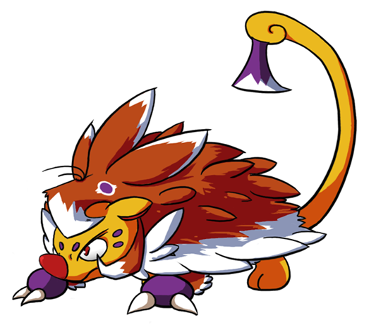
that probably stems from the fact that with the CAP's name being finalised I wanted to actually incorporate a tomahawk into the prevo, coupled with my making it purple to maintain personal colour balance. I've changed it to look more feather-shaped.
also Rittercat, you've got your grin! (hopefully, image uploading is still a cr*pshoot)

I originally put the spot there to mirror the larger one on Tomahawk, so "Kittihawk"...
THIS! I know this is perhaps premature, but I have to say that Kittihawk is the perfect name for the Prevo of Tomohawk. Why? Well, Kitty Hawk, North Carolina is where Wilbur and Orville Wright, the inventors of the airplane, successfully had their first flight. So Tomohawk gains flight out of Kittihawk. It fits perfectly. Plus it sounds adorable and somewhat fierce at the same time.
On to your art, Mos-Quitoxe. I think that this is remarkably good, especially since I assume this is the first CAP art you've submitted. My only suggestion at this point is to make the body slightly more feline to suit your proposed name Kittihawk (which as I said above is THE perfect name), since at the moment it looks more like an armadillo and even somewhat like Donphan.


Love love love love love love love love love love. Love
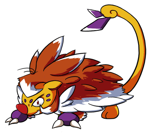
The changes to the mouth and tail feathers are perfect
I really love what you've done with the tail, but I think for a main submission, you should use the more serious face from your original image. I think the seriousness of the face from before really matched the main art design for CAP1. The super grin seems a bit off; CAP1 may be a prankster but he's got a fighting spirit, and I think keeping that in the pre-evo makes your design really succeed at the Rhyhorn/Gligar-type evolution style.Mos=Quitoxe said:
Yeah, that's cool! He's a little bit plump, but I think he still looks sufficiently pre-evo-like. I kind of like the bigness of it, although it tends to suggest a very dynamic change when it evolves into CAP1. This could work well with whatever stats we come up with, though, so that's cool. It seems like a bit of a stretch for some, though, but we'll see with more feedback. Great work so far!NastyJungle said:
- Status
- Not open for further replies.