@DougJustDoug
Your sprite looks good but in my opinion a more subtle shiny sprite would be better.
Your sprite looks good but in my opinion a more subtle shiny sprite would be better.

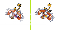
I did the backsprite and possible shinies.
I don't know whether to go with the first or second pose yet.


I made a bunch of changes to my sprite. Thanks for the feedback, everyone -- MofoAmbulance in particular. Several people commented about the legs, but you gave some very clear commentary as to why they looked wonky. Anyway, here's the current WIP:

Redid the legs and lower parts of the sprite completely, made the head bigger, and made the hands and claws more prominent. I've still got work to do on it, but I'm dropping it for today. I'll come back later, and see what I think. Working with pixels at such detail for long stretches of time, makes it hard to get a fresh perspective.


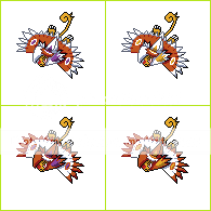
I did the backsprite and possible shinies.
I don't know whether to go with the first or second pose yet.
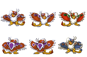
I did the backsprite and possible shinies.
I don't know whether to go with the first or second pose yet.
Updated:
-sprites-
Unless you guys have criticisms, I'll start on the backsprites.
Also, the proportions seem a bit off. The wings look especially small compared to the body. But I might be wrong about that.Hmmm. This has been mentioned before in this thread many times but: aren't 5th gen. sprites supposed to be neutrally posed? Either way, it IS a cool sprite. Although I think it is a bit small. But then again, I know nothing about art.

-sprites-
-snip-
I agree with the several who've said the first pose. I think it has a lot more character and captures the personality of the art better than the second.I did the backsprite and possible shinies.
-sprites-
I don't know whether to go with the first or second pose yet.