Might as well critique each picture.
#1: I'm always a fan of minimalistic design, but the main things that break this picture are Hawlucha's nose not being defined very well (some lineart at the top to make it not look like a sheer cutoff would go miles), and the period. The period is HUGE. Pretty much the only reason I'm not voting for this. Amazing picture otherwise.
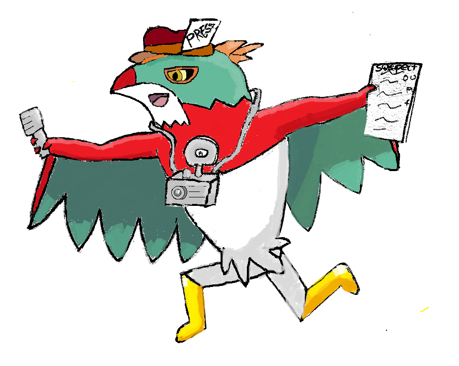
#2: Already gave critique directly to the author, but the main flaw is the shakiness of Hawlucha's silhouette lineart. It has a lot of character to it, though.
#3: Very similar to #2, looks the most professional to me IMO but lacks the character #2 has. Certainly a good piece, but probably not going to vote for it. Close runner-up though.
#4: A nice try. Proportions and general quality need to be worked on, otherwise would be a noteworthy submission. But alas. All this artist needs is some more experience.
#5: Like #3, looks very professional and is very well drawn, but something about the Hawlucha design triggers me. I'm not sure exactly what it is, but it doesn't seem natural.
#6: Putting humanoid characteristics on something that isn't canonically portrayed with them (here, visible muscles) sets off an insane number of bells in my head. Picture is good as always, but there's something about the color palette + quality that throws me off a bit.
#7: Like #4, a nice try. The picture could come across as crisper, but is otherwise a completely decent submission. The big problem here is that the style is off - it just doesn't seem to fit.
Without voting on the poll, I'm going to guess that the main contenders here are 2, 3, and 5. Going to vote #2, I like the character that it brings to the webzine. Makes you think of Hawlucha as more than just a mascot.