
-
Smogon Premier League is here and the team collection is now available. Support your team!
-
Follow our Instagram!
-
Welcome to Smeargle's Studio! Please be sure to review the studio rules. Feel also free to check out our hub to learn more about this place!Welcome to Smogon! Take a moment to read the Introduction to Smogon for a run-down on everything Smogon, and make sure you take some time to read the global rules.You are using an out of date browser. It may not display this or other websites correctly.
You should upgrade or use an alternative browser.Juicy Art
- Thread starter Juicy Fruit
- Start date
Hey bud, I would definitely like if you could draw an Infernape arm wrestling a steroided out Reuniclus. I know Reuni will be weird/difficult/ but that's the fun of being an artist right?Could you make a Lampent Avatar for me? :3
Thanks in advance :3Sorry guys, been quite busy. Music Festivals n shit.
 Could you make a Lampent Avatar for me? :3
Thanks in advance :3
Lampent:

Avatar:
 Thank you, SOMEBODY posted on Smeargle's Studio again (I'm bored). That Lampent looks great, and I especially like the shading and effects, but the arm edges look rough and pixelated? Maybe that's just me...
EDIT: Oh, wait, I just realised you don't have a luvdisc yet! You deserve one, so here ya go!
Really cool dude :3Lampent:
Avatar:
ThanksMy Entry for The Goodfellas torunament artwork:
A WIP for the No Weather Ubers tournament:
 Update Of New Stuff:
Finished submission for the No Weather Ubers tourney.

Submission for the BW OU Cavalry tourney:

Requests are on hold atm as I'm swamped with work.Another piece:
 Ubers WIP:
 Final Ubers Submission:

Also, A WIP of what will probably end up being my biggest project to-date.

 Damn. You went from the kind of crappy Munchlax drawings in BFA to that Ubers logo...
+1 Luvdisc. It has been earned.
EDIT: Forgot you had that other older art and stuff, that was better than the Hypno thing as well lolI'm just gonna keep updating this post with WIPS rather than spamming with constant updates.
Original: Lineart
Edit:
WIP 2: Think I'm probably gonna make this my biggest project to date, I was gonna go make it for the FB cover photo but I doubt I'll make the deadline, oh well. Was also thinking of turning it into a story board to show how I construct an image. I know some of the colours run outside the lineart but I just layed down the base colours to start with, and I'm gonna experiment with ditching the lineart before the piece is complete, just using it as a template atm.

Edit
WIP 3: SO now I've taken out the lineart and polished up the edges of the image, still unsure what I'm going to do for a background, if I even do one. Also filled in the last splashes of block colours. I'm going with a semi-realistic look for this picture, and I imagine a real Landorus to have mottled fur, not quite sure what I'll do about the red patches yet. So yeah, I've just laid down some colours with an airbrush and smudged them to the same effect. Down the right you can see my current palette which will probably quadruple in size by the end. Also decided I'll change the light source to be above and infront of Landorus.
Edit:
WIP 4: Finished covering the body in rough patterns on which I plan to try and paint a furry texture, although depending on how difficult and tedious that turns out to be I may not. No shading on the lower forearm because clouds need to be added later. Also, I've tried to work in those magenta hues on the arms to fit the appropriate places from the Sugimori art. Also, I laid down a really rough light source just to help me when I'm drawing. I don't plan for it to stay like that for the final picture.
Edit:
WIP 5: Ok, so now I've started adding the furry texture to the whole body of Landorus, I'm just working my way up the left arm now. I've also tweaked some of the edges mainly around the head and added some basic detail to the eye - proving really hard to get that eye-shine right.
 Some CAP crap


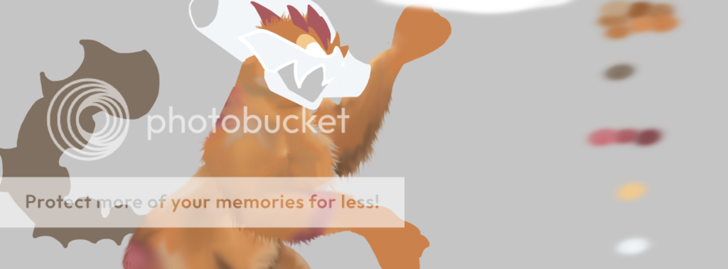
Also, keep checking my last post for updates on my landorus drawingUpdate on my Landorus T piece:
You raise a good point about the eye.
There are 3 problems I face:
1 - The sugimori artwork for the eye shows a yellow eye with a white as the pupil at the centre, that's the sort of eye you'll only really find on a fish.
2 - Landorus is part flying, and although I percieve it to be more covered in fur than feathers, the face appears to have more of a beak. Which suggests I should go for more of a birds-eye, which is large and very dark around the edges and has a pitch black and very large pupil at the centre.
3 - Like I said before, I percieve it to be more covered in fur than feathers and so looks like a hybrid flying tiger. In which case, should it get the eye of the tiger? (Pardon the pun)
I HATE EYES.Oh holy expletive.
That Landorus is absolutely amazing. I envy your ability to digitally texture! I can't wait to see it finished, it looks like it will be awesome!
critiques/specific commentaries below, proceed at own risk - despite the mini paragraphs, I truly do love it, I promise you (a lot of it is me disclaimer-ing anyway).
To me, the eye doesn't really bother me too much. I'd have to see it completely done to know for certain- and comparisons between other eyes might make it easier- but in my opinion, you wouldn't have to change the eye for me to like it.
As it is now, the fur works well standalone too. Furred creatures don't often have shiny highlights, but subtle ones in a few places might help, since it looks like it's mostly shadowed for detail. (Though it looks like that might be an issue of incompletion, since the parts you're working on are mostly in shadow, and you might just not have gotten around to the highlights yet.) The only other thing on the fur is that the top of the shoulder facing us looks a bit matted.
The only other nitpick I have is that the arm away from us is a little odd. I think it's because the shoulder-to-elbow bit of the arm isn't consistent on the two. Like, that bone seems shorter on the away-arm.
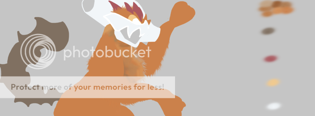
Again- and I feel I cannot stress this enough- this looks truly incredible so far. I can't wait to see it done! :DLatest Update on Landorus T: Ok, so now the fury texture across the body is pretty much complete. I've also laid down some pretty rudimentary lighting across the head crest and 'beak' which I've started to develop a bit more. i really want to get the texture right - I kind of picture it as an ivory material - but I'm really struggling to get it right, so if anyone has any ideas- help would be much appreciated. Also, probably most noticeable is the addition of the clouds!
Still yet to begin any work on the tail or mouth...

Also been asked if I can work on an LC Hub Logo, which is very flattering. So I might start some work on that - not sure if I'll have time though, really wanna just get this thing done now.


