Shinxe
http://i45.tinypic.com/1yscw0.png
Artistic Skill: 5/5
Theme Execution: 5/5
Plus Points: 5/5
Total: 15/15
Judges Comments:
Shinxe, I love you.
That is all. –
Wickdaggler
I second that notion. -
Bucky
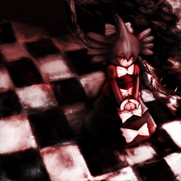
Yilx
http://img.photobucket.com/albums/v407/Yilx/gosurori2.jpg
Artistic Skill: 5/5
Theme Execution: 5/5
Plus Points: 4.67/5
Total: 14.67/15
Judges Comments:
This is bloody (rimshot) brilliant. I love the use of the checkerboard, very smart. As well, the movement of white sharp detail to blended reds and blacks was very well done. And those eyes... they feel like they're burrowing in to my soul :|. I don't really have any negative critique besides that I would have liked to see the white checkerboard been more crisp, to keep up with the theme you had going, but I suppose I should have mentioned that in the thread... anyway, great work! –
Wickdaggler
Aragornbird
http://img844.imageshack.us/img844/1988/swellow.jpg
Artistic Skill: 5/5
Theme Execution: 5/5
Plus Points: 4.67/5
Total: 14.67/15
Judges Comments:
This is brilliant. I love the soft glow that you put in your shading, and background, as well as the masterful representation of fire and feathers. The light blue light in the background reflecting off Swellow's back really pulled this together. Great work. -
Wickdaggler
Icepick
http://i392.photobucket.com/albums/pp10/icepickx/pokees/Zapdos.png
Artistic Skill: 5/5
Theme Execution: 5/5
Plus Points: 4.67/5
Total: 14.67/15
Judges Comments:
I love the borderline sketch style you use in your paintings... the use of the foreground lighting, bright cloud shading, dark shading on Zapdos, movement... it all came together to produce a masterpiece. Great job! -
Wickdaggler
ChuoToshio
http://fc04.deviantart.net/fs70/f/2010/202/2/b/Submission_for_Smogon_MAC_3_by_StevenChong_no_GMF.jpg
Artistic Skill: 5/5
Theme Execution: 4/5
Plus Points: 5/5
Total: 14/15
Judges Comments:
The style used in this painting... it's something else. The use of reflection off the lake, dark foreground shading, and several vivid fall colors on the trees, while not creating a direct conflict of colors, did create a centerpiece of Suicune... (one of my favorites, by the by) which, despite using the conflicting orange and blue, did still manage to seem in harmony somehow.
It's hard for me to put into words how much I love this, so I'll just leave it at this: brilliant work. –
Wickdaggler
What he said. -
Bucky
HellaHellaStyle
http://img411.imageshack.us/img411/9421/monthlyartcontest3entry.jpg
Artistic Skill: 5/5
Theme Execution: 4/5
Plus Points: 4.67/5
Total: 13.67/15
Judges Comments:
I love this; it's a nice smooth, simple, sepia toned piece which still manages to fit in lots of detail. However, it's not exactly what I was looking for in the theme, due to the use of several different colors and an overall color scheme... however, you did manage to capture the light -> dark mood pretty well, so I gave you a few points in theme execution... You’re a great artist, and I look forward to seeing more entries/art from you! -
Wickdaggler
Scampy
http://i46.photobucket.com/albums/f141/scampy789/rotom.png
Artistic Skill: 4/5
Theme Execution: 4.67/5
Plus Points: 4.67/5
Total: 13.3/15
Judges Comments:
I find this piece so incredibly and utterly charming! I love the varying shades of blue in the background, and the setting in general is just PERFECT! Incorporating more than just a single Pokemon was a genius idea, I the creativity that just resonates from this piece. Fantastic job! -
Bucky
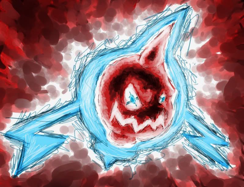
MofoAmbulance
http://i227.photobucket.com/albums/dd62/Shirude/rotom2copy.jpg
Artistic Skill: 4.3/5
Theme Execution: 5/5
Plus Points: 4/5
Total: 13.3/15
Judges Comments:
If someone asked what the theme this month meant exactly, I would present them this picture. You captured what I was thinking of perfectly. The use of a white border, dark reds, and light blue was very insightful. A+.
Swaggersaurus
http://img682.imageshack.us/img682/2807/gengarcopy.jpg
Artistic Skill: 4.3/5
Theme Execution: 4.3/5
Plus Points: 4/5
Total: 12.67/15
Judges Comments:
That thing is inspired. I have no idea what the ****s going on... but I love it. Especially the evil grin on its face. As for the style and presentation, I love the background and color choices. It's very disorienting seeing the bright shades of green and yellow against the purple blotch. Having Gengar take up the entirety of the center seems like a good design choice to me, and it focuses attention to the center, along with the "hole" in it's chest. This is part of why it's so disorienting: Your eye wants to dart to the brighter colors, but is attracted by this big beautiful purple dump in the middle. As always I love your sketchy, of the block random style, which, combined with the time you put into it makes it a great piece. -
Wickdaggler
I dig it. I dig it a lot. -
Bucky
Binary Solo
http://i177.photobucket.com/albums/w219/Bradlestix/mac3-highcontrast.png
Artistic Skill: 4/5
Theme Execution: 4.67/5
Plus Points: 3.67/5
Total: 12.3/15
Judges Comments:
You, sir, are a master of the grayscale. The shading is absolutely magnificent, the wings are fantastically done and really command the piece as a whole. The texture on whatever it’s perched on (I think it’s a telephone wire) is really wicked, and the lightning is pretty well done. T’was quite excellent of you to blur the lightening strike in the background. The composition of the piece is overall magnificent. -
Bucky
SEO
http://i731.photobucket.com/albums/ww313/MarceloSM/giratina.png
Artistic Skill: 4.3/5
Theme Execution: 4/5
Plus Points: 3.67
Total: 12/15
Alright, so I love this piece... just everything about it... the atmosphere, the background, and the way it comes together into white complimented by the yellow headpiece of Giratina. -
Wickdaggler.
Noobiess
http://www.iaza.com/work/100711C/duskull319009.png
Artistic Skill: 3.67/5
Theme Execution: 4.67/5
Plus Points: 3.3/5
Total: 11.67/15
This is a great piece, with a soft, powerful contrast between white and purple/ dark. I really love the way that the white draws your eyes towards it, the shading on duskull, and the way the background compliments the centerpiece with shades of purple, and the slow fade to black. Good job! -
Wickdaggler
Sanglunaria
http://img.photobucket.com/albums/v438/midnitesilven/Zekrom_final2.jpg
Artistic Skill: 3.3/5
Theme Execution: 4.67/5
Plus Points: 3/5
Total: 11/15
I really like this simplistic representation of the theme. You created a great effect with the glowing hues around the white markings, and the lighting in and around zech's body. The shading was really well done, and the background compliments the piece well. Unfortunately, this piece is outclassed by the crazy professional work done this month, but that doesn't change the fact that this is a well done, solid, basic piece. Keep it up! –
Wickdaggler
Wickdaggler said it all, but I can’t let go of this; I wish yellow had been used instead of white. Om nom nom. -
Bucky
Filth090
http://i50.tinypic.com/k4wi2q.jpg
Artistic Skill: 3/5
Theme Execution: 4/5
Plus Points: 3/5
Total: 10/15
Judges Comments:
I don’t care what anyone says! It’s SOOO CUUUTTE!!! I love the face, the texture adds much more interest to the image, and the shading is the epitome of perfection. I can’t wait to see more from you, filth ^__^ -
Bucky
Victus Inferi
http://i1020.photobucket.com/albums/af325/VictusInferi/TheRevolution13-1.jpg
Artistic Skill: 2.67/5
Theme Execution: 4.3/5
Plus Points: 2.67/5
Total: 9.67/15
Judges Comments:
Personally, I rated this high and I’m a little sore that the other judges for scored it low. I love the cartoony feel of it, and that bent finger on the Dusclops makes it so much more cool. I think the theme of stark contrast was captured in a very basic way, and the background with the moon and all the little red radio waves makes the composition interesting and appealing. Great Job, V.I. Joe. -
Bucky
Suntt123
http://i959.photobucket.com/albums/ae78/icebem/Infernape-1.png
Artistic Skill: 2.67/5
Theme Execution: 3.67/5
Plus Points: 2.3/5
Total: 8.67/15
Judges Comments:
THE SHADES! THEY ARE STROKES OF GENIUS! THEY ARRREEE!!! I love the contrast with the ground and the lake, although I think a more reddish brown should have been used to put emphasis on the sunset. Overall, I think this was very creative and I look forward to seeing more of your geniusnessisms. -
Bucky
00roca00
http://www.smogon.com/forums/picture.php?albumid=565&pictureid=3829
Artistic Skill: 2.67
Theme Execution: 2
Plus Points: 1.3/5
Total: 6/15
Judges Comments:
Sorry buddy, but we all know your potential and we know you can do much better than this. Look forward to seeing you in the next contest! –
Bucky