
-
Follow our Instagram!
-
Welcome to Smeargle's Studio! Please be sure to review the studio rules. Feel also free to check out our hub to learn more about this place!Welcome to Smogon! Take a moment to read the Introduction to Smogon for a run-down on everything Smogon, and make sure you take some time to read the global rules.You are using an out of date browser. It may not display this or other websites correctly.
You should upgrade or use an alternative browser.★ Smeargle Card Project
- Thread starter icepick
- Start date
I'll take 9 of Diamonds. Porygon.
well, as icepick said, nobody is pushed for time. you can still work on it if you'd like (which would be great if you can find the time for it). there is no deadline.Made my card, not the best job I could've done, but I've not been in a very artsy mood lately and I wanted to stop feeling bad about putting this off.

also, just as a nitpick, i'd probably move the top left spade and place it here if you don't want to overlap it with the nine. perhaps you can also shift the bottom right spade to the right a little if you want to keep some sense of symmetry going.Giving up my card, lost nearly all my motivation to redo it lol.Ugh finally done; took me ages.

The quality is really bad though: does anybody know how I can make it better? (dpi is 300)
EDIT: Fixed
That looks very good; it gives me inspiration to continue mine (which will be done soon, I promise)...! The circle-bubbles around the edge look interesting, and fill in the empty spaces, without interfering with the card itself.
Trust me, it looks a lot better in the hand-drawn version... I hope it's the right size; if you can't see the suit, tell me, and I'll change it a little.
I find this to be quite a cute piece and I enjoy the circles around the card, they really help fill in the negative spaces. However I do have some issues with this card. First off, I feel that the diamond around the Oddish looks really rushed and I can see the line overlap on its leg. I also find it rather rushed due to opacity overlaps on the diamond, doesn't look clean or constant. I would keep it a solid color if I were you.Ugh finally done; took me ages.

The quality is really bad though: does anybody know how I can make it better? (dpi is 300)
EDIT: Fixed
As for the whole piece, it looks like you merely used one layer (I can tell because of the shading overlaps). If you used multiple layers, it will reduce the chance of colors overlapping (you can use one layer for lineart, the coloring below it and so forth).
Finally, I find that the suite diamonds are out of shape. If you can, use the line tool over free hand, it will make your lines much cleaner (I'd recommend using it for the center diamond as well.You drew this... on an iPad?
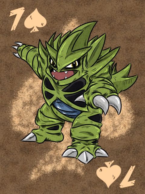
Slight update then. Keeping with the sandstorm background.

Mind blown.Reserving 9 of Hearts, Shuckle.
I imagine, for planning purposes, a beach scene, maybe near Cianwood; the holes where Shuckle sticks its limbs out of might become more heart-shaped. Quite possibly, one Shuckle will be eating a berry?Is there a limit to how many cards you can make in this thread?
If there isn't, may I take 7 of Clubs with Yveltal? i drew a thing :u

feel free to critique, I can always dick around with it more
didn't add the numbers/suit to the borders since it looks like someone was saying they'd standardize them all??? but I can always add them.
full size in the hide tags (look at your own peril, the messiness is much more acute therein)


