• Check out the relaunch of our general collection, with classic designs and new ones by our very own Pissog!

Smeargle's Studio General Thread: Spriting and Banners go here!

Status
Not open for further replies.
Thanks you for your reply, I just wanted some pokes to do a quick sprite. I need some requests to regain my old skills.

Edit: Super 5 minutes sprite ;o.
Introducing the flying ferret!
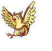
furotto.png

Boy, I lack some imagination. -.-
 
First, a few fusions:

Lombeak.png
Woodkern.png


And now for my Houndoom repose :D

HoundoomRepose.png
ShinyHoundoomRepose.png


HGSS Style Houndoom Repose

HoundoomReposeGoldRevamp.png
ShinyHoundoomReposeGoldRevamp.png


GSC Style Houndoom Repose

HoundoomReposeGreenRevamp.png


Green Style Houndoom Repose.

C+C please. Anyone who can guess the base of the Pokemon which I worked on to make Houndoom gets a cookie :D
 
And now for my Houndoom repose :D

HoundoomRepose.png
ShinyHoundoomRepose.png


C+C please. Anyone who can guess the base of the Pokemon which I worked on to make Houndoom gets a cookie :D

The rear leg is waaay too skinny. It should be just as thick as the front legs. And the neck looks awkard, it starts at the base of the horn, goes straight, then bends down then up again for the back. It should be one smooth curve coming from behind the horn (a few pixels higher than it starts now).

Nice repurpose of Mightyena though. Having to remove all those fur tufts is probably what caused the neck issues.
 
@TPH- Um....I hate to be the one to say it, coming out of my hole for the first time in weeks and all, but I don't know where to start on your, erm, fakemon.

The lines are all wavy and not at all straight. It looks like a blob. I can't make out a shape of the fakemon itself. The shading is too blocky and erratic...I honestly can't even begin to tell you were to start to fix it. Sorry, but that's just what I see.

To cover my own ass, I'll post my first sprite in weeks. Admittedly, I could have done better myself. I'm not wholly satisfied with it but eh, I'm rusty.
Girazel.png

Girazel. I wanted to add the horns, but the perspective didn't want to cooperate.

It's OK, I hate making fakemon, but wanted to do something different. Heh.

Thanks for the crit Darth, I'll work on it some more.

I'm assuming that because the other two are revamps the malformations look OK? ;)

EDIT: Done:

HoundoomReposeV2.png
ShinyHoundoomReposeV2.png


Better?
 
Blastoise_Sprite_by_mvidmaster.png

Yay I actually made a sprite. Used the silver version sprite as a base and worked from there. Updated the cannon designs to reflect the 4th gen sprites.
 
Blastoise_Sprite_by_mvidmaster.png

Yay I actually made a sprite. Used the silver version sprite as a base and worked from there. Updated the cannon designs to reflect the 4th gen sprites.

That is reaaaally good.

But with the left hand cannon (our left) the fat part of the cannon around the tip seems a bit long? Shouldn't have the thinner part started outside of the shell?
 
The perspectives on the water cannons were still bothering me, so here's an edit.
th_Blastoiserevamp2.png

Also, the WIP and what it looked like before I decided to rescratch the cannon slots.
th_Blastoiserevampoldcannons.png
Spr_2s_009.png


Ugh, now I have this horrible temptation to animate it. I should really do some more OU pokes though.
 
Me thinks rhyhorn has enough poses already (6 poses for 4th gen alone! And 4 poses for Gen II).

Besides, that is the goofiest looking sprite I have ever seen.
rbspr111.png
 
Me thinks rhyhorn has enough poses already (6 poses for 4th gen alone! And 4 poses for Gen II).

Besides, that is the goofiest looking sprite I have ever seen.
rbspr111.png

Are you joking? That thing is badass!!

On another note, here's an overworld trainer sprite I made, I'll probably make an in-battle sprite to go with it at some point...

MrBlack2-1.png


C&C please!

Edit: Made a Trainer sprite to go with it...

MrBlack_Trainer.png


I've never made a trainer sprite before now. Any C&C will be greatly appreciated!
 
The perspectives on the water cannons were still bothering me, so here's an edit.
th_Blastoiserevamp2.png

Also, the WIP and what it looked like before I decided to rescratch the cannon slots.
th_Blastoiserevampoldcannons.png
Spr_2s_009.png


Ugh, now I have this horrible temptation to animate it. I should really do some more OU pokes though.
Well....an animation would be nice........-hint-


I should start working on OU sprites too. I'll get on one today.
 
Gliscor_Sprite_by_mvidmaster.png


A gliscor sprite for all the good little boys and girls. These are way too hard to make from scratch without my sketchbook.

Working on Breloom next.
 
K, edited the ear.

That Arcanine sprite needs a lot of cleaning up. The paws are a big thing. On the front right foot (outstretched) you tried to make the illusion of a foot by adding a protruding heel like a human foot. But pawed animals don't have heels on their front paws because a quadroped's front paws are actually the equivalent of our hands. So think of front paws more as hands with really stubby fingers. On your other front paw, you weren't paying attention to your source image and you forgot to add in that black line that causes the paw to bend forward and separate from the leg. Without that black line, that front foot looks like a noodly nub.

There's a lot of jagged lines, and there's gradient shading on the knee fur. And I think the the tail should be bigger. And I think there's too much white in the eye, it makes it look sad. And on the subject of the eye, it's looks really odd to have it's eye facing in completely the opposite direction that it's roaring at. Oh yeah, and you probably didn't notice, but the source image is backlit, so I think that messed up your shading.

...and your Arcanine has no nose.

Hope that was helpful. Your really close with this one, it just needs some more refinement.
 
The Gliscor looks kinda weird but i'm a huge fan of that Blastoise, it looks 1000% better than the current sprite. Cool stuff guys
 
On another note, here's an overworld trainer sprite I made, I'll probably make an in-battle sprite to go with it at some point...

MrBlack2-1.png


C&C please!
I think it needs a little more outline and detail ie a colour other than black. It just looks like a big black blob with a face at the moment.
 
Status
Not open for further replies.
Back
Top