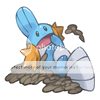
@ryuuzaki52: http://pearlsaurus.fc2web.com/ and just search the pokemons dex number
-
Check out the relaunch of our general collection, with classic designs and new ones by our very own Pissog!
-
Welcome to Smeargle's Studio! Please be sure to review the studio rules. Feel also free to check out our hub to learn more about this place!Welcome to Smogon! Take a moment to read the Introduction to Smogon for a run-down on everything Smogon, and make sure you take some time to read the global rules.You are using an out of date browser. It may not display this or other websites correctly.
You should upgrade or use an alternative browser.Smeargle's Studio General Thread: Spriting and Banners go here!
- Thread starter Alchemator
- Start date
- Status
- Not open for further replies.
Hello
I recently got into sprite fusions (started last year with a couple fusions of my favs, recently started back up again with the 5th gen). I mainly do it for fun, so I'm not really great, but I consider myself at least half decent. Here's most of my work, in order of creation:
Kirikiken

First one in a while, I think he turned out pretty dang good.
Blasterra

Pretty straightforward. I like him, but the head might be a bit too flat on top, kinda hard for me to tell.
Teratron

Probably has an excess of orange spots. Not too bad, considering it was my first time trying to continue actual patterns. Arcanine's tail, and the legs are Terakion's.
Manecroark

The face might be a little messed up since I tried to bring the hair forward for Manectric's face design. Legs are Lucario's, if you don't get that right away.
Golurk-Oh
Hadta fix up the left wing since Ho-Oh's head blocked out a lot of the bottom. I like the kind of angelic look the wings give him :) Beartic's arms btw, he's kinda "out there" so you might not recognize them.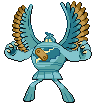
Just fyi, I use MS paint. Nothing fancy. I'd appreciate a review of these guys, if anyone's willing. I would take requests by the way, might take an hour or so out of school. Again, nothing fancy, and no original sprites.@ryuuzaki52: http://pearlsaurus.fc2web.com/ and just search the pokemons dex number
These pictures are very accurate and likeable, though is there a separate section where there are no effects/moves used?It's time you get some attention Shadowbane. (You didn't because we're all itching on the stuff of CAP1, sorry.)
Anyways, hello and welcome to the spriting gang. From what I see, you're doing great with your sprites. Keep it up, I hope to see more!I recently got into sprite fusions (started last year with a couple fusions of my favs, recently started back up again with the 5th gen). I mainly do it for fun, so I'm not really great, but I consider myself at least half decent. Good level of modesty. Here's most of my work, in order of creation:
Kirikiken
It is "pretty dang good", but the Blaziken feet have a softer outline than its body. It's a little deep but one to look out for.
Blasterra
Huh? The inside horn has dark pixels all around it.The chin and the neck up there where it joins the shell also has this problem. And yeah...It's a bit flat at the top. Lovin' the tail, though.
Teratron
The Arcanine tail's shading is off, the shadow should be at the bottom left. All pokemon sprites have their light source from the top right. The legs on the other hand blend in quite naturally with the body, also the spots are fine, just a little fuzzy.
Manecroark
Cool name, but yeah, the face looks pulled like dough ( you seem to know your errors very well, which is good) but the limbs are nicely and naturally fused.
Golurk-Oh
If there's something wrong with this, I can't see it. To me, this is great. Random remark: Ho-lurk would be better ;J
TO ENERGY STORM AND HIS TFFW:
Energy Storm, that is definitely the one design that most strongly demonstrates Intimidate. Also, your support art is the most unique and LOL-worthy. All the best to you and your design in the poll!
EDIT: It didn't make it :( aw well it's still cool.Kirikiken

First one in a while, I think he turned out pretty dang good.
All is well, but perhaps if you darkened the outline of its legs.
Blasterra

Pretty straightforward. I like him, but the head might be a bit too flat on top, kinda hard for me to tell.
The head is a bit flat, yes. The concept of it is sweet though! :D
Teratron

Probably has an excess of orange spots. Not too bad, considering it was my first time trying to continue actual patterns. Arcanine's tail, and the legs are Terakion's.
IMO, the tail just doesn't fit. The left leg (our right) is also protruding a bit past Heatrans head.
Manecroark

The face might be a little messed up since I tried to bring the hair forward for Manectric's face design. Legs are Lucario's, if you don't get that right away.
For a fusion, it still looks a bit too much like Zoroark.
Golurk-Oh
Hadta fix up the left wing since Ho-Oh's head blocked out a lot of the bottom. I like the kind of angelic look the wings give him :) Beartic's arms btw, he's kinda "out there" so you might not recognize them.
I love this one! :D I lol every time I remember that he can learn fly. The only thing I see is that the legs could be adjusted more to flow into the waist-base.
Kudos to you koopo for the sprites! Hope to see ya' around.
Edit:800th post!I have a working server with a few members that use actual implemented fakemon. They work fine in battle but we don't have any custom icons/sprites for them and the members would really appreciate high quality preview icons.
If you're interested in submitting icons, read this for instructions and then post your work in there. You may also post whatever questions you have.@ICC and ToastTyrant: Thanks a bunch guys :D I can see the outline problem with Kirikiken's legs, and...well, all the other corrections you had xP I'll keep 'em in mind. And don't worry about the wait, I passed the time doing a few requests on the B/W Social Board of GameFAQS. Speaking of which...
Scraftyman!

My attempt at recoloring Scrafty as Superman. Took the palette from a GBA sprite.
Rotespeon

Espeon possessed by Rotom, basically. Also my first work with Rotom, so the outline might not be too great.
The next two I made after my op, so I'll just stick em here and see how they fare.
Absolakazam

Notice the Deoxys core? It just felt right for the empty chest piece :P Almost feels like he'd be Ice-typed, what with the cold colors and such.
Zangoozard

Refitted Charizard tail and slightly shrunken Rampy head on my favorite non-evo of all time. I really hoped that what we now know as "Zoroark" was going to be an evo for him T_TI like it! Nothing wrong with it honestly. :D
Like as well, although the outline, as you said, could be cleaned up a bit.
Do you think we could see a copy without the mustache? The sprite behind it is good, but the mustache just kinda' gets in the way.
It's well done, but the tail behind the head looks more like a massive birthday candle went awry (sorry if it sounds mean. :( Couldn't figure out the right words). Perhaps if you add it lower and coming from behind it's left (our right) side of the body.
Nice work over all! Jeez, I feel so old and lazy. I haven't done much spriting lately. XD
Edit: You may want to use a site like iaza.com to transparentize your sprites. Fill the background with lime green, load the sprite to iaza, hit "transparent" and click the green background, and you've got yourself a sprite all by itself! :DThanks again Toasty :D Hmm...yeah, I could easily remove the 'stache. Just always wanted to do something with it xP Maybe I could just use the smaller female mustache? Btw, the candle thing made me lol, I must admit I thought it was a little...warped I suppose is the word, but I kinda wrote it off as my eyes messing with me. N I was wondering how you guys do that! Thank you, I'll hafta remember that site.Thanks again Toasty :D Hmm...yeah, I could easily remove the 'stache. Just always wanted to do something with it xP Maybe I could just use the smaller female mustache? Btw, the candle thing made me lol, I must admit I thought it was a little...warped I suppose is the word, but I kinda wrote it off as my eyes messing with me. N I was wondering how you guys do that! Thank you, I'll hafta remember that site.
No probs!
Hey, you have any suggestions/challenges for me to sprite? I want to try to get back into it. (starting tommorow though). Well, perhaps after me and Albino's battle.An original and fun and awesome request
Hey, you have any suggestions/challenges for me to sprite? I want to try to get back into it. (starting tommorow though). Well, perhaps after me and Albino's battle. Hello, Toast. Yes, I am always the one poking my nose everywhere and giving ridiculous requests.
:nerd: Quote GENESECT Dex entries :nerd:
"Over 300 million years ago, it was feared as the strongest of hunters. It has been modified by Team Plasma."
"This ancient bug Pokémon was altered by Team Plasma."
May you sprite Genesect as it was in its prehistoric days. Give it a typing and feel free to give it a name!
Shadowbane up there:
Yay more sprites! But my comments will be pretty much the same as Toast's so yeah. Anyway, good job! =)I have no clue what I could do for Genosect, but here's Rittercats!
 Hmm...sad to say, that's not quite right, because remember a disguise means keeping the outline of the 'mon and making the inside look like the other pokemon in question, i.e. Diglett. So...The challenge in Ritter's request is that you must keep Reshiram's dragony body shape and make the inside resemble diglett.
Have a nice day.
No, not yet. Try what you can do with Genesect, it's fun!
Tips: A Bug/Fighting or Bug/Dragon.Hmm...sad to say, that's not quite right, because remember a disguise means keeping the outline of the 'mon and making the inside look like the other pokemon in question, i.e. Diglett. So...The challenge in Ritter's request is that you must keep Reshiram's dragony body shape and make the inside resemble diglett.
Have a nice day.
No, not yet. Try what you can do with Genesect, it's fun!
Tips: A Bug/Fighting or Bug/Dragon.Some things I made, like...Two years ago...

 I have a sort of particular avatar request. It is a poker king card with rayquaza on it. Its suit is diamonds, but green instead of red. The picture of Ray doesn't matter so much, as long as it looks like a card. I would really appreiate it (I know it's very specific) and would give the standard sig credits. Thanks in advance!Some things I made, like...Two years ago...

This is actually pretty awesome. The only complaint I could make is that the face is rather...flat. Try shading closer to how the original Foretress sprite was.

This is really good too. Not exactly original, but still good. The left forearm should be a bit shaded at it's base. Also, the tip of the right scythe is missing its border.
You're actually pretty good, especially considering that (I'm assuming here) you were a beginner. I'd love to see more work from you, so keep it up! :DWould anyone like to make me an avatar? It would be greatly appreciated.
It would be pretty awesome if someone could make me an avatar with an aspirin bottle with an ivysaur on its label and with IvyProfen text. Could be drawn or using stock photos.
Something like these:
http://pokiidex.com/Content/Images/002_ivysaur.png
http://s.shld.net/is/image/Sears/038W327658110001?hei=600&wid=600&op_sharpen=1Can someone resize this:
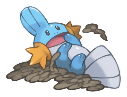
Please, can anyone make this avatar shape and size?Would anyone be able to explain how to use an animated avatar? I tried uploading an animated GIF of Empoleon from my computer, and tried through a URL, but it said that the file size was too large. Any tips?- Status
- Not open for further replies.


