
You used Arbok's jaw.chomzloh said:
Used: Groudon, Aggron, Tyranitar, Palkia, Rapidash, and (see if you can spot this one) Arbok.
C + C welcome, and much appreciated.

-
Check out the relaunch of our general collection, with classic designs and new ones by our very own Pissog!
-
Welcome to Smeargle's Studio! Please be sure to review the studio rules. Feel also free to check out our hub to learn more about this place!Welcome to Smogon! Take a moment to read the Introduction to Smogon for a run-down on everything Smogon, and make sure you take some time to read the global rules.You are using an out of date browser. It may not display this or other websites correctly.
You should upgrade or use an alternative browser.Smeargle's Studio General Thread: Spriting and Banners go here!
- Thread starter Alchemator
- Start date
- Status
- Not open for further replies.
I finally finished it, The concept was a Cloyster Evo with better typing, anyway, I like it, C+C is welcomed


Be sure to definitely not visit my newly revived (kind of) Art thread! Surely that doesn't count as advertising or anything :DMisty is FINALLY ready.

C+C I KNOW ITS CUT OFF I DONT WANNA SCRATCH THE REST DAMN IT THE ORIGINAL IMAGE WAS CUT OFF TOOWombat Sky Forme said:Misty is FINALLY ready.
C+C I KNOW ITS CUT OFF I DONT WANNA SCRATCH THE REST DAMN IT THE ORIGINAL IMAGE WAS CUT OFF TOO
Hey, that's not too bad for one of your first full scratches. But to be honest, it wouldn't have been too difficult to go find a reference pic like the one here and visualize what's missing. The effort would have been worth it. Just a few things, though:
- The color you used to shade her hair is too dark.
- Try using a dark shade of orange to outline her hair. The gray you used is distracting.
- Her right eyebrow needs to extend all the way to her hair
- You might want to completely redo the eyes. Instead of completely outlining the eyes, only include outlines on the tops and bottoms, like in your reference pic. In addition, her irises need to extend all the way from the bottom to the top of the eye. Remember to include the highlights as well.
- Her left jaw line needs to be fixed to match the one in the pic.
- You need to add detail to her ear.
It was a Pixel Over... And where did you find that image? I was looking forever and couldn't find one that I liked, so the next best thing was the one I used. I probably just would've used that one, but whatever. Thanks for the C+C. I'll work on it after my WSC is done.
Part of the reason for some of my mistakes was I resized it AFTER I had the outline, instead of resizing THEN outlining. Wow that was stupid....
On another note, are you back here? You stopped posting here right when I started.Some amazing sprites I'm seeing here. Many of the splices are ingenious, especially the colouring on some of them.
I'd like to post some scratch sprites, starting with my favourite Sparkra (based on a dragon I drew some years ago)...

A legendary trio I created, Electrobot, Freezobot and Infernobot (I'm not so happy with the fire on Inferno...)


(Electrobot was my first attempt at an action pose)
A couple others I made early and am not heaps happy with but maybe they have potential if I edit them...


This started as a pixel-over from a picture off the net, because I really like Robomewtwo...

And some revamps (From Silver to RSE)...


*I'll grab the actual R/S sprites from the net sometime and add them to the post for comparsion
And wth I'll post a few splices I made ages ago


Please give C&C if you have any, I'd really like to improve my spriting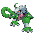
Mass fusion for the WSC.
This was so much easier to do now that I know how to use Layers in Paint.net. I could not imagine doing this in MSPaint.
Looks good for a start, but it looks more like Shellos is eating Cradily then Shellos is part or Cradily.
My first splice. In case you couldn't tell, it's Shellos with RS Cradily. C+C please.
Also, it's best not to fuse sprites from different generations because of size and shading differences.
Mass fusion for the WSC. I really hope this finally nets me a win. This runner up thing ain't happenin.
This was so much easier to do now that I know how to use Layers in Paint.net. I could not imagine doing this in MSPaint.
I see Ekans and Steelix... and maybe Ramparados? What are the fused 'mons?
EDIT: Nevermind. I just saw what you used in the WSC thread.
Also, I can concur. Once I figured out how to do layering effectively in paint.NET, it opened up a whole new door of possibilities.
How I scratched the Drifblim
This is mainly for you guys to tell me where I'm going wrong, since apparently the drifblim I did was an atrocity D:
- Drew the Drifblim in Photoshop
- Resized
- Imported into Paint
- Pixeled over the outline (and removed copious amounts of dots D:)
- Basic Colours from Drifblim Sprite
- Shading with colours from Drifblim sprite
Done? And for you Wobbufreaks like me:


 :)
:)
Hey guys, guess what I finally did!
... No, I already have a life, thank you very much. :)
I finished my first scratched GDN entry! Whoo, milestone!
So, can you guess what it is?
... No, not Magikarp.
It's the good ol' GDN011. Still confused? Behold!

Yeah, so I finally passed the only speedbump I have encountered in the GD. Amazing, huh? Yeah, so the chest beak, if you're wondering why that's there, it is what used to be Gallade's chest spike. And yes, I did steal leg design from every one's favorite Fire/Fighting starter.
C+C is highly smiled upon. As you can clearly see.:)
REQUEST LIST BY MORDOCK (for fun)
Rhyhorn-onix
Machamp-bronzong (maybe new avatar)
Latias-Tropius(another possible avatar)
Muk-drowzee
Kingler-Nidoking
I might try some of these, but as I currently stand, my priorities are:
1.CAP Art Entry
2.WSC Bronze Koffing
3.WSC Entries
(A)4(that is highly unlikely of occuring any time soon). CAP Sprite entry.
5.Other
So... yah, might take awhile. :(
EDIT: New GDN quickie.
GDN:038 Mawile

The skirt is scratched, along with the horn jaw's shading. Overall, not bad for 40 minutes, IMO.
C+C Is highly smiled upon. As one can clearly see. ^
I was never really gone; I've continued checking this thread and a few others since I stopped posting regularly. If you're wondering about any of my work, expect a scratching guide (that is hopefully more in-depth than that bland Dragonfly Cave guide) in the forseeable future.Wombat Sky Forme said:On another note, are you back here? You stopped posting here right when I started.
Bad Toro said:I finally finished it, The concept was a Cloyster Evo with better typing, anyway, I like it, C+C is welcomed
You know what? Good effort; I'm sorry no one commented on a sprite that I'm sure took a lot of work to fuse. But there's a reason for that: it is sloppily done and, in short, is not a good fusion. Don't let that get you down, though. Pretty much everyone begins at relatively low level. However, I'd like to give you a few pointers:
- Don't be afraid to stay within the 80x80 size limitation; just because a sprite is larger doesn't mean that it is somehow more impressive.
- Fuse your parts more smoothly. Right now, your fusion appears to be a repulsive mess of jumbled parts. It's somewhat difficult to define what I mean by "more smoothly", but while fusing, ask yourself, "Does this look natural and do these two parts transition seemlessly?" It's fairly hard to go wrong with a question as straight-forward as that, unless you are simply not an artistically-oriented person.
- Diversify your palette! People are generally reluctant to look at most anything that is drab gray and vomit-colored.
- Beginners should start by fusing a small number of sprites with relatively similar, or at least compatible, poses. You essentially did the opposite.
- Watch your lines; issues with line thickness seem to be a common problem among beginners. Ensure that your lines are no more than one pixel thick (except in some special cases, none of which apply here). In addition, never leave your outlines (all) black. Choose an appropriate outline color instead.
- I'm not completely certain as to whether you scratched the arms and hands or just managed to badly mutilate some other poor Pokémon's. If you did scratch them, I would highly advise leaving that until you have developed your skills a bit more.
- Identify your light source(s) and stick to it. You have multiple light sources going on there. Of course, reshading is required in many cases.
What's Sparkra reaching for? Or is there some other reason his arms are ridgedly extended straight out in front of him?MrBlack said:I'd like to post some scratch sprites, starting with my favourite Sparkra (based on a dragon I drew some years ago)...
No, but seriously, it's not that bad. Just a few things:
- Sparkra is facing directly to our left. If it is supposed to be like a Pokémon (and I'm obviously not sure), that is not acceptable. It should be facing its opponent. Note that even though some Pokémons' bodies are not directly facing the opponent, their heads, or at the very least, their eyes are.
- Try to avoid pillow shading. Be bold (but not overboard) with your shading; you'll like the results.
- While technically not a "flaw", try experimenting with more imaginative/energetic poses. It's something I myself struggle with.
How I scratched the Drifblim
This is mainly for you guys to tell me where I'm going wrong, since apparently the drifblim I did was an atrocity D:
- Drew the Drifblim in Photoshop
- Resized
- Imported into Paint
- Pixeled over the outline (and removed copious amounts of dots D:)
Personally, I create a new layer in photoshop and do the outline on that layer, then import into paint so I'm not taking the rest of the picture with it.
The Drifblim was actually pretty good though iirc.
Haha, but I think you need to reshade the Wobbuffet parts since you flipped it, it looks like the light is coming from the bottom instead of the top (while the feet do like likem its from the top).I like the one with no arms. But the neck is sort of odd. It's too rigid, maybe a curvier neck, like Meganiums.

Took around half an hour.
How does it look?
Chinchou-Charmander-Sunkern BTW
Plus
http://www.youtube.com/watch?v=47u8IWfi878
All my sprites bar the one above.- Status
- Not open for further replies.


