• Check out the relaunch of our general collection, with classic designs and new ones by our very own Pissog!

Smeargle's Studio General Thread: Spriting and Banners go here!

Status
Not open for further replies.
I Think I Can? FLCL? Come on...

And I just came across it on Google, search Dusknoir and it should come up. Also, where in particular do I need to shade it? The tongue/hands?
 
Oh right, that was kind of obscure. Maybe if you had added periods between each word like in the song. ^_^

you need to finish the shading everywhere, though especially the hands and the neck pipes. The problem I see is that you've only got 2 color shades for each color and for a sprite this big you should be using at least 3 shades + outline shade and highlight shade(when applicable).

Another problem is that ur light source is coming from the left side the sprite, below the head and slightly to the rear (as in a candle, vs. The sun for the other sprites). I'm not saying you should change the light source, it gives it an approriately creepy vibe, but it is something that you need to take into account when shading.


Edit. Oh shit that's AB's dusknoir. You might want to ask his permission, or at least give credit. He is a mod on this forum.
 
Neat Dusknoir, though as I said earlier, you should use more black in the outline. Diglett's eyes look weird; try using the darkest shade of brown on a corner or two to make them look less rectangular.

And now for something completely different:
femalechar.png

Test run of a new overworld style. Any comments?

Pretty darn good. I like the fact that we can actually see the character's mouth now. Nothing I can really see wrong. I can just imagine how big a Pokemon Center'll be with this style though. Wail, scratch that, the Battle Tower. Good luck with that, man. :)
 
The head looks kind of odd. I think it's that bandana. It looks like it's in the process of falling off her face. Maybe move the middle up a few pixels or move the sides up a few pixels, so it's either going across the top of the head or the forehead.

XandZ, what did you think of the edited palette for your avi?
 
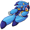
I liked the palette for the most part, the only thing I wasn't liking was the high contrast in some areas. So, in true me fashion, I also decided to make a revamped palette using grittier, darker colors, minus the contrast. Definately agree that it looks better with darker colors, though.

ththSonicX1535366340-iaza.png
 
Uh, the higher contrast was the whole point. Increased contrast adds more volume to a sprite. But your new palette does look better and less flat than the old one, so I'll leave it alone. Maybe super high contrast is just my own current style since I've been learning from professionals who's first comments are "more contrast in your colors".

Anyway, did a quick and dirty walking animation of Wichu's trainer sprite to practice walking animation. Wichu, I made the highlight in the eye white and added some darker pixels around it to make the eyes pop out more.

If you guys(Wichu) like this one I might try doing a run animation too.
TrainerWalk-1.gif

TrainerWalkslow.gif
 
picture.php


Made this one with help from my nephews lol. They kept asking me to add stuff on, so I saved after I added each body part. This was the last that looked decent. Meh, it was fun. C+C if you're bored.
 
bayleefpixeloverdone1.png
Red.png


Well, I finally got around to Bayleef. At first, I wasn't entirely happy with the neck bud/seed things, but the more I look at it, the better they look. I dunno. Thoughts? How does the size look?
 
chikoritapixeloverdone1.png
Red.png


Managed to get Chikorita done too. Wow, two in one day! :D Though I'm not entirely happy with this one, specifically the shading on the leaf, I just can't seem to get it right. Any tips?
 
You should get rid of the dark shade on the bottom and replace it with a whitish high light in the top-middle, so that it looks flat and shiny instead of thick.
 
frame-2-avatar-test8749733191-iaza.gif

^animation I made =D

Looks like Moltres is doing dirty things to Arcanine xD

Can someone please do an Empoleon repose? I got depressed (not really) with the Pt sprite...please also do the shiny and "Golden" forms of the Empoleon repose you do(see my avatar for guidance on golden xD red over the eyes and silver crest :D)
 
Since I have been re-commisioned for the task of creating the honorable mention trophies, I hath a question to ask of thou fellow spriters:

What is, in your opinion, the funniest Pokemon? You may post multiple entries, and the main reason I am asking is because I want to make a Most Humorous Trophy that appeals to everyone. So yeah, post your thoughts on here, and I'll also C+P this on the Spriting Thread.

Btw, my vote is a Magikarp-shaped shield with a Lickiliky, Golbat, and Haunter on it with each of them grasping tongues and maybe hands with each other. :)

So please, vote while you still can, since I am going to be drawing it up sometime next week.
 
Status
Not open for further replies.
Back
Top