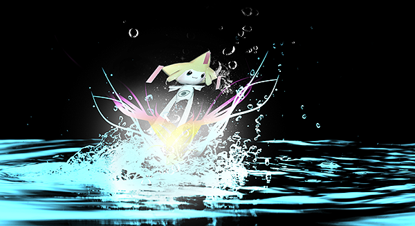
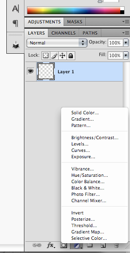
He used a gradient map to set those colors.
Ericc, you can also create depth by blurring the background bit, and then sharpening the focal. You want the render to be the main focus of the sig, not the background. Therefore, you shouldn't have your focal only cover a small area of the sig. This also applies to text. Don't make your text too ostentatious, because it would take too much attention away from the main focal.
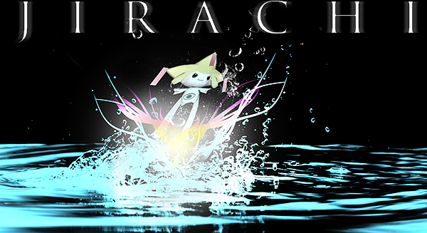
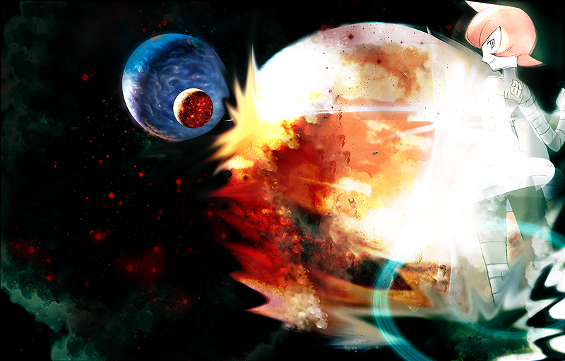
I did a quick edit of yours, and as you can see, you see the jirachi almost immediately, which is what you want. Of course,there are still things that could be improved with this sig, but I didn't have the proper layers needed to do anything about it..
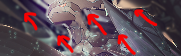
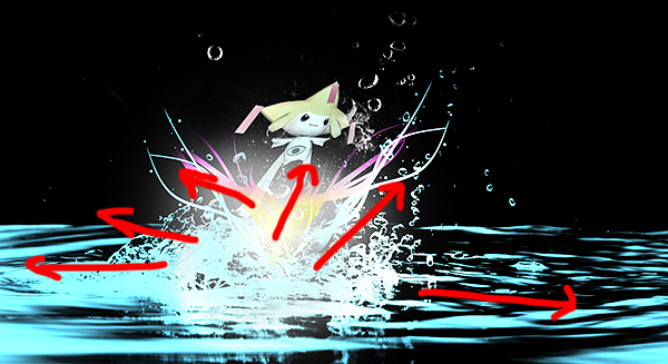
Also, flow. your jirachi banner doesn't flow, and It would look better if there was flow. To illustrate what I mean, I drew some helpful red arrows:
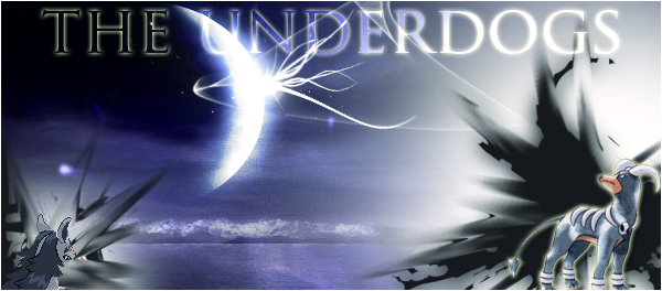
As you can see, the zekrom banner all flows up towards to the upper left. The jirachi one, on the other hand, goes in every which direction, when it should be towards the upper right. With that said, its not bad to have the banner flowing in two opposite directions, but as a rule of thumb for beginners, its easier to just have one direction.
Hope this helped!