• Check out the relaunch of our general collection, with classic designs and new ones by our very own Pissog!

Smeargle's Studio General Thread: Spriting and Banners go here!

Status
Not open for further replies.
About the JigglyDex, my problem would be that lots of them are just recoulours of other pokemon, or sticking jiggly on somewhere. That's not what dexes are liek, they are fusions with the one pokemon as a base, a regular fusion. For instance, Charizard, Electrode, Swampert, Staryu etc are just recolours. All you've done to Magmortar is stuck a Jigglypuff on. The ones that are good in my opinion are Arbok, Blastiose, Ditto, Koffing, Slowpoke, Raichu, Raticate (just maybe claws would make it better)

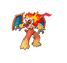
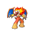
teddyman, some bits are just oddly shoved on (the infernape hand brass swirly things) and the hair fire looks odd, badly blended and too contrasting with all the different components, but apart from that its not too ad, maybe recolouring all in one of their colour schemes (blaizken?) as the wings with their different blue stand out etc. Not too bad I guess
 
Devamp of my dead cat
iaza12200777321800.gif
 
Just some stuff, let me know what you think:

Mastodonstradethreadbanner.jpg

This is the first banner I whipped up in about 15 minutes to stick it up in my thread for now. It features my favorite pokemon starmie in the background, but since I was just going to display the text, it's not very noticeable. This is what I'm used to making. Shortly after posting this I realized how important banners are to smogonites, so I accommodated a little bit better in my second, which I also took a little bit more time and thought with.


TropiusBanner.png

This is the banner I have in my thread now. Not as crappy as the first since I put a little more time in it. After realizing that most people's banners are not simple long rectangles which I am used to doing (the more standard kind of 'banner'), I went with a more artistic shape and added a drop shadow to make it stand out more. The tropius was kind of hard to outline since I did it in a rush, so I tried the row effect, and I thought it looked pretty cool. I think the font may be a little too small, but I don't know. Let me know what you think.
 
i havent sprited in a long time
i present to you the ugliest pokemon of all time, Magmabuzz!
iaza19702798720700.jpg

(the arms are meant to look like theyre melted on)

teddyman, i like the change of colors in the wings but the flames in the hair are a little weird
 
teddyman, all I meant is that you should do the wings with blaizkens colours of something. Anyway, the flame "tongue" as you call it just looks a bit odd, not liek a real flame, just...weird

Also with the grass one, it just looks liek bits stuck on to torterra really. For instance, it might look better if the flower replaced the leaves of the tree, but in different colours etc.

Also, heheheh that thing is sure fugly
 
Because you want it so much, some critique, Teddy.

"Epicfire"

Too much Blaziken. Far too much Blaziken; in fact, if i didn't know which Pokemon were put into this sprite, I would say it was just a weird edit of Blaziken. The Typhlosion, Charizard, and Infernape are incredibly subtle (not in a good way.) Also, the wings don't look like they're part of the body; different colour.

"Epicwater"

Too much Blastoise, again. 50% of the sprite is pure unedited Blastoise. Then you slapped on a Feraligatr head and slapped on it bits from other sprites. The head isn't the same colour as the body, either, making it look disconnected.

"Epicgrass"

This is literally a Torterra with a few plants growing out of it. It isn't a splice, just an edit. What parts there are don't look connected properly, especially the tail, which is facing a different direction than the body.

Also, for god's sakes please stop posting so much ;n;
 
ho-ly-crap! epic!!!!!!!!!

uhh, what did you change?

also still awaiting c&c for my new trio
epicflame-2.png
epicwater-1.png
epicgrass2.png
^ignorant post is ignorant. Look at sprites of Latias and Latios, then look at the disguises.
Also, as has been said, you just tacked on bits and pieces of the other starters. A big annoyance on "epicflame" (btw try to make original names in the future) is the wing part on the back of Blaziken's head is still there, and it seems out of place.
 
Do you know what a disguise is? He swapped colors to make Latios look like Latias, and vice versa.
ooooooooooooh, now i see it...
also a few things:
1 epicflame looking sideways
2 theyre sposed to look like that
3 i still think theyre epic
4 how is it not original? show me the "original"
and give me a break im still new at this
 
Because it's what all the cool kids are doing:
iaza12067695737000.gif


These were way too easy:
iaza12067672239500.gif

Also, I just realized I'm posting these in the same image...:/

EDIT:
ooooooooooooh, now i see it...
also a few things:
1 epicflame looking sideways
2 theyre sposed to look like that
3 i still think theyre epic
4 how is it not original? show me the "original"
and give me a break im still new at this

1.) Even if it IS looking sideways, the areas surrounded by rectangles in this pic:
iaza12067672373800.gif
should be omitted because they are distracing in your creation. In any case, they'd be burned up because you have flames in the circled area.
2.) They're supposed to look tacked on? As you have been told by others, they shouldn't look tacked on. They should look like a natural FUSION. Key word: FUSION.
3.) Good for you, take pride in your creations. However, you need to also be sure to take note of people's criticisms and try to understand them better. When people tell you to change the color of some wings, it's probably a good idea to change the color of the wings. If you're at a blank for the color, just ask someone, they'll help you out.
4.) You don't see how "Epicflame" is unoriginal? First off, fusions of starters have been done before, and in ways that are more visually pleasing than these. Secondly, the adding of the word "Epic" to any other word is used far too often, and doesn't really work for a Pokemon's name. You are attempting to make a new Pokemon by fusing old Pokemon, try maybe fusing the names.
5.) Yes, you are new to this. This has been evidenced by your creations. But look at your creations, then look at others' and try to see what's wrong with yours. If you think they look up to par, then post them and ask for C+C. Only ask for advice ONCE, and then just wait patiently. Don't bog down the thread with posts and then ending them with, "
ho-ly-crap! epic!!!!!!!!!

uhh, what did you change?

also still awaiting c&c for my new trio
epicflame-2.png
epicwater-1.png
epicgrass2.png
."
It gets to be annoying when you are constantly asking people to give advice on your sprites.
You've got a BIG challenge in trying to fuse all the sprites of the starters. For fusions, maybe start with a basically shaped pokemon and get practice with fusing body parts of other Pokemon onto it.

EDIT2: Also, I hope it doesn't bother you, but I figure'd that I'd show you what I believe was wrong with the wings:
iaza12067668996500.gif
 
Status
Not open for further replies.
Back
Top