XY Pokémon Models

I love these too... Have you ever played with Klang in Pokemon Amie? He gets happy and flings his small gear up, and catches it while whirling around!
I have, actually. Each evolution. It... is a strange thing to behold. How... how does it... I don't even know. But it's cool!

And my new favorite model: Sableye. SABLEYE. Oh my god, Sableye is great. Like for reals. I remember its sprite in B/W, with it's weird head twitching, it made it look pretty freaky. Then I saw it in X/Y. I was pretty bummed out when I saw it was generically looking scary, but when it attacks, omg, it does its head twitching thing and it looks so awesome. I think if I breed a good male one, I might call it Jacob. (Anyone get the reference?)
 

Pikachuun

the entire waruda machine
The best animation by far has got to be the Kakuna animation. So much elegance :o

But in all seriousness, I like Weedle's animations (especially its fainting animation which is the cutest thing ever... wait what am I saying).
 
Don't get any Archeops hate, it's based on the Archaeopteryx, it's still hotly debated as to whether it could even 'fly' at all. With that in mind, a significantly oversized one barely being able to get off the ground is way, way more accurate than the idea of it soaring around like a modern day bird. And I for one love the idea that at some point when trying to model Archeops for X/Y someone brought up the subject and everyone unsure on how to proceed given the answer to "can Archaeopteryx fly" is a resounding "we don't really know" decided fuck it, let's go with, "hey, it's not whether it could fly that really matters, it's the fact that it tried"

As for least favourite model I have to weigh in on the "smoke, flames are other non-solid entities" bandwagon because nearly all of them -Possibly all of them actually, I can't think of any exceptions- look completely solid and as a result, hideous. Like if my only experience of Torkoal was X/Y and you told me the smoke was actually supposed to be some sort of terrifying cancerous growth, I'd probably be inclined to believe you.
 

Stellar

of the Distant Past
is a Site Content Manager Alumnusis a Battle Simulator Admin Alumnusis a Top Social Media Contributor Alumnusis a Community Contributor Alumnusis a Smogon Discord Contributor Alumnusis a Researcher Alumnusis a CAP Contributor Alumnusis a Top Contributor Alumnusis an Administrator Alumnusis a Past SPL Champion
I combined the two model threads. There isn't really a need for both "favorite" and "least favorite," especially when the two threads tend to overlap.
 
Almost cried when I saw this. Like Hippowdon, Poliwrath has changed so much from the pokemon I know and love.
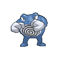
...It looks like its gonna murder me
Got them Boxing Gloves sized up now. Ready for the TKO. Either that or it blow air into them.

Anyways, Is it noted the first thing to amazed me was Aegislash and the shifting animation of Stance Change...
 
I just realized that I did a "hate" post but not a "love" one, so:

Spinda.


"You came to the wrong neighborhood, son. Dis place is only for the after-party and 'mons with inner ear infections!"

I legit cracked up when I first encountered one. It's even better when they attack.
 
Without repeating my earlier posts, I'll list some more pokemon models that exceeded or fell short of my expectations. I'll try not to include too many Pokemon that were already mentioned.

Disappointing models
Excadrill: Its model isn't bad, per se, but in its idle animation it just sort of stands there. In comparison, its animation in B/W, with lowered head and snapping claws, is downright menacing, appropriate for a pokemon that could easily sweep entire teams.
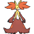
Delphox: Its official art looks great. Sadly, its in-game model has such a tiny head that you can barely see its facial features. Moreover, I wish the model had a posture more similar to the official art, i.e. leaning slightly forward, with its feet and the bend of its knees clearly visible.
Swoobat: As others have mentioned, its facial features look too small relative to its head. A huge disappointment since Swoobat is one of the cutest Pokemon in my eyes.
Arbok: The head shape seems off somehow. Either the top of the head is too domed relative to the flat lower jaw, or the eyes are set too low.
Paras/Parasect: Is it just me, or have the mushrooms changed from bright red to pale magenta over the generations?
Kadabra: Why is its tail so, so huge and fat?
Tangrowth: I'd hoped they'd flesh out the mass of vine tentacles a little more.
Xatu: A Xatu in perpetual flight just doesn't look nearly as iconic as Xatu's standing pose.

Surprisingly great models
Charmander: I've been pretty indifferent to Charmander's design for years, but this model has rekindled (pun intended) my fondness for it. The face is SO CUTE.
Golbat: Hard to describe why, but this model makes me actively like Golbat, whereas before I was ambivalent about it to the point that, when raising a Crobat, I would hold off on evolving the Zubat until after its happiness was already maxed.
Zigzagoon: Felt indifferent toward it before. Now I love how cute it looks, not to mention its zig-zagging attack animation.
Furret: See above. Cute model, cute attack animation.
Spewpa: The design itself is only so-so in my opinion. However, I dare say Spewpa has one of the best attack animations in the game. The way its ruff gets all spikey and the debris flying out in all directions is mesmerizing.
Ninetales: It's nice to see it finally standing up.
Pidgeotto: It was always my least favorite of the Pidgey line (though I like all three). Now, however, its death glare and flying animation bring it on par with Pidgey and Pidgeot for me.
Bellsprout: Its little root feet turned out better than I had expected, and it's as cute as ever.
Lanturn: The glowing particle effect surrounding its lure looks nice.
Jumpluff: The rendering of the "stubble" on its cotton spores is well-done.
 
Thankfully Gamefreak pretty much nailed the guy in my signature (T-Tar). Going off the top of my head.

Good Ones
  • Tauros
  • Tyranitar
  • Cloyster
  • Heracross
  • Tyrantrum
  • Xerneas
  • Sneasel
  • Crobat
  • Druddigon
  • Farfetch'd
  • Flareon
  • Magnezone
  • Metagross
  • Snorlax
  • Staraptor
  • Talonflame
  • Starmie
  • Anything that has a Mega Evolution
Bad Ones
  • Scizor
  • Swoobat
  • Salamence
  • Hydreigon
  • Haxorus
  • Machamp
  • Ferrothorn
  • Excadrill
  • Flygon
  • Golem
  • Nidoking
  • Rapidash

Well maybe not the top of my head... A few of the 'bad ones' have good models but terrible poses or animations. Case in point is Scizor, Salamence, and Hydreigon; they all just sorta... Well... Sit there... Doing nothing... I also think they messed up 'Mence's wing shape while combining it with a terrible camera angle. You also might notice that a lot of the more 'threatening' looking Pokemon are on this list. Interesting how that works sometimes.
 
Disappointing/Bad:
Mega Charizard X- It just floats there, and the mouth flames look bad. Charizard Y's animation and model is so much better.
Salamence- Love this Pokemon, but bad animation. Also floats there like a blimp.
Excadrill- Sorta stands there. Looks way derpy in Amie, haha. Looked more threatening in BW/BW2
Scarmory- Also floaty. Looked better when it stood. It tends to face head-on, making it hard to see its face.
Delphox- Ewww.
Tauros- Also drunk.
Archeops- Looks silly, looked better in BW/BW2
Scizor- Looks dull. Doesn't have good animation in Amie
Typhlosion- No back flames?
Purrloin- Why...is...it....bipedal...?
Hippowdon- Almost didn't recognize this guy


Awesome:
Noivern
Articuno- Love that tail
Ninetales- yay you're standing!
Mightyena- Looks way more threatening
Hydreigon- Surprisingly adorable in Amie
Mega Houndoom
Mega Charizard Y- looks intimidating and love the torn up wings
Fearow
Mr. Mime- Great animation but looks gross lol. But I'll put it under awesome.
Sneasel- got some 'tude
Weavile- love how it somersaults out of the pokeball, and strikes badass poses in Amie
Spinda- Lol looks so drunk and tipsy. Hordes of them are hilarious
 
Golbat: Hard to describe why, but this model makes me actively like Golbat, whereas before I was ambivalent about it to the point that, when raising a Crobat, I would hold off on evolving the Zubat until after its happiness was already maxed.
Does anybody remember the Golbat model from Pokemon Stadium? It was always on the floor and rocking from foot to foot with its wings completely wrapped around it. And when it opened its wings to attack an enormous tongue would come out its mouth... It behaved very weirdly, although given what it's sprite in Red and Blue looked like, it's not surprising. Another weird thing about Golbat's model in Pokemon Stadium was that the back of its wings had its' blue skin over them, but they've removed that from its design in Gen III I think.
 
One that has really impressed me is Charizard's. I like his slightly muted orange colour (in previous gens he looked like he had a bad fake tan), and his pose looks way more natural than in BW. I dunno what everyone else thinks, but I think that he looks more like he does in the anime now; he just looks great

As for a letdown, I'd have to say Heracross. He looks fat and his horn is nowhere near long enough. Also, that slightly-pale blue just doesn't look great compared to that beautiful, rich blue he has in earlier generations.
 
BW-

XY-


Why is the color so different? When I got one from Wonder Trade I rejoiced because I thought it was shiny. But... nope.
 

Celever

i am town
is a Community Contributor
Ok I'm just gonna look at all the designs of the new mons, not specifically the models but DHR told me to post here :(:

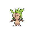
Chespin is interesting. No one could really tell what he was at first (chipmunk? Mole? Beaver?) and you can kinda see why. Plus, this guy took the idea from Sewaddle. And he should be Ground type. He should so be Ground type. That aside though, Chespin is probably the best of the basic-stage starters (I hate all of them, don't worry) because he looks kinda cute... I guess.

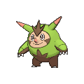
Best design of the starters this gen. He looks kinda derpy but the good derpy - something like Stunfisk or Dunsparce are made to be the "derpmons" but Quilladin isn't, he looks kinda serious (a Pinocchio nose! :D) but in all honesty he is the perfect middle-stage design. Chespin is skinny, short, and doesn't really have spikes. Quilladin gets taller, bulkier and has "horns" that imo count as the beginnings of the spikes.. because that's what they are. Still looks like a Ground-Type though...

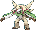
It was going so well... Chesnaught is the worst of the fully-evolved Kalos starters for me. He reminds me of a plane. His head is the cockpit at the front of it, his huge-ass arms can be the wings and his spikes the engines. Or something. Anyway he doesn't look like a Grass-Type any more... actually he doesn't really look like a Pokemon any more. If I had to give him a type it'd be normal, actually, because he is covered in beige and is quite bland. Except that his proportions are waaay off. WAAAAAY OFF!

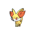
The Fennel fox Pokemon, Fennekin (imaginative I know) looks like a Fire-Type without having Fire on him, which I like. The same can't be said for Chimchar, Cyndaquil or Charmander... and Tepig doesn't even look like a Fire-Type so this is shared only between Fennekin and Torchic. Anyway, like all starters it is a basic design showing off some pretty normal animal traits of a fox; Quadruped, Nimble, giant tuffs of hair in it's ears, you know all the things a fox would have. Wait wha--

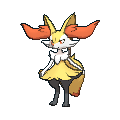
OH MY GOD THIS THING IS BLAND AS FUCK!!! Seriously Braixen has some kind of transitions i.e: Quadruped --> Biped, pretty sure he gets the stick at this stage but I hate the design really. Plus, I swear he has less hair now? Or is that just me? Probably... but anyway I don't like this design due to the simplicity Braixen has and because it's wearing a mini-skirt.

Best fully-evolved starter, no doubt in my mind. Like at all. Delphox isn't a santastic design but it gets what it needs to across, that being it's a witch, so a psychic, it's completely red, so it's fire, and the tufts of hair are p cool now. She also looks quite rugged, which I quite like actually! Downside would be the giant dress is really bland but... that's kinda minor to me.


Meh I'll do the rest when I get thoughts about them...
 

someone help me I'm too fat to stay in the air

but seriously, Archeops is great.
OMG, Archeops is FUGLY this generation... Did it take one too many Close Combats to the head or something? Maybe it's fat because it needs to eat to heal from the constant STAB moves it takes to its' very fragile body. xD it needs some meat on its' skinny-ass body. :p that sprite does not look very good. :|
 

Users Who Are Viewing This Thread (Users: 1, Guests: 0)

Top