• Check out the relaunch of our general collection, with classic designs and new ones by our very own Pissog!

Yilx first place artist

wagjghghgh

aryne.jpg


Yo Yilx, would you be so kind as to direct me to the brushes which you (mainly) use? Cheers buddy.

Also, I'm really struggling to get an ivory-like texture on a drawing atm, any pointers?

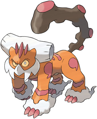
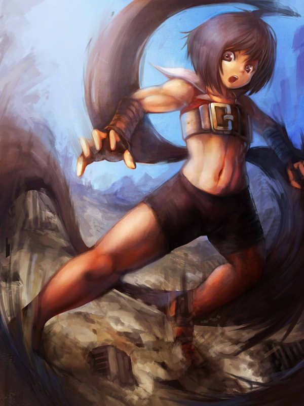
Your CAP entry was my fave btw, shame it didn't win. Keep up the good stuff!

you only ever need 3: hard round, soft round, chalk/oval shaped

everything else is for backgrounds/textures which should only be applied outside of the rendering/sketch stage

i use "Blur's Good Brush"es that rocket grunt the great reccomended

ivory? what kind?
 
Wait a minute..... Is she standing on a bunch of ruined buildings?! 0_0 That's one big girl.

Very cool, although I feel that the arm to the left is a bit too defined with the muscles, as her thighs and stomach aren't as toned as the arms.
 
you only ever need 3: hard round, soft round, chalk/oval shaped

everything else is for backgrounds/textures which should only be applied outside of the rendering/sketch stage

i use "Blur's Good Brush"es that rocket grunt the great reccomended

ivory? what kind?

Thanks, I'll have a look into those!


Ivory, as in the kind you'd find of elephant's tusk? The drawing I'm working on is Landorus-T, and I picture it's head crest and facial 'beak' for want of a better word, to be made of ivory. I'll try and find a decent reference image:
landorus-therian.jpg

elephant-tusk.jpg

I'm trying to make it quite a life-like image, and this texture is really screwin me over!

When all else fails, you could always do a paint over.

Patience is the key to everything, though. Patience and understand. Which means, get studying!
 
Yilx, it looks great, but I have a little nitpickabout your art at this current moment.

Right now, you need more variety. Besides the Kirlia, it seems like you've been painting the same thing, women, in the same style. Be a bit more adventurous and branch out into different styles. Think of other things you can paint.

Just my opinion.

it's a little complicated

i'm a junior artist at work now because my skill level is very low

i just render what the senior artist passes down to me and i'm drawing all kinds of things that i sometimes don't want to but have to

so during the weekends or at home i tend to want to draw something of my own volition. sorry. (which mainly includes anime girls)

and hey, i'm trying to avoid the thick black lines lol
 
I think she is a weird asian girl too

also i made some changes

1hHtX
The size of that belt buckle is outrageous. This certainly has more detail than your average work, and the anatomy checks out from what I can see. I also like how you've shaded with two light sources in mind: the sun, and the blue light which has reflected from the surroundings.

Now, if I assume that the sun is located in, or very close, to the upper left corner, then the lighting on the giant is stretching rather faw imo, as her face, buckle and hair could use less light. The skyline (I think?) on the left also curbs rather weird, as if the viewer is looking through a glass bowl or something. And while I won't doubt the crushing capacity she has, just the sight of one lonely skyscraper pile among several fields looks pretty weird, so other structures or rubble to fill out the area somewhat might be worth considering.

Still, this is a large improvement from its smudgy predecessor, so I'd consider it a job well done.

The size of those breasts are outrageo- *slap*

Her right one seems to be a tad bigger than the other one, though. And while her smirk can be cute, it really isn't correct, so I'd advocate a regular smirk instead. I also spent several seconds looking for her hands until realising those spiky red things are gloves. Or really dangerous mittens. Some clarification would be appreciated from my point of view, but I sadly don't have much to say how to correct it.

With that said, the above paragraph is the result of objectively scanning through the image, since my first glimpse resulted in me moving back in my chair and saying 'wow'. It's a very warm image of a kind girl with interesting garb and wings. Takes the viewer by force and keeps them spellbound for a good while before you can move on with your life.
 
it's a little complicated

i'm a junior artist at work now because my skill level is very low

i just render what the senior artist passes down to me and i'm drawing all kinds of things that i sometimes don't want to but have to

so during the weekends or at home i tend to want to draw something of my own volition. sorry. (which mainly includes anime girls)

and hey, i'm trying to avoid the thick black lines lol

I laugh at the fact you said your skill level is very low. I understand now though, thanks for replying. You do what you like, I respect that. One question remains:

Are you ever gonna go back to doing requests and retypes?
 
I laugh at the fact you said your skill level is very low. I understand now though, thanks for replying. You do what you like, I respect that. One question remains:

Are you ever gonna go back to doing requests and retypes?

requests, i don't think so. retypes, maybe. just maybe.
 
I think I just had a backgroundgasm.

You've really handled the lighting well in this one: You've nailed the light bouncing off the clear water as well. The shape of the head bugs me slightly, the face seems to far orientated to face towards us considering where the other 'ear' is pointed. I'd imagine her to be facing out towards that big suspension bridge more, since that's where - to me - it appears the head is pointed.

There's another bit of shading on the water in the backdrop - right beneath that big crevice - which seems to block-like for me, just needs to be blended in a bit more.

Seriously though, this is definitely one of if not my favourite piece of yours.

Thanks for pointing that out lol

1jXnB
 
cowgirl + paradise
You have outdone yourself this time. Truly. The distant buildings, the cliffe shrouded with shrubs, the different hues of blue riddling the water, and the warm sun blanketing the entire scene is a marvel to behold. The early WIP you posted on #smeargle gave a short glimpse of what was in store, but you really went well beyond my expectations on this one.

But while the bg is stunning, the girl up front could use some refinement. Her left horn seems to be too far back on her head, since both horns are supposed to be in even positions. Either that or you're showing too much of her face, it really depends on what angle you what to show the most. Her whole body, and the deck, could be sharpened since both are closer to the viewer, as right now they seem rather smudgy compared to the bg (which is much father away). The green leaves up to the left of her could also undergo a similar treatment, they seem pretty close.

As stunning the bg is, the hill on the other side of the river looks pretty empty despite your brushwork, so some trees or cliffs could be added to increase the variety. The water could also use some white reflections (and I do mean white) right above that yellow rock or further back, right now the water doesn't sparkle much even though the skies are clear. And while the web of light reaching the bottom is really nice, the part closest to the image's bottom looks skewed, and could be made more similar to the part preceeding it. Or it could be just me, but it looks weird in my eyes.

Fantastic work overall, and I sincerely hope this will be part of a future portfolio of yours.


2 hours electric CAP
As I mentioned on #smeargle, her collar stretches to far to her left, and her right hair tail have a blue highlight on the left which shouldn't be there. That aside, this is p cute for a quick work, goes to show how comfortable you are with shading and coloring.
 
Back
Top