Hello.
I made a sprite but now I probably won’t finish it.
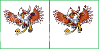
This is as far as I got, I attempted to take some comments into consideration (feet, wings, etc)
My intention was simply to sprite the CAP monster. I wanted a final submission that could be put to the polls; it didn’t matter where it came, as long as I was as happy as I could be with it. Unfortunately, I’ve done it in a way that’s looked down upon, and maybe even seen as wrong. I suppose it’s slightly disappointing because I know I’ve put effort into it, but apparently it’s not enough. It might not be against the rules, but it sure feels like it might as well be.
I think that a good pose is a good pose. When I saw the Pokémon, I wanted this kind of ‘attitude’ in the sprite. I did not enter my sprite because there was a pre-made back picture with an adaptable front (or vice versa). I entered my sprite because I thought these pictures captured the manner of what I envisioned this Pokémon to be like – despite it being a primary flying type Pokémon, I don’t see it circling the airs above, I saw it more land based and shaman-like. I opted to use these pictures because they captured what I saw in it, I didn’t want to mess with it too much because I thought it was perfect and I thought I might be able to do a good job of making it look respectable. This is not an excuse, but the Sugimori artworks are usually put into sprite form at some point or another (take the majority of Black/White, for example) – this is simply how I saw it, an opportunity to sprite what I wanted.
Because this isn’t in the spirit of the competition, because it isn’t a technique that is encouraged within the CAP community, I will probably not be finishing it. I don’t want to tarnish the reputation of proper entries and the excellent artists here.At this point in time, I don’t think I could finish my entry and be properly happy with it; therefore, my original intention would not be fulfilled, and so I’d be wasting my time. I cannot scratch very well, and I can barely pixel over, so I am not going to start again differently, I’d rather skulk away into the shadows and pretend I never bothered.
Yeah, yeah, sore loser, etc. Maybe I’m looking too much into it and reacting too much, but it’s an opinion that’s shared by a few people so I don’t think I have a choice but to leave the spriting to the spriters. I don't think I could handle people having such a severe distaste to something I worked quite a lot on.
I’m sorry for wasting people’s time, but thank you for the support and comments on my sprites everybody. Good luck to all participants and I hope the best wins.
And that’s that.