CAP 15 CAP 4 - Art Submissions

Status
Not open for further replies.
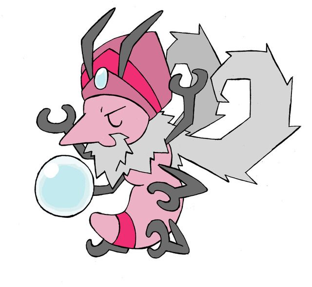
Since I'm really good at art and mouse-drawing, I made my CAP4 concept...


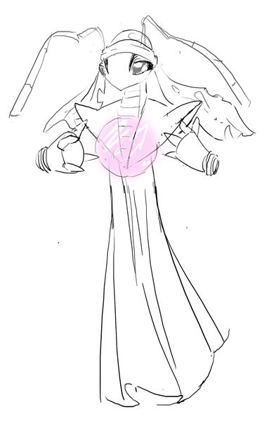
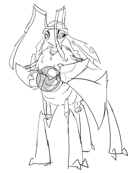
It's pretty shitty and stuff, but I just wanted to hear what people think about it.(Proportions and another things are messed up in every aspect of every other pic, but well yeah, it's me...)
So, the concept is pretty much mixture of a lot of bugs and totem. The primary idea was based on Fulgora and Totem, the I simply added other details like wings, body and tail from different bugs, such as Mantis, Spiders, Phoridae... I came to this, trying to fit Bug/Psychic on my concept. C&C is greatly appreciated ^^
 
Update 3 (WIP):


@fryfrey I've curved the neck/antenna and also narrowed the antennas towards the bottom, thanks for the suggestion!

@GuyInCorner I agree that there is a stiffness in the thorax area. I have attempted changing the shape, but the more radical or smooth I make it, the more it distracts from the orb (the focal point.) After experimenting with other various aspects, I think the rigidity of it comes from the association of the thorax with the limbs.
I changed how the arms attach to the body as well as brought the petals of the legs in closer which has decreased this somewhat, but I am still searching for a solution to this problem. As for color schemes, I will probably upload a few variations after I have fixed the body structure. I mostly want to use a light-pink color scheme because the design is based on an orchid mantis. Thank you for your suggestions!
_______
Design concept = Orchid Mantis + Psychic + Chair (Abdomen)
Orchid Mantis: http://3.bp.blogspot.com/_vtWj7IfgJBw/StPSrmwX5VI/AAAAAAAAAGQ/pazmhAN2g8A/s400/freaky-orchid-mantis.jpg

Any suggestions about improving/fixing my design would be greatly appreciated!
Note: I will put shading on the drawing after it is finished.
 
Update 3 (WIP):
http://oi48.tinypic.com/zjvvnp.jpg

@fryfrey I've curved the neck/antenna and also narrowed the antennas towards the bottom, thanks for the suggestion!

@GuyInCorner I agree that there is a stiffness in the thorax area. I have attempted changing the shape, but the more radical or smooth I make it, the more it distracts from the orb (the focal point.) After experimenting with other various aspects, I think the rigidity of it comes from the association of the thorax with the limbs.
I changed how the arms attach to the body as well as brought the petals of the legs in closer which has decreased this somewhat, but I am still searching for a solution to this problem. As for color schemes, I will probably upload a few variations after I have fixed the body structure. I mostly want to use a light-pink color scheme because the design is based on an orchid mantis. Thank you for your suggestions!
_______
Basic design = Orchid Mantis + Psychic + Chair
Orchid Mantis: http://3.bp.blogspot.com/_vtWj7IfgJBw/StPSrmwX5VI/AAAAAAAAAGQ/pazmhAN2g8A/s400/freaky-orchid-mantis.jpg
Any suggestions about improving/fixing my design would be greatly appreciated!
Note: I will put shading on the drawing after it is finished.


I really like where this design is going. I apologize if I missed you already mentioning you'd work on it. But perhaps you could go with a darker scheme overall. I think that'd really make this design pop. Again, just a suggesion.
 
Hello All,
I've been lurking around the site for a while, but I really liked the whole CAP project, so I thought I'd try my hand at submitting art. Anyway, this is what I came up with to represent this project. It's based on cicadas, which spend most of their time very passive, but display a burst of activity in a single day as they become adults. In the same way, the art shows a really passive/immobile bug that displays random bursts of psionic energy (I really like how it fits with the whole risk/reward prompt). Also, I don't have photoshop, and this is my first time drawing with word, so the images are a bit blocky. Ill see if I can round them out a bit soon.


forestflamerunner

Ain't no rest for the wicked
@Calad

Personally, i like the first clairovoyant a lot better than this new addition. I never felt that the first version didn't look "evolved" enough and I really miss the intricacy of the original wings, which really shouted bug/psychic to me. The mustache/ beard dont really seem to add much to the design, and the darker pallette just makes the pokemon seem less exciting on the whole.

Looking at your original clairvoyant design, the only real nevative I can see anyone saying about it is that it doesn't seem like a physical attacker. I dont see this as too big of a problem because i can still see your pokemon using STAB options like zen headbutt and uturn, but i think it might help if you made the arms a bit longer and thicker, so that it looks like those things can actually be used in combat. Once again, i love your work and i hope you go with the original design over this rasputin version.
 
@Chomz that is so pretty! Might look too much like Gardevoir or Gothitelle, but I'll definitely hold that opinion until I see the color version.

In regards to how art connects to ability...no, I'm not asking. Not unless someone tells me that I can ask that question here.
 
@calad: Use the first version! Also, on the first clairvoyant, can you make it seem (not to get ahead of ourselves or anything) a little less specially oriented, while still making it seem psychic? Not sure how though. :T
 
shinydreamer: Yeah, I'm not really planning on posting a final submission anything like this one; it's too anthro-ish, derivative (like all my other stuff :P) and clearly isn't gonna fit the ability/eventual stat-spread, I think. I just liked how it turned out and figured I'd share.

That said, I do think the fortune-teller idea has potential. I'll stick with it and work something out.

EDIT: oh hey look an alternative version thats a total shameless rip-off

 
Just a WIP, but the concept I'm going for is a spider that, like a hermit crab, uses magicians' gloves as a shell, giving it the disturbing shape of a floating/walking white hand.

http://i.imgur.com/wAcz7.png

I'm trying to incorporate a hat and wand in the design, but I'm still in the early stages.
 
Changed the big wings for something more sober and less complicated:


Calad, I agree with everyone. I like your first design better.
itsme looks like we had the same inspiration, but you were able to include the trippy wings way better than I did. Good job.
KoA I like a lot how yours is turning out. The inactive pose is a huge plus. About the alternate colors, the grey one looks too metalic, but I really like the others.
 
@Chomz Your designs are beautiful. I personally like the second one more, but it looks eerily similar to the Neopets Ruki. But at least it looks like it can deal damage to both sides of the spectrum

@BlueConcept I dont think you need that many props. Just try to emphasize the fact that its a magician's glove so it looks like a psychic type rather than a dark type. Otherwise its really cute

@Juicy Fruit I like the concept, but I think more than one prop is overdoing it. I'd say focus more on the puppet aspect, because the orb looks like its just there and not the source of its power or something.

@Demist it looks like it could be promising, maybe make it flow more? I mean No offense it looks like you put the pole on the body rather than it grew from the body.
 
(My scanner finally works, yes!)


Updated, traditional glowworm, with more praying-mantis-esque legs and without a feather. I'm not sure if I should digital this since, while it would make it smoother, it would probably make it less good. I am considering making it my final submission assuming it is legal and assuming it's preferred to the original. Apart from the things I was advised to change, this version is a bit more pudgy and has larger gems, and naturally leans forward more. Let me know on feedbacks!

I might edit this post later with commentary but I'm feeling burned out on all that, there are so many submissions.. @-@

Semi-important edit: In response to heatran's comment I decided I would show this only semi-coherent comic I scribbled out when bored in class, since I think it helps to show its Psychic typing more clearly.

http://i.imgur.com/wzLQT.png

It might be because it's not in colour (and if so, what colours work better for the entry?) or it could be due to subtle differences in design, or it could just be the fact it's using psychic-esque attacks (never mind that the opponent is a Tyranitar, maybe it was using Miracle Eye in the second-to-last-panel).

Something about the first panel screams Bug/Psychic to me more than the other drawing in this post, but I can't tell what's so strictly different from the two to create that image.
 
Calad: I feel like the warmness of the pink and the beard clash with eachother a bit. While I personally preffered the one without the beard, I feel like it could work with a little more alteration. The body, size and color are just a little too... young-looking to sport that beard.

Tin: I preffered the giant acid-trip wings, but it still looks lovely. I love the concept.

CBMeadow: Earlier, the design never really struck me, but this new drawing is growing on me. It's absolutely fantastic. Although, if I were to suggest anything at all, I would try to make it a bit more "psychic", as I could easily see it being Bug/Grass, Bug/Poison, or just Bug typed. It's still lovely, though.
 

Rocket Grunt

✁ - - - - - - - - - -
is a Top Artist Alumnus


just a very tiny shitty update
was trying to figure out the wasp-rider
thinking something like a tank driver something
but i don't think that reads 'psychic' at all right now
maybe some kind of stargazer telescope idea
tried to do a drawing on the computer
not that comfortable yet right now
gotta keep working on it though
thanks for the encouragement
gonna make the worm less fat
and push more psychic
weak armor too
 

KoA

Sorry, I thought anteaters were real
is an Artist
I like the wasp rider a lot, I.get a very megaman x.vibe from it and that makes me smile. I think a way to emphasize psychic would be maybe making the worms actions parallel with the wasps? (say if it moves it's arm, the worms arm moves in the same way etc)

Kinda plays on the while telekinesis angle more too.
 

Stratos

Banned deucer.
@CBMeadow:

wow, that design is truly amazing! Such skill for a newcomer. You're actually allowed to submit a scanned pencil sketch as your final sub (see Stratagem) so i'd suggest not using a digital drawing pad; you're just so skilled in the pencil medium.

As for what makes the first comic's panel feel more "psychic" than the current sub: i'd have to say it's the lack of the legs. When it's floating, it really does feel that much more "psychic," contrived and overdone though it may be. I'd try eliminating the back four legs, leaving only the front pincer, and see how it looks. And, as said above, the design looks quite poison-type. I'd edit the back gem, as it stands. Lighter hue, or different color, or smaller gem, or something. Right now it looks like a massive poison barb.
 
Image moved to later post

So I was trying my hardest to make a meditating praying mantis, but I simply couldnt find a design i liked. So I decided, ill just do whatever and started doodling and eventually got this. Its based on the oh so cliche idea in this thread of a gypsy fortune teller. The Antennae are incense rods, which the gypsy mantis uses to lull the opponent into a trance.

"yes...i see...i see...come...look into the scrying ball, yess closer" and then the victim is devoured.

I like this design so much more than my ant :D
 
Doran Dragon, your artwork is the one I like the most among many mantis-themed artworks in this thread. Only thing I would advise is about the color. I think you could incorporate even more of the gypsy fortune teller theme by using colors that might be associated with the said gypsy fortune teller instead of resorting to the typical psychic color: pink. Just googling 'gypsy fortune teller' gives many images that you might look into.
 
Wow, there's a lot of cool stuff going on in this thread. Rocket Grunt, I especially like your idea so far. The whole "parasitic wasp controlling a worm" seems just dark enough to be awesome, while your drawings so far make it just cute enough to not cross the line. The Psychic-type relation is a bit tenuous, but I don't think it'll take much of an effort to include it a bit more.

Anyways, I thought I'd contribute a bit of my own work to this thread. I'm not too good at using GIMP for line-art yet, so it may not be the best, and so I've included my original sketch to go alongside it.


You know, I thought I was being real friggin' clever when I thought of giving him limbs not directly attached to his body (the diamonds surrounding him are his wings), but not only have other people beaten me to the punch, they did it a whole lot better too :P But oh well, them's the breaks.

So for a bit of a breakdown: when I first sketched out my idea for a Pokemon, I drew a lot of inspiration from Volcarona to try and get that "majestic insect" vibe, but it ended up looking too much like Volcarona, so I scapped it. However, I liked how it sort of looked like a bug wrapped up in something, so I took that idea and started over.

The basic idea here is he was just an ordinary bug that entered the pupal stage, but rather than metamorphosing into a butterfly or some shit, he just developed psychic powers instead. So now he just pops his head out of his cocoon and gets around by using his psycho-powers. I showed in the sketch how the larger diamond shapes on the side of his cocoon can detach and float outwards, allowing his arms to reach out and grab things, which I think fits with the plan that CAP 4 be both specially and physically offensive. I imagine the diamonds on his levitating wings don't so much flap in unison like Volcarona's wings, but instead flap downwards while collapsing on each other, sort of like Skarmory's wings, although hell, they might do both.

Color-scheme is still a work-in-progress, but I'd love to get some feedback from you guys.
 
Status
Not open for further replies.

Users Who Are Viewing This Thread (Users: 1, Guests: 1)

Top