
-
The moderators of this forum can be found in the CAP forum staff directory.
-
Welcome to Smogon! Take a moment to read the Introduction to Smogon for a run-down on everything Smogon, and make sure you take some time to read the global rules.
-
Congrats to the winners of the 2023 Smog Awards!
CAP 15 CAP 4 - Art Submissions
- Thread starter Birkal
- Start date
- Status
- Not open for further replies.


Hot damn that is badass.
Can I have it as a pet?
It's good to no i'm not the only one here thinking that.. man so much good art here.Unsolicited opinion - all the mantis magicians/gypsies remind me strongly of Manny the Mantis magician from Pixar's A Bug's Life (which I'm totally ok with).
@KoA: you're seraph as totally changed my opinion of this bug. coming in I told myself that I absolutely wouldn't vote for a moth, but that all changed it. I especially like that grey alternate color you gave it. Totally love seeing that bug every time

So I took Pwnemon's critique to heart, and this happened:

I'm not gonna lie: I'm pretty impressed that I could manage that. But I think the colour changes have actually hurt its Psychic-type. If you think I should change the colour scheme back to the original, I can simply trace over this and do that- don't worry about sounding harsh, I like improving designs.
The changes are, pretty obviously, iridescence- which I've been TRYING to achieve this whole time- the lack of back-legs, the more clearly segmented body (for Weak Armour), and the new rainbow motif. After I'd shaded the body, I thought the old green gems wouldn't work, so thought of the rainbow idea and tried it out. If it's just me, do say, but it looks unPsychic to me now.
If you have any idea on how to make it better, let me know if you prefer this one or the one on page 8, and what I can keep from both designs and change from them to make the best possible final submission- I'd like to have a shot at this! :3
Also sort of important edit: http://i.imgur.com/McoVP.png This is a reference tool of sorts, full of all kinds of different ways I could draw Glowworm so you can point out which parts you'd like to see implemented, and which you wouldn't. It's definitely not the most refined of things, but should serve as a decent reference. The most important things in that are:
-Whether the body is slim or fat
-Whether there are spots on the underbelly
and -What style the segments of the glowworm should be in.
My handwriting is incomprehensible so sorry about that. :P
(Also: I hope I'm not littering the thread with my concept. I've posted what, three versions and two pages of supplementary art?)
Okay, I concede. I'll provide commentary and critique for everyone in the OP (okay, second post). Because every entry is being discussed, including ones I've already done, I'm going to be a bit more strict, specific, and honest, so look on with caution. Also if these sound half-coherent I apologize, there's a lot here to do.
Since I've had little to do recently, if anyone would like me to directly help with design or final art or anything like that, I'm willing- send a PM.
Additionally, if you need a visual of any of my suggestions (they're probably pretty confusing), you may also ask in a PM and I will try to demonstrate.

I'm not gonna lie: I'm pretty impressed that I could manage that. But I think the colour changes have actually hurt its Psychic-type. If you think I should change the colour scheme back to the original, I can simply trace over this and do that- don't worry about sounding harsh, I like improving designs.
The changes are, pretty obviously, iridescence- which I've been TRYING to achieve this whole time- the lack of back-legs, the more clearly segmented body (for Weak Armour), and the new rainbow motif. After I'd shaded the body, I thought the old green gems wouldn't work, so thought of the rainbow idea and tried it out. If it's just me, do say, but it looks unPsychic to me now.
If you have any idea on how to make it better, let me know if you prefer this one or the one on page 8, and what I can keep from both designs and change from them to make the best possible final submission- I'd like to have a shot at this! :3
Also sort of important edit: http://i.imgur.com/McoVP.png This is a reference tool of sorts, full of all kinds of different ways I could draw Glowworm so you can point out which parts you'd like to see implemented, and which you wouldn't. It's definitely not the most refined of things, but should serve as a decent reference. The most important things in that are:
-Whether the body is slim or fat
-Whether there are spots on the underbelly
and -What style the segments of the glowworm should be in.
My handwriting is incomprehensible so sorry about that. :P
(Also: I hope I'm not littering the thread with my concept. I've posted what, three versions and two pages of supplementary art?)
Okay, I concede. I'll provide commentary and critique for everyone in the OP (okay, second post). Because every entry is being discussed, including ones I've already done, I'm going to be a bit more strict, specific, and honest, so look on with caution. Also if these sound half-coherent I apologize, there's a lot here to do.
123ericn I don't specifically like it, but I don't specifically dislike it either. It doesn't stick out to me I guess? My recommendations are to smooth out its shading- it's a bit rough as is- and maybe add something of a new colour to make it pop, or think of an idea that will help it stick out from the crowd. As it is, the concept has been attempted before and it doesn't have much to show different.
akela I do like the idea- and the colour scheme, I'm always a fan of alternative colour schemes- but the legs look identical to each other and therefore make it look a little stiff and confusing. Some kind of pose that lets the legs be dynamic might help with that. Additionally, maybe you could make holes or markings where the legs meet the body- maybe it's just me, but I think that would help make it clearer the distinction between body and leg, and possibly make the whole thing look a little more refined.
aragornbird I've been a bit of a fan for this one since I saw its first idea. The concept, to me, is excellent, and it's drawn pretty well too. As it is now, it's very good- main thing is to smooth the shading just a little and refine the wings a tad. Speaking of the wings, leave it to levitate, I think it works better floating than on the ground and it doesn't make it look Flying type at all to me- many Bug-types levitate.
Asylum_Rhapsody Psycholobug, I think, will be a solid entry once it's completed. It's true that many people prefer 'badass' CAPs, but I like how yours looks and understand the merits of leaving it to look like a frail creature. Psychic types are very often frail, and Bugs aren't known for their defensive capabilities either. I think it does illustrate the risk of using the CAP well. I think I prefer the body of your work sketch and the wings of your original sketch. I might have to see that to be sure, but I think it would work pretty well. You seem to have issues with those wings though, and I'm not sure exactly what you're looking for so I'm not sure I can help.
Base Speed I don't see the Psychic so much. The limbs are unattached, but to me it's going to take something to make it look more like a Psychic type. It needs to stand out a little more, have something that stands out about it. Maybe make the "third eye" (by which I mean the spot on his forehead) to look like an eye, or something of that ilk? I'm not really sure what to suggest, just show the Psychic more.
Birkal Personally I prefer the newer two to your original submission, especially the 8-ball bug, since to me the hat design looks.. Kind of odd, like, offbeat for a Pokemon. I guess that's because the body segments aren't attached so it looks as though the hat is literally the insect. Might be what you were going for, but kind of odd to me. The 8-ball bug more easily looks like it could be a Pokemon, and I like the two concepts used for it (fly, I think, based on proboscis, and 8-ball). Shade it and see how it goes.
BlueConcept I really do like the concept here, so keep working with it. As someone else mentioned, make sure the glove is emphasized and tweak with colours so it looks Psychic- and not Dark-type. Also, mess around with antennae. It isn't necessary and may not help, but it's something you can try for tweaks, when refining your design.
Calad As others have mentioned, I prefer the non-bearded version. It looks evolved enough to me, and just seems to click better.
CBMeadow Continue, continue, you're flawless :D
(Not really, of course, I see many things wrong in mine)
Cartoons! I dunno if I like this one actually. I'm not sure WHY I don't, but it doesn't quite give the Psychic vibe- I can see it, but it isn't cleanly obvious at first sight. Artistically, there's something off about it- maybe it's the split-ness of the heads, I really and honestly don't know. However, I have bias against cutesy designs regardless, so it could easily be me.
Cheeseball504 I think the main reason this doesn't stand out in my eyes is due to the blockiness. I have no problems with its concept or any of its parts, it's just how it's drawn. I hope that makes sense.
Chomz I rather like this, especially the head, things on the head, and the neck. It somehow looks the perfect blend of Bug and Psychic to me. Definitely work on this, I would like to see it finished.
CyzirVisheen I prefer your wormhole worm, and honestly don't have much in the way of critique to say as of now. I think you might be able to get away with a black and pink-or-purple colour scheme, if you accentuate the bugginess of it. I think black works the best for it overall, but only if you can do that without making it look Dark-type. It's really cool; I'd like to see it finished!
DarkLatias92 The main thing with this one is that it looks more Flying than Psychic. Colour scheme may fix that, though. Looking at the wings, you could make them have eye patterns kind of like Masquerain, or you could keep them as they are and colour the current 'segments' with an eyelike colour pattern, if that makes sense. Like, maybe a dark purple for the "pupil" bit near the origin of the wing, and then a lighter purple for the "iris" outside it? Something like that. It would make the flapping helicopter wings pretty cool.
Demist I like the concept and how you've pieced it together- to me, it looks large, imposing, and threatening, kind of like a god standing over everyone which I think ties in well with the totem pole. I think with colours it will look pretty good. I see it as being rather bright and colourful due to the totem motif, but try what you see fit.
Doran Dragon I like it- the gold pieces contrast with the pinks and pinkish-reds to help bring it out. Toy around with adding blues, even in slight amounts, somewhere, since it might bring it out more by providing more contrast and a RBY-based colour scheme. Not necessary, and may not help, but just something you could try out.
DougJustDoug I think the Psychic typing is a little unclear on this one too. Books are associated with intelligence but I feel like it isn't standing out as one. I'll have to see the refined, coloured version to make a true verdict, but that's how I see it now. It is, however, remarkably cute and affable looking.
DugoutCanoe I like this one as well, and I'd like to see it shaded in. It's a solid entry. I think I especially like how- what's the word? Geometric, I suppose?- it is. It's very focused on cleanly recognizable shapes. The colour scheme is your general pink/purple, but its composition is appealing to the eye. Make alternative schemes if you want for comparison purposes, but I think the pink/purple works better for this than it would for mine, or some of the other entries here.
Empoleon Guru Shading is needed, of course. It's adorably stereotypical and quite amusing to me. Unfortunately I can't really say much else, it speaks for itself.
Furosuto The coloured version bugs me a little, and I think it's just that the colour scheme doesn't 'work' for me. It's hard to explain and I have no idea what colours would work, but the brown and purple just.. Doesn't click with me.
GuyInCorner I like this idea, and would like to see what colours you plan on choosing. It's the first entry I remember that is more Psychic than Bug, but I kind of like how it looks. Maybe make the ribbony things at its back look like the clear wings of a bug? Toy with that and see how it looks.
Heroes and Cons The idea is cool, and I rather like the colour scheme on this one. It's rather Paint-looking though, so you may need to get it smoothed out and more refined in design. Out of curiosity, what are the blue spheres?
itsme I really like this one. The bright, varied colours help create the feeling of "Psychic" to me. Really, I can't say much for way of change. Smooth out your shading a little- there are some choppy parts- and you're pretty much good to go in my eyes.
Juicy Someone else mentioned the two props being a little much- I do have to agree with that, the orb looks superfluous to me. Try removing it, and if you want to keep the 'gem' idea, maybe try putting smaller gems like it down its back or otherwise on its body instead of as a larger orb near its hands. You have the spots but maybe you could tweak with it to make it work. Up to you though, your entry looks good so far.
Juicy Fruit Yours stands out to me as one of my more preferred ones. It 'looks Psychic' enough, and has armour for Weak Armour. I can't quite say why I like it as I do, but just keep at that design and work with it as you see fit.
KoA Yep, yours is cool. It's one of the ones I like more. I can't say much by way of critique, just work as you see fit.
Leethoof This one doesn't specifically stand out to me either. I can't say why it does or doesn't, though. Perhaps you could make eyes of sorts, sticking out of holes in the hive, with the bees serving as more clearly defined hands?
Lawrence III This is a cutesy design. I can see both the Bug and the Psychic in it- and I have to point out here it reminds me very much of a battery for some reason, which I think works for it. Refine it some, as I think the appearance is worth pursuing.
Mafeking Shade it, and maybe add in some detail on the caterpillar-worm and machine so they stick out more. I can see the Psychic in it, but only if I'm looking for it- try to make some element that makes it more cleanly Psychic-type. It's hard to do that- trust me, I know; Psychic is a rather undefined type- but I think you can.
Mari As I think I've suggested before, maybe make the bug have its own face with human-face-like markings on its back, rather than the markings actually being the face- this helps to preserve its creepiness without making it look too forced in design. It's a solid idea, just work further on it.
Matezoide I see the Psychic typing well enough, but it seems a little forced. I think if you were to refine the drawing, though, it would help with that. Smooth out the lines, make the black of the body a little lighter than the black of the outlines- that should help.
Mos_Quitoxe I've already mentioned I absolutely love giraffe lamp. The only thing I have to say is make it more Psychic type and make it distinct from Mollux, as they look somewhat similar.
Nastyjungle I like the hulking dangerous look of this. I'd say to make the arm stick out more from the body, since as it stands it's kind of hard to make out. I like the little bugs crawling all over him too, hive-mind concept I'm assuming? :3
NeLLY979 Shading's still needed, especially on the tail-bulb-thing. Make it stand out a lot, and maybe add just a little spice to the body other than the purple- it works as it is, but toy with markings and such to make it stand out more if you can.
nov The red limbs flailing skyward almost look like odd horns or spikes to me- maybe try having them down with the other ones or not there at all. It might just be because they look thicker than the lower arms, though, so try thinning them first.
Orivexes Not much to say on this one either- I like it and honestly there isn't much I can say in form of critique.
paintseagull I like the glittery wings, and the long feelers. Both typings are visible fairly clearly, and it's drawn well too. Not much to say on this one either, it's a solid entry.
Pokethan Maybe you could add distinct antennae to it with some sort of quirk that set it apart from the other disattached-wings entries? It's pretty cute. I do want to see it refined, so please do smooth it out and colour.
PuffinHour To me this looks like a Grass-type. It might be because it's outlined in green and has no other colour, but the leafy-lookin' face and cottonball tail just make it Grass-esque to me. Try colouring in base colours and seeing if the Grass-esque vibe still appears.
Quanyails Personally, I prefer your original, more simplistic mosquito, and it's one of my favourite designs here. Stick with it unless a bunch of others object. The only tiny nitpick about it is that the left eye isn't perfectly round, that is how much I'm searching for problems here. :P
RabidChipmunk I find this design particularly cute and do want to see it finished. I think a green/yellow colouration might look best, but tweak at your own decision. How I see it is that the little diamonds under its head are its hands, pulled up tight against itself. As such they could be a little higher up on the body.
Rocket Grunt This is another one of my favourites and you should definitely work on this further. To me it looks fitting of both typings, and ugly-cute. It looks very much like a potential Pokemon as well. I look forward to seeing it coloured! :3
rockspet This one needs more Bug. Some spindly legs and/or mandibles, maybe, and try more than one eye. To me it doesn't look like it could be a real creature as it is, so try different things out until you settle on something you like. I do like the shading, though- the attention to detail about it is pretty cool.
Shelmet This looks Bug/Ground-esque right now. Refine and colour first, since his eye does say "Psychic" to me and maybe it's just the lack of a colouration that's making me think otherwise. I suppose make his body less textured and more sleek and smooth?
Stagnant This one's lacking the Psychic vibe too. I don't know why, it just doesn't come across as one. Don't change the black-and-green of its "hair", though, I do like that. Maybe try more traditional Psychic colours for its body? I don't really know exactly, so don't take as gospel.
SoIheardyoulikeSENTRET I like the bottom one the most, and the upper left the second most. Both look like their typings, I just prefer the appearance of the bottom one and think it emulates Psychic more.
Steampowered Initially it didn't look Psychic enough but I think the pose you have it in really helps. The only thing I could suggest to make it more Psychic would be to add some kind of design on its body somewhere, but I'm not sure if you could do that without messing with its effectiveness. Again I'm kind of at a loss of how to tweak this one.
Teravolt It might be my inherent nature to gravitate away from cutesy ones, but I don't like this one as much as everyone else seems to. I like the idea of it a lot, but I think the pink colouration detracts from it to me. There are ladybugs that are yellow, and you could probably get away with spring green. Don't take as gospel, but I'd like to see alternate colours because something about the pink just doesn't work for me.
The Reptile I think this one is a little too hulking to look the typings right. Try colouring with the base colours just enough so I can see if it's the lack of colour or the actual design, but I'm a little iffy on this one.
Thunderbuckets This one doesn't seem to fit either typing right. It's drawn pretty well, but I just can't see the Bug/Psychic. Sorry.. :/
Tin I think this is a solid entry. It uses many colours to create the Psychic typing, and I think you've chosen these colours well. I don't have much else to say on the matter, really.
ToxicPhox Finish this. It fits both typings great, in my opinion, and I find it one of the better entries in the thread. I have nothing else to say. :P
WPS The Bug-type is a little underrepresented here. My suggestion is to more clearly represent the purple creature inside as a bug- maybe make the larger skull fangs little bug mandibles?
Yilx I prefer your golden scorpion now that it's drawn out. It is also one of my more favourite entries here. Again, not much else to mention here.
Since I've had little to do recently, if anyone would like me to directly help with design or final art or anything like that, I'm willing- send a PM.
Additionally, if you need a visual of any of my suggestions (they're probably pretty confusing), you may also ask in a PM and I will try to demonstrate.


Here's my favourite idea (of my own) so far. This bug pokemon senses and feeds off the chi/energy fields/life force of its surroundings using its long antennae. The more chi that surrounds it, the more vibrant and sparkly its outer shell becomes.
Inspired by the sparkliest of shining leaf chafer beetles
http://bugguide.net/node/view/267632/bgimage
http://www.godofinsects.com/files/1412/7632/4450/115_17.jpg

If I continue with this design, I'll probably try to draw it in a way so that its cape-like shell looks more solid (to work with weak armour).
Feedback appreciated! (I'll give some feedback shortly)

I realize I'm coming pretty late to the party but i figured id give it a shot anyway!
3 ideas. I'm personally feeling the bottom one most!

3 ideas. I'm personally feeling the bottom one most!
Yilx: It almost sorta looks like a Steel-type, but otherwise it's pretty awesome. I want one, that would be pretty badass.
CBMeadow: I like the new colors, honestly. The Rainbow gems and the lack of extra pointy appendages have let it make the switch from looking more of a poison type to looking Psychic. I am curious to see how other shades for the body would look with the new look. I bets some blacks or dark blues would complement the brighter, more colorful gems.
Sentret: The upper-left one is catching my eye. They all look pretty interesting overall.


Sentret: Interesting designs, but (contrary to most folks) I feel like the bugginess of these guys isn't coming through enough. I think the bottom has a lot of promise though and I love your work so I look forward to more updates!
CBMeadow: I prefer the older design that had multiple legs, but the colours are nice on both. I'd keep your design loose at this point though because the most recent version very heavily favours a slow/bulky stat spread and we may not get that.
Yilx: I think the scorpion has potential but it's a bit unbalanced right now. I feel like it'd be remedied if its tail was longer like a real scorpion's. I also think that for a bug/psychic type, there is too much of a robotic vibe going on. I'm not sure why he needs the metal-coated look rather over the naturally armored bug look.
Doran Dragon(most recent design): Love it! I like the pink and where you've placed light/dark values but maybe another colour in the mix would help it be more visually appealing (ie 3 colours rather than 2 - the pinks you're using are just darker/lighter variations on the same pink so it doesn't really count as an extra colour in the scheme). I'm also wondering if the scrying ball could be more integrated into the design, or if it's even necessary - just something to think about, I don't have a suggestion.
Rocket Grunt: Love where you're going with it.. I don't have any suggestions, can't wait to see you develop it.
Chomz: The newer version is definitely better! I really enjoy how the bandana integrates with the design and looks bug-like. Love it overall! It's interesting with personality but not overly complicated.
Calad: I like where you're going with it but the body shape and beard-wings are a bit awkward still. I think that's easily fixable though!
KoA: This could work but the body shape is so awkward to me. I don't understand why it's a head on a stick. Maybe the body could have a shape that looks like it fits into the wing shapes. Also these colours are so bad I can't even look at them. Do not use that blue-purple with rust.. really the colours need to be completely rethought (sorry for harshness)
itsme: It's cute and the colours are nice.. can you alter the design so it doesn't need to fly?
Quany: You know my thoughts already but I like the second for its extra details and the first for its eyes. They are both great.
ToxicPhox: I think this is super cool I hope you finish it!
Cartoons!: Super great and adorable, but they look like they could get into so much trouble too!
Cyzir: I think the wormhole worm is really well designed. It doesn't need the wormhole to be part of its design, but it's great as flavour/supporting art.

Yilx that design looks boss, but like everyone else has said it does look like a steel type. Nevertheless it definitely looks like it could be a real pokemon.
I also had this design in case Illusion stole the show.
Kind of a hookah-faced Lewis Carroll-type caterpillar. I might still clean it up if people like it better than the lovebugs.
Sentret, I like the third one too. Colours?
paintseagull. I like your shiny beetle, but I think for its 'theme' to work, you could maybe do something to draw more attention to its chi-sucking antennae? Kind of like how Stantler's magic antlers have a very intentional design to them.

Yilx both of yours look good, but even in sketch form I loved the Scorpion more. It does come across more as Psychic than Steel to me, but to appease people you might make it a little less shiny.
Nasty Jungle's is amazing.
I don't know how many people have commented on Juicy Fruit's but I adore it, I think it toes the line of being too silly but that is where all the great pokemon are.
Nasty Jungle's is amazing.
I don't know how many people have commented on Juicy Fruit's but I adore it, I think it toes the line of being too silly but that is where all the great pokemon are.
Taking into account all the suggestions, here is my most recent update
Moved to later post
Edit@Tea&blues: yeah, its supposed to be incense. I was thinking of flare boost for that part of the design, but it may not even get to be part of cap now lol. I was also thinking of the gold accessories to be used as weak armor...
Moved to later post
Edit@Tea&blues: yeah, its supposed to be incense. I was thinking of flare boost for that part of the design, but it may not even get to be part of cap now lol. I was also thinking of the gold accessories to be used as weak armor...

I like that a lot Doran! Reminds me a lot of the "Inzektor" cards from Yugioh, but that's not a bad thing. You've got a good color scheme going.
Also like your support for weak armor Cartoons! I felt a pinch of sorrow and yet hope for the tragic duo. I'd be interested to see what your second design is, but I can't really make it out :(
Anywho, after some slight tweaking and additions, I've settled on what is basically the final version of this guy unless something superficial like a last minute palette swap comes into play. Added some beads around the neck, extended the tail and added some flexibility to the design in general (I never intended for it to look rigid), and altered the design stripes along the body so they don't clash.
http://i10.photobucket.com/albums/a110/kingofanime/finaled.png
If you're wondering how he fits that tail in his wing armor when at rest, he tucks it in and curls it up so it fits nice :v
At this point, I'm just gonna shovel out support art as I am personally satisfied with the main design.
I don't have time to enter this round, but I love a lot of the entries, particularly Doran's pink psychic mantis and yilx's crazy alternate design.
Doran, I'm curious about the smoke rising off the antennae. Is it incense? I'd like to see how she looks without that effect, unless the effect is part of the Pokemon, as per the rules.
Doran, I'm curious about the smoke rising off the antennae. Is it incense? I'd like to see how she looks without that effect, unless the effect is part of the Pokemon, as per the rules.

It's time for a newbie to do some CONSTRUCTIVE CRITICISM!
paintseagull: I'm loving the color scheme and shape of the design so far, but I think it needs some more psychic flavor. I'll leave that up to you, as it's probably the most fun part. If it is not too much to ask for, I feel like a different pose might show off what you have done a bit better, as the concept as it stands looks a bit like a diagram in a textbook and less like a badass bug-creature with psychic powers. That came off as being a little more mean than I intended.
SoIheardyoulikeSENTRET: I gotta agree w/ you on this one, the bottom design is my fav too. The top right and top right designs come across as too abstract and bizarre to really be sure what one is looking at. The bottom one has a fantastic expression and feel. May I suggest removing or at least tweaking the eye-structure on its forehead?
Yilx: Ok so I have some quick advice for your design, which is amazing btw. I think you would be better off having the tail curve up towards the head more. This rounds off the design nicely, as right now you have a very rigid body. Curving the tail so that it moves up more adds more dimension and gives you the oportunity to play around with some more design option. That's just my two cents, but I really think it would help your design.
I much preferred the old tail, although its still a solid design. Are those balls round its neck are for using Hidden Power? XDI like that a lot Doran! Reminds me a lot of the "Inzektor" cards from Yugioh, but that's not a bad thing. You've got a good color scheme going.
Also like your support for weak armor Cartoons! I felt a pinch of sorrow and yet hope for the tragic duo. I'd be interested to see what your second design is, but I can't really make it out :(
Anywho, after some slight tweaking and additions, I've settled on what is basically the final version of this guy unless something superficial like a last minute palette swap comes into play. Added some beads around the neck, extended the tail and added some flexibility to the design in general (I never intended for it to look rigid), and altered the design stripes along the body so they don't clash.
http://i10.photobucket.com/albums/a110/kingofanime/finaled.png
If you're wondering how he fits that tail in his wing armor when at rest, he tucks it in and curls it up so it fits nice :v
At this point, I'm just gonna shovel out support art as I am personally satisfied with the main design.

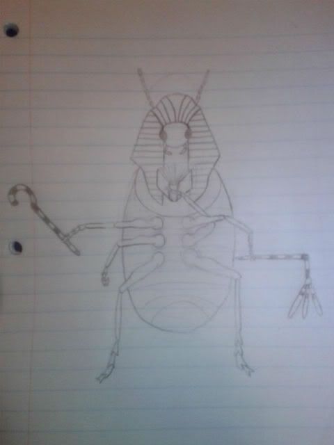
Don't get why my other post was taken down. THERE WAS A SERIOUS COMMENT ABOUT YILX'S ARTWORK!!! I said the scorpion's tail needed to be longer. Anyway, I don't think it looks like a Steel-type - I mean, the look is there, but the entire Egyptian thing would work for a Psychic. Besides, if Mummy wins the secondary ability poll, I'll vote for the scorpion.
KoA, I like what you've done with this! I've figured out what's wrong with the lower part of the body, though: you've got the look for head and thorax down, but I don't think you actually have a bug's abdomen. What if you made the whole tail thicker and a little bulgier? If you still want that pretty ball on the end of a thin tail, attach that to the bottom of the abdomen, but you have to have the abdomen to complete the look. I don't get the necklace.
KoA, I like what you've done with this! I've figured out what's wrong with the lower part of the body, though: you've got the look for head and thorax down, but I don't think you actually have a bug's abdomen. What if you made the whole tail thicker and a little bulgier? If you still want that pretty ball on the end of a thin tail, attach that to the bottom of the abdomen, but you have to have the abdomen to complete the look. I don't get the necklace.
Thanks for the feedback, CB! I liked your idea for green and yellow, so with that in mind I went and bought a pack of colored pencils from the store on campus and pieced together the first color draft for my CAP 4 proposal.RabidChipmunk I find this design particularly cute and do want to see it finished. I think a green/yellow colouration might look best, but tweak at your own decision. How I see it is that the little diamonds under its head are its hands, pulled up tight against itself. As such they could be a little higher up on the body.

I edited his wings somewhat so that way they look more like, you know, wings, I guess. They some much more "natural" now, if you can call it that. Didn't color them in because I'm still deciding on what color they should be. I'm thinking a light bluish-pinkish sort of deal for now. I'm contemplating reversing the colors of his cocoon (lighter colored diamonds and darker colored shell).
I can see why it looked like the diamonds on his side were his arms all tucked in, but alas, it's just a pattern on his cocoon. Hopefully this image clears that up a little bit now that we can see that his body and his cocoon are different colors, but just in case, I also happened to sketch up a few other designs (no color) that show him in other stances.
http://i550.photobucket.com/albums/ii432/Rabidaih/CAP4nococoon.png
This image is just a quick sketch of how I imagine him looking with no cocoon at all. I drew his antennae way too small, but whatev's.
http://i550.photobucket.com/albums/ii432/Rabidaih/CAP4angry.png
This is an image I drew of a female version (her antennae have heart-shaped tips instead of diamond-shaped ones) in a pose where she's leaning threateningly out of her cocoon. I honestly really like how she looks in this one, she's got so much attitude :3
Colors and refined the concept. I'm liking this. I agree, there was much wrong with the eye on top of his head so now it's part of his crest!


Here's a fully colored version of the bookworm design I've been working on:
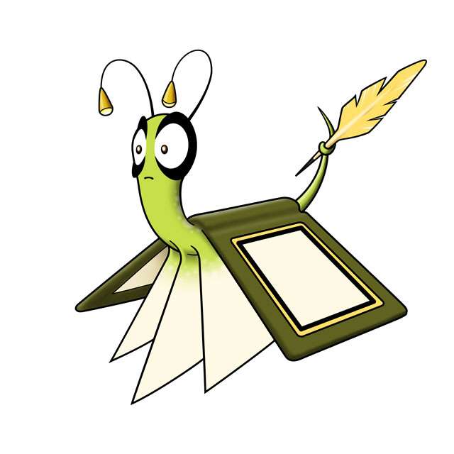
I tried out a lot of different color schemes, and I will probably upload and post them later, just so you can see everything I rejected. I tried many variations to include some pink, because that's the cliche color for Psychic typing. But I couldn't find anything that worked right for this. I'm loving the bug green as the main color.
The bookworm theme should be pretty obvious, but I tried to integrate the book elements to be more organic than they were in the sketch.
I envision this pokemon being discovered in game kinda like you discover Amoongus mistaking it for a pokeball, or like encountering Rotom when you interact with the TV set. In Pokemon, you come across all sorts of bookshelves and such -- well with this pokemon, when you are poking around a book shelf, I imagine the game giving some hint like, "One book looks like it is moving..." Then boom, "A CAP4 appeared!"
What seems to be pages of the book are actually prehensile appendages the bookworm uses to move, grab stuff, etc. Although it looks like it only has three "pages", they are actually multiple thin folds packed together, so if the pokemon decides to fan its "pages", it has hundreds if the need arises.
The pokemon is known to be exceptionally intelligent, and uses its golden quill (which is rumored to be plucked from the tail of Ho-oh) to make strange markings on its pages when it encounters interesting situations. The markings are very similar to the shapes of Unown found on various runes, which has led to speculation that this pokemon is somehow tied to Unown and the dimension they come from.
I don't know if I will incorporate this into the design or not, but I had an interesting idea that every bookworm could have a distinct symbol on its cover, based on its IV's or PID, using the exact same formula as Unown. Obviously we wouldn't code this into our sim for CAP, but it could be a fun flavor twist for this design and backstory. Here's an animation showing the cover symbols for A, B, C, and D. Although stylized to look like writing strokes, the symbol shapes should be familiar to any self-respecting pokenerd... ;-)

I'm having fun with this design so far. I hope you like it too.
Yes keep green.DougJustDoug said:I tried out a lot of different color schemes, and I will probably upload and post them later, just so you can see everything I rejected. I tried many variations to include some pink, because that's the cliche color for Psychic typing. But I couldn't find anything that worked right for this. I'm loving the bug green as the main color.
...yeah... not really buying this unfortunately. You really need to find a way to make the book look more page-ful for the design to work. It just looks very awkward to me.What seems to be pages of the book are actually prehensile appendages the bookworm uses to move, grab stuff, etc. Although it looks like it only has three "pages", they are actually multiple thin folds packed together, so if the pokemon decides to fan its "pages", it has hundreds if the need arises.
Love this. No reason we couldn't do this. Spinda/Unown inspired. Very nice.I don't know if I will incorporate this into the design or not, but I had an interesting idea that every bookworm could have a distinct symbol on its cover, based on its IV's or PID, using the exact same formula as Unown. Obviously we wouldn't code this into our sim for CAP, but it could be a fun flavor twist for this design and backstory. Here's an animation showing the cover symbols for A, B, C, and D. Although stylized to look like writing strokes, the symbol shapes should be familiar to any self-respecting pokenerd... ;-)
@Sentret
I like the design but i dont really see the bug in it. I dont know if a differnect color palette would change it maybe make it less human like? Not sure.
@Doug
I like this design also. I think if you make the bulbs a little bigger at the end of his antennae it would look cool. Its an interesting part of the design and i feel like it needs to be bigger.

YourFavoriteEgyptian
Banned deucer.
I believe I've fixed the size on the picture, really sorry about that. That was a technological error, not an intentional one.
- Status
- Not open for further replies.