CAP 14 CAP 3 - Art Submissions

Status
Not open for further replies.
Here are some of my ideas:

The pharao-snake, the smoking anteater and the deep seavent eel (based on eel city ^^).

I'll try to comment alot of the designs too:
funerallaugter: Radioactive llama XD love the idea. But I think you should redo the shape of the body so it looks more like a llama. I thought it was a cat with a very long nek ^^
Bluemon: I actually really like the second idea. But I think you should redesign it a bit so it fits the typing more.
Calad: I love this one! One of my favorites :) The only problem is that I can't really image how it looks when it stands up... I love the colors btw
Nov: Cute :) I don't really like the flames on the head though.
Mos: I always wanted to see a lavalamp-pokemon, but I never really have seen a good one. But this one, I just adore it :)
Mlarf: I really like the design. But I think it's facial expression doens't match it's dangerous-looking body
Koa: It looks horribly good. I feel like this could be a good WTF-pokemon (like stunfisk). It doens't look to strong though..
Lightylights: I love the concept. But the design looks too much like a flying type. I think you should make it like it is'nt able to fly because of the sludge.
Mari: Wow, that's really nice for your first artwork. I would love to see a drawing of the sideview of the pokemon
quarck: I adore the concept. I'm a sciencedude so it make it even more fun to read. I actually would really like to see it with some colors.

ps: bummer CAP3 isn't a steel/ice. There goes my titanic pokemon ^^
 
Calad, you have an interesting concept, but right now it reminds me a lot of Gurdurr. I guess it partly can't be helped, though. Anyway, I prefer the first colouring for this reason.
 
Here is my submission. I'm a bit late, but I'm hoping I get some feedback!


He is a poison type because of the pollution and I think some squids are venomous. He is a fire type because of his internal boilers, and the smokestacks. Dry Skin fits him because squids are aquatic, and boiler factories run on steam. I tried to incorporate some cool stuff into my design, like a face reminiscent of a gas mask, and his right arm spilling some toxic goop on the ground. Feedback is greatly appreciated, there are so many cool designs so far!

Some ideas I had related to improving him involved adding a Darth Vader stye grill mouth, and perhaps a minor recoloration to show the fire-typing more. Sorry for my semi-terrible art, I only had paint and a mousepad -.-. I'd also love to have any advice relating to the art, rather than the design itself.
 
I have two variations on the original (Rework is still on its way)
http://desmond.imageshack.us/Himg338/scaled.php?server=338&filename=tarbase1.jpg&res=landing
http://desmond.imageshack.us/Himg845/scaled.php?server=845&filename=tarbase2.jpg&res=landing
The difference basically being eye design.
(I need to work on my shading....)

After the confirmation of Dry Skin, I figured that the most probable way for this to be naturally correct is if that it's due to the pokemon's fire half that the tar keeps its liquid form and that it needs to burst out every now and then in order to catch prey and such. The hardening of the tar can be likened to that of magma, except that it's toxic and that the cracks in the tar absorb liquids while being in the sun would cause it to overheat and lose solidity.

I incorporated the idea of ghost lights through the yellow designs (which I will expand on) which, in the night, it intensifies the lower heated flames from those regions to lure lost creatures into its toxic bog.

It already seems more Fire/Poison though to me, although I guess it could use a mite more poison decal. Then again, Drapion is poison dark and neither bug nor steel at all.
 
LightlyLights, your design is getting better and better, I really like it, but I think you shouldn't leave the fire-thing on it's head, since it's gonna get hit by Water and like it.
Out of your two new designs, I like the one without the yellow thing around the eyes more. keep up the great work.
 

DougJustDoug

Knows the great enthusiasms
is a Site Content Manageris a Top Artistis a Programmeris a Forum Moderatoris a Top CAP Contributoris a Battle Simulator Admin Alumnusis a Smogon Discord Contributor Alumnusis a Top Tiering Contributor Alumnusis an Administrator Alumnus
Moderator
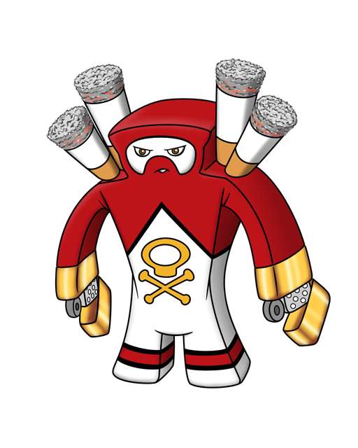
There has been an increase in Koffing and Weezing in Unova, and this Fire/Poison Pokémon is almost certainly to blame! My working title for this design is Smokémon...


I realize the theme is edgy, and I know Nintendo would likely never make something like this, but perhaps we could use this as a way to raise awareness of the evils of smoking and tobacco. By clearly indicating this is *poison*, I don't think I'm glorifying smoking as a habit.

The typing is right on the money, which is the main reason I like it. It's also a distinct departure from many of the designs posted so far, so perhaps originality counts for something.

As for the ability Dry Skin, it's not nearly as far fetched as you might think. If you know anything about tobacco or cigars -- you know that tobacco must be kept moist or it is ruined when it gets too dry. This pokemon's body is like a big humidor, which is a container for storing cigars and tobacco. Humidors have reserves of water and keeps the humidity inside at a constant level, ensuring the tobacco has the right moisture. So, this pokemon has an organic moisture regulation system, and it requires water to remain healthy and not "dry out". Ergo - Dry Skin! Hey, it works for me...

The visual inspirations are pretty clear, so I won't go into that here. I will point out that the squarish shaped body was not solely intended to look like a pack of cigarettes -- I also wanted it to evoke the imagery of a hazmat suit, and I reffed some hazmat suits when making this. The lighters are a bit more literal than I prefer for pokemon designs, but all the abstractions I tried just didn't convey the concept properly. The lighters can launch flame attacks obviously, but can be closed for punching, and could even be used as "pincers" too. Poisonous acid attacks can be performed by spraying "lighter fluid" on the enemy. And, of course, this pokemon damn well should get Spark and some other electrical moves! The smokestacks on its shoulders can launch cannon-like moves and smoke-based attacks.

I leveraged the skull and bones symbol from Koffing and Weezing because I want a clear connection to those pokemon. Smoking, coughing, and wheezing just go together too well to ignore! And I've always liked the few pokemon that have "shared" elements like Mantine/Remoraid or the Shellder/Slowbro/Slowking lines.

I'm not sure this is the design concept I will take to final submission. But I had to finish this one out a bit, just to get it off my mind so I can focus on other ideas. At the very least I chuckle when I see this design, so I hope you like it too!
 

Stellar

of the Distant Past
is a Site Content Manager Alumnusis a Battle Simulator Admin Alumnusis a Top Social Media Contributor Alumnusis a Community Contributor Alumnusis a Smogon Discord Contributor Alumnusis a Researcher Alumnusis a CAP Contributor Alumnusis a Top Contributor Alumnusis an Administrator Alumnusis a Past SPL Champion
While I value the creativity in your design Doug, I don't think I can get past the fact that you would never see that design in a Pokemon game.
 
I don't think I'm glorifying smoking as a habit.
I'm just saying smoking gives you awesome blinged out flamethrower hands. A.K.A. GLORY

but jokes aside I think this is a very interesting design, It won't get my final vote but I'll support it through the first few polls. Very nice balance of detail and not being overcomplicated.

While I value the creativity in your design Doug, I don't think I can get past the fact that you would never see that design in a Pokemon game.
These aren't going into a pokemon game though I see your point. Honestly I think it DOES look significantly more "pokemon" than a lot of the other entries. Difference being is this would be for a mature/farce pokemon game but stylistically it's not far off.
 
There has been an increase in Koffing and Weezing in Unova, and this Fire/Poison Pokémon is almost certainly to blame! My working title for this design is Smokémon..
Oh my god I cracked up at this. I don't know if this should go all the way but I'm definitely going to support it for several polls.
 
I like dougs I really like it, although it has an issue with being somthing that GF would never make. I really like mos's snail mon too
 
If anything, DJD, the design is almost too literal, though I'm glad to see designs getting away from snakes and lizards. As a firefighter I can tell you that thick, oily, smothering black smoke is definitely toxic and just as dangerous as the flame itself. But this seems intentionally controversial. The poke doesn't seem so much about the dangers of smoke as the dangers of a smoking habit, and I wonder about the typing. Your wording itself seems to reinforce an unyielding disney-esque view on the matter (the "evils" of smoking, rather than the "danger" or "risks" of smoking.) I seem to recall a similar should-we-should-we-not controversy during the design and flavor phases of Pyroak regarding marijuana.

* Getting away from the politics of the subject matter, I like what you've done with the design re-cigarette pack + Hazmat suit. That's very interesting, but the hazmat part wasn't obvious to me until I read your description. A larger "faceplate" or some kind of airfilter might make that stand out a little more.
*My biology teacher taught me a phrase used in the study of evolution, "Nature favors asymmetry." I've found this to also sometimes be true in art. Consider a single lighter arm, paired with a fingered arm. It makes more dynamic poses possible, and he can strike his own lighter rather than having the mechanism activate itself.
*The cigarettes on the shoulder are super offputting. I like the idea of smokestacks of some kind. But not only are the cigarettes kinda heavy-handed imagery, they make me cautious of the typing. Cigarette smoke is (mildly) poisonous, but cigarettes themselves are mostly plantmatter, and would probably be better suited to a grassmon.
 

thornchild

Guest


Alright a quick post of lantern jelly In color! I'll be back later to make some commentary of my favorites so far. :D
 
I really like Lord of the Fireflies idea with all of the lore behind it too. Apart from that one, all of the frog ideas are cool too. Can't wait to see what this mon ends up looking like!
 

Deck Knight

Blast Off At The Speed Of Light! That's Right!
is a Forum Moderator Alumnusis a Top CAP Contributor Alumnusis a Top Smogon Media Contributor Alumnus
Doug's design is pretty epic, though I do agree the cigarette butts are a little too much. I think smokestacks would help convey the same idea while keeping with a lot of the flavor that makes it look like a pack of cigarettes with a lighter, etc. It might even be just as simple as making the base of the butts silver and removing the filling or something, I dunno, it's your call.
 
I don't think the butts are overkill at all. If anything, I would get rid of the lighter arms, which seem like a bit much, and replace them with lit cigarettes (or cigarettes with a little glow at the end). So far some personal favorites are the cigarette mon (idgaf if gf would ever make it, we're not gf), Mos-Quixote's lava lamp, bluemon's velociraptor, soIheardyoulikeSENTRET's silo, meddle's cauldron, Yilx's golem, and Calad's yellow fever mon.

EDIT: also, why do people care if gamefreak would ever make a mon like that? We're not gamefreak. If enough people like it, we should choose it.
 

Bughouse

Like ships in the night, you're passing me by
is a Site Content Manageris a Forum Moderator Alumnusis a CAP Contributor Alumnusis a Tiering Contributor Alumnusis a Contributor Alumnus
Agreeing with pretty much everything said about it, Doug. Huge fan of your art and it's really slick like your designs always are. Props for originality...

but no. If you are honestly trying to win, it'd be best to leave that thing by the wayside. It's just like an oil-spill mon for Water/Poison. It's just not something that would EVER be done by GF and that's just not going to cut it in a poll with many good options.
 
question

A lot of art submissions seem to plan on us choosing the ability Dry Skin, which confuses me. Why would we want to use a Fire type during Rain, which neuters its STAB, while also making sure the CAP can't effectively be used on a Sun team? I realize the 25% health gain from Water types would be useful, but still.
 
A lot of art submissions seem to plan on us choosing the ability Dry Skin, which confuses me. Why would we want to use a Fire type during Rain, which neuters its STAB, while also making sure the CAP can't effectively be used on a Sun team? I realize the 25% health gain from Water types would be useful, but still.
Well we have already chosen to use Dry Skin in this poll thread here. http://www.smogon.com/forums/showthread.php?t=3466099

Sorry
 
So thornchild's entry doesn't get buried by discussion about Doug's:

It's quite nice! It's one of the cuter 'mons we've had so far. I like how eerie the tentacles look, and those eyes are piercing.

It might be the color scheme, but it reminds me of Lampent or Chandelure.
 

Quanyails

On sabbatical!
is a Top Artist Alumnusis a Community Leader Alumnusis a Community Contributor Alumnus
Supplementary art: oil snake pixel scenes and updated doodles.


http://img688.imageshack.us/img688/7441/moccasingesupplementary.png

Colored the two-panel thingymabob from my second set of sketches, thanks to some encouragement and four free hours. And joining the supplementary art war of certain other artists. :P

I suppose I'm pretty happy with the results, seeing as I manually pixeled every color. From the second set of sketches, I added a Glare/Intimidate doodle toward a Dugtrio, a Coiling oil snake, and some scribbly Wild Charge. Hopefully, the image doesn't resize like last time. o_O

Comments:
  • Eszett: I do think you should improve art as a subject; your design is rather hard to decipher. :/ Even then, your new design is rather complex for spriting. That'll need to be simplified.
  • Uberksetchy: I like it! You made that hazard sign look really natural on the frog, and the design works really well.
  • Stagnant: Looks interesting, but you'll have to develop it more. Can't say much about sketches other than that the current art style's a bit complex. Simplify when you continue!
  • KoA: Good entry. :) Yes, you've made that liquid quite clear and separate now.
  • Furosuto: Satisfied with the design. Not much to say unless you'd like suggestions on what to modify with it.
  • McAwesome: I do think the head should be more than just that symbol on the side of the can; if the skull could be more prominent and bulgier, that'd make it more livid.
  • meddle: Yay! You've got a nice, updated design, which I think can totally work. Just remember to make the background white again when you finalize your submission!
  • trulyElse: The design is adequate, though it's rather drab. A few more dribs and drabs should make the design more notable.
  • LightlyLights: Very unique idea, I must say. However, the design is a bird stuck in some muck. The rippled eyes are rather 'eeh', and the coloring is rather 'meh'. Maybe a patterned stomach or more vibrant plume would do.
  • Chomz: I like the left and right ones. :P I'd like to see a progression of design after your doodles, especially how you incorporate the Fire/Poison aspects into it.
  • Josia Richter: Which side is up on that design? O_o I can't really tell. In fact, I can't really tell what all those squiggles are. Could you define those shapes a little more so I can determine that design better?
  • Fatecrashers: I'd go with the right design; it's kinda alien-like and squid-ish. I can see the design turning into something with those people who balance things on their head, if that's not too much a stereotype. The stretched-out eyes unnerve me, on another note. Maybe you can use that intentionally.
  • Cretacerus: I like the swimming sketches in the supplementary art; it's quite adorable, I must say! I was thinking that the round design on the tail acted like a false head (if you mentioned that, sorry, I didn't remember). Maybe an idea for a sketch there. :P
  • Azul: Looks good to me! Go with the purple coloring.
  • LouisCyphre: Aw, you and your Dry Skin fish. D: I do feel bad for that. But otherwise, it's a change from the rest of the designs in that it's completely a fish which shows Fire/Poison typing well. I do feel the supplementary art's a bit... eh, it's confusing at first glance. :/ The paling Gastrodon is lovely, though.
  • Asylum_Rhapsody: Mustached cuttlefish. XD It's simple and cool, that's what I'll say.
  • SubwayJ: It's a bad apple/crab apple. :P I was thinking purple bruises/spots on it to show more of the Poison typing. And have the fire be lit on the top of the stem like a bomb fuse.
  • chuckeroo777: Monstrous. The entire design would benefit from lightened colors and a general bettering of style.
  • bugmaniacbob: Perhaps I should skip you. :P
  • Lord of the Fireflies: I wonder about the size of those ears. Intentional size distortion or just the perspective? Otherwise, you'll need some physical additions to the design to make it more of a Fire/Poison type, rather than rely in description alone.
  • DarkShiftry: What are those tendrils floating off the top--smoke? The design is pretty simple, so some patterns should make it more interesting for voters. :P
  • Quark: I'll really have to see the image larger, sharper, and maybe colored to get a good sense of it. My current sense is 'okay'.
  • MLaRF: Is it just me, or do the patterns near the eyes remind me of a luchadore? Ah, well. Cool and stylized, the design is.
  • Doran Dragon: I think the lavender and pink on your design can be merged to a single color, like you've done for the green on the spikes on the shoulders and tail-head. Also, you'll have to draw the entire chimera--the design can't be cut off by the canvas size!
  • Mari: Reminds me of the leaf-tailed gecko, which'll make it seem Grass-type-like. The flower exemplifies it further. :/
  • Steampowered: The head is a bit confusing. Is that red bottom the mouth? And it's turned its head? The colors and body shape remind me of Salamence, and those white things remind me of clouds more than smoke.
  • Mos-Quitoxe: You and your supporting art. ;D Wonderful.
  • nov: I shall wait until your next post, since you've made something which was deleted.
  • Energy Storm: Cockatrice, eh? We've got chimeras, manticores, and now cockatrices. It's a mythological zoo! Anyway, if it bursts into flames, what about--even though another individual had already done it--making it a phoenix as well?
  • Calad: Dry Skin--heh, that sorta fits, though something like Water Absorb would be a bit more thematic. Either way, again--unique idea, great execution, except maybe that thermometer-tail. I mean, I'm okay with it, though others aren't.
  • ikasu: The fangs on the mouth of your design don't really fit for a jellyfish. A simple line or puckered lips can do. Also, are the eyes on the rim of the thingymabob? How does the dark-purple part relate to the light-purple plate?
  • bluemon: The dinosaur looks good to me. I don't even mind the flame-like ridge and details. :P If you can make the crab look good (maybe without the googly eyes on the end), go ahead. I'm wondering how you'd make that look poison-ish, though.
  • funerallaughter: Reminds me of the Solosis line in idea. If you'd want to keep the smoke tail, add some orifice to emit that smoke. It's got some odd charm to it.
  • noobiess: Daw, snakes. (There's mine... :P) Okay, another cobra. How does it stand out in terms of design? Contours and stripes bring its origins in Egypt, but what about it? The fire anteater's been done in Heatmor, unfortunately, so I don't think that'll proceed. Then there's the eel. The volcanic pipes and jagged fins look very nice--those puffed cheeks can work for billowing fire or poisonous gas. Out of your three ideas, I'd go with the eel.
  • Leethoof: Just make sure not to make it look too Steel-type-like. The blue is good to off-put that, but maybe it detracts from Fire and Poison as well.
  • DougJustDoug: This was briefly discussed on IRC. I think I can say that it's interesting and well-designed, but won't work for CAP. :P
  • thornchild: Lovely. :) I love how you've made this pokemon, and I worry that its color scheme is too ghostly. Could you maybe make the bluish tentacles and eyes more red-inclined? The tentacles would still be purple, but a red-purple for Fire-type, rather than something ghostly or watery.


Supporting Material:
Idle stance

Flamethrower

Dry skin/Water Absorb - I have to explain this. Basically, the mane, which is made of toxic substances, absorbs water, which it can store and use it to use scald, or use it to spread poisons around via a mist such as haze or smokescreen. It also helps keep CaPmon 3 from growing too hot due to the thick toxic fur and red dry scales.


This is pretty much gonna be my final pose. I can add Ram horns if that would make it more interesting.

@Quan: I see what you're saying, and i did change it a bit, but i felt if i had it the same color as the mane, it would look too dark compared to the red of the snake.
 

So this is salamandermon v 1.1, as seen here he is upright (see the previous page for the crouching one), I was given the suggestion to remove the purple smoke "v"s, however I think that by removing them it would look far too plain and would lose the poison feel to it.

Edit: people seem ot be confused by the smoke v, i wanted to clarify that i think that they are a solid like smoke thing

other than that I've got nothing, oh yeah, i wanted to see if i could do a style similar to Nastyjungle, so that's why i did all the little highlight spots and such, if i offended anyone by doing that then i apologize and i will remove them.

I would also like some feed back please
 
currently steam, your poison smoke doesnt all flow the same way, the way it would if there was any sort of wind, and even if there wasnt, the smoke would billow upwards. otherwise a solid design id say :)
 
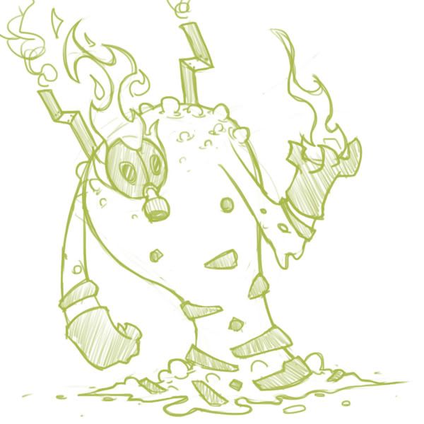
Ok everybody, here's an update! Just a sketch, but hopefully it conveys enough of the updated design! Thank you guys fso much for the feedback! I fixed the things I totally agreed with and will hopefully fix even more soon enough!


Notable changes:
More gasmasky-y gasmask
Action pose (thank goodness)
simplified glove like things
exhaust pipes/smokestacks (kinda on the fence about these)
and finally, de-emphasized steel typing with less of a barrel base!

Hope you enjoy! C&C always welcome! Happy CAPing!
 
Status
Not open for further replies.

Users Who Are Viewing This Thread (Users: 1, Guests: 0)

Top