CAP 16 CAP 5 - Art Submissions

Status
Not open for further replies.
Welp I guess I should finally post my updated cauliram design, ha. Hopefully it conveys that it's half ram, half cauliflower a bit better now! Obviously playing off the whole vegetable lamb thing. The idea is meant to be that it was once a food source for humans, but was overexploited by them and has now taken to land and gone grimmdarque in order to get revenge by eating the humans who overfed on it. :E


Brambane

protect the wetlands
is a Contributor Alumnus
I finally did that legged version requested of me on like page 1 lol


He has ASCENDED to primeval serpent status.
 

dwarfstar

mindless philosopher
The toad, definitely. Finalize the toad. The potato, while sort of amusing, doesn't fit well with Harvest (or with the concept in general, but maybe that's just me).
 
I've updated my first post as my final submission.

The final art is as follows:


I decided to redraw his leaf appendages larger and more scoop-like in appearance, making his use of such competitive moves as Fling, Gunk Shot, and Barrage more plausible. Because he didn't have tiny little t-rex leaves anymore I thought I'd make his feet stumpier and lose the whole chickenly sub-theme altogether.

I think your potato has potential, OldMan, but it could develop more appeal, and the toad is already ahead of it in terms of personality.

Legs are cool and all, but I miss old snake-y :pirate:
 
Cartoons!, shouldn't final submissions be on a white background? Love it!
Eol, yours is my favorite, do not change a thing.
And noobiess, your new design looks very promising. Can't wait to see it colored.
 
Even though I love my voodoo lily pokemon, I realized it wasn't something for CAP (since Necturna is too similar) and the stats and ability are just not matching. I felt like I had to force my design to fit description of CAP5 so I decided to make another design.


So I present:
The wolf pokemon
http://www.iaza.com/work/130309C/iaza11730193079300.png
Maybe this one needs a little explanation... This pokemon disguises itself as a bush to attract it's pray. When they are close, it attacks.
So for example: An innocent mareep in standing in the meadow and suddenly sees this bush with delicious berries. It tries to eat one and then... Wam... LAMBUSHED!

I hope I have some time to work on the design because I really like the concept. Maybe I should add a tail or something... Here are some other sketches of the design.

Here are some comments:
Calad: I love the design and the colors. The only thing that bothers me a bit are the light green things on its head. I feel that they could be integrated better into the design.
Chomz: I like the colors but I think the inner color (the green) should be lighter and paler. I think the fresh green draws too much attention to that part of the design.
Harle: Maybe you should change the type of leaves. I think a grape leave would fit really nice with the vines of the body.
the flexistentialist: I’m loving the design more and more. I only find the feet a bit weird because it doesn’t look mobile at al.
I quite like this one, actually. It looks a literal take on the metaphor "A wolf in sheep's clothing"
 
So feedback of all designs so far in the thread, in alphabetical order. (Thank the lord for Quanyails' page 1 post). If I haven't commented on your design, then that means that you should start over again (at least I think you should). Also, I apologise as it is pretty evident I tapered off towards the end of my critique. Writing so much is difficult when there are a lot of submissions.

Adams: Hmm.. to be honest, I'm not really sure what your design is. It seems a mish-mash of mildly grass related objects. The grey colouring indicates a steel typing rather than dark, and the overall colour scheme doesn't work; perhaps opting for a green/black/dark green would be more suitable. The hands are.. odd to say the least. It seems like they're protruding from the head? I'd scrap the hands altogether and think of something a little more viable. I'm assuming it has a hat, although it isn't very obvious from the detail you've put into your design. It's quite large and looks floating rather than perched on top of the head, but it is a nice idea. What are the brown things hanging down from the body and the hat? Roots? Twigs? Either way, I'd get rid of them.
Agile Turtle: I like the idea of a mischievous squirrel/chipmunk (Although we do have Patrat). The pinecone tail looks good, but we already have a pinecone in Pineco. It's hard to add any more comments, since your design is so far a rough sketch.
Antarctros: I like the overall concept. I also love the idea of using the petals as fingers, it's very clever. My problem with this design lies in two areas. First of all, there's too much going on. You've got a collection of colours, which whilst aesthetically pleasing, makes the design look clustered. Also, there would be difficulty in spriting with all the colours; iirc there's a 15 colour limit. Secondly, it doesn't really convey a dark typing. I can see grass, but if I had to take a guess, it would be fighting type.
Aragornbird: I've already commented on yours earlier, but just to reinstate: go with the Tiki Monster (it also fits the stats somewhat perfectly if we o end up with going for a slowmon).
Athel: The design on the right reminds me of a torch :) The design on the left looks a little eccentric, but would fit the typing more. I'm not really a fan of either though, keep thinking and you'll eventually think of a concept or design you like.
Birkal: It's hardly the most inventive design, but it is one which I strangely love. Your colour scheme is great at the moment, but this isn't really a standout design. Still, cornmon is one of my favourite submissions so far.
BlueConcept: Somebody earlier on in the thread pointed out that it looks a little like Abomasnow, and that is pretty true. I think it's the frilled arms, which don't really work. Are they pineapples? It isn't really clear from the sketch. Other than that though, it's a nice idea, and has a lot of potential.
Blue Frog: I'm not sure what to say really. I'd think of something else to be honest; it looks rather sinister, which is usually good for a dark typing, but the placement of the mouth, the plant... thing, it seems poorly designed and doesn't work.
Buffalo_Wings: Thank you, SOMEBODY decided to draw an auberginemon. I was worried for a moment. It's a rather simple design, maybe too simple for a CAPmon? A design which the community generally goes for has a lot of detail, yet is quite simple. Your design is basically an aubergine with a face, arms and legs. It's lacking any imagination whatsoever. If you want to make it look more aubergine like in colour, than darken the purple until it's almost black. This would help bring out the dark typing as well, since it's not apparent at the moment. Good God I've written a lot for a submission like this :/
Bummer: Whilst having a leaf ninja is a nice concept, I'm afraid just replacing some of the stuff it wears with leaves, and colouring it all in green/turquoise isn't going to cut it (must..resist..the beautiful...art style). Take the robes for example: they're ordinary robes, but are coloured turquoise to show the grass typing... there should be a little more imagination than that. And despite your best efforts of colouring it, there's not enough different types of colour; it's all green. It needs something, maybe a contrasting colour, to improve the design drastically.
Calad: It looks very Christmas-esque, which doesn't really fit with the intended dark typing. Also, the fact that it is standing on its hind legs makes the design look quite awkward. I'm not a fan of it, but I know people who are. One positive about it is that it conveys both the grass and the dark typing very well.
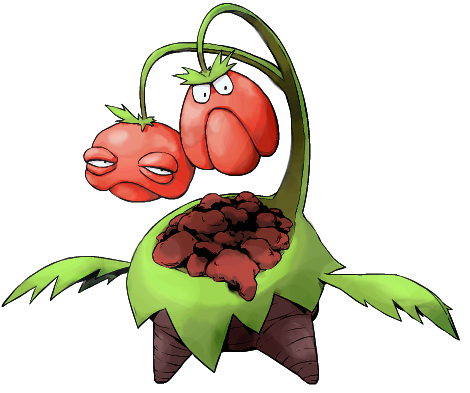
Cartoons: I preferred your first version, although that may be because of the more sketchy style. To be honest, I can't help thinking that the bottom area looks like a body with a severed head, and that all the innards are showing. The longer leaf arms almost look like wings, but maybe that's just me. Also, I'm not sure if the heads are meant to be cherries or not? If so, we already have a sun-based cherry in Cherubi and Cherrim.
Cheeno: A mushroom warrior is a nice concept, so kudos to you. I'm sceptical on whether this design is going to convey a dark typing though; it looks like a saviour rather than a villain. I'm uncertain on what the thing on its chest is; it looks misplaced and doesn't fit in with the rest of the design. I want to see the colouring before I can make any more comments on it.
Chomz: I love this fella. The colour scheme is spot-on, and the vine tail is a clever idea. One thing which bugs me is the fact that it looks like it's wearing a v-neck. It makes the design look slightly awkward. Right now, it needs some working on, but it is amongst my favourites.
Collol: How is it a cornmon if it doesn't have a cornface :( I like the idea, although it's hardly unique. A mental patient would be more suitable for a Ghost or Psychic type imo. It is a very sinister design though, and is certainly not a bad submission by any means.
CommanderZorvox: I like it! It's quite plain for a CAPmon though, where most people tend to opt for more extravagant submissions. Also, the only real indication you have of a Grass/Dark typing is the colour scheme, which is something I wouldn't base my typing on. You need to bring out the typings, grass more so.
CyzirVisheen: Not a fan. The berry bush looks quite contrived (unless it's a bunch of grapes?) and the flimsy tentacle-like arms and legs seem out of place with the rest of the design. I'm not really sure what it's holding either; I'll have a better judgement once the sketch is cleaned up a little.
Doran Dragon: Oe of my favourites. The dark typing is subtle, yet still apparent, and the concept itself is very imaginative. I would quite like it if there was more greenery at the lower end of your design, since the areas the plants are in makes the submission look a little unbalanced. That's just a nitpick though, it's a very good design overall.
DougJustDoug: I liked your withered plant colour scheme you showed in #cap earlier. There's a few things I dislike about this design so far though. It has a close resemblance to Ferrothorn, no doubt due to the green vines and circular head. The hands look squashed, although that's just a minor issue. There is, of course, the problem with the colour scheme, and finally, it looks a little too sinister and overwhelming.
Dracoyoshi8: My favourite submission so far. The colour scheme along with the well-placed leaves convey the typing perfectly, but there are a few problems that I have with it. First of all, the sheer size of it would mean it would be difficult to sprite, unless the sprite was large. Not to mention the tiny orange dotted pattern, which would be very hard to pick up as a sprite. Next, this pokemon might not fit the stats. It looks fast, and the consensus is that this pokemon should be slow (although there is a possibility of the community choosing fast instead).One way of getting round this would be to lose the legs (again), as slithering is slow. I think the fastest snake is the Black Mamba? Ahem.. moving on. Lastly, I think with your latest submission you may have lost the cleverness of the Eden concept. The fig leaves and lighter colour scheme especially conveyed that on your earlier design, whilst here it is lacking.
elcheeso: It looks rather sheepish (please don't baaaaan me from #smeargle for saying that). Anyway, I love it. It seems like you've finally solved the problem of the cauliflower wool, so the only thing left which needs sorting out is the legs. I can't really explain what I don't like about them; they just look stick-like and awkward. Also, I have mental images of your mon chewing on its own belly grass. Just sayin'.
Eol: Design wise, it is my favourite submission by far. I'm a huge fan of the concept, and it looks beautiful. There's just one problem with it: it's covered in moss. Moss tends to thrive in dark, damp places, something which doesn't really go well with it being on the intended sun team.
Furosuto: I need the sketch to be coloured and more refined before I can make any specific judgements, although I will say that the head area looks way too much like Houndoom.
Golurkyourself: It's...different to say the least. This goes against the community's general viewpoint, but it's too unusual for my liking. I agree with the shoulders needing work, but the overall shape and structure of the design is very odd.
Green Dweeb: See my previous comments on yours :)
Gun6: So it's a swamp monster with wooden armour? Seems a little uninventive, and besides, we already have a wooden-armoured CAPmon in Pyroak. Also, the sickly-green colour isn't very pleasing for the eye :/
HappyJames: Looks too much like another Grass/Dark pokemon, Nuzleaf.
Harle: I prefer the colour scheme on the right; it showcases the dark typing more without keeping to the generic grass colour scheme. Overall though, I'm afraid it looks too humanoid. I'm also unsure on what the body actually is. Is it roots? Leaves?
Juicy Fruit: There's a slight colour clash going on here; I don't think the blue/yellow/green/dark green colour scheme works, perhaps opting for less colours? Is the branch the orangutan's staff? If so, it looks like the orangutan should topple over, but that's just a minor nitpick. It's not really clear that this mon is Dark type, although I do feel that you can get away with that.
Kadew: Evil sloths are evil. It has potential, and will most likely fit the stats very well. It does look quite plain though, and detail does need to be added (I know it's just a preliminary sketch though).
Koa: It's just not working. It looks much too overwhelming and detailed to ever be sprited, and the muscular, human like structure makes it seem fighting type rather than the intended dark type. I think it's the human objects as well which puts me off; the sandals and trousers (pants).
Magistrum: Despite what others think, I think it looks beautiful, no doubt the art style and quality contributing to my viewpoint. It gets across the Grass and Dark typing well, without being (too) contrived. I'm quite puzzled by the actual inside of the armour though; whilst I don't think it looks sinister or anything like that, the fingers and arms are ogre like, yet the insides are almost... empty? How does that work?
mcFlareon: Ugh I'm not ready for another feminine CAP grass pokemon. (Granted, I wasn't here for Necturna, but that's besides the point). What you have designed is a clever concept where it looks Grass/Psychic more than Grass/Dark. I can't help feeling that just colouring the body black is a cheap way of making a pokemon a certain typing; it needs more depth than that. Also, I'm quite puzzled by the head tail thing.. it looks very strange.
Menshay: See my previous comments on yours earlier :)
Mos-Quitoxe: Already commented on yours. Post more supporting art!
noobiess: I like the oxymoron of having a wolf look like a sheep. I know that's not the intended effect though, and won't be apparent when it's actually coloured, since it's meant to be a bush. I like the idea..we already have a dark type wolf pokemon (Mightyena), although I think your mon is different enough from Mightyena for that to be acceptable.
nov: Very sinister. I don't really like it though, there's too much wrong with it. First of all, it doesn't really convey a dark typing. The gems as the eyes, and on the tail leads me to believe that it's a psychic typing, and the serpentine body means it could be dragon also. If you're gonna have a serpentine body, you need to justify why it does. DY8's snake is justified in that sense because it is cleverly designed to refer to Genesis. Also, wooden hands area a big no-no for me; it makes absolutely no sense to bend something freely that is wooden.
OldManDugan: Go with the frog.
Orivexes: I've already commented on yours, and the same feedback applies. Colouring something green just to make it look like a grass type does not/shouldn't work. Also, where is the dark typing? It looks like a cuddly teddy bear, and more Grass/Normal.
paintseagull: It is executed well enough, but it just seems underwhelming amongst some of the other designs. Also, see my moss argument I gave for Eol (although I've already told you).
Quanyails:
Rocket Grunt: Very sinister! I like it a lot though, it's a shame it has gone unnoticed in this thread. Whilst it is verging on the lines of being too humanoid, I'll allow it, seeing as there are enough features to think otherwise. I especially like the inclusion of the grassy dress. There's not much more to say really.
Shanimanim: Agreeing with others, that snake looks phallic. I'd rather you resort to your previous design since that had something going for it (I personally didn't like it, it seemed too contrived, but I know a lot of people did).
ShyGuy1221: I loved your previous design but I love this one even moreso. It will be interesting to see how you convey the dark typing, since it seems to be somewhat lacking, but the overall concept is very good. I'm especially fond of the tail, and the mushroom head.
Steampowered: The problem lies in the fact that it's a grass-type Dewott. I don't really see how this mon is a dark type either; it looks to me like a Grass/Normal. I'm unsure on why there are rocks on the back; it seems needless and there are much better alternatives.
the flexistentialist: I like it. It differentiates itself from the rest of the submissions and keeps to its own unique spot. The grass and dark typing don't seem forced at all, which is always good, but there is one problem; spriting. Due to the size and detail which has gone into your design, it would be very hard to sprite. Other than that, it may be a little too overwhelming.
Trollpriest: I can't help thinking that this is just a reference to racism and Asian discrimination.. That is all.
Wyverii: A lot of people seem to like it, but I do feel that it is a little too uncanny. The exceedingly long arms and neck put me off, alongside the goofy grin which I don't feel is right for the pokemon.
XDaylon: As I said to nov, wooden arms and hands don't work for me. It seems impossible to move your fingers or anything like that if they're wooden. It also seems all too plain, with only two colours; there needs to be something else to make the design more vibrant and more unique. The dark typing also needs to be evident as well, it looks like a Grass/FIghting type at the moment. Perhaps that can coincide with the colouring? I don't know, it just needs something.
Yilx: The priliminary sketch had me excited. I loved the idea of another pineapplemon to reside with Ludicolo, and dreamed about all the raving nightclubs they'd go to. Anyways, there needs to be a lot of improvements with your mon. First of all, I don't like the fact that it's wearing clothes. It seems like a very human thing, and so I'd replace that with something else. Pokemon such as Gothitelle get away with it because that's what their concept is based on (goth -> goth clothes). Your design is just a pineapple wearing clothes. I do feel that the dark typing isn't very clear, and could be more apparent. At the moment, it looks like a grass/fighting type, which is near-unavoidable with fists like those. Ugh you seem to humanise everything you draw... anyway, the reason I'm saying this much is because I REALLY WANT A PINEAPPLEMON.
ZirraNova: I like it a lot actually. The concept isn't very unique, but it's executed well and does convey both typings. My problem once again lies in the fact that it's too simple.

One thing I do want to point out about all the submissions in general is that whilst the quality has been consistently good, there hasn't been a stand-out winner like all the other CAPs I've participated in. Somebody needs to submit a design which will blow all the others out of the water.
 
@elcheeso:

If I'm not mistaken, you mentioned grimdark?

The design is amazing, I really like it. The only issue I see with it is that it doesn't look all that much like a cauliflower, more like a half-sheared sheep.
 

Cretacerus

Survivor
is a Top Artist Alumnusis a Forum Moderator Alumnusis a Contributor Alumnusis a Top Smogon Media Contributor Alumnus
Reactions Contest Winner
I really like the way you implemented the legs on the eden snake, and the head looks more devilish, too. It even has a horn to use the likely Horn Leech flavourwise!
The downside is, that the new version lost a lot of the personality of the original design, especially the evil and sneering expression.
What makes your concept so great is the clever idea behind it, and a complex and busy design just tends to distract from it, so you have to be careful when taking this route.
 
I finally did that legged version requested of me on like page 1 lol

http://i.imgur.com/gDrStpB.png

He has ASCENDED to primeval serpent status.
This one just doesn't do it for me...I think most people think of snakes when they think of the Garden of Eden. I'd recommend sticking with the legless design, which really exemplifies what you're going for. As stated before, the legless design has a lot going for it in terms of actually looking evil, rather than implying it.
 
Haven't been around much lately due to school crap and music, so I'm not putting much input into the nuts and bolts of CAP 5, but I think I've seen enough to get involved in the art process if nothing else.

Anyway, some comments. All these comments are based on the current images posted on Quanyails' post so forgive me if my comments are obsolete. I haven't read or seen any background info on the designs, so my comments are completely from an outsider's point of view.
@Calad: Love the design. The color scheme is a little bright for a Dark-type pokemon, in my opinion, but the facial expression more than makes up for that. Awesome job.
@Cartoons!: This one's one of my favorite designs so far. Perfect interpretation of a Grass/Dark Harvester. There's really not much I could say that would improve upon this. The twin berries idea is priceless.
@Chomz: Another one of my favorites. My only problem with it is that it doesn't feel like a fully-evolved Pokemon. Then again, this one kind of reminds me of Weavile, who is fully evolved, so I guess it's not a problem. Tomohawk and Mollux don't exactly look like fully-evolved Pokemon, either.
@Collol: This one's just kind of creepy... I don't much feel the Harvest on this one. Would go perfectly with Birkal's 55 Base Speed stat spread if it wins, though.
@Doran Dragon: I don't know, maybe I'm just a rammish type of person, but I really like this one, too. Looks like it could wield some pretty strong Fighting-type moves. The horns could be a little more elaborate, in my opinion. Maybe more curled. I can certainly see 114 Base Speed on this thing.
@DougJustDoug: Power Whip, anyone? I'm not overly fond of the humanoid design, but very well executed. I don't see much of the Harvest in the design, though.
@Dracoyoshi: Hmm... another grass snake? I like the ferocity, but I could do with the leaves on the face. They just look kind of goofy to me. I could use more spikes and leaves along the body--to resemble reptilian scales. The appletail idea is money, as is giving it gender differences.
@Eol: Another really nice design, but it looks too much like a Ghost-type, rather than a Dark-type. One way that I think you can get the Harvest theme through--I can't see it much on this one--is to maybe turn the leaf thing on the tip of the hat into a like berry or something. Apart from looking a little too ghost-like, this one's a great design. Very well executed.
Golurkyourself: This one made me chuckle. I think it's supposed to be a chicken? I'm not too sure what it is, but it gets the Grass/Dark typing across very well. The onions give the Harvest feel, so that's good. The only thing I don't understand is the seemingly random hole in the middle of the body. Those short, stubby arms look hilarious.
@Harle: Oh, cool. A humanoid Pokemon I'm really enjoying looking at. Grass/Dark is perfectly interpreted. Awesome color schemes. I like that the gender is ambiguous. That's usually my biggest problem with humanoid Pokemon. It's a little weird thinking of a female Machamp or Conkeldurr, or a male Gothitelle, so ambiguous gender on humanoid Pokemon is the best, in my opinion. Awesome, awesome, awesome. Love the hat, too.
@KoA: Dammit, KoA. Didn't you win the last Art Poll, too? Another great design on your part. Kind of reminds me of Hellboy. Love the woody-looking colors for the body and the vases on its back giving the Harvest theme across. Big, and bulky, too, like the three remaining stat spreads suggest (although I can't really see this thing having 114 Base Speed.)
@Magistrum: This is an amazing piece of work you have there. Grass/Dark gets through just fine (although it teeters on the edge of going Ghost-type), but I'm having a bit of trouble spotting Harvest on this design. I think if you change the eyes to look maybe a bit more humanoid it would look more Dark than Ghost. Looks like this thing might be able to learn Megahorn, too hint hint. Although it is wood so you have to wonder if it could really take the power necessary to drive the wooden horn into an opponent... In any case, awesome.
@the flexistentialist: Whoa that's a sinister design. Big, bulky, and just basically looks like it's going to Harvest the hell out of you if you don't stop it. Awesome color scheme. The petals around the head look a little oddly-angled, but that's an easy fix.
@Wyverii: Hello. O.o This thing looks big and menacing... Me gusta. This specific angle makes it look like it's towering above me. If you could get a side view to kind of illustrate in greater detail just what I'm looking at that would be great.
@Yilx: Big, bulky pineapple man-thing. Harvest is clearly interpreted. I'm just trying to find a bit more of the Dark typing. I think if you make the eyes a little bigger, keep the expression the same, you can get a better feel of Dark-type across. ...Kind of hard to explain just what I mean... point is, my only real problem is the eyes.


I don't know if my comments actually help anyone, but good luck in the Art Polls, guys. If I ever develop the artistic skills and obtain the tools necessary maybe I'll join in on the fun.
 
Hi guys my coconut one was pretty bad I have to admit so I've got one now that is supposed to be a rat but it could be some other animal cus it doesn't exactly look like a rat haha. It has a vine tail and it is striped and has a mask and bag like a robber but I think I need to change the bag! Any comments/criticism welcome


Thanks guys
 
Final Submission:

The Dark Knight Rises.


I've emphasized more on the Dark Typing and added Grass as a subtype.

Due to that cap 5 stats, the form was pictured to be bulky but i was never a graceful designer of bulky things. I just retained the small, sleek form of my CAP design, but added shields, to block special attacks, but due tot it's size, it has trouble deflecting physical attacks. [Speed is irrelevant in the design since like Absol, who looks really speedy, is actually slow as seen on his stats.]

Update:
- Replaced Leaf Sword with another Mushroom Shield which can morph into a crescent blade.

Possible moves it can learn that inspires the Design:
Night Slash, Horn Leech, Seed Bomb, Spore, Mega Horn, Mean Look, Rapid Spin [Crescent Mushroom blade spinning], Sucker Punch, Pursuit.
 

Magistrum

DOITSU NO KAGAKU WA SEKAI ICHI
is a Top Artist Alumnus
@Eagle4: I answered that question earlier in response to Sonic the Hedgedawg's critique:
On the matter at hand, though--- with the chest/torso/abdomen part, I actually think it is the least problem of all since the forest troll concept I go with explains it. Forest trolls are illustrated as having vines/plants/tree parts growing on its body, and can be confused with treants if not for some of its organic, ogre-ish body parts. In relation to my design, it's a tree hollow with a vine spiraling around, which is actually a part of the plant features growing on its body which I made subtle by adding the darkness. Otherwise you would'nt want me showing you a vine sticking out from somewhere privy. Another is the "leafy muffler" it wears, which I will also point out as not merely cosmetic but actually part of its body.
@RavensNation: My first supporting art explains how it does Harvest. Kinda lucky since I wanted Harvest from the moment it was mentioned in the Primary Ability Discussion thread.

I also reverted to my previous design since it sticks with my concept way better than the revised one, although I tweaked the eyes a bit to make it less sharper and more circular. Will post my final submission within the day.
 

paintseagull

pink wingull
is a Top Artistis a Forum Moderator Alumnus
I think I'm finally getting some direction out of this idea.


This guys are evil forest kings based on binturongs. They take over forests by bullying other pokemon, usually with the help of other forest-dwelling dark type or selfish pokemon such as Murkrow, and proclaim themselves as kings or queens. They have huge egos and feel entitled to anything they covet. They are very prideful over their cloaks, which are made from large thick leaves and/or grass, and constantly oil them and decorate them with the rarest and most beautiful berries and flowers as a way to represent their regal status. They have vicious fights with others of their kind when there are territorial disputes, and it's very rare to see more than one in a given forest.
 

Magistrum

DOITSU NO KAGAKU WA SEKAI ICHI
is a Top Artist Alumnus
Final Submission

Final Submission

Main Design


Supporting Material

Relation to the CAP concept “Type Equalizer”: This design represents the CAP concept via the spiral. As it was stated, the concept encourages use of underwhelming types while hindering the overwhelming ones. Adding CAP 5 to the mix triggers change, causing a red spiral of chaos to the otherwise monotonous dark abyss represented by the prevalence of rain in the metagame.

Lore: This design's concept is the Forest Troll, a mythical creature described as a forest-dwelling species with monstrous strength and plants growing all over its body. They are large, savagely intimidating, and are mischievous tricksters trying to outsmart humans but almost always fail. They are in harmony with nature, which is why they dislike humans who ruin and pollute it.

Pokemon Description: This Pokemon is mischievous and obnoxious, and will definitely pull a prank or two even in battle despite its menacing look and massive size. It takes advantage of its odd facial features to provoke opponents. It is proud of its tree hollow pouch housing elastic, sturdy vines growing from a subspecies of Liana Vine inside its body. Even though it is a bit slow because of its heavy wood-like body, its strength can deliver powerful whipping blows with amazing speed and dexterity, enough to pierce through its enemies' defenses.

A long time ago, people were puzzled by the swirling vines imposing as its eyes and tongue, because it reacts to various stimuli the way a normal eye or tongue would. Some people theorized that these vines function as some sort of evolved sensors akin to an insect's antannae. Others dismissed it as mere reactions according to its "real" eyes and tongue, but whether those "real" eyes and tongue existed or not is still a mystery to this day.

It has been discovered through the help of modern technology that this Pokemon’s tree hollow parts and its organic skin has almost the same genetic makeup and is bonded to the cellular level, effectively making its “bark armor” a harder variant of its organic skin and its “mask” to be its real face.

Support Art:
Back art
Tentative Shiny Version
Proposed Human-Pokemon Scale
Harvest Ability and Grass-type moves
Dark-type moves
Miscellaneous moves

Closing Remarks

CAP 5, which is the first Smogon project I participated in, has been a very fun experience. Trollfreak, as I once named it in the supporting art, is a precious piece to me, as it is, after all, my very first capmon. Even though I’m just a newbie in Smogon, especially in CAP, I appreciate the comments, critiques and support that the community has given to this design. I hope to participate in the next CAP too, if time would be so kind to let me. Until then, thanks everyone!
 
Here is another sketch of my lambush-mon:

I finally had some time to add color :) Since I'm colorblind comments on this is always welcome ^^
 

Cretacerus

Survivor
is a Top Artist Alumnusis a Forum Moderator Alumnusis a Contributor Alumnusis a Top Smogon Media Contributor Alumnus
Reactions Contest Winner
Hey, looks good, but you might try a darker and more greyish shade of brown for the fur :) Like it!
 
Dracoyoshi's is still pretty much my favorite design, but since the CAP 5 stat poll came out as base 55 speed the Snake option seems too fast, so I think the legs are a step in the right direction. Personally however, it still might be too lanky for 55 speed; with a little bit less body it may be able to look more like a dinosaur type creature, which would make it look slower while keeping that same general evil reptile look to it. Just my two cents.

EDIT: Also, the new coloration and head shape is f*cking awesome, keep that. You could do to add back the evil glare it had in the last design, but overall it is much better now.
 
That is really amazing Magistrum!! The size, shiny versions, and descriptions are a little too much, however, as they are decided upon in later stages of the Cap process.
 
Status
Not open for further replies.

Users Who Are Viewing This Thread (Users: 1, Guests: 0)

Top