• Check out the relaunch of our general collection, with classic designs and new ones by our very own Pissog!

Smeargle's Studio General Thread: Spriting and Banners go here!

Status
Not open for further replies.
I need a Banner made for my new Forum:

I need it 752px x 172px
Needs to have the artwork for Charmander, Squirtle, Alakazam, Charizard, and Tyranitar with a glow around them matching there main colours (If that's not possible then any sort of glow)
Needs to have the words Storm Force Dungeon
For the background, I would like a half visible picture of a player in a Dungeon from any of the Pokemon Mystery Dungeon games. If thats not possible, then just black with some red lightning streaks.

Thank you. Unfortunatly, I can't offer anything in return. Sorry if this an inconvienience.
 
th_Idleanim-2.gif
th_Idleanim-1.gif
IdleAnim.gif


Anybody wanna try coloring/shading the Hitmonlee or the Blaziken? It would save me a lot of time so that I can just focus on the animations, and of course I would give credit in the final production.

I'll help, only if it's possible to do it in MS Paint.

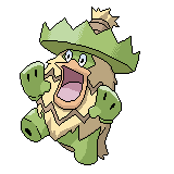
Oh yeah, Ludicolo.

Ludicolo_PO43650.png

The only problem I can see is on his right leg, where the green meets tan, the spike is messed up. I'm currently shading the outlines, so don't tell me that.

My question, though, is what exactly is Pokemon Amethyst? I offered to help 'cus I like Pixel Overs.

C+C
 
What program are you using again, TVboyCanti? I remember you posted somewhere, but I don't remember where. I'd like to give the shading a shot, but it probably wouldn't be the best attempt out of the other spriters here.

Also, Blaziken's arm on our left looks weird. Arms really don't bend like that...
 
made some new splices:
hitmonchanekans.png
rockstarmie.png
piplachic.png
lucarioarcanine.png
mankeyraikou.png
typloshionhooh.png
scizorlatios.png

C+C please
and also Im accepting requests as i dont know what else to make :P

Hitmonkan: Brilliant! The colour scheme on the head could be brightened a bit, and IMHO it would be perfect.

Starmie - Onix? - Regirock: It looks ok, but the shading on the left rocks looks like light is coming from the centre, rather than the top left.

Bulbasaur - Piplup-Torchic: The shading on The head is coming from the top-right, not the top lelt. Excluding that, its a cute one.

Lucario - Arcanine?: Ok by the looks of it, but at the bottom of the tail to our right, the edge seems cut off. If the tail in the original design was missing, then you'll need to scratch that one in.

Raikou - Mankey: Sorry, but there's too much going on in this one. If you have a copy from before the face was done, and just added the eyes it would feel less cluttered.

Ho-Oh - Typhlosion: Fine, except for the thing on Typhlosions head (I don't know what it's called.)

Scizor - Latios: OK. The head coulering goes from Blue to Grey on a very straight line. The wings feel like there at an odd angle to Scizzors body. The claws work well for me.

If you want a fusion, the first one I did was Solrock-Psyduck. See how you do on it :).
 
cradily+Wailord=
cradilywailord.png


btw thanks dogfish
starmie has onix and regirock
Lucario and Arcanine is right, i used them two.
Im not that good tho :P thats why i still cant do the shades all that good
 
I'll help, only if it's possible to do it in MS Paint.

Oh yeah, Ludicolo.

[Image]
The only problem I can see is on his right leg, where the green meets tan, the spike is messed up. I'm currently shading the outlines, so don't tell me that.

My question, though, is what exactly is Pokemon Amethyst? I offered to help 'cus I like Pixel Overs.

C+C

Your line art came out great on this piece, it's very smooth and clean. The main issues I saw were with the shading and the color palette, so I made some edits to your picture. Let's compare.
Ludicolo_PO43650.png
th_Ludicoloedit-3.png


Here's what I changed:
1. The first thing I changed was your color palette. The colors neeeded more contrast so that the shading could actually become visible. I know you tried to stay close your source materials colors and shading, and that's good, but pixel-art has a tendency to look flat compared to regular art because of the lack of different colors, which is why contrast is so important for making your shading stick out without using too many colors. After you've shaded and colored your pixel-art, look at it and ask yourself, "does this still look flat?". If it does, it's probably because there's not enough contrast in the shading hues.

2. The second thing I fixed were some shading issues, which had become more pronounced after I upped the contrast. I removed the base color at the back of the hat, rounded out the shading on the thumbs, added shading in the upper right part of the body, and added a darker shade to the tail behind the body.

3. I changed the highlight on the right leg to a base color. Having a highlight there next the darker shade creates too much contrast, which makes the surface look like it's very shiny or has a very bright light shining on it in the dark. Remember, never use the lighter shade next to the darker shade unless your surface is shiny and your using a highlight, or if your surface has a very sharp angle in in it, like the mittens on Ludicolo (where you correctly used the lighter shade next to the darker shade.

4. I changed the lighter color on the stripe and the trunk. It was too close to being white than it was brown, which made it look like a highlight and again made the stripe look overly shiny.

5. Take a look at the rim of the hat. Notice how the shades transition smoothely into eachother and don't look so abrupt? This is because I used dithering here to create the illusion that there are more color shades than there really are. Because the image is relatively small, letting the shades intermingle in this way confuses the eye as to where one shade ends and the next begins, without having to use extra colors. Dithering is a very important technique when you have large, smooth, uninterrupted curved surfaces.

You are welcome to keep this edit if you like it, I don't ask for any credit, since you did all the work. Consider it my contribution to Pokemon Amethyist.

I'll get those animations into sprite sheets in just a minute so you guys can take a crack at coloring them. I know that several of you have gotten quite good at coloring and shading, so I'm looking forward to seeing the results.

Edit: FelixMartin, I like the Tiger Mankey.
 
hey dogfish, i cant find any way to mix those two pokes :P solrock and psyduck :S
But i did make some others :P
electricmedicham.png
blazikenmagnemite.png
joltirichu.png
machamptauros.png
voltorbhariyama.png


The ones with the black background were done longer ago, like a couple weeks, but i dont think i uploaded them os there they go:P
C+C please!
 
IIRC pokemon amethyst was a game wichu was making, using pokemon emerald as a reference and respriting everything
 
cradily+Wailord=
cradilywailord.png


btw thanks dogfish
starmie has onix and regirock
Lucario and Arcanine is right, i used them two.
Im not that good tho :P thats why i still cant do the shades all that good

It's a cradily sticking out of a recoloured Wailord with no eyes and..

WHAT DID YOU DO TO IT'S FINS?

It looks more like a Cradily-possesed Wailord than anything.
 
Could someone please make a logo for my site?
I would like this pic,
Tyranitar_Wallpaper_1280x960_by_MattRiddle.jpg

Shrunk down to about the same size as Smogons logo,
Round it, Maybe just clean it up a little,
and make it say "Despotar"?
Thanks in advance!
 
It's a cradily sticking out of a recoloured Wailord with no eyes and..

WHAT DID YOU DO TO IT'S FINS?

It looks more like a Cradily-possesed Wailord than anything.

hahaha thanks for the comment, it was very helpful :P
well thats what its suposed to look like so i guess i didnt do that bad :P
 
I just got Paint.net and I'm using it right now. I'm still getting used to it, but right now the Global fill color option thingy has proven to be extremely useful. Currently recoloring RBYG Dragonite using 4th gen coloring.
 
Canti, do you want us to put in the eyes and other marking into the Lineart you provided?

Like, do you want the toenails on Hitmonlee, and the bangles on his arms and legs or w/e they are, and the eyes?

Also, where is the lighting source?
 
Light source is the sun, so nothing too dramatic. Adding in eyes would be part of the coloring so that would be nice, and if you could add any details that I missed that would be great.
 
Uh... Well. If it's a fighting game, how are you going to have the light source? In the middle of the screen so both faces are lit? Behind one, yet in front of the other?

And, do you want the fingers to be distinguishable or just as a ball?
 
Best to make the faces illuminated. I want to keep this as simple as possible, so I want to be able to just flip the sprites around.

Sun lighting = powerful light high above the sprite. Example

And if you can make the fingers distinguishable in the fist, that would be great. Try not to alter the sillouhette too much, if you move things around like the hands I will have to fix it so it works in the animation.

And here's the Machamp sprite:
th_Idle1-2.png
 
Final question, I promise, do you want the outlining rules to apply? Or keep all the outlines black?

I'm using the colors from the official sprite, so I hope that's ok. Also, it's proving very difficult to fit the fingers to make it look good, since the hands are only about 3x3. And, I can't figure our how to make the eyes work. But, I'm working on them.

EDIT:
Thanks for the example.
 
Status
Not open for further replies.
Back
Top