That's a lot better. (and I prefer the new tail as well, because it blends better.)
-
Smogon Premier League is here and the team collection is now available. Support your team!
-
The moderators of this forum can be found in the CAP forum staff directory.
-
Welcome to Smogon! Take a moment to read the Introduction to Smogon for a run-down on everything Smogon, and make sure you take some time to read the global rules.
-
Congrats to the winners of the 2025 Smog Awards!
You are using an out of date browser. It may not display this or other websites correctly.
You should upgrade or use an alternative browser.
You should upgrade or use an alternative browser.
CAP 8 CAP 8 - Art Submissions
- Thread starter CyzirVisheen
- Start date
- Status
- Not open for further replies.
http://img27.imageshack.us/img27/9214/elotsacolours.gif
Here's a shitstorm of colour options for y'guys >>
Here's a shitstorm of colour options for y'guys >>
The Blue Skin with Black is the best. The blue skin with silver clouds the second best and the Orange skin with black clouds for third place.
Any one of those 3 is great. All the pink fluffy ones are thumps down for me...
Any one of those 3 is great. All the pink fluffy ones are thumps down for me...
Bottom row, fourth from the left.
ungulateman
ungulateman
I like the top row, second one; fourth row, second one; and last row, first one. In reality, I like the original the best. However, if you could do the body color from the second row with the gold wings/details and pink fluff that would be really cool.
http://img27.imageshack.us/img27/9214/elotsacolours.gif
Here's a shitstorm of colour options for y'guys >>
I really like the 4th row 1st one and the 4th row end one but I really enjoy the original design the best.
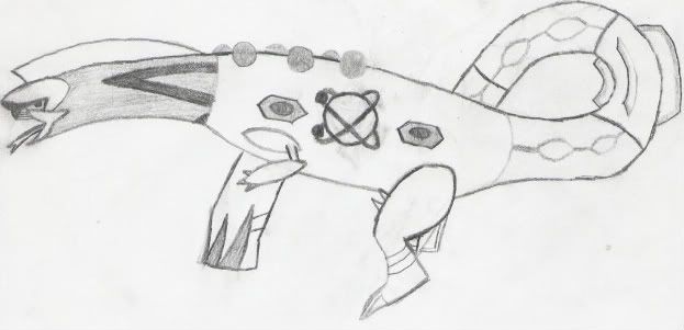
Seeing as my old post was cut off do to size restrictions, (Yeah, I now realize it was 1k pixels wide, thank you very much.) I have now shrunk it.
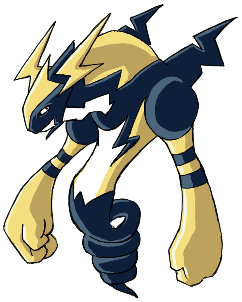
So, as stated before, I redid it using a fully Electric body produced by the Atom core in the center (which will hopefully look more "in the center" by final submission), it now uses parts from Pokemon in the Dragon Egg Group (e.g., Arbok tongue), and, at least IMO, it looks simultaneously more streamlined and awkward.
So, thoughts? Opinions?
EDIT: And yes, I'll color it later.
@atyroki-the purplefluff+blue body is the best. the purple fluff in general is great.
Atyroki: I'm personally a fan of the original colorset. The pink fluff really makes it stand-out against other already made Pokemon. Plus, it's the original =D
Now that you redid it, I really like your work. I already said what my preffered colour scheme is. The shiny one should be the third one from the left in the third row.
I don't really get what the point of the dragon fusion is. How does an Electric/Dragon Pokemon give you a mix of all the Dragon types? I think it's unnecessary, not to mention CAP helps everyone see something new. Seeing all the Pokemon we're familiar with conglomerated awkwardly into one potpourri is pretty unsatisfactory. That's my opinion. XD
Now, if I were to do a Dragon fusion, I'd naturally try to blend it very smoothly without any thought (and make it symmetrical).
I thought I'd just put in some input, seeing as it didn't get much attention. :<
ATY: Dark Purple Cloud looks the best, as it looks like a thunder cloud. Also missing the two lightnings on the side of the head, those are what made it stand out from Meganium and Salamence.
Most Awesome Work So Far! FTW!!
In no particular order:
Atyroki

Regi DS
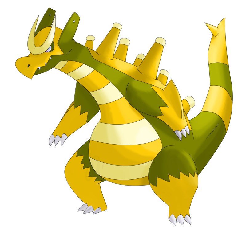
DougJustDoug
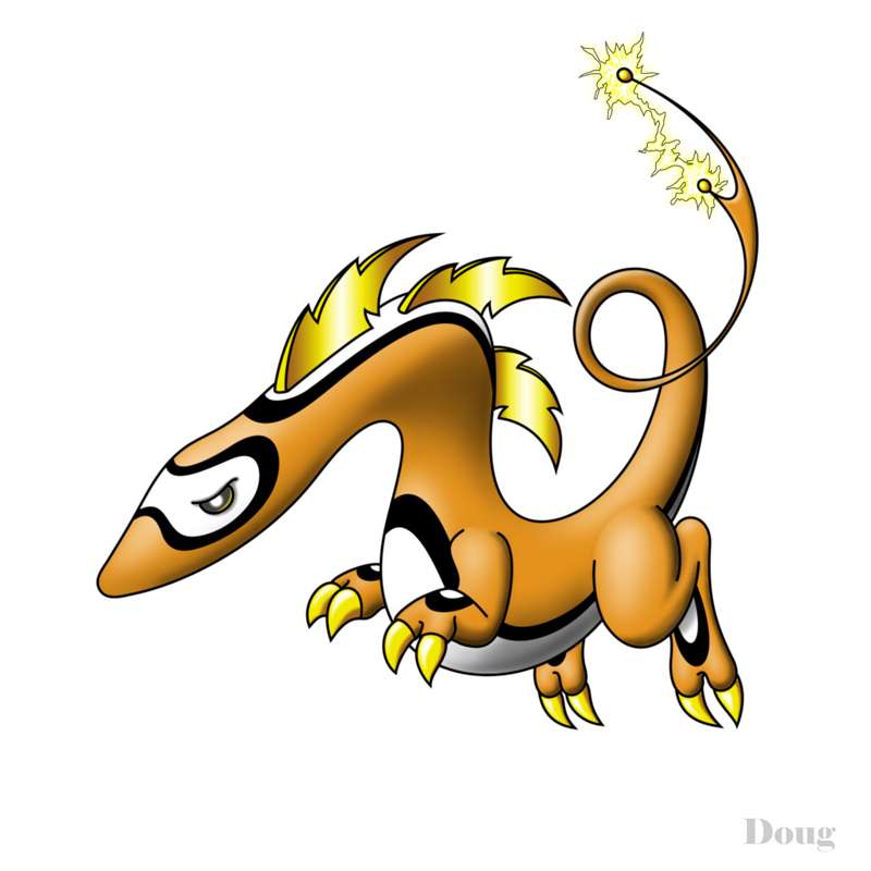
Cartoons!
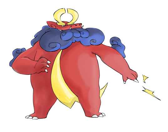
Elagune
In no particular order:
Atyroki

Regi DS

DougJustDoug

Cartoons!

Elagune

ATY: Dark Purple Cloud looks the best, as it looks like a thunder cloud. Also missing the two lightnings on the side of the head, those are what made it stand out from Meganium and Salamence.
Well, I felt that the gold things looked like they were just slapped on, which lent to the fact that it just looked like an electric meganium, as for the salamence part, the only thing the design has in common with salamence is that it's a quadrupedal dragon =/
Even with the new design, the things on the side of it's head are not the same as salamences, they're actually just meant to be lightning bolts that are actually part of it's structure instead of just slapped on there, whereas salamences is some sort of three-pronged thing...


For comparison

Quick MSpaint sketch of Circuitmon in another pose. He let go of his tail, but he's still charged up for now.
Hey there. Here's actually something I sketched up for cap5.

http://www.smogon.com/forums/showthread.php?t=45650&page=8
^ more info, original post.
Originally, this was based around the special attacking rock pokemon, but after taking another look, I think I could easily adapt some of the body parts and add some lightning arcs (^__^) and it would look more like a dragon type than it ever did a rocker.
Maybe I'll get my bamboo fun set up; it might be cool to see another one of my ideas as an option in a clicky vote.
last row fourth column is my favoritehttp://img27.imageshack.us/img27/9214/elotsacolours.gif
Here's a shitstorm of colour options for y'guys >>
- Status
- Not open for further replies.


