Time to update my post!
1. TRC Banner - I thoroughly enjoy your mewtwo and mew's "dark" versions. They are quite intimidating looking. Your avatar is also quite fitting, I could always picture you wearing something like that running around ruling the world haha. One suggestion though! Im not entirely sure if you were going for a full "dark" look or if you chose the bright warm colors as the background just to accentuate your "dark" pokemon. I personally would have done something a little "cooler" in colors to make it look more dark and evil - but either way I think it turned out well.
2. XD-001 Much like your mew and mewtwo, I love the negative colors and the appear of it being "dark". The giant attack in between his two hands looks absolutely amazing - something that should be feared =p
3. Fall of Giovanni - Hahahahahaha, love the title name ^_^ I like it a lot - it reminds me of the pokemon movie where mewtwo gets free and destroy's the rocket corp area. Love the effects!
4. Dragon Trainer - I think they all turned out quite well - not entirely fond of the giant flapping cape in dt1 but you didnt go with that one so it's all good =p You may have been able to make it more subtle without the particles in the background but the wings still sort of jump out at you (in a good way mind you - I like wings you know ^^)
5. Snorlax - hahaha =p RAWR
6. Hypno's banner - I think this one turned out quite well - the background color is rather fitting with his choice of pokemon. (Dratni is one of my favorites too!)
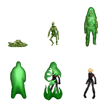
7. Valor's banner - Same as above though I might have went with a different color than green due to his pokemon choices and his choice of a dark suit. Just my opinion =p
8. Your banner - I think this one is the best out of the three - it has all the components I was talking about in the other two - aka your ice so blue background as well as a blueish tinted clothing. I think it looks quite awesome ^_^
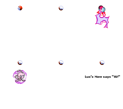
9. Your real banner - I freaking love that mew so much hahaha. I love how you two match - looks cool =p But once again I would try playing around with a darker blend of colors - Im not entirely sure how you do that in photoshop but if you can - try it!
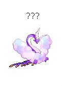
10. ??? - Ahhh It's so adorable haha. Love the elongated "ears" or whatever you want to call them lol.
11. MEGAMAN! hahahaha - looks cool - you should make more armored versions imo!
12. You already know my opinion on this one ^_^
13. Animated Sprite - are you just forcing the negative version of the color to animate it? It looks pretty cool though I think Im having a seizure LOL
14. Hypno - I like this one too! You took out the particle effect and made the wings move omg! Haha I love it (and wings too =p) - I wish I could fly haha.
15. hahahahahahaha - love the car and "grunts" =p how fitting for a CEO
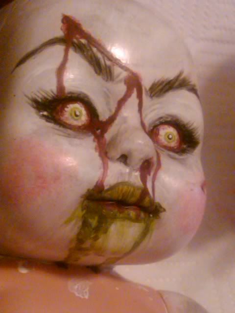
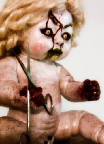
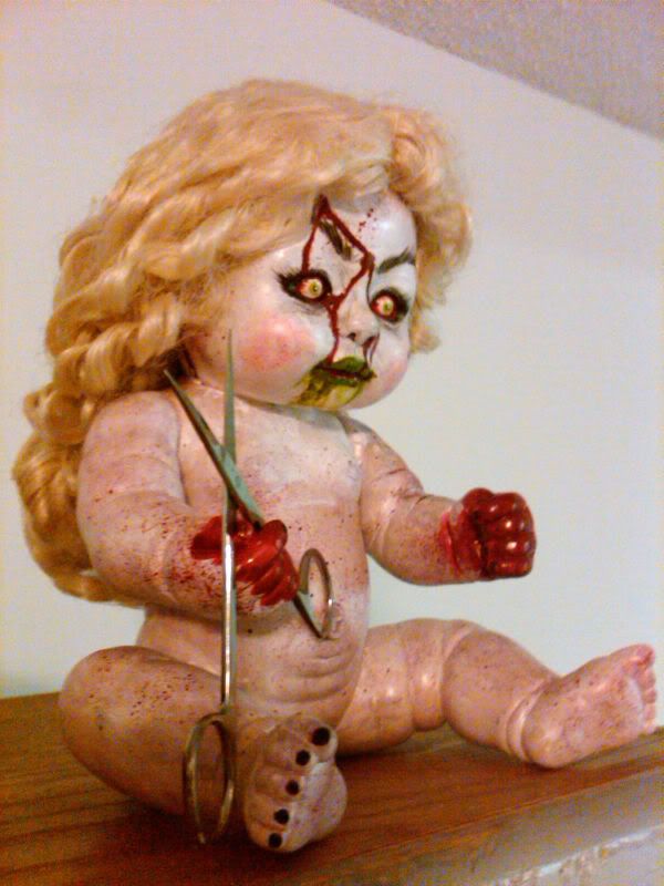
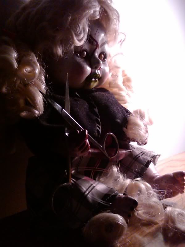
16. O M G - you know how much I love Sabrina and psychic pokemon - this is just too awesome - you should do another one with the doll walking down a dark road in between buildings or something really creepy. That would look so awesome!
17. Hardly a fair fight LOL =p I love that radiating "bubble" effect around mewtwo though - It's sick. How did you do that?
18. Already commented!
19. Haha that's quite sick for Antimeta game - love the way his avatar is facing the other way. The fire effect and the two pokemon overlapping each other turned out quite well.
20. I very much like Hypno's banner - the darker coolers are much more fitting and make Hypno's guy stand out more. I also like the use of three pokemon in the banner - the way you overlapped them looks awesome, with of course his main guy in the front.
21. Haha I cant really comment on this one as I dont really know the 5th gen very well but I can say I like the picture =p
22. Fitting avatar for a fitting banner =p
23. I FREAKING LOVE THIS ONE OMG - It's SO adorable and I LOVE the way mew is looking up, almost pondering or gazing at the stars. SO pretty!
24. HAHAHAHA - not much else to say =p
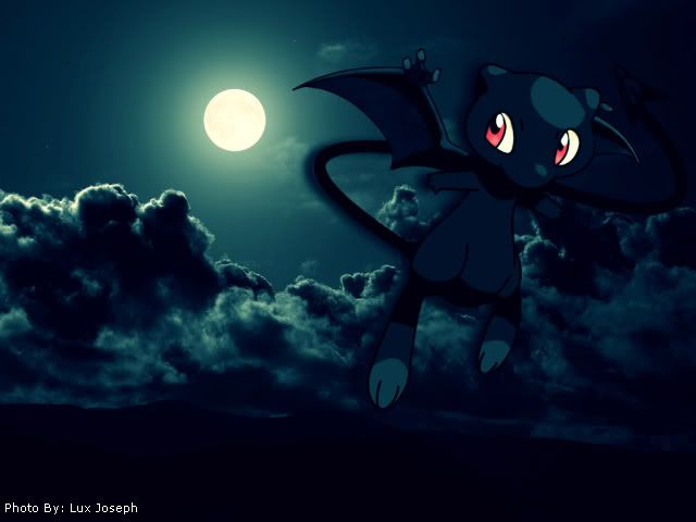
25. LOVE IT - Love the dark feeling of this picture and love your mew! I'd suggest making the moon on the right side though since your mew has highlights coming from the right side and not behind him. Small little thing but might make it look better =p
26. Shame they kicked it out - I liked it =/ haha. The leaves turned out well ^_^
27. Photos + Card you know I already love =p


