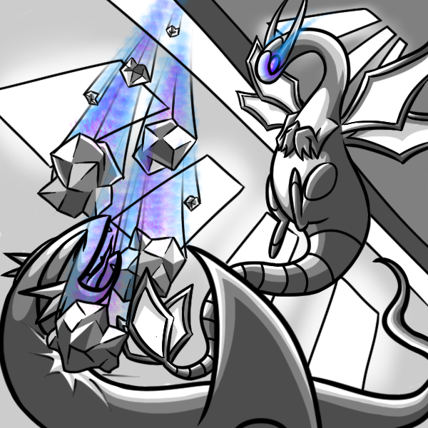
porygon-d
http://img192.imageshack.us/img192/2323/mac4copy.png
Artistic Skill: 3.16
Theme Execution: 3.2
Plus Points: 3
Total: 9.36/15
Judges Comments:
My first impression of this work was a combination of "What is that?.." and "Oh sweet muffins look at that Altaria". I was a little relieved after seeing the artist post what exactly the Dragon's Den was in their interpretation, and after looking it up on the wiki to get a better understanding of the subject, couldn't help but laugh at this piece's humor and creativity. For this reason, I gave it a solid five in Theme Execution. Now, for Artistic Skill, one thing really stands out in this picture. The Altaria. I don't know what it is, but it just seems like a perfect representation of what Altaria should look like. The perfectly done cloud body and wings in combination of the clean lines for the appendages make me give it a real thumbs up. The rest of the work doesn't really stand out very well, but I do like the shading of the chairs and texture of the floor. I would have given this a three for Artistic Skill, but the quality of the Altaria made me push it up into four. When looking up the term composition, it strikes me as something that is both artistic and clean, especially when it comes to line work. Like mentioned before, nothing really stands out about this picture, but I have to admit that the art is very neat and look like it took a good while to put down. The lighting is what I would expect it to be in a closed room setting, but still nothing spectacular. I was really torn between a three or four, but I'm going to have to give this piece a three in Plus Points. You could have done a little better with the lighting, but overall this picture is really good. - BuddyBlueBomber
Good God, BBB, you wrote a novel...Several novels O__O - Bucky
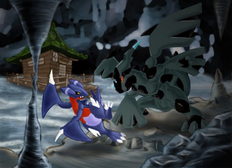
Lord Jesseus
http://i218.photobucket.com/albums/cc149/aeojrtfao/DragonsDen.png
Artistic Skill: 2.74
Theme Execution: 4.2
Plus Points: 2.8
Total: 9.74/15
Judges Comments:
At first glance, I'm not extremely impressed with this picture. It just doesn't come out as outstanding, or very original. Upon closer inspection, however, I can see that this took a lot of time and care to complete, as well as being right up to specifications for the contest to the dot. For Artistic Skill, there are a few things that stand out. First and foremost is the Dragonite; obviously the center of this piece. It is both proportionally correct in every sense, as well as emitting real sense of power. The aura, eyes, whirlpool, and stance all contribute to this. The second this I notice is Lance near the front of the picture facing this powerful Dragonite. He is drawn not only well, but also with a slight blur. This gives off either two things; that the Dragonite is giving off a large amount of energy to distort his outline, or that the focus of the picture on Dragonite blurs his image slightly from human eyesight. Either idea is both sound and creative. The quality of the pagoda near the back of the cave is very well done, as well as the rocks on the edges. They have a very realistic feel to them. For these reasons, I have opted to give a four in Artistic Skill. The theme was made right to specifications, so there's no reason not to give this piece a five. The lighting was done fairly well, it makes a really nice effect with the aura shining off of lance. That's really the only lighting I can see otherwise. The composition for this was done very well; it is both clean and artistic in all aspects. For Plus Points, I give it a four, since it's very good but not very over the top. All in all, this drawing really grew on me, and is a great representation of what this month's theme is all about. – BuddyBlueBomber
Yilx
http://img.photobucket.com/albums/v407/Yilx/jn.jpg
Artistic Skill: 5
Theme Execution: 5
Plus Points: 4.8
Total: 14.8/15
Judges Comments:
Really, I'd have to say this is one of Yilx's best works. It is of wonderful quality, and is extremely dynamic while still fitting all of the contest's criteria. I can't really say anything for Artistic Skill other than noting its pure quality. The combination of the colors and blurring effect really make it seem like it is an actual painting. Speaking of said effect, the circular blur really makes it seem like a high powered duel is going on between these two draconic powerhouses, with the pagoda right in the eye of the storm. The energy is just amazing.
The theme was certainly met, but the creativity doesn't really seem all there behind it. That's really not enough to hurt the score at all down from a five, just a little note to add. Lighting is fantastic, the calming glow of the pagoda reflects both off of the water and on the pokemon themselves, giving a really good feel to the piece as a whole. This picture has a really great composition; clean and decisive lines mixed with artistic creativity. Definite five for Plus Points. A very powerful contender for this month's contest, and my first perfect score. – BuddyBlueBomber
Fatecrashers
http://img829.imageshack.us/img829/2803/dragons.jpg
Artistic Skill: 3.76
Theme Execution: 4.2
Plus Points: 3.8
Total: 11.76/15
Judges Comments:
Fatecrashers was the first artist to depict an underwater Dragon's Den theme to the contest, and I really like the direction it went. It gives a whole new perception on what the Dragon's Den is really like on the inside. For Artistic Skill, I know the artist's skill fairly well, and feel that he could have done a lot better when it came to the line art. I do really like the texture for the rocks, though, as well as the water. This is why I give this piece a three in Artistic Skill. That being said, everything else about this picture is top notch. The theme was very original, and was executed very well. Just look at those cute little magikarp! What really speaks to me about this is the whole "Humans contacting with nature", with the cold hard steel of the pagoda clashing with the obviously mellow cave depths. For theme, I give this piece a resounding five. The lighting is very beautiful here, the streams of light are very under-toned when it comes to the picture as a whole. I think it has a great effect. The artist is naturally composed in his art, which gives in edge in this aspect. I also really like how the Magikarp were done in a simple, artistic way. Overall, definitely deserves a five. A very creative piece! - BuddyBlueBomber
DJGopher
http://i261.photobucket.com/albums/ii55/dj_gopher/dragondenpreview2.png
Artistic Skill: 3.18 ßDat’s my birthday!!
Theme Execution: 4.6
Plus Points: 2.4
Total: 10.18/15
Judges Comments:
The artistic skill of what seems to be finished is, I'd say, about the same level as I can do. The fire is very interesting stylistically, but without the rest of the picture in that style, it makes it seem a bit out of sync. I'd say you did pull off the Theme very well, you showed the Dragon's den in the background. – Doran Dragon
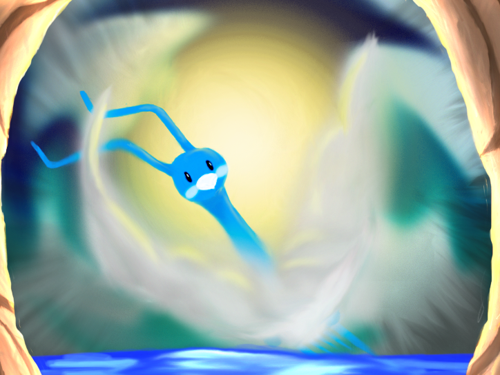
Plus
http://i235.photobucket.com/albums/ee307/Plus9000/altaria3.png
Artistic Skill: 4.02
Theme Execution: 4
Plus Points: 3.8
Total:11.82/15
Judges Comments:
I love the use of shades to show the contrast between light and dark, but I think you made the cloud wings a little too soft. I like the use of strokes to make it feel as if the whole seen is coming out to the viewer. I feel that you didn’t pull the theme off too well. Yes you have a dragon type Pokemon in the picture, but its entering what really doesn’t look to be cave, and there is no indication that would really make me think dragon's den. It could have very well have been slowpoke well or dark cave :/. – Doran Dragon
SINCE HE IS PLUS I MUST GIVE HIM ALL PLUS POINTS – Wickdaggler
^Huhuhuhuh, good one - Bucky
DEZTROYA
http://fc02.deviantart.net/fs71/f/2010/225/a/9/Salamence_in_Dragon_Cove_by_DEZTROYA_001.jpg
Artistic Skill: 2.9
Theme Execution: 4
Plus Points: 2.6
Judges Comments: 9.5/15
Kudos for traditional artwork, but the coloring looks quite messy. I do love the cartoon-like style the Salamance was drawn in. I also feel that this does seem like its the dragons den, because it is obviously a cave with a powerful dragon in it. I would have liked to see the dragon's den in it though. – Doran Dragon
icepick
http://i392.photobucket.com/albums/pp10/icepickx/pokees/dragonsden.png
Artistic Skill: 5
Theme Execution: 5
Plus Points: 4.8
Total: 14.8/15
Judges Comments:
I have three words for this. NOT BLOODY LIKELY! Not really, this piece was very well drawn and colored, and like everyone else, I was quite impressed by the style and obvious nature of the theme. I personally think that the magikarps don’t look good. Its in a completely different style compared to the rest of the picture. it felt like you were trying to mix the cubist style with something more traditional. The theme was executed perfectly in this piece. Again, quite an exquisite piece, and I do approve. – Doran Dragon
MofoAmbulance
http://i227.photobucket.com/albums/dd62/Shirude/WIPMAC123.png
Artistic Skill: 3.7
Theme Execution: 3.7
Plus Points: 3
Total: 10.4/15
Judges Comments:
MofoAmbulance's whimsical and somewhat messy style is a lot of fun to look at. The shading is nicely done, and is a quality piece. However, while Salamence meets the theme criteria, the Dragon's Den is really just used as a backdrop and not very incorporated into the piece. And while the Squirtle we all know and love looks especially cool and (for lack of a better term) badass, it really doesn't fit the theme. This piece in my opinion, while quality, is more or less a commentary on Salamence with the Dragon's Den used merely as a backrop. – pkmn Trainer Zach
Shinxe
http://i33.tinypic.com/2mzl1ya.jpg
Artistic Skill: 5
Theme Execution: 5
Plus Points: 5
Total: 15/15
Judges Comments:
Oh, Shinxe, you've really done it this time. Probably my favorite piece of yours so far, this is just a joy to look at. Props for you for really running with this month's theme and making the Dragon's Den an essential element. You've done a wonderful job at creating a mood and an atmosphere. And might I say, I love your take on Altaria. – pkmn Trainer Zach
neo.
http://i435.photobucket.com/albums/qq78/fossilspriter/mac4entrysizefizedandwdragon.png
Artistic Skill: 4.26
Theme Execution: 5
Plus Points: 4.2
Total: 13.46/15
Judges Comments:
Ahh, so calming. This really is easy on the eyes, another quality piece. My advice, don't be afraid to take that extra step. While this is a great piece, there's not much that really calls for your attention. It's important for your work to pop. You can still achieve that calm feeling by using more color. – pkmn Trainer Zach
Kukem
http://i139.photobucket.com/albums/q301/Kukem/DragonsDEN001.jpg
Artistic Skill: 4.2
Theme Execution: 48
Plus Points: 3.4
Total: 12.4/15
Judges Comments:
This is another quality piece, and I can tell that a lot of attention was paid to detail. I like this piece, however it's very monochromatic. There's nothing that really visually captures interest. The eye isn't really drawn to anything in particular. Don't be afraid to experiment with color and shading! – pkmn Trainer Zach
BuddyBlueBomber
http://i132.photobucket.com/albums/q2/BuddyBlueBomber/Dragons_Den.png
Artistic Skill: 2.63
Theme Execution: 4
Plus Points: 2.75
Total: 9.38
Judges Comments:
An interesting piece, the composition makes it look as if it actually were underwater in a way but could be better artistically. Not that I'd do much better myself though! :L - CharizardKiller
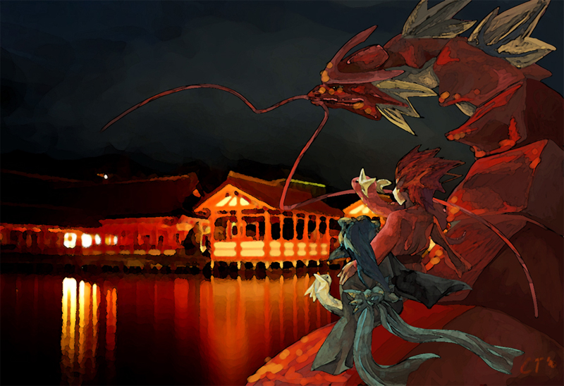
ChuoToshio
http://fc05.deviantart.net/fs71/f/2010/233/9/3/Dragon__s_Den_by_StevenChong_no_GMF.jpg
Artistic Skill: 5 (can I put an infinity sign here?)
Theme Execution: 5
Plus Points: 5
Total: 15/15
Judges Comments:
So, lucky me, I get the honor of giving commentary on what is, in my opinion, the best piece of the bunch (sorry guys). I love the gritty look of the gyarados, Lance, and Clair. The lighting in the middle was very well done, and I love the look you achieved with the lighting off the lake. With the dark moody cave atmosphere, combined with the bright, orange and yellow energy from the shrine, this piece has an atmosphere of it which is exactly what I thought of upon seeing the theme. It defiantly sticks out among the other entries, and I wish you luck in the final poll. – Wickdaggler
Absolute perfection. And you’ve managed to steal the hearts of all of the judges with this piece. Excellent. - Bucky
VonFiedler
http://i327.photobucket.com/albums/k463/vonFiedler/aaxjsp.jpg?t=1282473801
Artistic Skill: 2.5
Theme Execution: 3.5
Plus Points: 2
Total: 8/15
Judges Comments:
I don't exactly get the joke... but in terms of the actual art, I really love the shading that was done on the various pokemon, and the background lake/ sky provides great contrast with the cave. However, this thing seemed really rushed. I mean, all the pokemon have different shading, with one (aerodactyl) not even getting any! And I'm not entirely sure what is going on with the black lines... I think the piece could have done without it...You seem to have some decent talent, make sure to hone it, and we'll see you in the next MAC! – Wickdaggler
aragornbird
http://img690.imageshack.us/img690/8044/dragonsp.jpg
Artistic Skill: 5
Theme Execution: 5
Plus Points: 5
Total: 15/15
Judges Comments:
Oh, aragonbird, where should I start? The hidden trainers (lance, clair, and our hero, from that one event in HG/SS), the brilliant lighting off the water, and the pokemon themselves? The way the Den provides so much contrast and focus in and un itself? The epic effects?!
I can't really describe in words how much I love this, but let this be known: you are a master of shading and highlights, and of incorporating dynamism and mood into your paintings. Good luck in the finals! - Wickdaggler
SoIHeardYouLikeSENTRET
http://i782.photobucket.com/albums/yy101/SentretLover/dragonslairPNG.png?t=1280861634
Artistic Skill: 4.34
Theme Execution: 4
Plus Points: 4.5
Total: 12.84
Judges Comments:
This is up there with some of my favorite pieces in the competition. The lighting is really well done, and the black and white lighting, which I would normally complain about, mind you, is mastered perfectly in this. I love the epic effects of rock slide(?), and in flygon's eyes. The difference in lighting between the jagged rocks and the windows is duly noted. The entire piece seems sort of surreal and cool. I love it, and I hope you make it into the finals (if everyone else judges you as fairly as I do). Good luck. - Wickdaggler
noobiess
http://www.iaza.com/work/100822C/dragones_dens281989.png
Artistic Skill: 2.8
Theme Execution: 4.4
Plus Points: 4.4
Total: 11.6/15
Judges Comments:
This piece reminds me of a wonderful illustration in a charming fairytale. I love everything about this picture, especially the placement of each of the subjects. Noobies, you really understand what it means to implement great composition in your art, and that will definitely help you become an amazing artist. The color and shading are flawless in only two spots; the Altaria and the Milotic’s tail. Don’t be afraid to experiment with drastic shading and dark colors. I really look forward to seeing what you come up with in the next contest! - Bucky
Chinnie15
http://i4.photobucket.com/albums/y119/Chin_gal/DragonsDenneweggCustom.png
Artistic Skill: 3.1
Theme Execution: 4.4
Plus Points: 3.4
Total: 10.9
Judges Comments:
It’s so cute I could cry!!! If you managed to pull this off in Paint, then kudos to you! To make something like this look as fantastic as it does is truly a skill, and I can only imagine what you could do with better software. Your use of color is absolutely perfect, however, shading was a big part of this contest and that is the one aspect where this piece was lacking. You definitely have a lot of talent though and it really shines through in your entry. I might suggest using traditional medium in the next contest only because no matter how great art done in Paint might look, it never gets very far simply because it was done in Paint. Unfair yes, but that’s only due to the limitations in the software. Keep going at it though because this really is fantastic, and I can’t wait to see more! - Bucky
I MUST SAY THIS:
d'awwwwwwww :3 - Wickdaggler
Johann
http://a.imageshack.us/img541/7504/photo51k.jpg
Artistic Skill:3.2
Theme Execution: 4.2
Plus Points: 2.4
Total: 9.8
Judges Comments:
This is like something I would see on a giant billboard while flying on my Crobat to Blackthorn City. It really does look like the perfect advertisement; it’s charming, cute, and almost sort of catchy in a way. I love the style that comes across here. The composition and perspective portrayed is great, and the fact that you’re able to pull of something like this is a great asset to your artistic abilities. However, shading played a big role in this contest, and this piece didn’t have it. Remember to be creative in the ways that you meet the Plus Points category. Other than that, great work! I really hope you’ll participate next month - Bucky
Swampert360
http://img23.imageshack.us/img23/5498/m1ac4.jpg
Artistic Skill: 1.9
Theme Execution: 3.2
Plus Points: 1.8
Total: 6.9/15
Judges Comments:
When I look at this piece, I think “Hrmmmmm…………..Mmmm…..Hrmmmm….” I know you’re a great artist from what I’ve seen in your art threat, but this piece doesn’t show it. There’s something about it that puzzles the viewer and makes it so that we don’t know where to focus our attention. The overall concept of the piece is actually great, and your use of color and lighting is fantastic as well! That’s definitely something you should continue to try and pull into your future pieces. Unfortunately, like I said there’s something about this piece that confuses the viewer and so that draws our attention away from your great use of color, shading, and lighting. However, I know you’ve improved greatly since you submitted this piece, and so I’m really looking forward to seeing more from you. - Bucky
Bombiron
http://i33.tinypic.com/314uwk5.jpg
Artistic Skill: 4.8
Theme Execution: 4
Plus Points: 4
Total: 12.8
Judges Comments:
I’m so glad this made it to the polls. It’s a flawless demonstration of what stylistic traditional art should be. The way that you incorporating lighting and shading even though you limited yourself to barely two colors is amazing and also an enormous asset to your artistic arsenal of skills. Your composition is great as well; I love that there’s more to look at then just the Kingdra in the front, but there’s also a bunch of little things going on in the background and the scenery is fantastic, it really makes this piece enjoyable. You, my friend, are truly skilled. Keep up the good work! - Bucky