
-
Check out the relaunch of our general collection, with classic designs and new ones by our very own Pissog!
-
Welcome to Smeargle's Studio! Please be sure to review the studio rules. Feel also free to check out our hub to learn more about this place!Welcome to Smogon! Take a moment to read the Introduction to Smogon for a run-down on everything Smogon, and make sure you take some time to read the global rules.You are using an out of date browser. It may not display this or other websites correctly.
You should upgrade or use an alternative browser.Super Spriting/Trainer Card/other art nonsense thread
- Thread starter DM
- Start date
- Status
- Not open for further replies.
lol it seems like the smogon spriters don't have anything to do these days ( but the're so many requests O_o)lol it seems like the smogon spriters don't have anything to do these days ( but the're so many requests O_o)
I dunno about the others, but I've got spriters' block.
Else I'd try to tackle some of these requests.Could someone do these two fusions?
Shiny metagross and Salamence
Lucario and Salamence
Yeah I like Salamence...
I'mma try to kill my spriters' block. Here goes.Could someone do these two fusions?
Shiny metagross and Salamence
Lucario and Salamence
Yeah I like Salamence...
I have good timing then.

What do you guys think?It is just a salamence, it was made from scratch so I need some critiques on it as a scratch sprite. We don't all just do fusions. And it's actually supposed to be flying. I have no right giving advice or anything, but that sprite seems a little long TVboy. By long I mean, long neck, long.."feet" (whatever salamence has).
If it's supposed to be flying, it may look more so if its wings aren't as far back, and are more forward (though this may block a couple features.
Its still an awesome sprite as usual. Good work.Yeah, I'm seeing what your seeing now Heysup, the sprite looks stretched out because I didn't put enough curve in the neck and the legs. And foibles, I can't stretch out the tail because I'm confined to an 80x80 box.
I think I'll just deem the salamence sprite a failure and move on, although I'd still appreciate more critiques on it to avoid making something like this again. I will probably try Salamence again, because I really want my own Salamence sprite to use in RMTs and stuff.Spriters' block kicked!

....Not really. ._. It's more of a recolor with the X haphazardly semi-scratched on. I'mma say this one fails, too.
Maybe I need to try a fusion of my own.
TVBC, if you're still looking for critiscism, I can offer two things. His left leg (our right) is turned out at an awkward-looking angle. The other thing I noticed was a lack of an end to his tail. It looks like it's cut off behind the wing, even if it just ends back there.Spriters' block kicked!
....Not really. ._. It's more of a recolor with the X haphazardly semi-scratched on. I'mma say this one fails, too.
Maybe I need to try a fusion of my own.
TVBC, if you're still looking for critiscism, I can offer two things. His left leg (our right) is turned out at an awkward-looking angle. The other thing I noticed was a lack of an end to his tail. It looks like it's cut off behind the wing, even if it just ends back there.
I like it, lol
Interesting... nice job.Spriters' block kicked!
....Not really. ._. It's more of a recolor with the X haphazardly semi-scratched on. I'mma say this one fails, too.
Maybe I need to try a fusion of my own.
TVBC, if you're still looking for critiscism, I can offer two things. His left leg (our right) is turned out at an awkward-looking angle. The other thing I noticed was a lack of an end to his tail. It looks like it's cut off behind the wing, even if it just ends back there.
TVboyCanti: I agree with Fuzzberry, and it doesn't have that intimidating look that the DP sprite does.Some more random sprites...
Chimko. The only one in the line fusion (that gave me this spriters' block in the first place) that came out even marginally alright.
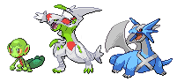
Shaychomp Sky Forme is done. And a little creepy. It's kind of hard to tell, but Shay's little scarf thing is behind Shaychomp's ear. Otherwise, it's just Shaymin's ears and colors on a 'Chomp sans the back fin.in honor of suspect i request garchomp + shaymin-s
And last but not least, non-shiny Metamence.
I'm slowly coming out of this.
EDIT: Thanks, Arctic. I don't like it much, though. ._. Could be how bad the X looks, but eh.
Yeah, the X looks a little off. Try moving the point where the lines of the X meet to the right of the sprite. I would like to request a sprite duel, HIT ME UP.Thanks, gamemaster.
I think I'll leave the X like that for two reasons. One, it'd be a bitch to fix, and two, I can say it's off to the side on purpose. Oh well.
Mordock, I don't think I'd fare well in a sprite duel. ._. Espescially not in the state I am.
Somebody give me a 2 Pokemon fusion. I want to get the creative juices flowing again...OK, I decided the sprite might be salvageable after all, so here's v1.1

Tried to destretch it be curving the neck and making the rear legs farther apart, as well as shortening all the legs. Tried to make it look less "Barneyish" by redrawing the Crests larger and sharper, shrinking the lower jaw and adding a black outline to the eye.
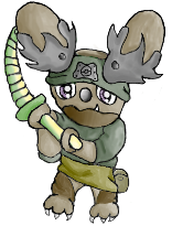
Everyone's advice was very helpful.Would anyone like to try and sprite this thing that I drew?
(or point me to a spriting tutorial somewhere...)What about Absol + Darkrai + Garchomp
My 3 favorite pokes lolRequest
Is it possible to do a mix of Garchomp, Rayquaza, and Rhyperior? I like the head of the rayquaza, salamence, rhyperior head.- Status
- Not open for further replies.


