


Cofagrigus in particular. That transition from an inert sarcophagus to the flailing arms of the monster that dwells within is a pretty essential part of Cofagrigus' whole design. It was completely botched with the 3D model where the monster is out at all times.There are a lot of good sprites in the ones you seem to have a problem with.

-
Follow our Instagram!
-
Welcome to Smogon! Take a moment to read the Introduction to Smogon for a run-down on everything Smogon, and make sure you take some time to read the global rules.
You are using an out of date browser. It may not display this or other websites correctly.
You should upgrade or use an alternative browser.
You should upgrade or use an alternative browser.
Worst Pokemon Sprites?
- Thread starter Rankumander
- Start date
i have a lot of pokemon in mind but i lied i cant actually remember any of them so heres 2.
and for reference here's a picture of the line together
drizzile is... kind of a trainwreck. i know middle evolutions are supposed to be like the weird transitional stage between "uwu cute" and "murder beast" (almost reminiscent of a person's phases in middle school-- in this case, emo) but this just aint it. the colors, the pose, it just isn't working together. and oh my god those fucking mittens who designed those
colors. eugh. in theory a palette of pure cool colors (and white) should work together but its just stitched together in the most incoherent way. the purple is too close to red to be decent, and that green is absolutely fucking with me. sobble has the blue/gold color scheme! inteleon has the blue/gold color scheme! and here's drizzile, a disaster. the worst part is that you can't fix the colors without the whole thing looking weird. im not a fan of the shiny form either, but at least it has somewhat consistent colors across the line. (plus its trans flag colors. instant redemption)
the pose is just awkward. thats it.
those mitten things are just weird considering the whole "spy" theme of inteleon but at least it masks the transition from sobble's lego hands to inteleon's freakishly humanoid hands. they couldve gone full meme mode and given it fingerless gloves but, here we are
and now for the biggest downgrade in all of pokemon

typhlosion.
typhlosion has something like quagsire (and a handful of other early mons)-- from the front theres just nothing. it's purely that cream yellow whatever color, then you have a bit of blue at the top and you're done. the fire is the main thing that draws attention. gen8 threw that nice pale yellow out in favor of Ass Yellow.
this is one of those rare cases where the gen2 sprite is WAY better than anything else. my only complaint is that the arm on the left is just a bit too long and too high. its shiny sprite is WAY better than the reworked ones. the purples look great on it compared to the weird red. (i DO like gen3's shiny though. its a nicer red.
most of the body is fine on the gen3-6 sprites but it looks like they didn't know what to do with the arms.
gen6 is just bad. where's the activity in the pose? where's the dynamic expressions? where's the fire? this sprite is a trainwreck and im sure you can see why
and for reference here's a picture of the line together
drizzile is... kind of a trainwreck. i know middle evolutions are supposed to be like the weird transitional stage between "uwu cute" and "murder beast" (almost reminiscent of a person's phases in middle school-- in this case, emo) but this just aint it. the colors, the pose, it just isn't working together. and oh my god those fucking mittens who designed those
colors. eugh. in theory a palette of pure cool colors (and white) should work together but its just stitched together in the most incoherent way. the purple is too close to red to be decent, and that green is absolutely fucking with me. sobble has the blue/gold color scheme! inteleon has the blue/gold color scheme! and here's drizzile, a disaster. the worst part is that you can't fix the colors without the whole thing looking weird. im not a fan of the shiny form either, but at least it has somewhat consistent colors across the line. (plus its trans flag colors. instant redemption)
the pose is just awkward. thats it.
those mitten things are just weird considering the whole "spy" theme of inteleon but at least it masks the transition from sobble's lego hands to inteleon's freakishly humanoid hands. they couldve gone full meme mode and given it fingerless gloves but, here we are
and now for the biggest downgrade in all of pokemon
typhlosion.
typhlosion has something like quagsire (and a handful of other early mons)-- from the front theres just nothing. it's purely that cream yellow whatever color, then you have a bit of blue at the top and you're done. the fire is the main thing that draws attention. gen8 threw that nice pale yellow out in favor of Ass Yellow.
this is one of those rare cases where the gen2 sprite is WAY better than anything else. my only complaint is that the arm on the left is just a bit too long and too high. its shiny sprite is WAY better than the reworked ones. the purples look great on it compared to the weird red. (i DO like gen3's shiny though. its a nicer red.
most of the body is fine on the gen3-6 sprites but it looks like they didn't know what to do with the arms.
gen6 is just bad. where's the activity in the pose? where's the dynamic expressions? where's the fire? this sprite is a trainwreck and im sure you can see why
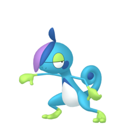
Not only does Drizzile have a totally different color scheme (which I actually really like; I'm a sucker for blue and green) but it also has a totally different head shape. Sobble and Inteleon both have have similar-looking sail fins on their heads. Drizzile has... bangs with a vaguely similar shape? Doesn't explain the cowlick, though.i have a lot of pokemon in mind but i lied i cant actually remember any of them so heres 2.
and for reference here's a picture of the line together
drizzile is... kind of a trainwreck. i know middle evolutions are supposed to be like the weird transitional stage between "uwu cute" and "murder beast" (almost reminiscent of a person's phases in middle school-- in this case, emo) but this just aint it. the colors, the pose, it just isn't working together. and oh my god those fucking mittens who designed those
colors. eugh. in theory a palette of pure cool colors (and white) should work together but its just stitched together in the most incoherent way. the purple is too close to red to be decent, and that green is absolutely fucking with me. sobble has the blue/gold color scheme! inteleon has the blue/gold color scheme! and here's drizzile, a disaster. the worst part is that you can't fix the colors without the whole thing looking weird. im not a fan of the shiny form either, but at least it has somewhat consistent colors across the line. (plus its trans flag colors. instant redemption)
the pose is just awkward. thats it.
those mitten things are just weird considering the whole "spy" theme of inteleon but at least it masks the transition from sobble's lego hands to inteleon's freakishly humanoid hands. they couldve gone full meme mode and given it fingerless gloves but, here we are
and now for the biggest downgrade in all of pokemon
typhlosion.
typhlosion has something like quagsire (and a handful of other early mons)-- from the front theres just nothing. it's purely that cream yellow whatever color, then you have a bit of blue at the top and you're done. the fire is the main thing that draws attention. gen8 threw that nice pale yellow out in favor of Ass Yellow.
this is one of those rare cases where the gen2 sprite is WAY better than anything else. my only complaint is that the arm on the left is just a bit too long and too high. its shiny sprite is WAY better than the reworked ones. the purples look great on it compared to the weird red. (i DO like gen3's shiny though. its a nicer red.
most of the body is fine on the gen3-6 sprites but it looks like they didn't know what to do with the arms.
gen6 is just bad. where's the activity in the pose? where's the dynamic expressions? where's the fire? this sprite is a trainwreck and im sure you can see why
Typhlosian is funny cuz as early as Stadium he never flares unless he's attacking
Pokemon Mystery Dungeon also shows this, and even the anime. It's kinda like how Blaziken's arms don't flame when not battling
Poses helped him, but without the flame no one really liked him sadly. Too plain I guess
Pokemon Mystery Dungeon also shows this, and even the anime. It's kinda like how Blaziken's arms don't flame when not battling
Poses helped him, but without the flame no one really liked him sadly. Too plain I guess

Oh, wow. I've disliked Typhlosion's Gen 6 model since it debuted, but I never really thought about how all its front sprites after Gen 2 were so... not painfully offensive, but certainly uninspiring. I've always felt Gen 2's sprites had this dynamic energy to them that future gens seemed willing only to use for intro animations, but this is case study numero uno.


Here's a Drizzile defense post from someone who didn't like it either at first.
The Galar starters aren't just humanlike animals. Their evolutionary stages mirror human development. The middle ones aren't just weird transition stages; they pretty clearly represent the awkward/edgy teen stage. Let's be honest, Raboot kind of looks like an edgelord. And while Thwackey gets off easier than the other two, it's still recognizably a teen.
I'm pretty sure Drizzile can change its colour. I think there's an animation in the games where it does this, though maybe I'm mixed up. Anyway, we know that Sobble can. I interpret the weird-looking green as a colour that Drizzile has chosen to display. It's out of place with the rest of the family because Awkward Teen Drizzile is going through a phase where it's experimenting with an iffy style that it will eventually outgrow.
I think the model does okay at getting this all across. Don't get me wrong, it's still not one of my favourites.

Here's a Drizzile defense post from someone who didn't like it either at first.
The Galar starters aren't just humanlike animals. Their evolutionary stages mirror human development. The middle ones aren't just weird transition stages; they pretty clearly represent the awkward/edgy teen stage. Let's be honest, Raboot kind of looks like an edgelord. And while Thwackey gets off easier than the other two, it's still recognizably a teen.
The majority of the JAPE crew when we judged the Galar Starters agreed with that assessment.
Yeah, kinda don't like that though. The shift to being less beastly and quadruped is starting to get old
Though what they said made me realize, Wartortle and Croconaw also have the issue of the middle stage sticking out oddly. Marshtomp almost does due to being biped
I'll just end here, this is a bit of a tangent from this subforum's topic
Though what they said made me realize, Wartortle and Croconaw also have the issue of the middle stage sticking out oddly. Marshtomp almost does due to being biped
I'll just end here, this is a bit of a tangent from this subforum's topic


So there was another prototype leak today, for Gen 2. There was a lot leaked, multiple builds and a ton of emails and bug reports from within gamefreak. And of course there's a ton of new (old) pokemon we hadnts een before, likely dropped just before or just after the spaceworld build we know about https://gssource.neocities.org/sprites.html
but putting that aside, if you scroll down we have a later build, nearer to the final release and that means we got a lot more sprites and boyyyy howdy can you tell these things were still getting refined. Is it really fair to judge placeholder sprites as the design was still being finalized? No.

Will I still make fun of the incredible majesty of tyranitar? Absolutely.
but putting that aside, if you scroll down we have a later build, nearer to the final release and that means we got a lot more sprites and boyyyy howdy can you tell these things were still getting refined. Is it really fair to judge placeholder sprites as the design was still being finalized? No.
Will I still make fun of the incredible majesty of tyranitar? Absolutely.
So there was another prototype leak today, for Gen 2. There was a lot leaked, multiple builds and a ton of emails and bug reports from within gamefreak. And of course there's a ton of new (old) pokemon we hadnts een before, likely dropped just before or just after the spaceworld build we know about https://gssource.neocities.org/sprites.html
but putting that aside, if you scroll down we have a later build, nearer to the final release and that means we got a lot more sprites and boyyyy howdy can you tell these things were still getting refined. Is it really fair to judge placeholder sprites as the design was still being finalized? No.
Will I still make fun of the incredible majesty of tyranitar? Absolutely.
Wow! That leak has some real gems in it. I’m surprised you didn’t mention Tyranitar’s even more beautiful pre-evolution, larvitar.

My hot take is that the celebi concept sprite is better than what we got.
Larvitar is at least obviously a placeholder sprite. Hilarious, absurd, but you get itWow! That leak has some real gems in it. I’m surprised you didn’t mention Tyranitar’s even more beautiful pre-evolution, larvitar.
View attachment 240000
My hot take is that the celebi concept sprite is better than what we got.
Tyranitar hypothetically could have shipped like that.
see also :both of dunsparce's sprites, "wobbuffet"'s sprite (at this point, it was still Twinz)
I have a couple bad sprites to share. Both from gen 8.

Ugh. Why do people actually like this thing? I may have never shown any hate for it here on Smogon, but anyone who uses Lobby on PS knows how much I hate this things design. That has got to be the ugliest mouth I have ever seen. And those ice bits on it's body... Is some of the laziest ice I ever seen. Seriously! Maybe I wouldn't even bring this Pokemon up if it weren't for the snom community being completely obsessed with it! They treat it like it's their god! And they cannot take it when someone says they think it's ugly! Well guess what! It is, and it's fact! ... Sorry, I just really don't like the snom community or this things design.
But nothing, and I mean NOTHING compares to this next thing.

OH MY FUCKING GOD!!!! ... I don't even feel like talking about this thing! Just look at it yourself to see how badly designed it is! And to add salt to the wound, it's evolution actually looks pretty awesome!

Look at it. Look at that menacing, awesome, well designed turtle. It's way better than chewtle!
Edit: Forgot to mention that I think these may fall under unpopular opinion category or controversial, but eh. Think what you want about em, as long as you accept my opinions I accept yours
Ugh. Why do people actually like this thing? I may have never shown any hate for it here on Smogon, but anyone who uses Lobby on PS knows how much I hate this things design. That has got to be the ugliest mouth I have ever seen. And those ice bits on it's body... Is some of the laziest ice I ever seen. Seriously! Maybe I wouldn't even bring this Pokemon up if it weren't for the snom community being completely obsessed with it! They treat it like it's their god! And they cannot take it when someone says they think it's ugly! Well guess what! It is, and it's fact! ... Sorry, I just really don't like the snom community or this things design.
But nothing, and I mean NOTHING compares to this next thing.
OH MY FUCKING GOD!!!! ... I don't even feel like talking about this thing! Just look at it yourself to see how badly designed it is! And to add salt to the wound, it's evolution actually looks pretty awesome!
Look at it. Look at that menacing, awesome, well designed turtle. It's way better than chewtle!
Edit: Forgot to mention that I think these may fall under unpopular opinion category or controversial, but eh. Think what you want about em, as long as you accept my opinions I accept yours
Last edited:
E3I have a couple bad sprites to share. Both from gen 8.
View attachment 240002
Ugh. Why do people actually like this thing? I may have never shown any hate for it here on Smogon, but anyone who uses Lobby on PS knows how much I hate this things design. That has got to be the ugliest mouth I have ever seen. And those ice bits on it's body... Is some of the laziest ice I ever seen. Seriously! Maybe I wouldn't even bring this Pokemon up if it weren't for the snom community being completely obsessed with it! They treat it like it's their god! And they cannot take it when someone says they think it's ugly! Well guess what! It is, and it's fact! ... Sorry, I just really don't like the snom community or this things design.
Finally, someone agrees with me
The Bug it's designed by looks a lot cooler too, and comes in different patterns.


It being Ice because it's clear doesn't really make sense since it's from the tropics. But above all I hate the literal butt face Snom has
As for Chewtle it is the very definition of big head syndrome, with derp teeth
That is so genuinely horrifying.
Who let this even happen. WTF

Hey Onix, is everything ok? What's with the weird vibrating?
A lot of Emerald sprites do that. I think it's supposed to represent roaring.
Hey Onix, is everything ok? What's with the weird vibrating?
They're Groovin'
Hey Onix, is everything ok? What's with the weird vibrating?