XY Pokémon Models

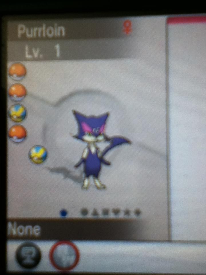
Anyone seen Purrloin? It stands on two feet. It's like an entirely different pokemon.

Edit:

 
Last edited:

Mario With Lasers

Self-proclaimed NERFED king
is a Forum Moderator Alumnusis a CAP Contributor Alumnus
Kirlia.

Kirliakirliakirlia.


Kirlia switching in.

Kirlia fainting (why would you let that happen).

Kirlia being Taunted.

Kirlia in Amie. Oh god, Kirlia in Amie.

Kirlia.

Cute.


Too cute.


KIRLIA
 
Didn't see this, so basically making the antithesis of the "Favorite New Model" thread.

So people, X/Y gives us all of our beloved Pokemon in 3D models. Some look great! We see them, we are filled with nostalgia/delight/happiness. Then there are some Pokemon that look... off. Or perhaps their old sprites conveyed their characteristics better.

For example, Cofagrigus. I know you can't get one ingame yet, but I've faced off against many in the Battle Maison. It looks... boring. It just sorta stands there menacingly. What happened to the craziness of its B/W sprite? The hopping around, the shifting from sarcophagus to ghost, that was cool. The new X/Y model looks boring.

Feel free to discuss your thoughts.

(And if this thread has already been made, forgive me, I can be blind at times.)
 
Eelektross. In BW it seemed large and menacing, a giant electric eel/leech getting ready to attack you.
Now... it's tiny, and it looks like a tapeworm. I thought it was its pre-evo (Eelektrik?), that's how small and un-threatening it looked.
Apart from that one, though, I have yet to see a disappointing model.
 
lol Marrill and Sentret are bottom-tier models.

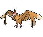
Also I know someone's gonna call out Archeops, but let's be real here; it's sweg. Fat bird struggle to stay airborne because of how fat it is. Cute af.
Ugh, forgot about Sentret. It looks so fat.

And Archeops looked a lot better in the B/W sprites, honestly. It looked more like a bird then. Not saying the X/Y model doesn't have it's own charm though, but still...

Where are you guys getting pics of X/Y Pokemon Models?
 

Codraroll

Cod Mod
is a Forum Moderatoris a Community Contributoris a Top Smogon Media Contributor
Moderator
Rapidash looked a little uncanny to me. The eyes just didn't seem to fit very well.

Bibarel being on all four makes it kinda hard to distinguish from Bidoof. Now well, still looks decent.

Spiritomb took me by surprise. I had always pictured it as kind of a cloud around the stone, like purple flames with a face. Instead, it's a... spinning disk? What the heck?

Honorable mention goes to Eelektross. I didn't recognise it when I first saw it.

Loads and loads of great models out there, though. They more than make up for the worse ones.
 
Where are you guys getting pics of X/Y Pokemon Models?
Serebii has 'em. At least, all the models of stuff you can actually encounter in the game.

I think Watchog's kind of a downgrade:
->

It's always been kinda goofy-looking, but in Gen V it was all business. Good posture, arms crossed, standing on its toes for maximum height. Always seemed to be looking down on you, like it had better things to do with its time. It could be watching Meerkat Manor right now instead of fighting your sorry self. Now it's just plain goofy-looking in an awkward gangly snaggletoothed sort of way.
 
Altaria. Its "wings" look wierd in X/Y. It looked much better in the sprites with the wings pulled in close to the body.
 
Purrloin, there's just something oddly disturbing about it standing on its hind legs. ALL. THE. TIME. I know in the 3d pokedexes that it can, but seriously, it's meant to be a fricking cat.
 

Celever

i am town
is a Community Contributor
Eelektross. In BW it seemed large and menacing, a giant electric eel/leech getting ready to attack you.
Now... it's tiny, and it looks like a tapeworm. I thought it was its pre-evo (Eelektrik?), that's how small and un-threatening it looked.
Apart from that one, though, I have yet to see a disappointing model.
This. When I first saw it I actually had to put my DS down and just complain for a little bit in my head because WHAT THE FUCK EVEN IS THAT I DON'T GET IT!?!?!? I haven't seen Eelektrik or Tynamo in-game yet but... my god that model sucks.
One thing I don't get is right here:

They are pretty much the same size as eachother. Now I get that proportions are fucked up in Pokemon but really?

Also here,
you can't really see it with that picture but in-game Audino has black lines all over it. Everywhere. Kinda sucks to be honest, but meh I can't see it being that bad I guess.
 

Andrew

beep boop
is a Top Artist Alumnus
yea I agree Hippo looks really bad...Sudowoodo creeps me out b/c he's just so...still. I get that he's mean to be masquerading as a tree but it's weird to me, especially the first time I saw him in game. One mon that I just didn't get was cascoon. It always looked like it just had one eye/red spot and I didnt understand it. But after seeing it in 3d model you can see much clearer the position of it's eyes and it actually looks pretty sinister. Also it's pokedex description , something like "It remembers every hit it took as a cocoon. When it evolves, it gets revenge." Very creepy.
I'm not really a fan of the washed out colors on the Kanto starters. They just look less vivid to me.
I really like zigzagoon's attack animation! He runs and zigzags in a very cute/cool way.
It was brought up on IRC about venomoth and how gormless she looks...her body and eyes so still while her wings are frantically flapping...I like this one
One mon I have to say Im very impressed with is Conkledurr. He always looked kind of derpy to me, but after seeing him standing there with his arms resting on his concrete pillars, swaying his head ever so slightly, he now looks like a genuine bad ass to me
Croagunk looks like he's got an arm deformity, the way one is held close to the body while the other goes in a circular motion
I really don't like Rampardos...he looks too fat, not bad ass at all, his expression looks like he is about to fart and his arms are held very effiminately

I may be in the minority here but I've always liked garbodor.
his b/w pic:

x/y pic:

At least in b/w he looked line an insane heap of garbage. Now he looks like a sad retarded heap of garbage...why did they not give him a crazy open mouth??? His movement sucks too.

shuppet. I never thought much of shuppet, probably b/c she and banette always sucked. But I do like the new animation for her and her mischevious expression
x/y: b/w:
(not much different but if you look at the pokedex animation you'll see)

and my wtf mon : drowzee. WTF is he doing with his arms and fingers??!! Idek what to say about this @.@
 
Bibarel. It looks even more derp-tastic than it did in the original sprites. WTF happened to it? -_- Meditite looks pretty bad now too. Looked better when it was in the yoga pose, now it just looks 'D:!' IMO. Drowzee looks like it's trying to do very bad things to children, and WTF happened to the badassery that used to be Cofagrigus? Now it just stands there, instead of flailing its' dead ghost arms around. >:(
 
Xatu looks terrible with its wings outstretched. There's a lot of flying pokemon who looked better when standing, but were given a flying animation instead for sky battling.
 

Agonist

how can I feel existential dread, it's my fear
is a Forum Moderator Alumnus
Xatu looks terrible with its wings outstretched. There's a lot of flying pokemon who looked better when standing, but were given a flying animation instead for sky battling.
I actually like it a lot better than its previous sprites where it was just standing there.
 
Strongly agreed with Hippowdon, Bibarel, and Cofagrigus. To add some to the list:

Maybe he is supposed to look odd, but XY Hariyama is just ridiculous looking. He's all thighs and hands. Plus, he looks short. Previous sprites made Hariyama look like an intimidating sumo wrestler, now he's just fat.


What happened here? Ludicolo isn't supposed to look mega creepy ... he's supposed to be a bundle of dancing pineapple-y happiness.
 
As others have said, Stunfish, Mr.Mime, and Magikarp are all great. You need to see the animation to really appreciate these two:

XY excelled with Yanma; it's buzzing wings are beautiful to watch in full 3D.


Fearow has always looked intimidating, but not like this. Those wings are so huge!
 

Andrew

beep boop
is a Top Artist Alumnus
Red G , I definitely agree with those two.
another one that didn't get any better is exeggutor

In BW, he's overly ridiculous. In XY, he's just doesn't reach the same level of loveable goofiness. I've never had a hard on for exeggutor really, I guess there's just some they have to make look terrible in order to emphasize the coolness of others.

Idk if this on'es been mentioned before, but scyther also got shafted

The previous artwork is awesome. So dynamic and threatening. The BW sprite is good too; he's standing on the ground and waving his sharp scythes in a chopping motion which is p cool. XY: weird flying, motionless legs, weird arm position, not intimidating at all. I really wish they had made scyther better
 
Strongly agreed with Hippowdon, Bibarel, and Cofagrigus. To add some to the list:

Maybe he is supposed to look odd, but XY Hariyama is just ridiculous looking. He's all thighs and hands. Plus, he looks short. Previous sprites made Hariyama look like an intimidating sumo wrestler, now he's just fat.


What happened here? Ludicolo isn't supposed to look mega creepy ... he's supposed to be a bundle of dancing pineapple-y happiness.
OMG, I just realized how creepy Ludicolo looks now. Goddamn it, they shafted one of the coolest sprites and make Ludicolo look like it wants to go the route of Drowzee and Hypno. D:
 
I swear, whenever I see Ludicolo in X/Y it pisses me off for some reason. I think it's all the dancing and its weird shaking when it attacks.
 

Users Who Are Viewing This Thread (Users: 1, Guests: 0)

Top