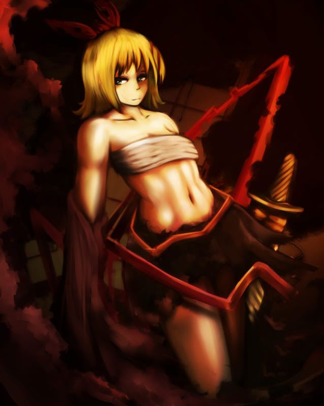
• Check out the relaunch of our general collection, with classic designs and new ones by our very own Pissog!

Yilx first place artist

Man I love your stuff. Just friggin amazing. I was wondering, if you aren't too busy, may I request a Vanilluxe, possibly using Blizzard on a Garchomp and freezing it? I would really appreciate this, but I understand that you might not be able to do it. Thanks :)
 
talking about the art poll in #cap today...

<~DougJustDoug> And Yilx has a very big following of admirers from his thread in Smeargle's Studio.
<~DougJustDoug> He could draw a black box and make the top five, probably.
<~DougJustDoug> Because that black box would be the most amazing black box you've ever seen

I think you should draw a black box. :)

...In some dramatic fashion, maybe a sableye is hidden in it.

You are a very talented person and I love every one of your drawings in this thread.
 
talking about the art poll in #cap today...

<~DougJustDoug> And Yilx has a very big following of admirers from his thread in Smeargle's Studio.
<~DougJustDoug> He could draw a black box and make the top five, probably.
<~DougJustDoug> Because that black box would be the most amazing black box you've ever seen

This is so going to be my new signature. Keep up the great work Yilx!
 
trying something -slightly- different

bug-esca.jpg
 
Your drawing style delivers as usual, but I'm not too fond of that green color (and blue dot). I get that you tried to accomplish a strong contrast, but maybe a color which is relatred to red would work better. Like the yellow in his eye, for example.

The pixelated font down below is also a nice touch, but I have a hunch that it'd be better off without that outer glow (since the actual image doesn't have anything of that sort).
 
Bummer pretty much hit the nail on the head there. I do like the extra edginess of the shading though!
 
I thought it was pretty good. D: It seems better than usual, I didn't question the green, lol. I thought green sort of does work with red? In that their opposites on the color wheel.
 
Your drawing style delivers as usual, but I'm not too fond of that green color (and blue dot). I get that you tried to accomplish a strong contrast, but maybe a color which is relatred to red would work better. Like the yellow in his eye, for example.

The pixelated font down below is also a nice touch, but I have a hunch that it'd be better off without that outer glow (since the actual image doesn't have anything of that sort).

Thanks for the feedback, I'll post the updated one alongside the next one in the series once I'm done with it! :)

Are you still taking requests? I'd love to see a picture of Milotic using Recover, Dragon Tail, or Scald, or activating Marvel Scale :)

you can, but... i feel a little jaded by requests right now, so it might never see light of day :justin:

also,

happy birthday kagamine rin
i will give love to whoever knows the songs this piece is based off
rin_shura.jpg
 
I love that Flygon! Esca is neat and your changes to it really improved it, but damn, that Flygon! *_* The way you do shadows and make Flygon look like it's in motion is very impressive.

Nice Rin art too, even though I don't know that song~
 
yup that flygon is sexy

also: escavalier looks amazing but that yellow just bothers me haha

how about changing the yellow to white? just a thought~
 
Sheesh, can't please em all.

Though vocaloids infuriated me ever since I first heard what passed for their music. Leave the e-bands alone, Japan. That Rin however is very ncie.
 
How do you get the colors at the border of the black to be so smooth. o _o It always ends up jagged when I fill the colors in. I've had to manually use a brush to get color borders that smooth. Do you use some setting like "smart object" to get it like that? What method do you use?
 
guess nobody here likes vocaloids :(
it's also somewhat hard to comment on loosely colored women on someone else's computer ahaha

But I like the smooth work you've out into it. Her arm seems unusually thick when I compare it to her chest, but otherwise, it's a really neat drawing with an nice pose.

flygon and escavalier
aww yisss, escavalier looks real sweet now. The same I said about him can also be said about Flygon, since the purple highlights should at least be seen at the right end of the background if the light source comes from that direction. However, since purple works with red, and Flygon is naturally green, it's not as big of a deal like last time. I also like what you did to his eye, Flygon really should have been made Bug/Dragon from the start imo.

How do you get the colors at the border of the black to be so smooth. o _o It always ends up jagged when I fill the colors in. I've had to manually use a brush to get color borders that smooth. Do you use some setting like "smart object" to get it like that? What method do you use?
Not sure how Yilx goes about that, but I usually select the empty spaces with the magic wand tool and then expand the selection with 2-3 pixels. Afterwards, I fill in the color on a separate layer with the selection I just made. But sometimes that's not enough to fill in all the creaks, not to mention that you need the lineart to not have any gaps, but it's a way to get the job done quickly.

Although I've had similar problems when the selection gets jagged, for no reason in particular. And I always forget how to cure that!
 
Back
Top