


Meh, Cartoons! wins this contest, hands down. Still, I'll give it a shot.
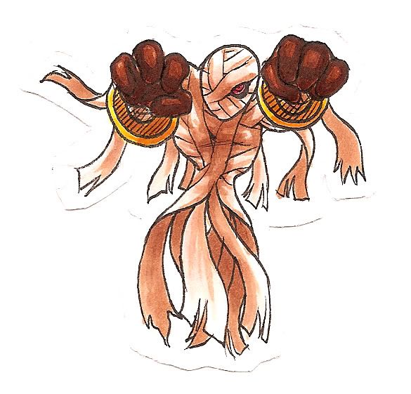
Bleh, my colors are too bright for Revenankh, but it's not too shabby overall. I'll have Syclant done probably tomorrow, but I lack the colors I need for Pyroak, so that'll have to wait until Monday or Tuesday...
EDIT: DERP
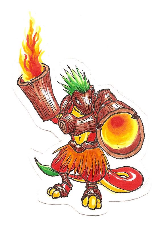
Pyroak
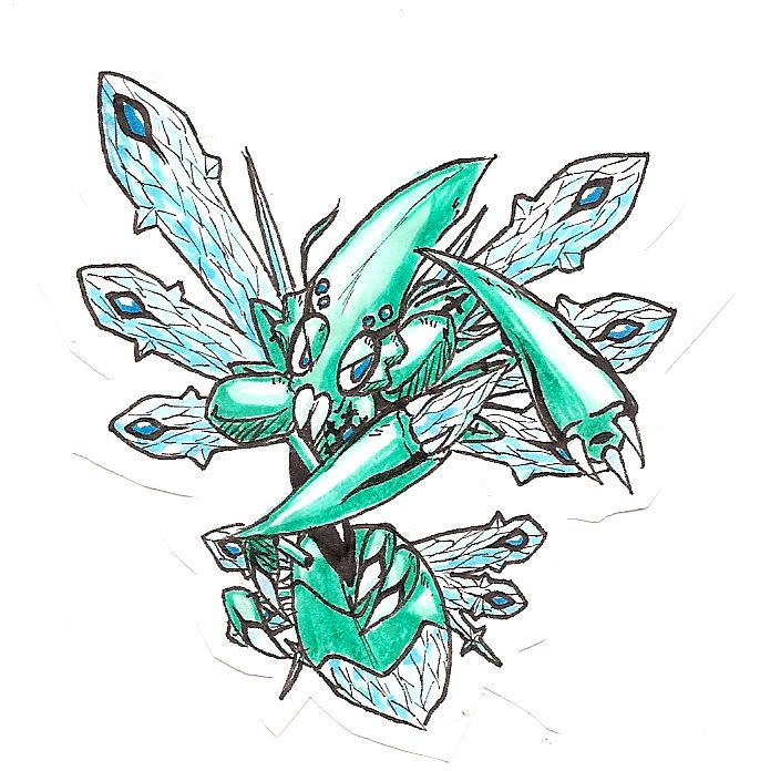
Syclant
Bleh, my colors are too bright for Revenankh, but it's not too shabby overall. I'll have Syclant done probably tomorrow, but I lack the colors I need for Pyroak, so that'll have to wait until Monday or Tuesday...
EDIT: DERP
Pyroak
Syclant


