CAP 10 CAP 10 - Art Submissions

Status
Not open for further replies.
Hmm, time to try an idea that's a little outside of the box...


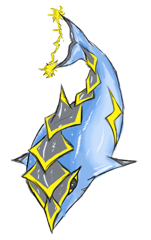
...well, outside of the box and into a glob of water.

Inspired one of my favourite toys as a kid. The creature inside is not based off of any real world animal, just a random cute thing that will probably be getting a hefty number of design changes. I'll play around with colours tomorrow as pure blue isn't the best, input on that is very welcome.

To below comments

@ Pink: I think that rule only applies to backgrounds, or something? But yeah I'll try to define the outlines a bit more regardless, thanks for your feedback!

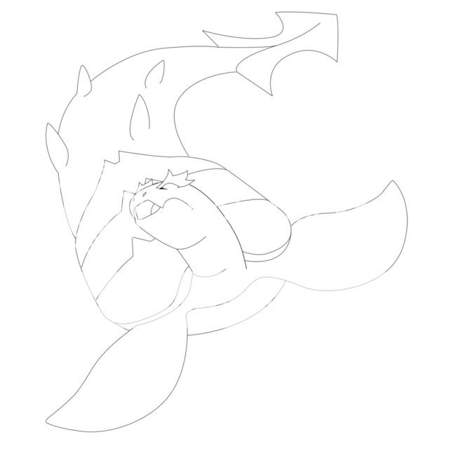
@ Taicho: Haha, don't worry, you're likely to get my own vote so I guess it all evens out. Turtlemon is looking cool too, loving the pose.

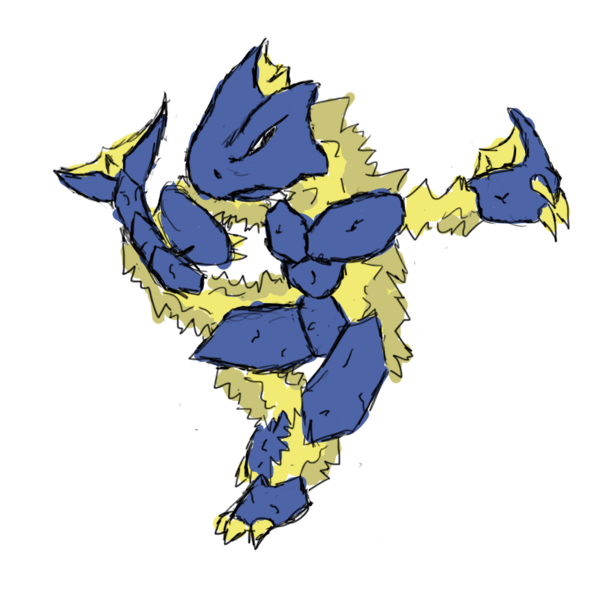
@ Cartoons!: Yeah he's creepy alright, I'm not too certain if that's something I want to try to remove or promote, though! By the way your CAP10 rocks, I really like how serene and peaceful it looks (even when it's zapping Gyarados).
 
The Top Left one. The bottom teo look like they have mouths, and I prefer the extra set of antenna. The Left Side is better since it has a more Shrimp Pose with the characteristic semicircle. So yeah, go with the Top-Left. +)

As a note, I should be entering something for this sometime tomorrow, which, funnily enough, is based off of an animal that I based my recent Science Project on. Who would'a thunk it?
 
Skampy, I love your idea. Just be careful of the solid outline rule! I feel like yours could run into problems in that department.
 

macle

sup geodudes
is a Top Tutor Alumnusis a Site Content Manager Alumnusis a Social Media Contributor Alumnusis an Artist Alumnusis a Forum Moderator Alumnusis a Tiering Contributor Alumnusis a Top Contributor Alumnusis a Smogon Media Contributor Alumnusis a Battle Simulator Moderator Alumnus
Shiny_togekiss: I love yours. I was going to make something similar but that's so great I'm not going to waste my time.


Yay Turtle Serpent!

Time for colorz @_@

I got third last time lets see if I can take this all the way =P

@ Damnit Scampy.... I hate thinking that I'm not going to vote for my own piece... even though I usually wind up voting for other people anyways =\
 
Wow, I love some of the artwork in this thread, so amazing!

MAN O' WAR

Inspired by the Portuguese Man o' War. Shield and a sword for the "utility counter" aspect in a sense.
 
I definitely prefer the thunder cloud design over the jellyfish, Caladbolg. Not only does it manage to fit the Electric/Water motif in a logical, but unique way, but I think it looks pretty cool as well. Also, I find the whole plug and socket apparatus unappealing.

Banryu, to be honest, I'll say it looks a little bland right now and could probably do with more tinkering. That doesn't necessarily mean 'add more stuff', but I think it needs a hook, a design element that will get you to look twice if you were skimming through the Pokedex. As an aside regarding concept, electric eel is cool, man. It'd be unfortunate if, in an attempt to take the less obvious route, no one ends up doing that concept for an Electric/Water type.

Scampy, I like the idea, but I also find it really creepy! The lighting aids a lot in that effect. I won't comment much now as you said it's a work in progress.

I prefer the top left one too, aragornbird. The 'S' shaped design could work if you posed him to be able to stand upright in a more balanced manner, but 'C' is just so charming, and very suitable too.

Taicho, my favorite was the sponge. I thought it had a lot of personality, and it was a unique design. I like the turtle too, but any chance you'd be willing to have another horse in the race?

edit: sorry..cucumber. animals named after things you'd find in the kitchen get me all mixed up.
Also, the rules state apparently only one submission per artist. Oh well, follow your heart :-
 
Taicho, my favorite was the sponge. I thought it had a lot of personality, and it was a unique design. I like the turtle too, but any chance you'd be willing to have another horse in the race?
Sea Cucumber* >.>

Is it legal to have two designs going until the end? Kinda sounds like thread hogging. I liked the that design too because it reminded me a little of Bronzong retyped as a Water Pokémon.
 
Yea, it's the Art Submissions and I'm already seeing interesting stuff here. I never would have thought of some of the stuff that I'm seeing here.

Anyways, I suppose I should leave some comments here.

@ Aragornbird: Aw... it's such a cute little shrimp. I think the colors you have on the initial design work well with him. In regards to the pose, I think the curled-up pose looks, well, more shrimp-like: that standing pose just doesn't jive with me.

@ TanzAufDemVulkan: At first, I was thinking, "a Portuguese man of war? What is that?" After searching on google images, I now know what a Portuguese man of war is. And it looks like a jellyfish. I digress, though. It is an interesting design: interesting is always good. I certianly would like to see this colored before I can say much else about it, though.

@ Galactic Grunt: Dude, from what I'm seing right now, that is SICK man! I'm not sure what you're going for in terms of what this guy looks like at the moment, but it looks like some sort of reptile. Then again, one doesn't have to know what the design is based off of in order to like it. Either way, it's looking good so far.

@ scampy: I've never thought of hermit crabs using different shells as "self-customization," but now I see it. I really like this guy as he is in your rough sketch of him and that includes the shell: I think that you should leave the shell as is, although that part is clearly up to you. His expression is adorable and the little lightning-bolt moustache makes it even better... maybe not what you were going for, but still. All in all, it is both a cool and cute design.

@ pkmn-taicho321: I think your dolphin and your turtle are your best two out of the designs you've come up with. I really think that you should go ahead and shade the dolphin and compare the two to see which one you like better. Which design you ultimately go with should be your choice, obviously.

---

As always, everything you do is up to you, but I really do like what you guys are comming up with so far and it will be really fun to see these pieces develop and what else people will come up with.
 
I love the Heron idea, very very original.

Scampy has me enthralled by the plasma ball. So cool. It's also very interesting concept wise. Since it's enveloped in water, it can effectly control the water. Such as, if it wanted, it could turn the water into fists or make it into a shield. It fits our concept rather well and would like to see more "amorphic" water concepts.

Best example I can think of is Chaos from Sonic Adventure.

Water can take any shape but only maintain 1 at a time, kinda like this concept.
After you said that I'm kind of reminded of that Water temple boss from LoZOoT
 
Thats a really neat concept ticketmeister but it looks very un-Pokemony and the transition between the two elements is so quick, if it was "smoothed out" it would look so much better
 
I really like the storm cloud thing because it is very unique and really displays what we want. I disagree about the lightning bolts in the hands. I like them and think they had an extra effect to the character. Also, we finally get another rain dancer. I mean look at the storm cloud it would be perfect for a rain dancer in addition to its job as utility counter.
 
Scampy has an amazingly awesome and original idea. Promotes versatility which is what this CAP will be based around. Very well done.
 
I much enjoy Aragornbird's first drawing, Umbreonage's drawing and pkmn-taicho321's drawing imparticular. All drawings are very good ^_^
 
my WIP kinda want feedback on the colors and other such things..

There's some really great art in here already =)

[badass picture]
I am literally shocked at how good this is. Not only did you just take my vote away from the competition, but you also basically ensured that no matter what is submitted, I will vote for this. Great job. My only advice would be -since you cannot keep the electrical effects- to make it have a bit more of an electric feel by adding something or changing the color scheme.


EDIT:
http://i713.photobucket.com/albums/ww139/pkmntaicho321/SeaCucumber.jpg?t=1268859554
I don't know how I missed this Tai, but I am in love with it. Too many great submissions!
 
Status
Not open for further replies.

Users Who Are Viewing This Thread (Users: 1, Guests: 0)

Top