CAP 11 CAP 11 - Art Submissions

Status
Not open for further replies.
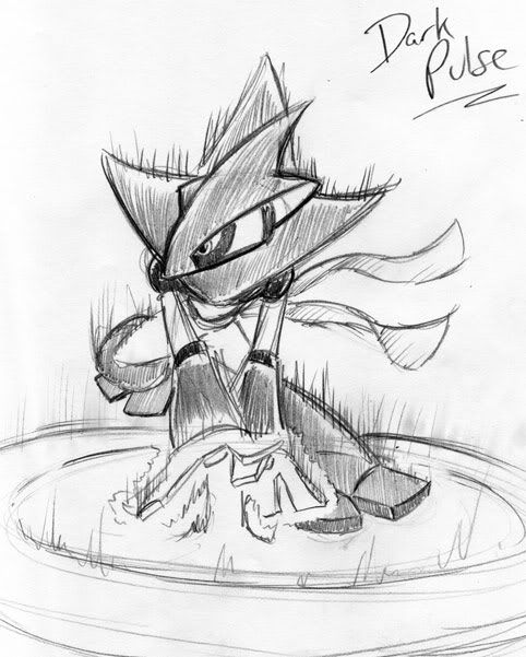
Here's a better look, unshaded, Swaggersaurus. I'm still doing experiments for the colors. Any thoughts? I do hope it isn't look like a water type.

edited: Which do you prefer?

i don't think it looks too much like a water type! i could see in inhabiting water, perhaps, but lots of pokemon have a subtle, hidden third type of sorts

as for which i prefer, i'm having a really hard time deciding

the "collar" makes it look more geared up for fighting, but without it i think it looks a little bulkier. i would suggest when in doubt go for what's simple, so i'm going to go with no collar!

I started playing around with a few other design ideas, and I started tinkering with gorillas, King Kong, tribal warriors, and cannibalism. Yeah, maybe you guys don't tend to merge those ideas -- but I'm kinda twisted like that. Anyway, here's a rough sketch of my design progression along those lines.

this looks really mean, i'm intimidated by the sketch alone, haha

i can't really comment on the jackrip/ripjack (icr?) vs gorilla divide; i personally liked the former a great deal. one thing i wish i'd mentioned (sorry!) at the time is that whilst i was fine with the "clothing" colour scheme, i think the bag looked a little awkward fused into the hand design. i think you could have had a second knife-like claw and made it look more natural, and still very jack the ripperish

having said all this, i love this voodoo-y gorilla. i support the suggestion to deck it out with beads and feathers and all that, tribal tattoos perhaps too? looks absolutely great thus far, i hope you go for a strong vibrant colour scheme to give it a really "jungle" feel

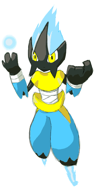
Thanks for the help ^_^ Heres the tinkered version

hey, looking good! one thing that i think makes it look odd is its tall stature. it looks very robotic like that. perhaps you could try reposing it with it's legs bent and spread, and arms down and ready, as if preparing for a fight? just a thought!

Well, here it is. I worked pretty hard on this one. This is , once again, supporting artwork for my design. It's my design using focus blast and being an overall badass.I really hope you like it.

this is the sort of thing that used to haunt my nightmares as a kid, jesus, seriously seo! also:

I've also been thinking about some back story. So far I am going with something along the lines of lonely temple guardian. This pokemon spends most of its life in the deepest reaches of ancient mountain temples around the world. They live out their lives in solitude, devoting all their time to meditation in order to better guard the ancient treasures and secrets they are responsible for. Since they spend most of their lives in the deepest regions of mountain temples, these pokemon are hardly ever seen. If you do ever happen to stumble upon one of these rare pokemon, be ready for a difficult battle! This ancient species are also believed to have incredibly long lives.

that's exactly the sort of thing i imagine for it. the lack of facial features aside from those ghostly glowing eyes make it look like some sort of ancient unfeeling golem, i really like it

i think i'm settled on a colour scheme for the tanuki ninja, and i'll be playing around with different eye designs now. i'll post up some more comparisons (ugh, sorry) when i have them, thanks for your input so far everyone!
 
Thank you very much for the feedback Swaggersaurus! I've really enjoyed watching your little tanuki ninja grow over the days, I think we can all appreciate the difficulty in deciding on the color scheme for designs! Keep at it, I'm sure that your submission can only get stronger!

I started playing around with a few other design ideas, and I started tinkering with gorillas, King Kong, tribal warriors, and cannibalism. Yeah, maybe you guys don't tend to merge those ideas -- but I'm kinda twisted like that. Anyway, here's a rough sketch of my design progression along those lines.

Obviously it's very rough, but it gives you an idea of where I was trying to go with it. I don't know if I will take it any further, but I think it captures certain elements of Fighting/Dark. And it has a mystical flair too (tribal designs tend to do that, which is why I love 'em so much). Anyway, I was just kicking it around, so I thought I'd toss it out here and see what others think.

I am really liking this design. It has a very King Kong/Planet of the Apes sort of feel to it. The only thing I am a little worried about is that it looks very physically biased. I am having a hard time imagining it do something like flamethrower or thunderbolt, whereas I can totally see it murdering stuff with close combat. I hope my opinions help you out, but of course, feel free to disregard them if you don't agree.
 
personally i like SEO and ckpmax1108's, though i think SEO's could undergo a coloring revamp. although doug's first idea was good, but not for this CAP. the gorilla was quite nice though.
 
alright, this is what i have heard more than anything, so i think a change is definitely in order. i know people have mentioned making the lighter fur darker, and i'd just like to take a moment to explain why i haven't. part of the reason why i think the colours of this design are attractive compositionally is the high contrast of both fur types. if i closed this gap, the design would looks less dynamic, and the idea of a ninja "helmet" and "armour" depicted by the dark fur would be played down

i think it is still possibly for this design to look dark with that light fur intact, and with this in mind, i've decided to experiment with the colour of the scarf. personally i liked the gold, but i some interesting things have come up through experimentation

i've numbered them all so that it's easier to discuss them (#1 being the original) so let me know what you think! there's a lot to look at and i wanted them at a decent size so i'm going to link:

http://img838.imageshack.us/img838/6388/tanukicolourcompv2.jpg

thoughts? the dual-colour is an experiment more than anything, but i actually think with some tweaking it could look good. so far purples look good to me!

with regard to the eyes, i hear you. i really want to stress that i don't think "dark" types have to look evil or be all black and red etc, but at some point the eyes stopped expressing what i wanted - a sort of mischievous fox-like look - and are instead apparently now just too cute!

i'll post another variety of revised eyes soon, and i might bring back the option of having them open, though personally i like the slanted look

thankyou for so much feedback, it's really helpful and i couldn't refine this design without it! and sorry again for such a huge post aaaa


If you insist on not changing the light fur,I like B out of the choices, but I urge you to open the eyes, it's important in my opinion
 
I wasn't really feeling the monkey idea, so here is a new concept I came up with.

Based on an Iguana/Komodo Dragon. (click for larger image)


It's limbs are made unfused vertebra wrapped in thick muscle, allowing them to expand and contact to an incredible degree, and with an enormous amount of force. When fully contracted, its arms are ~3ft long, and can extend up to 9ft away in half a second. The vertebrae in it's neck are not fused together, allowing it to stretch it's neck up to three times its normal length. It's lower jaw can be dislocated at will, opening it's mouth almost 180 degrees. Sharp teeth and claws can easily slice all but the toughest armour.

Colour scheme will probably be dark and light greys, and olive green.

Anything I could do to improve this one? What could I do to make the armour look more 'organic', or would it be better to remove it entirely?
 
Since my CAP11 hasn't received much love, I was kind of down and unmotivated to further improve it(also improving it is kinda impossible with my skills)

I colored it like in 30 seconds, but I want to know if the black and yellow colors looks cool or should I change it into Black and light Orange?
CAP11_colors_Minotaur_by_Sunruler.png


If this one fails to impress any, I'm thinking of making a new one. If you have great ideas and cannot draw, I'm willing to draw it for you.
 
C~Dog, your idea is just awesome! I have always loved Komodo Dragons since I saw them in some doku. They are ridiculously strong as it took five people to stop its movements completely without killing it.

I like the idea of Komodo Dragons strength and kinda sínister nature represents Fighting and Dark types

You should give it pokemonish eyes like seviper. Yours is gonna rock.

Won't it eat Togekiss rather than helping it? lol
 
Glad you like it FreakInside ^^ I was meaning to improve the eyes, but I suck at pokemon eyes.

As long as Togekiss helps catch Bidoof and Rattata, then there won't be a problem. >:C
 
wow c~dog, that thing looks beastly. i'm not sure what to tell you armour - my instinct is to tell you to give it some sort of leafy loincloth or tabard, but we already have lots of leafy lizards and those are all grass types. maybe discard it?

here are tanuki ninja's eye options

http://img683.imageshack.us/img683/6718/tanukieyecomp.jpg

i brought back the open eye design since a few people asked to see it again, and i made a "meaner" variant, though i personally don't like either much at all

at the moment i'm personally leaning towards v or ix

x is the original, for reference, so please let me know what you think!

thanks
 
I am pretty into both vi and ix. I don't really like the original because it seems too happy and not really mischievous, which is what I think would be most fitting for a dark type.Good work though, keep it up! I was wondering, are you going to do more detailed pieces? I would really like to see your tanuki ninja in detail!
 
@SEO, that's pretty badass. You've got my vote for sure, but there is one thing. In past CAPs there has been more or less a "strict outline rule" for final submissions, and that it's supposed to be on a white background, more or less. But it's really awesome. BTW, I already finished my moveset for this Pokemon, and as I was writing it, I was thinking of your design for the Pokemon, and figuring out what moves would work. (Coincidentally, having only 35 Very Good Moves is Very Hard.)
 
wow c~dog, that thing looks beastly. i'm not sure what to tell you armour - my instinct is to tell you to give it some sort of leafy loincloth or tabard, but we already have lots of leafy lizards and those are all grass types. maybe discard it?

here are tanuki ninja's eye options

http://img683.imageshack.us/img683/6718/tanukieyecomp.jpg

i brought back the open eye design since a few people asked to see it again, and i made a "meaner" variant, though i personally don't like either much at all

at the moment i'm personally leaning towards v or ix

x is the original, for reference, so please let me know what you think!

thanks


I'm liking, actualy all of them besides X, VIII, VII and IV, but I think my favorite is IX or V, like you, maybe IX more...
 
I am aware of this outline rule. As it stands, I have my original design which could be submitted at any time as a final submission. Everything else I have made has been supporting art in order to attempt show how awesome my design can be. I don't want to say that my original design is my final though, there is still lots of time before we have to make our final submissions. If time permits, I will work on my final submission within the next few days.
 
Just adding some supporting material, still working on the claw hand on the main design.. This is dark pulse, cap11 slams each of the torn scarf pieces into the ground creating the pulse wave. Gonna start finalizing everything in the next few days-ish.

darkpulse.jpg
 
Yahoo! CAP 11! I've been waiting so long for this!

So anyway, I banged out 5 rough sketches, about 5 minutes each. I eliminated the weakest one, leaving you guys with the other 4. Which do you think is worth developing and fits the concept best?

picture.php
 
This is actually a lot cooler now that you've posted the supporting material than I originally thought it would. The current pose you have for the main art obscures a large part of his body and makes it difficult to see the back leg and stuff. I think after looking at the Vacuum Wave pose, it looks really cool. I dislike how the feet appear to be "boulder-like" with the thick circular toes, but the hands appear very metallic with the sharp edges. I think a bit of consistency there would go a long way. Good luck!

Okay, so I reworked the design a bit and made a few adjustments. I tried Wraps on the hands, and even a headband to further employ the fighting type but didn't like it. I adjusted the feet to the suggested style and really like it! I also reworked the design a bit and altered the armour slightly as well as the feet. I've posted the rework of the original and a link to the new design... as well as a design I came up with while on break today at work. Different character but still seems cool.

Version 2
Darklorisroughver2.jpg


Version 3:
http://i139.photobucket.com/albums/q301/Kukem/DarklorisroughVer3.jpg

New Design for CAP 11:
http://i139.photobucket.com/albums/q301/Kukem/CAP11_2.jpg
 
Final Submission


So the things I initially took into account for this were the stat spread and the typing. From the looks of the stats, it looks like it will be a mixed offensive pokémon that excels in special attacks rather than physical attacks. Since the special attack and speed outweigh the defense, health or physical attack, I figured it shouldn't look bulky, but rather tall, slender and nimble. Since it's fighting, I thought making it an athletic body type would work nicely.

I took influence from the idea of a ninja, basing the simple full dark body with "baggy" "pants" and leggings. the hair is based on a ninja's veil.
I imagine them being silent killers, hence the lack of a mouth; even their footsteps are silent, as they travel through the shadows.
I took the color scheme from the idea of night. The fighting stance and style is based on ninjutsu.

Flavor Lore:
These silent pokémon found a home in Mahogany Town, long before Team Rocket used the area for their hidden base... The ninjas who used to call this town home noticed the wild pokémon making primitive shelters on the outskirts of town, and recognizing their intelligence, welcomed the pokémon in as accepted community members. Over time, they trained the pokémon in the arts of ninjutsu, and fought along side them as faithful partners.
They left Johto and disappeared from history, along with the last of the ninjas long ago. They were recently rediscovered defending young Togepi while the parent Togekiss has left the next.


Old Colors:
http://img293.imageshack.us/img293/1089/cap8.jpg
 
@meekhead: It looks a bit too elongated in the torso area, and the lime green coloration doesn't do too much for its typing. It also looks kind of... indecent for a supposedly feminine design in comparison to things like Gardevoir.

@Doug: Oh you so silly. :P

Anyways, I've come up with yet another design, based on a shooting star.

FightingDarkMonAttempt3.gif


This time, the image is compressed.
 
there are so many awesome designs. I like Doug's ripper and SOE's... thing the most. I'm just wondering about Doug's hands... is one of those a hand bag? Why?

I also really like your design you Meekhead. it looks like an evolution for Mismagious. It looks really good, but if it were a real pokemon, it would have more rule34 than gardevoir. I'm not sure if this is a good thing or a bad thing, (I like it) but it's something you should consider,
 
Hey guys, submissions are looking nice this round! I wish I could critique everyone, but I'm about to head out sooo :(

@DougJustDoug: While I did like your old (RipJack) concept, I had a really hard time imagining it using a wide variety of moves, (especially elemental punches/beams) because of it's lack of distinguishable features. Don't take me wrong, it was a cool concept! I'm really digging your new gorilla though. It conveys the types well, and it's easy to imagine it smashing things with physical moves, as well as conjuring up special moves with all those tribal designs. can't wait to see it coloured!

@SEO: I'm really impressed by this one. It adds some ethereal elements without being overly ghostly/psychic looking. (on a side note the way you colour is beautiful) it's nice to see some backstory as well, the way you describe it is exactly how I would have imagined it. I can't think of much critique, except maybe the lack of chest/torso features? I understand leaving it blank though, it might look a bit too cluttered if you add too many lights and stuff.

@Swaggersaurus: I was actually going to enter a fox/Tasmanian devil this round that looked a bit like yours haha. shame my tablet pen broke, otherwise I probably would have entered. anyway! While I do like the current eyes (x; they make him such a cutemon, but still convey a sense of mischief imo) I think ix or v would be safe choice to make it look a little more composed/serious. The open eyes, for me, are a no-go, they make him look a little scary ^^; the "angrier" eyes look okay, they remind me of what racoondog would likely look like in battle. overall I'd say my choices are x, ix, v, or ii.
 
Oh dear... "indecent"... "more rule34 than gardevoir"... should I 'de-sex-ify' it?

Also, I see what you're saying about the Mismagius comparison... I think it's the eyes. Is this a problem?

Here are some different color ideas, as well as fix to the torso area.
http://img827.imageshack.us/img827/1089/cap8.jpg
Just posting it as a link, since it's a rather long image
 
Status
Not open for further replies.
Back
Top