Welcome to Smogon! Take a moment to read the Introduction to Smogon for a run-down on everything Smogon, and make sure you take some time to read the global rules.
I ain't gonna win, but I hated my octillery so I did a new one, tbh every single other entry is better than mine so idek why I'm posting this? Mega sylveon with whipping ribbon flesh yay
I know I missed the deadline, but I didn't discover these forums 'till last night! I will have a mega done before I go to bed....soooo, regardless of whether you allow it I will be posting it tonight :)
Alright guys, I realise we're more than a little after the due date here, haha. Don't worry tcrfelton, I'm allowing your entry since the MAC wasn't officially closed. Speaking of which...
Submissions are now closed. The poll thread is over here!
Alright, since we've all been awaiting X and Y with bated breath, our new theme for MAC #27 is...
X and Y redesign!
I think everyone saw something like this coming. We want you redesign the final evolutions of the XY starters! As some of you may know, the final evos of the starters have already been leaked, which is why this is being called a redesign, but having seen those designs isn't necessary for entering the contest. Just go for whatever you think they should look like! Feel free to redesign between 1 and 3 of them, as well.
This is very early, but I want to submit my...um...submission for this MAC.
So.. I chose Chespin because when I see Chesnaught, I do not see it being the final evolution of this cute grass starter.
In my opinion, it makes the least sense.
So..here you have it! Chespin's final evolution Redesign!
This contest theme is perfect for me. Admittedly, I was pretty disappointed when I first saw Delphox. Braixen made me so happy because I adore witch characters, and Delphox is well… a Wizard. So I made a full-fledged witch Delphox design! I like it a lot better sob
Hi all, just letting everyone know that we're putting MAC on hold until after Christmas, simply because 1. Holidays! 2. Many of our usual artists already have a lot on their plate with secret santa and I don't want to overstress people. If you can't live out the next month without contests, you can try your hand at the facebook profile picture contest or maybe even submit something for the facebook banner! See you all next month!
PS: If anyone wants to recommend a theme for the next MAC, feel free to shoot me a PM.
Meh. Haven't done pokemon drawing or any form of drawing (digital or otherwise) for a really long time now, but I'm just going to post it here for C&C and improve my drafts as time goes by, though I'm not expecting to win anything. And I don't know how I could have mistook LC for NU and made a totally different piece. :p
Gigababy : I like it, but first thing that comes to mind is that Goliath is usually portrayed as larger than David. I'ts obvious that competitively, Jirachi is more powerful than abra, but your pic seems to visually switch the roles of the two pokemon. The Idea is right - Abra is defeating Jirachi - but visually it almost seems like Abra is the Goliath and Jirachi is David...I hope you get what I'm saying and I really look forward to seeing your next drafts!
Ahh. I honestly don't get how I could have missed that seeing that I'm Chirstian. Shame on me. :O
Thanks for the feedback, Andrew and I'll work on it. ;)
Gigababy One thing I think that would improve your look is the spots where your lines don't *quite* connect or overshoot a little bit. For example, Abra's left ear is disjointed, and Abra's left hand (bottom part) has some extra lines sticking out. Another place is Blissey's bottom right nurse's cap thing. If these small areas (and a couple others) are cleaned up imo it would look a lot cleaner!
Also, the shadow under Abra doesn't *quite* line up, which looks a bit odd.
Looks cleaner! There's that one spare black line on blissey's right arm tho that you might want to edit out to green to match the rest of her outline, easy fix :)

 This contest theme is perfect for me. Admittedly, I was pretty disappointed when I first saw Delphox. Braixen made me so happy because I adore witch characters, and Delphox is well… a Wizard. So I made a full-fledged witch Delphox design! I like it a lot better sob
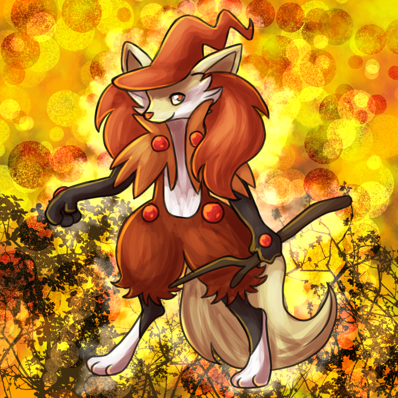 Hi all, just letting everyone know that we're putting MAC on hold until after Christmas, simply because 1. Holidays! 2. Many of our usual artists already have a lot on their plate with secret santa and I don't want to overstress people. If you can't live out the next month without contests, you can try your hand at the facebook profile picture contest or maybe even submit something for the facebook banner! See you all next month!
 Gigababy : I like it, but first thing that comes to mind is that Goliath is usually portrayed as larger than David. I'ts obvious that competitively, Jirachi is more powerful than abra, but your pic seems to visually switch the roles of the two pokemon. The Idea is right - Abra is defeating Jirachi - but visually it almost seems like Abra is the Goliath and Jirachi is David...I hope you get what I'm saying and I really look forward to seeing your next drafts!
 Gigababy One thing I think that would improve your look is the spots where your lines don't *quite* connect or overshoot a little bit. For example, Abra's left ear is disjointed, and Abra's left hand (bottom part) has some extra lines sticking out. Another place is Blissey's bottom right nurse's cap thing. If these small areas (and a couple others) are cleaned up imo it would look a lot cleaner!


