-
Check out the relaunch of our general collection, with classic designs and new ones by our very own Pissog!
-
Welcome to Smeargle's Studio! Please be sure to review the studio rules. Feel also free to check out our hub to learn more about this place!Welcome to Smogon! Take a moment to read the Introduction to Smogon for a run-down on everything Smogon, and make sure you take some time to read the global rules.You are using an out of date browser. It may not display this or other websites correctly.
You should upgrade or use an alternative browser.Smeargle's Studio General Thread: Spriting and Banners go here!
- Thread starter Alchemator
- Start date
- Status
- Not open for further replies.
were do you guys upload the sprites before uploading them here? you know because it says, "put in html for image"?were do you guys upload the sprites before uploading them here? you know because it says, "put in html for image"?
Photobucket, imageshack, other sites like that. Google image hosting and you're bound to find one that suits you (I use photobucket, personally).
Here you go ragonorkalex! Hope you like it!
hey thanks that looks pretty good! Although would it be possible to change the black stripe dealy on his shirt to white as well?Hi, I was wondering if I could get a trainer sprite revamp of

This guy?
Just make the coat green and orange, make the pants red and and replace the hat with

This guy's hat colored red with the stripe in the middle black
A little tough, but from what I've seen you guys can do it.

Sorry if it's not the best. If there's anything you want changed, let me know!ARGH the internet crashed 10 minutes after i promised buck and i couldnt get my altaria sprite, and i have to be in bed super early tonite (karate tomorrow!) so ill try to do better than maste win tomorrow... :D not that its bad, ill just be better :D
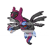
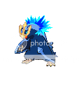
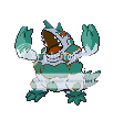
oh and aron, theyre not bad, but your concept isnt the best. Just think how it would look if you put body part x onto pokemon y. Hydreigon/lat@s is pretty good, as it flows nicely. on the other hand... raichu looks to over done with the wings and tails every where, as does metagross. Just try to think about how this pokemon would look running (or flying, floating, swimming, etc) around. how would the tails and wings and stuff look flailing behind its body? and another thing: angles. look at metagross facing left and the legs faing right. they just look very choppy. Reversing metagross would make it look more fluid, along whit mybe an arm replacement. they are just dangling and looking all weird. but look at staraptor: the head fits perfectly in the body, making it look realistic. if you want you can look at my sprites a page or two back and see how i like to do things. now sorry if i sound like im being hypercritical or im bragging, im just a bit of a stickler for little details (ursaring's wings nearly killed me with the extra pixels). im not telling you to do anything different, but for guidence, you might want to check out twoohfive205 on youtube, he is a great spriter. hopes this helps!
Here you go! Although with the white and blue, he's starting to look like a member of team aqua.... Actually, that's pretty cool!
Perfect!! Thanks a lot, that should sum up my persona nicely, i owe ya one :)ARGH the internet crashed 10 minutes after i promised buck and i couldnt get my altaria sprite, and i have to be in bed super early tonite (karate tomorrow!) so ill try to do better than maste win tomorrow... :D not that its bad, ill just be better :D
oh and aron, theyre not bad, but your concept isnt the best. Just think how it would look if you put body part x onto pokemon y. Hydreigon/lat@s is pretty good, as it flows nicely. on the other hand... raichu looks to over done with the wings and tails every where, as does metagross. Just try to think about how this pokemon would look running (or flying, floating, swimming, etc) around. how would the tails and wings and stuff look flailing behind its body? and another thing: angles. look at metagross facing left and the legs faing right. they just look very choppy. Reversing metagross would make it look more fluid, along whit mybe an arm replacement. they are just dangling and looking all weird. but look at staraptor: the head fits perfectly in the body, making it look realistic. if you want you can look at my sprites a page or two back and see how i like to do things. now sorry if i sound like im being hypercritical or im bragging, im just a bit of a stickler for little details (ursaring's wings nearly killed me with the extra pixels). im not telling you to do anything different, but for guidence, you might want to check out twoohfive205 on youtube, he is a great spriter. hopes this helps!
Too bad I finished before you and submitted it too him. :Dikr :D well i have karate and camp today so itll be a while if i even do it...Thought I'd put my WSC submission up here and get some feedback before I put it up for reals. I'm pretty happy with it but I'm worried it might look a bit too busy. Opinions? It's meant to look vaguely Voldemortish (it even has a stupid slytherin scarf)... apparently Voldemort uses the sinister powers of levitating pokeballs to destroy his enemies. Also, for what it's worth, it used the right column (so darkrai, giratina and mewtwo).
 ZOH MAH GOODNESS thats good. now i need to make cho chang or luna lovegood or someother ravenclaw :DNew pixel-over:

C&C appretiated.It actually works beautifully for a repose, but then it has trollface. Make the eye bigger and shinier, perhaps?
My entry for WSC. idk if it's complete or not, but I think I did quite well. The shading on the hands bothers me, but meh. We'll see how it does in WSC. :DThought I'd put my WSC submission up here and get some feedback before I put it up for reals. I'm pretty happy with it but I'm worried it might look a bit too busy. Opinions? It's meant to look vaguely Voldemortish (it even has a stupid slytherin scarf)... apparently Voldemort uses the sinister powers of levitating pokeballs to destroy his enemies. Also, for what it's worth, it used the right column (so darkrai, giratina and mewtwo).

Very niiiiiice......... I love the head! Looks beastly.

This is going to be my submission for the WSC. Does anybody think I should put any more details in? C&C please!hello i made all of these about a year ago and haven't really sprited since then...
but what do people think
pretty goddamn pathetic compared to most other things in this thread but as pendulum would say:
 <--- i made that for a very good friend who had a suspect alt named "Mismanaphy" which i thought was pretty cool


 <----- that one is a combination of various techniques pretty much stolen off marriland people


what you gonna doVery niiiiiice......... I love the head! Looks beastly.

This is going to be my submission for the WSC. Does anybody think I should put any more details in? C&C please!
Looks good overall, though I think you'd be better off going back to the old version's nose (though this is a personal thing, there's nothing strictly wrong with the nose on this one... I just prefer the other).
Anyway, now that I've had time to really start hating my sprite, I need help deciding which one would be best for the comp. I think the scarf looks kinda shitty and/or vaguely hoboish... not to mention the coat colour and other shit also making him look like he crawled out of the gutter, but I wanted to see what you guys think. Here's the line up.


Personal preference is 5, but it's possible it's just too dark and there isn't enough definition between the coat and shirt/pants... in which case 3 is probably the best.
Also I did some random fusing and made my own trainer sprite... I thought it was pretty awesome until I got told that it makes me look like a creepy pedo.

What do you guys think? Cool or should I keep my sprite away from baby pokemon?- Status
- Not open for further replies.


