-
Check out the relaunch of our general collection, with classic designs and new ones by our very own Pissog!
-
Welcome to Smeargle's Studio! Please be sure to review the studio rules. Feel also free to check out our hub to learn more about this place!Welcome to Smogon! Take a moment to read the Introduction to Smogon for a run-down on everything Smogon, and make sure you take some time to read the global rules.You are using an out of date browser. It may not display this or other websites correctly.
You should upgrade or use an alternative browser.Smeargle's Studio General Thread: Spriting and Banners go here!
- Thread starter Alchemator
- Start date
- Status
- Not open for further replies.
All right, I'll edit that, repost it then come back with the Poison and Ground.Okay, this are my first proper Spriting, so don't judge we as a regular spriter. Its a recolour of Tyrogue to make him look like Link from Legend of Zelda, with an added Master Sword and Shield (The shield is horrible, I know).

Also, one with Link's hat:

Anyway I could improve on the Shield? I really ruins the Sprite...
Anyone? :/
Did this Kyogre, recoloured with Groudon's colours:
 @Canti: Sweet! Tons of criticisms! I actually thought about a lot of them at school and I will try to see what I can do about them. The whip was originally supposed to be made of energy like Zero's and the reason the shading is funny is because I was trying to make it transparent. I think I'll trash the idea and replace it with an opaque whip, though, since I think I could do better that way. Also, my shading in retrospect was too light on it, making it look flat. I'll definately try to mess with the palette a bit. I'll also see what I can do about the shading and arm. The whole "Can it bend that way?" question never crossed my mind when spriting it out. I'll also see if I can't make it a little less cluttered. Definately learned that I need to check over my sprites better in the future b/c of this. But first, I must start up the Comment Train as promised.
Note: The following comments are in newest posts to oldest posts. So that should help you skip to your part a bit.
@Raikou151; Underdog: Your sprites are completely blocked from my standpoint. I'll see if I can't comment on them later when I'm at home.
@PHunter: The Politoed Dex is definately off to a great start. The only thing I could see that could use a little work is Gliscoed's eye. It looks a little strange right now. I think it would look better if you kept Politoed's eye, IMO.
@Wizwum:I didn't comment since nothing horribly wrong really stuck out at me. I would reccomend the Swampert line, btw.
@Solstice: The only thing that I think could be fixed up would be the red dot in that first hole. I think a vacant eye would make it look a lot better. Great Job, btw.
@Fuzz: I like the way the new Buidex entriescame out, too. Only thing that I can see is that you can see Sazel's other eye. It makes it look like it's eye is popping out, IMO. Still, looks great. :)
@Alch: Looks like it's about to collapse, lol.
@PHunter(again): I would reccomend removing some of the black from Caterpie's chest and replace it with a dark brown. Aside from that, I would reccomend making Digglett's head more circular at the top. Right now it looks kinda pointy, since it's tilted to one side.
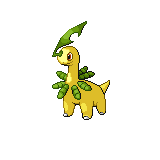
@Everyone: Whew. Took me forty minutes to type all of that. Don't think I've commented like this in forever. That should cover the last twenty posts, give or take a few.Thanks for the comments XandZ. I'll work on the revamps later, but I changed Gliscortoed's eye:

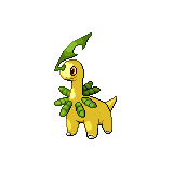
Better? :3
The wings are really bothering me.. not only do they look like black cut up cardboard, they're different shapes :d I reccomend looking at the original sprite for what they should look like.The wings are really bothering me.. not only do they look like black cut up cardboard, they're different shapes :d I reccomend looking at the original sprite for what they should look like.
I tried, but I couldn't get the shape right. :S
I'll have another go soon.
Non-Pokemon related, just some sprites for a game I've thought of. C+C please.
sorry, I had meant to comment on this, I was just having a hard time figuring out what I wanted to say and forgot to post. Anyway, all I would say is try a slightly lighter outline color for the blue bumps unless the bumps are supposed to be huge, in which case well done! But definitely go with a slightly lighter outline for the yellow scales which like they should be flat. Good sprite overall, good use of color here.I got the Metleon with a blue tail done, but I think the color makes it look like it's made out of ice rather than steel so I made one with a silver tail. Also, I edited the eye to make it look more like it's looking forward and made the the shadow color darker. The last one is the original for comparison.


 I got the Metleon with a blue tail done, but I think the color makes it look like it's made out of ice rather than steel so I made one with a silver tail. Also, I edited the eye to make it look more like it's looking forward and made the the shadow color darker. The last one is the original for comparison.
It looks like ice because it's an oversaturated blue. Desaturate! Wait, are those default mspaint colors?It looks like ice because it's an oversaturated blue. Desaturate! Wait, are those default mspaint colors?
No, I got the colors off of Metagross. I'll probably try some others tomorrow.Thanks for the advice, Canti. :) Hopefully this version looks a little better; I just copied the shading style from Bayleef's leaf, and used a lighter highlight as you suggested. Here it is, along with the rest of the family for completeness' sake.


All three look good to me, although I find the difference in line colour on the top right of Megamium's head (just above the eye) a bit too glaring. Maybe use a midtone to smoothen it out some? My entry for the WSC:

Sprites used: Regice, Registeel, Tropius, Kabutops, Anorith, Armaldo and Omastar
C + C is appreciated!My entry for the WSC:
Sprites used: Regice, Registeel, Tropius, Kaputops, Anorith, Armaldo and Omastar
C + C is appreciated!
Looks pretty good, the only thing I'd reccomend is adding mor Fossil. It's got too much Tropius in it right now, IMO. (Btw, it's KaButops, not KaPutops.)
:)
Looks pretty good, the only thing I'd reccomend is adding mor Fossil. It's got too much Tropius in it right now, IMO. (Btw, it's KaButops, not KaPutops.)
:)
Better?Better?
Yes. The rocky portions are well done in my opinion.My WSC Pokemon!
The Senitel.

C+C please!Do you mean sentinel? I think the legs should be a bit thicker where they connect to the torso.
@Wizwum, I'm seconding the line comment. Maybe just use that darker green outline instead on the lighter areas.
Better?
Woop C+C- Status
- Not open for further replies.