CAP 14 CAP 3 - Art Submissions

Status
Not open for further replies.
Here have a crappy image of sludge wave/acid spray dissolving a bibarel and a pachirisu:


Thornchild: I'm glad you did submit your flying lantern jelly, he's darling! A little plain for my tastes, but nontheless representative of the typing :)
BlueConcept: well well well, some direct competition! While I like how you integrated the lamp with the mantle, there are a few areas you could improve further. firstly, those protrusions at the top could be simplified, perhaps by making them into large fins. Secondly, it's pretty much a requirement of the art here to be on a plain white background and all parts of the subject to be surrounded by a solid outline, including any gas (thought I'm certain you knew that already). Thus I think it would be best to have the smoke/ink be exhaled in wisps from the ports on the mask-structure.
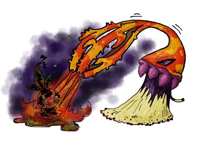
nov: why man? your shrew/tenrec was looking good! Well anyway a flamethrower-tailed lizard works too, though you have made the mask-face much too small.
mattgcn: I wasn't expecting you to be here :P I've got to clear something up about dry skin; It's not describing what the pokemon HAS, but what it CAN BECOME. The majority of pokemon that have dry skin live in moist habitats, hell, the croagunk line are dart frogs! Dry skin pokemon necessarily have a thin, permeable epidermis that makes it really easy to lose water to evaporation (and gain water in high humidity/rain, natch), so all the thin-skinned amphibians and sea creatures here have the right idea as far as the original intent of the ability is concerned, and all these literally dry-skinned reptiles are technically in error.
Not that I'm condemning them or anything, we have some cracking good reptiles on offer, and some creative ways to incorporate the ability!
 
Meh, I only changed it because I cant see a shrew having dry skin. And I intended the eyes and nostrils to be where they are. Should I just make the black coloring of the mask part extend out on the face a bit more?
 
Here's an update with some of the suggested changes. I added more red, and I made it's main body a little lighter. hopefully it looks a little less ghost like. Also my top 5! :D
http://img.photobucket.com/albums/v25/mirror/Jelliurn-1.jpg
My last post was edited for the picture, hopefully hiding the image is sufficient (what I did with this one.)

Now the body clashes with the tentacles... (lol, sorry, it is better than before though.)

I would make the bag a little bit darker (NOT as dark as before, by "a little" I really mean a little) and change the facial features back to their original colors. You still want it to feel ghost like (its the nature of your design) you just don't want the ghost to over-ride the fire design. So, in reality, do whatever you think would accomplish that best (as I am a pretty horrible artist, so your opinion is probably better than mine.)

I really don't know how purple eyes would look with the red fire (there now may be something new that clashes) but I would really like to see that purple somewhere else on the body then just the tentacles.

Another option would be to make the tentacles red, but, personally, I find that less appealing.

P.S.
Sorry if hiding the picture isn't enough. Sorry about liking your design so much to the point that I am so picky about it. Just to let you know, despite my lack of complimenting in this post, your design is still my favorite.
 
Once, when I was in Tahiti on an exchange, I was stung by fire coral. Horrible stuff. Caused a hot, burning infection that my friends kept putting lime juice on. So I can't resist using that as my inspiration, it seems to fit all the details so far. Fire coral isn't actually a coral, it's more closely related to jellyfish and other Poison-type fodder.

I just moved house, my scanner is busted from the move, so although I've got nice colour pencil designs, I have make my intro of this dude with my lacklustre computer-drawing skills:


- Coral arms are coloured to conceal Magikarp, and also fit a Fire-type.
- Has a base of densely knit stinging tentacles that it uses as an anchor on the ocean floor, and also like a "foot".
- Has a mouth inset in the middle of its tentacles.
- Can open and close the gummy teeth-like things around its base.
- Shoots acid and flame out of its coral arms.
- Shiny palette for hiding among seaweed
 
Nov it might actually be in your best interest to remove the mask entirely; having a skink/salamander look like the TF2 pyro doesn't really work in my opinion, and we have like, a dozen other submissions whose charm point is a gas mask already.
 
paintseagull's lizard monster is pretty cool. The six legs really sells it to me.

I love how Mos's cone snail keeps pulling out all these really cool surprises, like a Wonderball. except instead of three pieces of shitty candy, the surprise is poison.

tean and blues' idea is fantastic. It's one of those ideas that no one thinks of, but seems like a really obvious choice in retrospect. I like how it's thought out to the point of having it be able to hide magikarp in its branches.

And then Yilx's golem, man. I just can't get over how awesome it is. Perfectly combines hulking menace, sludge, and fire. Three of the finest things in life.
 

Imanalt

I'm the coolest girl you'll ever meet
is a Tiering Contributor Alumnusis a Battle Simulator Moderator Alumnus
Tin i prefer the first one, and really like it, but i feel like the engine thingy around its chest could look more like part of it rather than on top of it
 
Tin - First one, definitely, although I think Yilx is right. I see Steel/Fire and Steel/Poison for those designs. Recolor the plating, maybe?

Here's another view of my concept. I'll get some more anatomical sketches up soonish, once I have a scanner again.

 
Once again, I just love the designs made by Yilx and Mos-Quixote. I'm leaning more towards supporting Mos-Quixote, both because Yilx won the art poll last time and Mos-Quixote's design is really quirky, cute, and awesome. Plus, "Evil Sun God" doesn't quite fit well for a Pokémon with Dry Skin.

Tea-and-Blues's fire coral also looks really, really awesome and badass.

Tin's first design looks way too much like Heatran...
 
@Tea_and_blues
Really like the design, in my top 3 right now. Really like how the typing reflects it.

@Tin
That looks even better than before. The only thing i would say is make sure it has a definite mouth. Just a black line would probably be enough.

@nov
I like the concept but the art is just way too busy for my eyes. Theres so much going on its hard to see what the art is actually about. I would take off the gas mask too, like many others have said.
 
I'm okay with losing the gas mask, but what about the fumes? Would it lose to much of the poison attribute if the fumes were gone? I might be able to drop the ones on the mouth and put two on the head to look like horns. Then it would lose the gas mask effect and retain the poison.
 
Well guess now is as good as any through a new design in the mix. To explain my idea, I created a poisonous gas snake which slipped into the shedding of an extinct fire type. ( for reference it is temporally named Noxious Dragon) It appears to have three heads, however Noxious Dragon has only one head (center). It uses the natural gases that it's body produces to keep the extra two heads a float. Noxious Dragon uses these heads as an extention of its body, similar to arms. It's able to use fire type attacks by igninting its toxic gases within the extra heads, also due to it being a pseudo-fire it does not share its sub-typings weakness to water type attacks.
 

paintseagull

pink wingull
is a Top Artistis a Forum Moderator Alumnus
Some comments for peoples~

tea and blues: I really love your concept but I think the design could be improved. I think the skirt is drawing too much attention away from the main coral part for two reasons: too much detail and clashy colour scheme. The pale yellow is too far on the green side and too pale. Why not use the yellow you've used in the coral, or maybe just make the whole thing purple? Also, those reddish dots throw it off further - I don't think they're needed. I definitely think you should keep the skirt, just that it should compliment rather than distract from the main part of the mon.

Tin: I like your first design! It has more personality. If it's reptilian/amphibian in nature, then dry skin works just fine.

nov: I think your first design is better, the second is too forced. I think you could incorporate dry skin by making your shrew really mangy, with patches of fur missing at its extremities maybe. Shrews have less fur around their snout so.. it might work?

thornchild: I think making the flame larger and less symbolic would help it look less ghostey. I also think adding details would help - if it resembled a paper lantern more literally, that would help the dry skin ability be represented too. Like this or this?

sentret: I like where you're going with this!!

Calad: I love this, it's so clever. I prefer the top colouring.
 
Tin: I do get a Fire/Steel vibe from Factorymon 2.0, but overall I like it better than the first one.

I'm not sure if you intentionally gave it no definite mouth, but it looks really cool if that's what you meant!
 

thornchild

Guest
After a lot of mulling over how to improve my design from my own reservations to the commentary made by you guys I went back to the drawing board and made this new little guy.


Still a Jelly lantern just a little spruced up.
 
Feedback:

I'm particular concerned that two of my favourite artists, Yilx and Doug, don't have designs I can see making the cut based on flavor and theme. I really want to see some more ideas from you guys, even if you end up sticking with your current designs.

@paintseagull - I will have a look at improving the tentacle skirt. Thanks for the advice!

Quanyails - As a beginning, it's nice. I'd love to see it turn more Aztec, more plumed-serpent.
Mos-Quitoxe - I love this guy heaps. He's like an awesome counterpart to Shuckle. Supporting art is great. You got a hot concept very quickly.
bluemon - I love the Exploud vibe of your first and would like to see more developed art. I don't really like the raptor, it's a bit generic feeling.
Cartoons! - I love this design, I'm just not so sure it works with Dry Skin. It seems like it's literally "dry-skinned" reptile, not a water-absorbant "risk of drying out" sort of flavour that Dry Skin gives.
Birkal - Your frog is so cute! I always love your designs. I'm always iffy about Pokemon with weapons, but there's plenty of examples in official canon where they do, so shmeh, a baseless criticism.
nov - I like this, I think you could emphasise "salamander" with a design like that.
Yilx - Brilliant style, but I don't think either of your designs work with this CAP as it stands. Both look acceptably bulky, but neither seem to fit with Dry Skin. I'm also longing to see something that isn't anthro from you.
KoA - I love the slug design, and want to see it polished and in more poses. I prefer your earlier colour schemes.
aragornbird - I don't care that it doesn't easily fit Dry Skin, I LOVE THAT CAMEL.
Phazon-764 - Teapot! As a tea lover, I'm not really one to associate tea with poison, though. I'd like to see more of this guy all the same.
meddle - You're finally starting to hit something great with your more recent interpretations of the cauldron monster with its green Grimer inside. Keep going.
Cretacerus - I love your design, but something about it seems more Steel or Ground than Poison.
Calad - Easily in my top three, it captures the CAP's attributes perfectly, and somehow reminds me of Lickitung. Prefer it without a flame coming out of the thermometer.
SoIheardyoulikeSENTRET - Yay! So cute. Reminds me of that old cartoon Toxic Crusaders. :P It's not that clear that he's broken out of a drum or containment silo, and I think you could do more to clarify that part of the design.
LightlyLights - Great concept! How does it work with Dry Skin? I think you need to give that more thought. Your current art is great?
Fatecrashers - I prefer your anenome. I want to see how it would attack.
DougJustDoug** - You're one of the best artists in CAP, so it troubles me that you're submitting a beautiful design that so many people are obvious going to down-vote due to un-Nintendo-y subject matter. I would support the mon, and I appreciate the argument you make in its support, but to be blunt, I want to see an alternate design from you. I doubt you can win with Smokemon, and you're an artist that deserves to be in the running.
thornchild - Your original lantern jelly is my favourite, with your more recent designs losing its simple charm and looking too much like Lampent or Chandelure.
paintseagull - Your design is cute, there's something about the head though that seems more toned towards realism than Pokemon designs tend to be.
 
Thornchild I don't know how, but by making it look even more like a lantern you have made it look 1000x better than it did before! :D

marc6kteam, while your idea is sound I really think it could do with looking a bit less like Charizard.
 

DougJustDoug

Knows the great enthusiasms
is a Site Content Manageris a Top Artistis a Programmeris a Forum Moderatoris a Top CAP Contributoris a Battle Simulator Admin Alumnusis a Smogon Discord Contributor Alumnusis a Top Tiering Contributor Alumnusis an Administrator Alumnus
Moderator
This creature is a walking radioactive waste accident, with the personality of a big playful dog. It's entire body emits searing heat and toxic radiation, but the pokemon has no idea that it is lethal to everything and everyone around it. When people run at first sight of this glowing nuclear beast, the pokemon thinks it's time for a fun game of chase! It doesn't want to hurt anyone, it just wants someone to play...


I have been kicking around radiation based ideas since Fire/Poison was first chosen as the typing. I was originally considering a post-apocalyptic radioactive zombie kinda thing, but all the sketches were too morbid or too human-like for a pokemon. Then I started imagining, "What if a playful dog was radioactive instead?" I loved the contradiction of a big playful animal who just wants attention and fun, cursed to be deadly to everyone around it. That dichotomy piqued my interest.

I didn't want to do a literal dog, but preferred to make a more generic quadriped beast with a glowing radioactive body, where you can see vaguely skeletal structures inside. Hopefully the look evokes impressions of x-rays and that sort of thing, while at the same time looking deadly and kinda scary. The alert stance, upright tail, and wagging tongue are all classic characteristics of a dog ready to play and have fun, which completes the visual contradiction.

I have enjoyed making this guy, and I intend to keep working on it. I'll post more backstory and supporting material later. Hope you like it!
 
Kicking around some palette ideas and could use advice. I'm very fond of 3 which is closer to my original scheme, but I can see why it's come under criticism for clashiness. 1 is my next favourite. I tried without the red "stinger" dots, but it just didn't look like it might be a mass of tentacles any longer without them.


@DJD - Love this one! A lot! I'd like to see some fire moves from it.
 

Bughouse

Like ships in the night, you're passing me by
is a Site Content Manageris a Forum Moderator Alumnusis a CAP Contributor Alumnusis a Tiering Contributor Alumnusis a Contributor Alumnus
@Yilx this design is your best so far. My only comment is that I'm not entirely in love with the one thing you seem very attached to - the sun-head. I'd recommend you make it a bit more fireball-y and organic and not so stylized and pointy and strictly sun-like. Remember... the Sun doesn't actually look like that.

@DJD This is adorable. I like the Reuniclus Jelly-Blob vibe it gives off. Comments, though, are still in order. Is the head intentionally more lizard-like than dog-like? Second is just that, while I'm not entirely sure how they would fit on the body, the design really could use some eyes. The only Pokemon design I can think of with no eyes is Zubat, and that at least makes some sense because it's a bat. Maybe make some over-sized unnatural buggy eyes like Venonat's? It's just really hard to look past the no eyes... It also restricts the logic in giving CAP3 certain moves like Glare or Mean Look, which could potentially make competitive sense. The other thing is to consider maybe playing with color palette a little. Purplish tinge in the bones/tongue might be cool.
 
Doug, that's a fantastic spin on the typing, definitely my favourite concept so far. My only qualm with the design at the moment is that the tongue should have some sort of connection to the inside that is observable, like the skeletal structure.

As for eyes, I think he looks cool without. I guess he looks more dopey, cellular and unnatural that way.
 
@Doug I also really love the design! It's a really cool concept, but I think you should change up the palette a little bit to make it seem a little more Fire-typish.
 
Status
Not open for further replies.

Users Who Are Viewing This Thread (Users: 1, Guests: 0)

Top