
Well that looks great! Looks more physical now with that grace still there.Looks like she's going to be a physical sweeper...
Fire Punch/Ice Punch
image

-
Follow our Instagram!
-
The moderators of this forum can be found in the CAP forum staff directory.
-
Welcome to Smogon! Take a moment to read the Introduction to Smogon for a run-down on everything Smogon, and make sure you take some time to read the global rules.
You are using an out of date browser. It may not display this or other websites correctly.
You should upgrade or use an alternative browser.
You should upgrade or use an alternative browser.
CAP 13 CAP 2 - Art Submissions
- Thread starter Wyverii
- Start date
- Status
- Not open for further replies.

DougJustDoug: When I saw your initial design, I liked the majority of it--save for the comedy-tragedy masks on the hands. I realize your intent was to evoke acting as an art of its own--which I think is a great, creative idea--but as was, the masks just looked awkward, as though they weren't really part of the Pokemon.
However, the supporting art you just posted of the Pokemon attacking and defending have assuaged my concerns a great deal. Showing how the masks are used in battle makes them seem much more natural, especially the fan-fighting idea. Nonetheless, I wonder if there might still be a way to make them seem more integrated into the design?
However, the supporting art you just posted of the Pokemon attacking and defending have assuaged my concerns a great deal. Showing how the masks are used in battle makes them seem much more natural, especially the fan-fighting idea. Nonetheless, I wonder if there might still be a way to make them seem more integrated into the design?
BrotherMycroft's design
And on a related note, a freshly-minted Smogonite presents his Pokemon design! (Sorry if it doesn't show up; I'm still figuring all of this image-posting ballyhoo out).
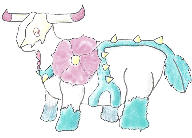
Grass, you said. Ghost, you added. Bulky, you hinted. Well, here is a design that hopefully fits all three criteria.
I drew my inspiration from the artist Georgia O'Keeffe, whose two primary motifs were intricate closeups of flowers and the skulls of dead cows. I bring together the best of both worlds with a creature that echoes the poignant spirit of the American West--I hope. I suppose you lot will be the judge of that!
The spectral bovine is in a symbiotic relationship with the thorny rose that encircles it: the plant gives it potency in battle, and in exchange, all members of this species (who need no food themselves) instinctively nourish their flowers.
Note that the roses and vines are symmetrical; you can see a bit of the other rose at the far left.
Cheers!
Mycroft
And on a related note, a freshly-minted Smogonite presents his Pokemon design! (Sorry if it doesn't show up; I'm still figuring all of this image-posting ballyhoo out).
Grass, you said. Ghost, you added. Bulky, you hinted. Well, here is a design that hopefully fits all three criteria.
I drew my inspiration from the artist Georgia O'Keeffe, whose two primary motifs were intricate closeups of flowers and the skulls of dead cows. I bring together the best of both worlds with a creature that echoes the poignant spirit of the American West--I hope. I suppose you lot will be the judge of that!
The spectral bovine is in a symbiotic relationship with the thorny rose that encircles it: the plant gives it potency in battle, and in exchange, all members of this species (who need no food themselves) instinctively nourish their flowers.
Note that the roses and vines are symmetrical; you can see a bit of the other rose at the far left.
Cheers!
Mycroft

I just have to say I absolutely love this design. Grass/Ghost is kinda a dream typing for me, and for whatever reason I'd always pictured it as a sleeker, ghostlier Shaymin. And no lo and behold: a slender porcupine. The crop-circle idea ingeniously fits the Grass, Ghost, and Sketch concepts into one neat package. Just wow.Okay trying to get this to a more solid place!
Some notes about this:
- long, grassy cape instead of porcupine spikes, because it's spookier and allows for a crop circle design on the back
- this is ghost and not dark typing because it is not evil or mischevious, but spooky, methodical, mysterious, obsessive
- colouring here is just a first try. definitely open to suggestions but I want to keep the greenish-yellowish-brownish theme of dry grass or wheat stalks. I definitely don't want to do purple or black.
- patterning is also definitely open to suggestion
- sketch is supposed to be subtly represented in the design (since it does not learn it by level up, so it shouldn't be blatant, but it should make sense) by the crop circle patterning that the pokemon accomplishes by flattening stalks with its wide arms
- creepy, long fingers instead of claws
IMAGE REDACTED
Sorry I don't have time to give feedback right now! I really need help/opinions for the colours and patterns though so please give me some feedback if you can!
It's difficult to give constructive criticism on a design I love so much already, but I'll do my best. For starters, I have to agree with Onetwobananna in that his legs might need a tiny bit more bulk. I love the color scheme as it is, but maybe the main green could be made just a tiny bit darker to make it just that much creepier? Idk it's good already I'm just throwing stuff out there. For the shiny though, I have to think the only logical main color would be purple, despite your aversion to it.

As requested here is some elaboration of my original wilted lily design.
Here are two slight variations, as well as some supporting artwork. The top left is more strictly flower based while with the top right one I tried to incorporate the angel/pixie concept a little more in winglike petals and the meditating 'hands.'
Any ways I can improve it let me know!
Here are two slight variations, as well as some supporting artwork. The top left is more strictly flower based while with the top right one I tried to incorporate the angel/pixie concept a little more in winglike petals and the meditating 'hands.'
Any ways I can improve it let me know!
http://www.photoshack.com/displayimage.php?pid=4806
I edited it a little more. I haven't really gotten any suggestions so I didn't change too much.. Any feedback is appreciated, thanks.
You can see the three stages it has been through.
I edited it a little more. I haven't really gotten any suggestions so I didn't change too much.. Any feedback is appreciated, thanks.
You can see the three stages it has been through.
I couldn't tell if the lack of critique for it was because I either had nothing to it that could be improved, or if people just didn't care, so I took the time to do a side angle of my original submission. The original is in the spoiler if you need a comparison. Hopefully the supporting material will get me my answer, aha.
Throughout its stages, an infective growth on its prevolutions grew larger and larger until it took over the host. The vines at the bottom are the remains of its prevo while the skeletal structure is the growth now having full control. I'd say more of the inspiration comes from the idea of zombie infections, ghostly possession, and a bit of Jack Skellington himself. Being able to root itself into the bodies of others, I could say it's justified of learning Sketch just once. If it can hijack an already decomposing organism completely, then there's nothing stopping it from getting sampling from a fresh new one.
Final Submission
Fiddled with my design a little, hoping that I haven't blown my chances by being so late on the scene, but I've been doing a lot lately.
I love a lot of the designs I've seen here though so I doubt I have anything to worry about, I'm sure CAP2 will look awesome

Flavor Text: CAP2 does not have much substance on it's own. It must haunt painting or photos to make physical contact with people or other Pokemon. Because of this CAP2 have been known to wander around Museums and Galleries. It's pre-evolution has no concept of space or time, it just wanders until it happens across something it can haunt.
I actually had this idea when I saw a Picaso-esc painting. It was a still life that looked as if it had a face and arms, Made me think of possessed paintings from Mother 3, one of my favorite RPGs of all time.
EDIT: it just so happens that the power unit for the only computer I have a licensed version of photoshop for melted so I'm going to have to make this my final submission. I wanted to add another and make the painting's background more foreboding, but I guess I'll have to hope people can picture it that way and leave it to the spriters. I swear I'm never going to get through one of these things without my computer dying in some fashion.
Fiddled with my design a little, hoping that I haven't blown my chances by being so late on the scene, but I've been doing a lot lately.
I love a lot of the designs I've seen here though so I doubt I have anything to worry about, I'm sure CAP2 will look awesome
Flavor Text: CAP2 does not have much substance on it's own. It must haunt painting or photos to make physical contact with people or other Pokemon. Because of this CAP2 have been known to wander around Museums and Galleries. It's pre-evolution has no concept of space or time, it just wanders until it happens across something it can haunt.
I actually had this idea when I saw a Picaso-esc painting. It was a still life that looked as if it had a face and arms, Made me think of possessed paintings from Mother 3, one of my favorite RPGs of all time.
EDIT: it just so happens that the power unit for the only computer I have a licensed version of photoshop for melted so I'm going to have to make this my final submission. I wanted to add another and make the painting's background more foreboding, but I guess I'll have to hope people can picture it that way and leave it to the spriters. I swear I'm never going to get through one of these things without my computer dying in some fashion.


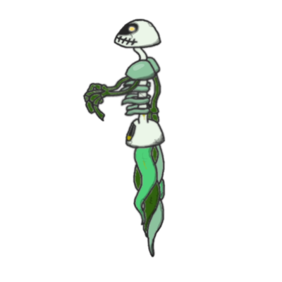
Fiddled with design, amalgamated everything I've experimented with thus far, came up with this:

Edited eye position to make it look less like Ferrothorn. Will probably change the effector-ectoplasm to less macabre shapes. Also a simpler colour and drawing scheme, so that if I have time to doodle some supporting art, I can do so.
Comments etc. appreciated.
Edited eye position to make it look less like Ferrothorn. Will probably change the effector-ectoplasm to less macabre shapes. Also a simpler colour and drawing scheme, so that if I have time to doodle some supporting art, I can do so.
Comments etc. appreciated.

My first ever art submission.
I wanted a more traditional design despite the various brilliant works by others. Critique welcome: I really just wanted to throw out another design to see if anyone liked it.
Thanks.
@Magic_Leopard
The design is cool but I think you should scale back on the smudging, it's supposted to have a clear outline.
Other then that you might want something to make it distinctly Grass, add a flower, or some leaves or something, just so people don't have any fuel for their inevitable "I can't see the ____ typing"


Posting to say that this is my Final Submission since I don't have much time to work on it anymore now that I'm sick and dying on my couch.
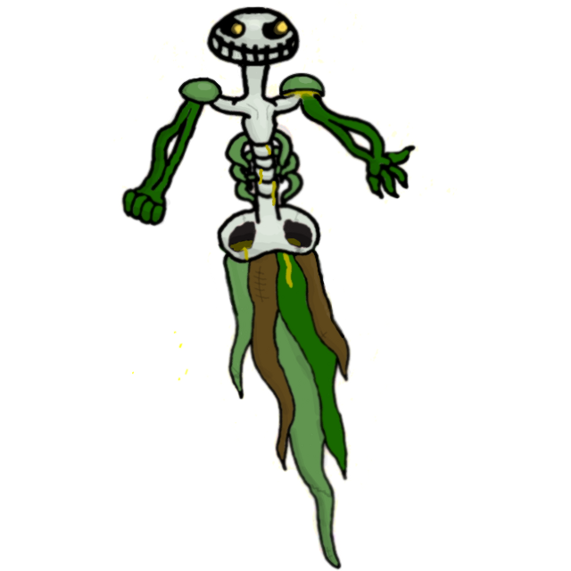
@ bugmaniacbob - Amazing! It looks awesome, much better with the ectoplasm and such. The only thing I think now is the ectoplasm shapes made should be more vine like instead of a hand etc. Something like that
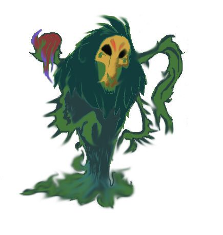
I beg to differ as his submission looks like something made entirely out of either moss or seaweed like how most swamp monster are depicted in media/folklore. To my eyes, Magic Leopard's submission captures the Ghost and Grass typing nicely since it may not be "solid" in the sense of have a bone structure or whatnot.Other then that you might want something to make it distinctly Grass, add a flower, or some leaves or something, just so people don't have any fuel for their inevitable "I can't see the ____ typing"

Tkmn-Paicho321 - What is what what what I don't even what. This is ridiculously amazing and amazingly ridiculous.
Lagic Meopard - I'll agree with Tokemon Paicho on the first part, the smudging (if it weren't frowned upon) could be taken out. However, I do certainly think this conveys the grass type quite well, in fact, due to its resemblence to seaweed or some kind of generic swamp monster. It's quite a great design for a first submission, really creative!
Lagic Meopard - I'll agree with Tokemon Paicho on the first part, the smudging (if it weren't frowned upon) could be taken out. However, I do certainly think this conveys the grass type quite well, in fact, due to its resemblence to seaweed or some kind of generic swamp monster. It's quite a great design for a first submission, really creative!


Fiddled with my design a little, hoping that I haven't blown my chances by being so late on the scene, but I've been doing a lot lately.
I love a lot of the designs I've seen here though so I doubt I have anything to worry about, I'm sure CAP2 will look awesome
Flavor Text: CAP2 does not have much substance on it's own. It must haunt painting or photos to make physical contact with people or other Pokemon. Because of this CAP2 have been known to wander around Museums and Galleries. It's pre-evolution has no concept of space or time, it just wanders until it happens across something it can haunt.
I actually had this idea when I saw a Picaso-esc painting. It was a still life that looked as if it had a face and arms, Made me think of possessed paintings from Mother 3, one of my favorite RPGs of all time.
pkmn taicho this is such an original design! First off I love your inspiration and I think it really comes through in your picture. I also really like the Rotom-esque vibe it gives off. A ghost who goes and haunts something, taking on its shape and form. One thing I would suggest though is that its grass element could be a little more obvious. I like the idea of the painting coming to life(his head being a tree from the painting) but maybe add a little more life to the painting. For example instead of an eerie desert it could be a spooky forest. Just a suggestion :)
Flower Pot Peekaboo Ghost colored.
FINAL SUBMISSION
Honestly, I'm quite happy with how this turned out. I can't really think of anything to tweak on the main design, and I think the colors are about perfect. Rushing to finalize this now because of the tight schedule I have with work so it's unlikely I will ever make changes to this in time anyway.
The basic design is of an old abandoned flower pot being taken residence of by a spirit. This lil poltergeist is friendly and only seeks out mild mischief, though it is capable of some horrible damage if provoked and enraged, even being able to mimic the enemy and use their power against them.
When at rest, it closes the pot up and remains completely indistinguishable from a normal pot. When out being mobile or attacking, it opens up and reveals itself.
Supporting art:
Lying dormant as a normal pot.
PEEKABOO!
c:

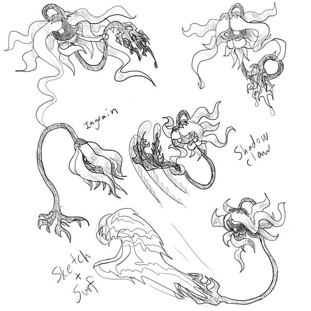
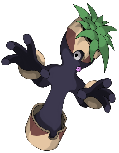
Alrighty, after taking some helpful (although kinda obvious...) advice from another member here, I revised my Centaurmon and made it a little less "realistic and busy." I also gave it a "typical" color scheme to start out with.

The only thing I'm not really satisfied with on this guy is the rainbow of colors in his Sharingan-esque eyes (which sorta tie into how Centaurmon performs Sketch'd moves). Suggestions?
Here's a little supporting art to give ya a better idea of how this guy's built:

(Hint: ^Click There^)
Centaurmon's vines are fantastically malleable (as in, they can stretch, contract, flatten, expand, and basically morph into any shape desired). Another thing to note is that all the vines are anchored only to the base of the horse half's "neck."
Anyway, the key to Centaurmon's Sketching powers is the gourd on its face. After seeing another Pokémon's move through its mask, Centaurmon stores the visual memory of the move within the mask. Then, using its ghostly powers, it "resurrects" the move from being just a memory into being a physical (or special, teehee!) manifestation which it can then use against its opponents. There's only room enough for one move memory at a time, of course. :P
I may include further supporting art depicting Centaurmon performing Sketch'd moves in my eventual final submission, but for now, I'd like to hear some feedback from you all! :)


Hey, I'd just like to say that I'm always available for giving out critiques! Since it was quite a hassle to go through every concept, I'm going to say that if you want a critique, just send me a VM/PM. Feel free to ask specific questions, whether it be art-related or concept-related. Great stuff out there. Keep up the good work, CAP!
Final Submission
Final Submission
Main Design:
"Ancient tribes believed their most artistic matriarchs would return as PCAP2 if they were unhappy in life. PCAP2 seem to hold a grudge against any living thing. These Pokemon have many prickly thorns and equally prickly personalities, they will only express themselves to trainers that have earned their trust. Although tormented in the wild, PCAP2 can be a delight under the guidance of a kind and loyal trainer. Some restaurants use them as dancers and for serving tea. Due to their creative natures PCAP2 can potentially learn to use incredible moves, but they are usually so vengence-focused that they only ever master a few, using these to baffle and terrify passers-by."
Design Background
Supporting Material
Supporting images:
Final Submission
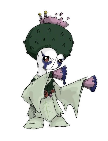
Main Design:
"Ancient tribes believed their most artistic matriarchs would return as PCAP2 if they were unhappy in life. PCAP2 seem to hold a grudge against any living thing. These Pokemon have many prickly thorns and equally prickly personalities, they will only express themselves to trainers that have earned their trust. Although tormented in the wild, PCAP2 can be a delight under the guidance of a kind and loyal trainer. Some restaurants use them as dancers and for serving tea. Due to their creative natures PCAP2 can potentially learn to use incredible moves, but they are usually so vengence-focused that they only ever master a few, using these to baffle and terrify passers-by."
Design Background
This CAP2 submission (henceforth referred to as PCAP2, where P stands for potential) has two primary inspirations, the scotch thistle, and the Japanese Onryō. Onryō are vengeful spirits that traditionally wear burial kimono and white and indigo make up, so PCAP2 has a thistle kimono - Don't worry, she's not wearing clothes, the "kimono" is really just a leafy-outgrowth of her body. She might be deemed a ghostly thistle geisha. (Also, while it wasn't really a deliberate influence, a Thai friend said early on that PCAP2 looked like a Yakuza wife and that has had a bit of an effect on the design too).
Due to these feminine design inspirations PCAP2 would probably be mono-gendered as female.
PCAP2 attacks using the brushes on her hands which secrete an ectoplasmic paint that forms whichever attacks she is best practised in. The character herself is not very expressive, mainly shooting a vengeful glower and making gentle dancing movements with her arms - the majority of the action and threat comes from the paint itself, which can stream out her hands in ribbons. She is, however, perfectly capable of slicing, jabbing, and punching with her hands when particularly enraged, powering up her attacks by hardening her paint into blades or fists.
PCAP2's hands are simultaneously thistle flowers, paintbrushs, and can be fanned out like geisha dancing fans. Her eye make-up is obviously intended to evoke angry tears, and draws very loosely from the pattern on cheetah faces.
Supporting Material
Supporting images:

@tea and blues
I really like that. Nice looking design. The sketch fits in well.
I really like that. Nice looking design. The sketch fits in well.

Thanks guys, she's been an interesting character to design.
I have an odd situation right now where I'm not including part of the supporting art because I think it's not quite relevant. I have a male counterpart I designed - a samurai. However, I designed it as a counterpart, not as a male form. It has no brushes, no way of using sketch.
I wouldn't even have entertained him as a male form until we suddenly got this HUGE attack stat, which kind of fits him in that he's a warrior. His design would need refining - it's a bit busy - if I were to use him, and I do not know how I could work anything as convincing as Thistlemon's brush fans into his design.
Should this guy be Thistlemon male, or should I retain mono-gendered design?
Edit: Another con of including him (even as supporting art) would be that he isn't really a male Onryō. He's just a samurai. But he's a base that could be developed, perhaps.
@DougJustDoug - I keep forgetting, so before I forget again. I absolutely love the defensive pose. To me that finally justifies the masks. I still can't help but feel if her hands were free she'd fit the sketch theme so well. Great big finger-y gestures, you know? Like Swanson herself. Her coat is awesome.

okay, time to stop dallying and get down to bizness
some inspiration taken from energy storm's interesting chinese ink concept
except i hate how it doesnt fit the state spread that well and looks like the bastard child of volcarona and scyther
please advize, if not i have another idea waiting in da wings
EDIT: okay lets try something else
feel this one suits the stat spread more but you never know, also ideas on how to make it look a bit more ghostly????
thanks
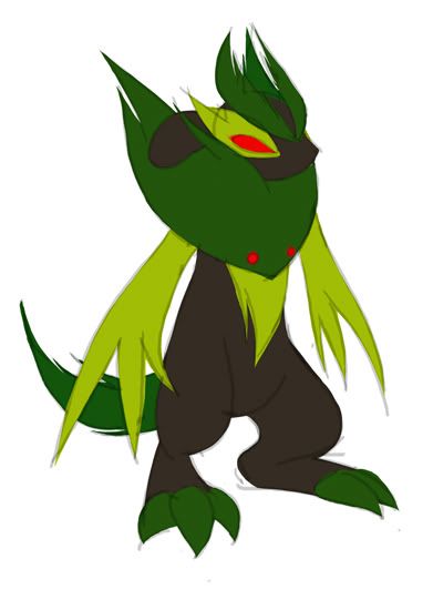
MLaRF: ah yes, i was trying to remember why that neck tuft felt so damn familiar :P i think ill prob do a lot more tweaking tomorrow when its not 2.30am
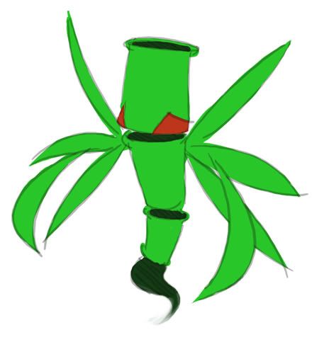
some inspiration taken from energy storm's interesting chinese ink concept
except i hate how it doesnt fit the state spread that well and looks like the bastard child of volcarona and scyther
please advize, if not i have another idea waiting in da wings
EDIT: okay lets try something else
feel this one suits the stat spread more but you never know, also ideas on how to make it look a bit more ghostly????
thanks
MLaRF: ah yes, i was trying to remember why that neck tuft felt so damn familiar :P i think ill prob do a lot more tweaking tomorrow when its not 2.30am
Chomz - The second one is Zoroark!
Okay, but seriously, I'm likin' the first design. It doesn't really have that big of Volcarona vibes goin' on, but if you are having a problem with it, maybe give it withered or ripped leaves to make it look more dead.
The second one... yeah, it reminds me of Zoroark. I am so sorry. Maybe you could make it ghostly by separating the head and arms from the body? I'm not sure if it'll get the look you want, but it would probably make it look more supernatural.
- Status
- Not open for further replies.