CAP 6 CAP 6 - Art Submissions

Status
Not open for further replies.


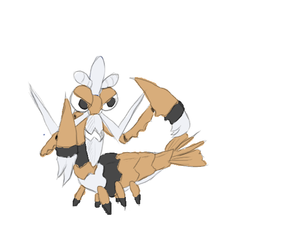
My first time to join a CAP^^ I think a shark is also a warrior of the sea, not only the pirates. Although I think it looks a bit too similar to Garchomp...

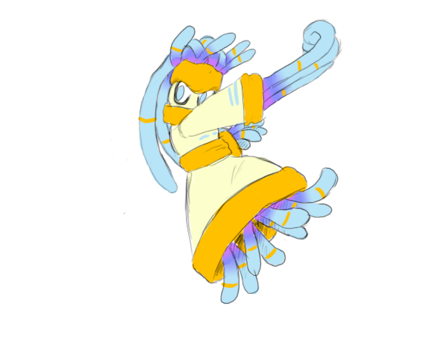
Btw I love this squid/starfish-like thing^^ It rulez

I can't be the only person who thought of this...

jawesome.jpg


STREET SHARKS
 
Well, note that is my first time doing something like this.

I give you, the slime fighter:

CAP6coloured2.jpg


Done with a mouse, although you can probably tell.

Basically, I wanted a fighting type that didn't resemble a fish or anything like that, but rather the very essence of water. I'm going to add some action pics later to show its movement and attacks, etc.

Please leave comments and criticisms. And try to be nice =P it was my first time.

Thanks,
LR.
 
So far, i think Wyverii,Atyroki, Hazmat and Cartoons! have a good chance of winning this, although my mind is still changeable I think the above names are the most creative,realistic for this purpose and damn right good.
 
Here's a backshot of my squid, deferring his prize to his cruel and demanding master, Rey Mysterio.
*awesome pic*
Won't someone rescue him from this abusive situation and find a good home for him in shoddy?
The extra art/animations you do has really helped promote the image of this squid, fantastic work. Also my bro loves rey mysterio, wonder what he'd think of this :P
 
I took Jagged Angel's adwise and made a new pose for the fighting fish, and tried to make it look allaround more fighting-like and not just fish-like. I'm still unsure about the colours, especially the green and the red on the body, and I'll need to try some alternative colour schemes on there. But atleast I made some progress, and I'll continue tomorrow.


Wahey! I'm liking this more and more. It's pelvic fins are much more fist like and it's got a great look of grim determination. If you're experimenting with colour schemes I'd try moving the underbelly colour lower so that it doesn't join onto the end of the smile. Also if you can, try making it so the fins change colour the further you go along them, so that the tips of the fins are darker/lighter than the bases. Great job so far Estranged.

Edit: Wyverii - you are a truly amazing artist.
 
I understand the orca thing, but he still doesn't look too water-type to me... Maybe if you changed the red to a dark blue?
 
Wow that orca is really cool and I love the native american inspiration to the design. Also dont listen to the other guy, the red makes sense considering what it was inspired from and the red and is a very distinct look.
 
Here is my submission
cap6laine.png


My design is based on Haida style orcas. Hope the image isn't too huge.

Most definately my favorite design so far, but there a few things you could fix. The feets and hands are pretty blah, they need some work. The lips are a bit too pointy for me, but I love the design!
 
Well, due to certain issues, I can only access A sometimes, and looking at this thread all I can think is
"OH GAWD, NOT AGAIN"
This is just au'some, and so varied (though comparable to 5? who knows). ATM I'm leaning towards the fabulous cephalopods of cartoons and aragornbirb, the drunk sea lion by nardd, ORCaman, and the fighting fish.
i g2g for, and won't be back for awhile (curse you darkie)
EDIT: omg, i forgot two important others that I really like Doug's scubasumofightmaster and Legacy Rider slime guy.
 
Yeah Im gonna try to work on the feet but I'm really not to sure what to do with them. And I think I'll try out some other colour combinations.
 
Well, note that is my first time doing something like this.

I give you, the slime fighter:

CAP6coloured2.jpg


Done with a mouse, although you can probably tell.

Basically, I wanted a fighting type that didn't resemble a fish or anything like that, but rather the very essence of water. I'm going to add some action pics later to show its movement and attacks, etc.

Please leave comments and criticisms. And try to be nice =P it was my first time.

Thanks,
LR.

Why? Every time I get a good idea, someone else beats me to it by that much! Anyway, I'll be posting my new design soon, and I would rather not catch a lot of flack for it.
 
Okay, I have base colors for my two designs. However, I really couldn't come up with any color choices that I really liked, so I'm open to all suggestions.

cap6anemone2color2.png


Originally I wanted it just blue and purple, but when I actually tried the colors, it looked like it was Water/Poison rather than Water/Fighting (an example). Yellow and orange helped offset that a bit, but I'm still a little dissatsified with it. One thing I was satisfied with was the tentacles. They really didn't look that nice with a solid color, so I instead went with a gradient effect, from purple to blue and blue to light blue. I also added bands on the tentacles and removed the lines on the body stripes.

cap6mantisshrimp2v422.png


This one was a fair bit easier to color than the anemoninja (lol), with just three colors. However, I really couldn't pull off a nice color combination, so I experimented quite a bit on it. I did a dull tan coloring (as seen above), an orange coloring, a dull goldish coloring, and a green coloring.

Additionally, I experimented with the band coloring, and ended up trying a black coloring (again, as seen above), a dark blue coloring, a dark purple coloring, and a dark green coloring.

Also, as indicated on the some of the images, the top of the head was the same color as the bands, while some of them were the same color as the beard. It was suggested that I try to give it a top knot instead of a hat, and in the end I couldn't decide which looked better, so I colored both of them in random drafts. Which looks better?

So, once again, any suggestions etc. are welcome.
 
Okay, I have base colors for my two designs. However, I really couldn't come up with any color choices that I really liked, so I'm open to all suggestions.

cap6anemone2color2.png

Yeah, I agree this clothing isn't really nice. I just did a tentative coloring (REALLY tentative; lol Paint), and from what I poorly tried, dark red (not THAT dark, actually) fits the drawing better than orange. Then again, I never really liked orange, but my point stands.

And I think there's *something* wrong with the tentacles... I'm just not sure, but I think I'm not liking the bright blue. I think it would look better if it was darkened just a little.

Take this as some opinions from someone who's a negation for drawing but always likes your concepts :)
 
Initial quick drawings of my "Battle Brawling Tortoise", lol

Complete with in built knuckle duster fists and spiky shell plated hide. He does does it all from Hammer Arms and Focus Punches to Rapid Spin and Spikes, Mega Horns and Earthquakes to Withdraws and Roaring.

Imo, he certainly looks like the kind of pokemon with a defensive bias, yet physical attack capabilities. Could easily be justified with almost any abilities we gave it as well as move pool.

He's a tough cookie who cares about nothing else other then crushing his opponent into a pulp!!

Watermon.jpg

Watermon2.jpg


I'll do other more refined and colored drawings if he receives any decent feed back.

Thoughts??
 
Battlestork.png

Full position set. This lot can be used as reference for markings and colour scheme if this design is picked to go through to spriting. The action poses will be posted separate from this set once complete. There's an addition of wing markings as suggested by NichMcCoolStratus. The stiff feathers on the wings are used to block opposing attacks and slash. (Note: back view is actually a reversed position from the front view. It keeps things consistent.)

The poses coming up will probably be a fighting attack pose, a water attack pose, an "unaware" meditate pose and a defensive pose.

I know this design isn't for everybody especially with the hidden flying element but i'm not in this purely to win. I'm in this because nobody else would (probably) make this type of design. I think that people are a bit too constricted by stereotypes when it comes to design so I do tend to think up odd concepts. As for my current favourite, it is Estranged's fighting fish.

There are 2 things I love about this design.

First of all, that is some excellent art! I love the idea of a fighting stork, and that's a pretty good implementation of it.

Secondly, looking at it from a purely competitive point, the "hidden Flying element" as you put it allows it to use Brave Bird (assuming this goes physical). This stops Celebi, which would otherwise be a really good switch in for this thing (resisting both STABs), from stonewalling it. Non-flying Pokemon with such elements who learn Brave Bird are not unprecedented (Blaziken!), so it wouldn't be such a farfetched idea either!
 
Secondly, looking at it from a purely competitive point, the "hidden Flying element" as you put it allows it to use Brave Bird (assuming this goes physical). This stops Celebi, which would otherwise be a really good switch in for this thing (resisting both STABs), from stonewalling it. Non-flying Pokemon with such elements who learn Brave Bird are not unprecedented (Blaziken!), so it wouldn't be such a farfetched idea either!

Ice Punch/Ice Beam/Blizzard (if it gets No guard) would be a better option to use on Celebi than Brave bird without suffering from the
recoil but it would be a great move to use on fighting-types (specifically Revenankh and Heracross)

For now cadalbolgs, atyroki, vividsketch and farfins are my favs. gonna be hard to choose one =(


Not really that much to update, I just allaround cleaned up the picture and changed the green to a little lighter tone.

Right now I'm liking Atyroki's, Wyverii's and Antarctros' submissions, and I'm sure this has been said in every CAP art thread in history, but theres just too much great art to choose from.
 
Status
Not open for further replies.
Back
Top