Redesign Contest"While there are shittily designed Pokemon in RBY and GSC, I - and as far as I can tell most people - feel that in general, standards have declined significantly since then. In particular, there has been a change in direction toward far too many fiddly details, such as adding stupid stripes as well as things like random tufts of hair in some really awkward places. But with most things, certain guidelines were needed to keep things within reasonable boundaries.
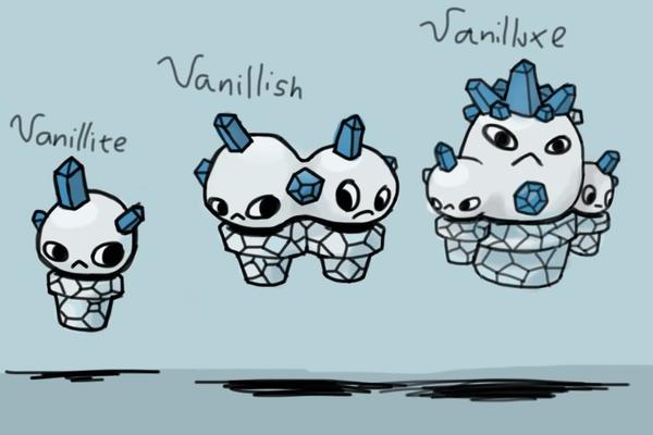
While these contests didn't have any awards apart from a sense of entitlement, they were a fun event in the studio during their prime time. Vanilluxe RedesignsThere are few people who openly defend the appearance of the Vanilluxe line, and for fairly good reason, given how it suffers from tropes such as unexplained levitation and multiple head growth. However, plenty of artists answered the call to alter their appearance, be it slight adjustments or a complete overhaul of the icecream concept. Here follow some of them, along with commentary by the host of the first round; Hipmonlee. 1st place - Fatecrashers
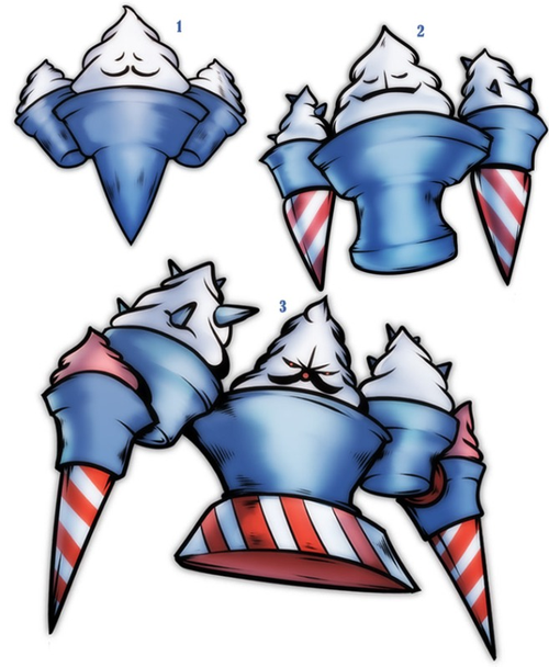
HipmonleeExactly! It's an icecream cone. If there isnt anyone around holding it, its going to fall over. And then, what you get left with is a piece of tragic nostalgia in perfectly sensible pokemon form. And then from that, the evolution is derived perfectly. Everything is there and it all makes sense. And with the cone, that becomes a hat, and then becomes a carrot nose, you just have, a perfectly executed three way visual pun. I would ditch the hat entirely on the final evo tbh, just go with the nose. You dont need it any more. 2nd place - Nastyjungle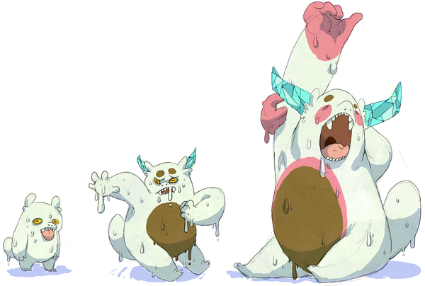
HipmonleeOk, using that colour scheme to convey the ice-creamness is such an elegant device, I love it. It lets you create something really true to the concept, while keeping it plausible and throws away the damn cone, which is a pretty awkward thing to incorporate into a pokemon design. Then the perpetual state of meltingness is just something that tells you so much about the personality of this pokemon with just a couple of drips and a sticking out tongue. Still dont like the ice shards 3rd place - Bummer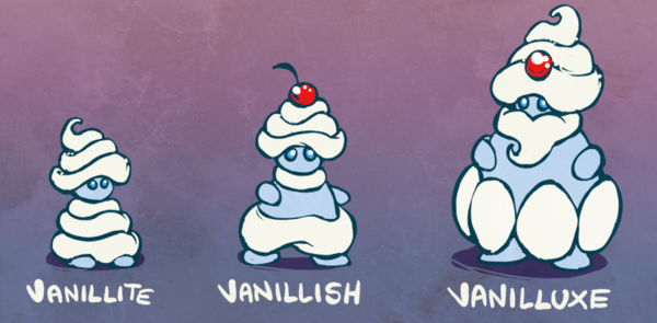
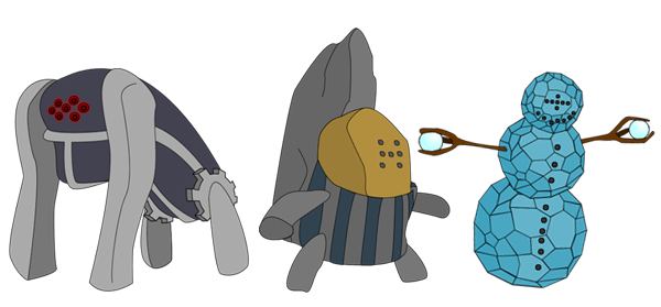
HipmonleeThe cherry is a really nice little touch, and incorporated really tidily. Also, the turban is a truly great example of the sort of personality that can be created with such a simple device. Though, admittedly it is extremely racist to say that because someone is wearing a turban it tells you a lot about that person. It kinda feels to me like in terms of cartoon monsters this is ok. My sincerest apologies to any Sikhs reading this. Regi TrioThe second round of the redesign contest was preceded by conflicting interests, so a poll was held to decide what to cover next. The masses demanded a re-evaluation of the Regio Trio, and Eagle4 along with a two other judges was the ones to grade each entry. The results can be seen below, along with commentary by Eagle4. 1st place - Doran Dragon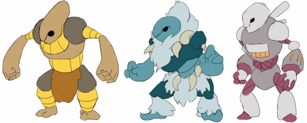
Eagle4These guys are wonderful. Each has it's own features, yet keeps true to the theme, which I find excellent. I like your use of contrasting colours; it makes the original Regis look dull in comparison. I do agree with Kevin that the torso of your Registeel looks a little odd, but that's just a slight nitpick in an otherwise fantastic entry. 2nd place - Bummer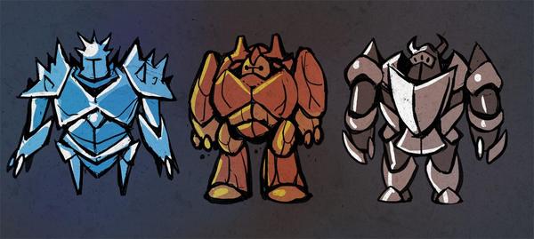
Eagle4You've chosen a great theme to base your Regis on, as it still relates to the original. golem-esque theme. I love each and (almost) every detail of your pokemon, ranging from the differing helmets, to the impressive and well-chosen claws, these are all well thought-out. I am especially fond of Regice's shoulder armour, but I see the legs a little too thin; I don't see how it could hold the upperbody's weight. I do think however, that these pokemon are in desperate need of a secondary colour; they look great, accomplished and... plain. 3rd place - elcheeso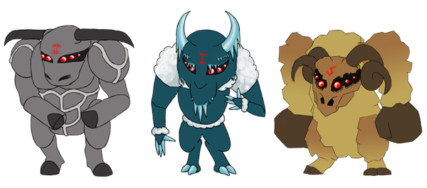
HipmonleeWhilst this contest is mainly focused on concept, it's hard not to notice the structure of these designs; they seem awkward and unnatural. The concept itself is very hard to pull off, and even then it doesn't really relate to the original concept. I have to say though, I love your Regirock. It's stance imposing and very accomplished, and overall it looks the most finished out of your designs. Your Regice looks a little goofy and generally less impressive than the other two. Your Registeel honestly doesn't look steel-type to me, I would've replaced those black horns with metallic ones. Your red markings doesn't really work in my opinion, but I like the idea of the eyes. |